
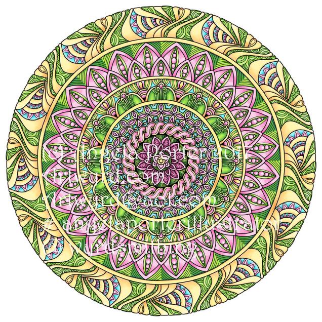
Birthday Mandala

This week, I’ve been doing my best to get images drawn for the Eerie themed book. Various appointments and just generally feeling down and unwell have got in the way, and today hasn’t been much better.
I have spent sometime drawing a ‘DoodleWorlds’ image, which is sitting in a file on my computer to be re-drawn and so on.
The zentangle kind of thingy above is something I’ve done not too long ago. I drew the design using Sakura Micron pens and a white Sakura Gelly roll pen on natural coloured Mixed Media Paper from Claire Fontaine. The paper size is 10cmx14cm.
Last weekend, I created this bit of art work:

It was deviantART.com’s 17th Birthday and a challenge was set there. I wanted to have a go as it was a bit of a challenge, it let me try out new techniques/ides with Autodesk Sketchbook Pro and my Surface Book and Surface Pen, but mostly it’s because deviantART is where various editors/publishers/artwork managers have found my art and engaged me to do work for them. That is the reason I was able to leave teaching, how I’m able to look after my mental health more, and to find a different way of life as well as being able to heal.
Thank you deviantART! And thank you everyone else who has believed in me, my work, and given me opportunities, even when I’ve not believed in myself, my ability, or the quality of my work. And thank you everyone who has bought the books and stamps and so on … I am so grateful.

The day be soon upon us! National Coloring day in the USA, but that can apply to the whole world!
In celebration, I’ve created a free coloring template, a partly coloured version of which you can see above. You can get the template by visiting my facebook page, just click on this link to go directly to the post – Angela Porter Illustrator.
Have fun! I have been – lost several hours colouring in the template, and it’s only about half done, if that! Yes, I’ve been doing this one digitally, well partly. The mandala was drawn using Autodesk Sketchbook Pro, printed out, and then the doodles and zentangles and so on were drawn using a Sakura Micron Pen. Scanned the finished image in, cleaned it up in Sketchbook Pro, then started to colour it digitally, and I actually like how the colouring is turning out. I’m finally getting to a stage where I can say I like what I’m doing … for this style of drawing at least. Somehow, I think that bold, bright colours with high contrast shadows and highlights to create a strong illusion of depth/dimension is me, and I perhaps need to forgo the desire to do ‘watercolours’…we’ll see in the fullness of time!

That’s right! Not digital, but drawn using Pitt Artist Pens from Faber-Castell.
Something inside me told me I needed a break from playing around with digital art, and that my pen wielding skills needed a bit of a dusting off.
If anything, drawing digitally has resulted in me being a bit more confident and fluid with my pen strokes. I also realised that it’s a lot easier for me to work out designs on paper (though I’m not happy with all of the drawings above – a bit out of practice, maybe).
I’m my latest drawings for the Dover Publications project, I have been drawing out the bare bones of a sketch on paper, scanning in and then working on it digitally. That has helped me with size and layout of the design for sure.
This makes me hanker after a Surface Studio even more, as I’d be able to work on a digital image at a 1:1 scale for A4 drawings at the very least.
It’s not easy for me, it seems, to get my brain around the the fluidity of scale of drawing digitally as compared to the fixed scale on paper.
All the same, I really enjoyed wielding a pen with creativity on paper rather than screen. It has it’s own pleasures, and challenges, including having to work with the mark you make when you put ink directly on paper; there’s no easy ‘erase button’ to be used! So, it’s more about going with the flow and the creative opportunities that the permanency of ink results in (creative opportunities being the positive way to view ‘mistakes’; as I was once told, there’s no mistakes in art, only happy accidents!).
Oh, the boxes on the images. Well, I do intend to scan these in individually and create files for printing out, the boxes being there where a greeting or message or quote can be placed.
Also, each drawing is approx. 4″ x 4″ (10cm x 10cm)
Inbetween working on a colouring book for Dover, I get to play with mandalas from time to time. This is today’s coloured mandala.
Autodesk Sketchbook Pro, Microsoft Surface Book, Microsoft Surface Pen.
I’ve spent quite a bit of time on this over the past couple of days, and it’s coming along for sure.
The background colour isn’t the final one; I’ve yet to work out what colour/s would work out well, but just testing out a sandy kind of colour.
Autodesk Sketchbook Pro
Microsoft Surface Book
Microsoft Surface Pen
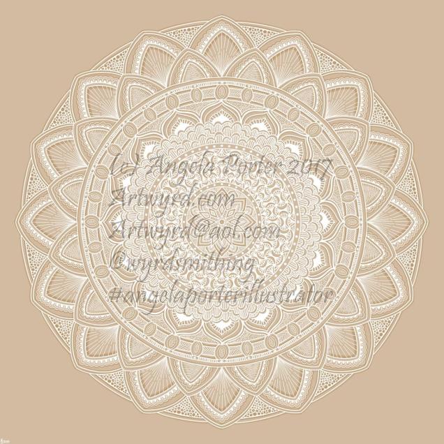
I thought I’d try white on a kraft paper coloured background. I quite like it.
Autodesk Sketchbook Pro on my Microsoft Surface Book
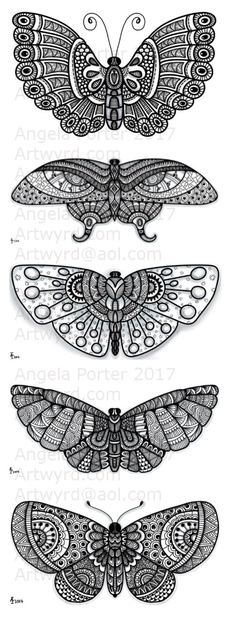
Another four patterned butterflies, drawn using Autodesk Sketchbook Pro on a Microsoft Surface Pen with the Microsoft Surface Pen as the input device.

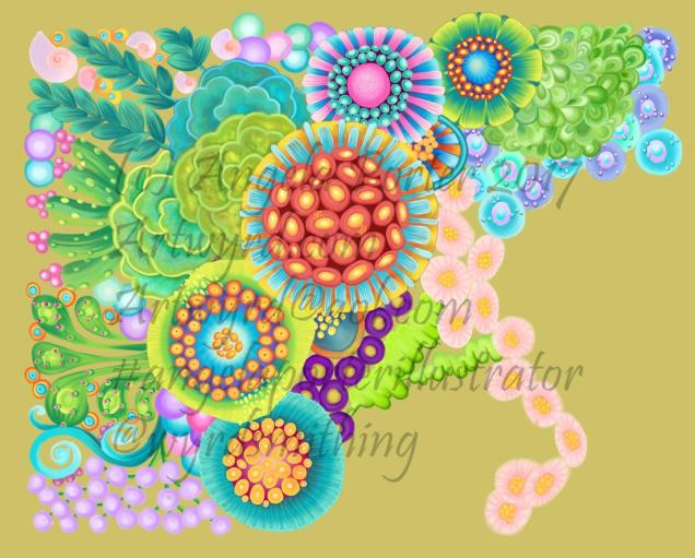
More Foamiran flowers, this time rather more stylised or abstract. Background is texture paste mixed with distress ink and some pearlescent paint from Liquitex and stenciled over a distress ink background. Papers coloured with distress inks or distress oxide inks.
Embossed paper and ACEO card are coloured with various acrylic paints from Pebeo and Liquitex. They’ve been used to create a collaged pattern behind the previously made ACEO/ATC paint.
Liquid pearls have been added in places, and gems in the flower centres.
I die-cut the leaves from Centaura pearl paper and coloured them with Copic markers; the sheen they have is subtle and fits in nicely with the more pastel colours used.

A second mixed media work from me. Texture paste through stencils, distress inks, diecuts, various papers I’ve coloured, some that have been embossed. Metallic and iridescent paints. And gems.


