Monday – a dangle design

©Angela Porter 2018

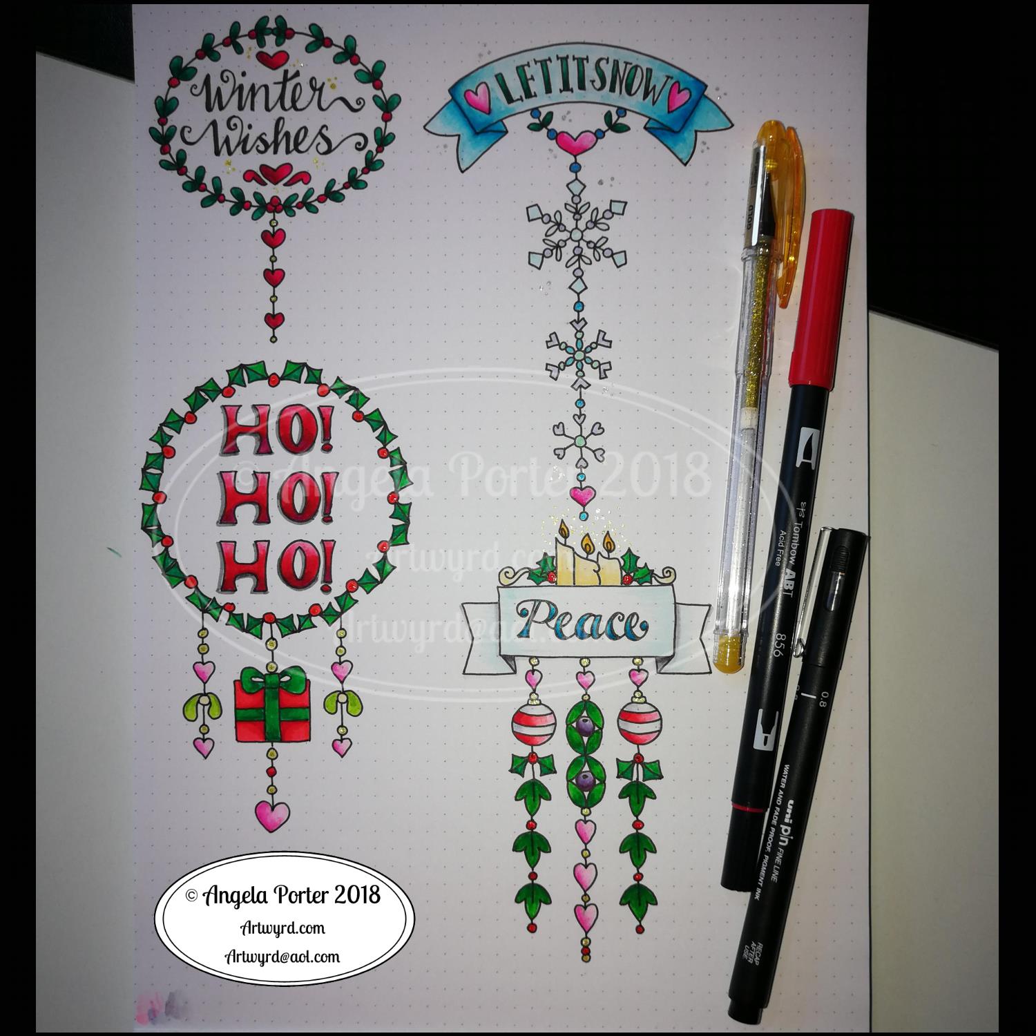
A quiet start to Monday morning here with a spot of hand lettering and dangle drawing.

This is my first draft of a design, which is a bit wobbly in places and there are some ink smudges too.

I pencilled in the basic shapes of the letters, inked in the outlines and then added the inner decoration.

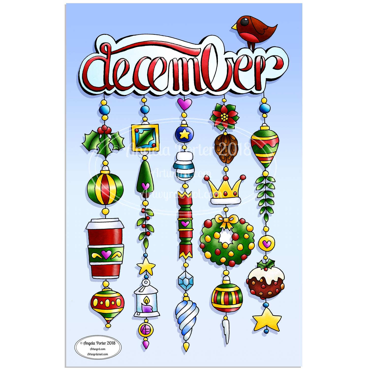
The dangles were drawn with pen directly on paper. The use of dot grid paper helps to keep things vaguely level usually, but this morning that’s not quite gone to plan. Of course as it’s December I’ve gone with December themed charms and a Moon for Moonday Monday!

I have a few tasks to do and then I may just re-draw this, or at least colour it in. Colour makes all the difference.

This could be a bit of a big dangle design to use in a BuJo, but just the word with one dangle to the left would make a charming header with dangle for a day. The beauty of dangles is that you can just add to them as you go through the day. If the charms are small enough you could even add ones that will go with your BuJo entries – event, note, task and so on.

I think that would work well for a big and busy day.

A Dangle A Day is released on 8th January 2019.

©Angela Porter 2018

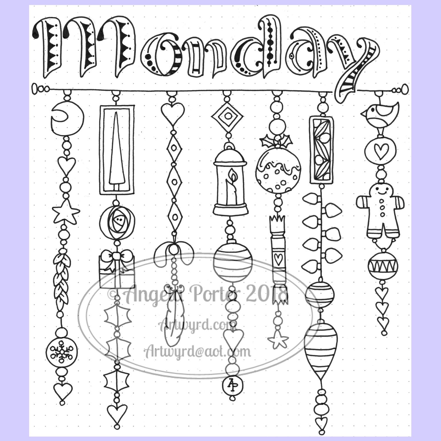
I did go away and create this sample BuJo page showing the kind of thing I meant above. The hand lettering has worked out a lot better. I also like the blue gradient I’ve used to colour the letters with. A grey shadow was added to the left and bottom of the letters too. I also like the cute little date box. The ornate ends on the bar through it give it a ‘feel’ that goes with the lettering.

I did have fun doing this. It’s maybe not something I’d do everyday in my BuJo. My BuJo is very much a working one, with lots of mistakes and rubbishy writing going on as I scribble down things. However, I do enjoy hand lettering, especially more so as I’m beginning to accept that I have to accept my own way of forming letters is perfectly acceptable and that I can work with that.

I have to remember that others don’t see my hand lettering (or art) as I do. They see it with fresh eyes, without the close up work that goes into it, without the small flaws that I see and are magnified by my inner critic into hideous blemishes and fatal errors in the work.

I can quieten the crtiic when it comes to my drawings/art, mostly. Except on any bad days I have in terms of my mental and emotional health. Because hand lettering is something that is a new focus for me, the inner critic feels it’s empowered to be hypercritical of anything I do. It’s only by doing, by doing what I can not to ignore the critic, but to check what it’s telling me as being valid or invalid and learning what I can from the valid points to improve in the future.

Christmas Dangle Design

©Angela Porter
Design from ‘A Dangle A Day’, authored and illustrated by Angela Porter

It’s Friday so it’s #dangleday. Today, I wanted to share a Christmas Dangle with you from my book ‘A Dangle A Day’. In the book I show how this design was drawn, step by step.

When I created this design, I first drew it in pencil on dot grid paper. The next step for me was to scan it in to the computer and then re-draw it step-by-step, saving each step as I went. For the book, the final step was to colour the design and then write the instructions to go with the images. My tools for this were a Microsoft Surface Book, a Microsoft Surface Pen and Autodesk Sketchbook Pro.

I wanted to include as many Christmas-themed charms to create the dangles as I could and still keep the design balanced. I also kept the length of the dangles uneven. The waviness in the ends of the dangles echoes the waviness of the fairy lights above the hand lettered word ‘Christmas’.

What I did this morning was to print the black and white line art design on an A4 sheet of paper. Then I used Chameleon Duo Tones and Color Tops markers to colour it in.

These pens make it easy to create gradations of colour, such as on the hand lettering. These gradations add ‘dimension’ to the charms and dangles. I keep the darker shades to the left and bottom of the designs so that there’s a consistency across the whole image. I also used a pale grey marker to add drop shadows to the left and bottom of the design elements; again this helps to add dimension to the design.

Finally, I added some highlights with a white Sakura Gelly Roll pen. I also added some sparkles around the fairy lights and individual stars with a gold glitter Uniball Signo gel pen. After all, it wouldn’t be Christmas without some sparkle!

Used individually with a monogram or Christmassy image the dangles would make lovely book marks. Printed at A5 in size, the design would make a fabulous BuJo page for the big day itself. It would also make a lovely design for greetings cards or note cards.

Of course, it would be easy to change the word at the top to, perhaps, Winter or Yule and use fewer dangles to suit the length of the word. Personally, I like to use an odd number of dangles wherever possible – it gives a more balanced design.

Christmas comes early to the Porter household!

My advance copy arrived this morning!

Oooh! Excitement!

A knock at the door, a Fed-Ex delivery driver asking me for a signature before handing over a parcel. I saw it was from Lydia at Quarto so knew it would be a copy of ‘A Dangle A Day’. So excited to open the package and see the book in a solid, tangible form.

A Dangle A Day is due for release on 8 January 2019.

I’ve seen the pdf versions of the book as it was put together before going to print. But, it’s never, ever the same as having that book in my hands.

Even more so today as this is my first book with words and art done by myself. I trust it won’t be the last.

About the book

I had a lot of fun creating this book. I’m so excited about helping others to create their own dangle designs and to gain confidence that they, too, can create lovely designs for use in all kinds of ways – BuJo pages and spreads, greetings cards, note cards, framed pictures, scrapbooks, planners, journals, bookmarks, place cards, and more.

I’ve done my best to show you how to create monograms and dangle designs in easy steps both visually and with some supporting words.

Suggestions about how to approach hand lettering is scattered throughout the step by step instructions for the dangle designs.

Examples of dangle designs in use in bullet journals and more are included – with all their imperfections. Remember, work created by each of us will be perfectly imperfect. It’s those imperfections that make it uniquely ‘you’.

There’s lots and lots of examples of designs and dangles and charms that you can use as they are or as inspiration for other designs. There are designs for all seasons and many, many different events throughout the year.

I’ve included suggestions for color palettes, media to use.

A short primer for bullet journals is included; I’m no expert on bullet journaling but I do make use of one and find it very useful not just in organising my tasks for the day but in recording ideas, reflections, memories and more. 

This has put a big smile on my face this morning, and that smile will continue for a long while. I never thought I’d write and illustrate an art tutorial book. I’d thought I’d like to, but didn’t have the confidence to think it would be so. 

Why I chose to use digital tools

I made great use of my Microsoft Surface Book and Microsoft Surface Studio along with a Microsoft Surface Pen and Autodesk Sketchbook Pro to draw many of the designs. Working digitally made editing designs, breaking the design process down into simple steps so easy. 

I used to think, as many do, that digital art is simpler, easier than traditional forms of art.

It’s not.

The skill set required is different. I wanted my digital drawing and coloring to look like I’d done it with traditional media.

Digital drawing is no easier than drawing on paper.

What is easier is correcting mistakes, smudges and removing pencil lines. It removes the frustration I experience in scanning images in and spending a lot of time cleaning the image up for the publishers. Scanning can be a frustration for me too, which would’ve been worse if I’d had to scan in step after step after step. And having to re-draw if I’d missed a step out, or re-scan would’ve driven me nuts.

What I didn’t want was artwork that looked too perfect, too inhuman. I wanted digital drawings that looked like I’d drawn them on paper. So, I worked hard to set up pen ‘brushes’ that would mimic how my favoured drawing pens would look when drawn on paper.

Also, I rarely used any line smoothing tools for any of the work so it has that slightly ‘wobbly’ line appearance that my pen and ink linework has. I also kept the design elements, called charms, imperfect just as they would be if I’d drawn them with pen on paper.

In fact, each and every design started out as either a pen or pen drawing on paper which was scanned in so I could re-create it, step by step, digitally, saving a file for each step to the computer.

There were plenty of revisions/edits required and colour changes. Again, working digitally make this a less onerous task than if I’d had to do everything with pen and ink on paper, scanning in each step all the while worrying I hadn’t missed a step as I got engrossed in the process of drawing.

Working digitally did not make the drawing any easier or simpler, what it did was allow me a different way to draw the steps.

Coloring the designs digitally was no quicker than with traditional media, in fact it took me longer! I learned a lot about this process by doing this book, and I think it was the book that allowed me to become more comfortable with digital art and how to make it look like I’d drawn with pen on paper, in my own style.

Of course, I can print out the line art and colour it with any media I choose. I also can redraw any using traditional media. And of course, adjusting the size is so easy. 

Winter Dangle Designs 3 December 2018

Winter Dangle Designs – 3 December 2018

I have had some fun designing these, as always!

I did use some circle, oval and hexagon templates to help me design the wreaths and snowflakes. The dot grid paper helped me draw mostly straight lines for the dangles.

I did sketch them in pencil first before inking them in with a Uniball Unipin pen. Colouring was done with various Tombow dual brush pen markers and some sparkly elements added with Uniball signo sparkle gel pens.

These would look lovely as greetings cards. In fact, I’m thinking of redrawing them digitally and using them to make my own christmas cards this year. Printing out the black line work and then colouring them with traditional media. In the past couple of years I’ve designed my christmas/winter/yule cards digitally and had them printed professionally. This year, I think I’ll do it the way I suggest in my book ‘A Dangle A Day’.

They’d also look great as note cards or as pages in a BuJo, planner, scrapboook or journal. They’d lend themselves to cute bookmarks too.

These relatively simple and small dangle designs are perfect for practicing hand lettering too. And in these four dangles I’ve used four different lettering styles.

I’ve also kept the finished designs simple by not adding any drop shadows, except around the ‘HO! HO! HO!’. Not only that, a lot of the colouring is very simple too.

I do hope you’ll have a go at designing your own, maybe using these as a bit of a guide.  If you do, I’d love to see what you’ve created.

Another December Dangle Design

As one of my current goals is to improve my hand lettering I thought it would be fun to practice it with another dangle design.

For this one, I used some dangles from my book ‘A Dangle A Day’ to build the dangle designs with a wintry, Christmassy vibe to the finished design, thanks to the traditional Christmas colours of red, green and gold, along with with some blues, purples and cool pinks thrown in.

Of course, I could’ve chosen a non-traditional series of colours too, for fun. For example, the baubles on the dangles and the wreath could be done in pink, purple and blue. Whatever your decor at this time of the year it can be reflected in your colour scheme for your dangle design.

From the initial sketch to posting it on this blog it’s taken me around 6 hours to complete. 

Yes, I started with a sketch and then inked it in traditionally, pen on paper. I scanned that drawing into GiMP so I could remove the dot grid and the faint echoes of erased pencil lines. This was followed by coloring the image. For this I used marker and blender brushes . The last steps were to add texture to the design, a coloured background, a drop shadow and then the watermarks.

I used a Microsoft Surface Pen, a Microsoft Surface Studio and Autodesk Sketchbook Pro to complete the digital colouring and so on.

The charms on the dangles are a lot easier to draw than they appear, it’s the colour that really brings them to life and gives them dimension.

It’s always fun to string charms together to make these dangles. I often tend towards more symmetrical designs, but ones like this are good to do too. They all have their own charm, pardon the dreadful pun there.

I take you designing dangles step by easy step in my book ‘A Dangle A Day‘. There are lots of examples of dangle designs in the book that are ready to use, but it’s easy to rearrange things to suit your particular needs. The release date is 8 January 2019, a new style of creativity to start in the New Year, and throughout the year as all the seasons and many different celebrations are covered in the book, along with suggestions for projects using dangle designs.

December 2018 BuJo Monthly Cover Page

I’m absolutely dreadful at taking photographs! However, here is my coloured version of the dangle design I posted earlier today, all glued into my BuJo ready for the start of a new month tomorrow.

This is likely to be the only artsy stuff I do in my BuJo as the rest of my bujo is rather minimal – it’s functional and I can lose way too much time prettying it up. For instance, sketching, inking in the design and then colouring it has taken me most of my day! It’s been fun though, and a much needed ‘quiet’ day after a hectic week.

I realised after coloring the hand lettered December in that I’d messed up the letter M. The second vertical line should’ve been like the first one to give balance to it.

I also forgot that when I printed out the A4 sized design as an A5 that the lines would be reduced in thickness. So, I had to invest time in going over them with a thicker pen after I’d finished the coloring. Mind you, this helped to make the lines nice and bold again.

To colour I used Tombow Dual Tip Brush Markers along with glitter Signo gel pens from Uniball. I also used some Chameleon coloured pencils to add a bit of shading here and there and to add the shadow around the design.

I left the background white. I realised that I could’ve coloured it with Distress Inks and then coloured over them. So, instead of messing up the background by trying to colour it I elected to use silver and gold glitter gel pens to create patterns of ‘sparkles’.

Yes, glitter! I rarely get to add glitter or metallics to my work, especially if it’s for publishers as it really doesn’t photography or scan at all well. But as this is a personal project I did add a fair amount of sparkly highlights and elements.

I think this one may be my favourite BuJo monthly cover so far.

I must admit if I had time or desire to colour it again I’d not use the  Tombows. I managed to smear the colours lightly here and there so I haven’t got a ‘clean’ coloured illustration.

I think I’d go with alcohol markers such as my Chameleon Color Tones along with the Color Tops.

However, I think I may find it difficult to colour the tiny spaces with the Chameleons. That’s the problem with printing the design smaller than the original. 

December Dangle Design for BuJo

It’s Friday, so that means it’s #dangleday! As it’s the last day of November it seems appropriate that I design a dangle design that would look fantastic as the monthly title page for a BuJO, journal, planner or just a fun design to color and frame or, printed out smaller, used on a greetings card.

As usual these days, I sketched the design out on dot grid paper and then scanned it in. I used Autodesk Sketchbook Pro and a technical drawing pen ‘brush’ to ink the design, as well as make adjustments to the design.

The final steps were to add a background colour and watermark it for sharing on the internet.

Naturally, I used my Microsoft Surface Pen along with my Microsoft Surface Studio to do the digital drawing. I think I’m going to print this design out so it will fit in my BuJo and colour it with traditional media.

I’m going to make this available as a coloring template in the Angela Porter’s Coloring Book Fans facebook group. So, if you’d like to download and print the template, pop along to the group and join in!

This is quite a complex dangle design to look at, but it’s not that complex to create. In my book ‘A Dangle A Day’, released on 8 January 2019, I take you step by step through the process with loads and loads of examples of monograms and dangle designs for all seasons and all occasions, along with ideas of how to use them. There’s also a fair number of tips and encouraging words within the book.

If you do download, print and colour this design, I’d love to see how you’ve coloured and used it! You can find me on twitter, Instagram and facebook.

December Bujo Ideas

December is nearly upon us and my mind is turning to ideas that could be used to brighten up BuJo pages with simple lettering and design ideas. And this sheet is what I’ve come up with … thus far!

If you use any of them for inspiration in your BuJos, planners, journals, or in card making or any other way I would love to see how you’ve used them! If you share on Instagram then tag me in your post @angela_porter_illustrator. On twitter you can tag me as @artwyrd and you can find me on facebook as @Artwyrd

All are hand lettered and hand drawn. I used Crayola Supertips to colour the images in. I used Uniball Unipin pens for the black lines and I worked on dot grid paper to help me keep the letter sizes and spacing consistent.

I can see that the bubble lettered ‘December’ has a weird looking M. It looks more like Decewber!  Oops! Practice is needed with bubble lettering methinks.

This was a fun project, that took a bit more time than I thought it would. 

Of course, the next thing for me would be to choose some of these and convert them to dangle designs, a process I cover in my upcoming book ‘A Dangle A Day’.

I’m finding that I’m enjoying hand lettering a bit more now that my conversation with myself in an earlier blog is setting in – about making it mine and accepting the little imperfections as they are what make it unique, just as they do in my drawings.

Inspire – 28 November 2018

Today’s hand-lettering is just a variation on the one I posted on Monday.

For this one, I’ve used simple patterns to fill the white space in the letters and added a ‘line shadow’ to left and below the letters. To do this I used a Uniball Unipin 0.5 pen.

I like the graphic nature of just black and white as well as the intricacy of the patterns.That intricacy is something that warms the cockles of my artistic heart.

I didn’t only add details to the letters – I’ve added details to the dangle too! Simple additions but add a feeling of complexity.

I feel at the moment I’m in a position both in terms of demands on my time but also in how I feel about myself and my artistic nature to explore hand-lettering so it’s an ‘Angela’ thing that I’m comfortable with.

Not just comfortable, confident in my skills too. So, re-working a fairly open hand lettered word like this in different ways. 

So, it’s possible you’ll see variations on a word appearing on this blog, my Instagram, deviantART, Twitter and facebook accounts as time goes on.

We’re rapidly approaching December so it’s time for a number of personal artistic pursuits :

  • my christmas/winter cards for 2018 need to be designed and printed
  • ‘freebie’ templates need to be designed for the Angela Porter’s Coloring Book Fans facebook group.
  • BuJo spreads and design elements

I’m sure there’s some other things that need doing, but this morning they escape me. Of course I’m going to note these things in my BuJo.

I’ll also be starting work on a new book for Creative Haven by Dover Publications.

So a nicely ‘busy enough’ time ahead. 

Yesterday, I had a lovely day out to Aberglasney Gardens for lunch with my pal Liz. It was hammering down with rain during our journey there, but the rain cleared up by the time we’d finished a leisurely lunch. 

It had been many years since I’ve visited Aberglasney and I’d forgotten how interesting it is. I’ll return sometime soon with sketchbook in hand for sure!

My evening and night until well past midnight were taken up designing a birthday card for someone. The design was finally uploaded to Moonpig ready for posting today near midnight. To say I was, and still am, shattered could be an understatement today! Still, I can have a semi ‘self-care’ day today to recover.

Basic Hand Lettering reference sheet

I woke up early today and thought I’d organise my ideas about basic hand lettering into a reference sheet, and this is what I’ve come up with.

The foundation of hand lettering, to my mind at least, is to practice, practice, practice drawing your basic letter shapes, both upper and lower case. Bullet journaling can be a good way to practice hand lettering and to try out variations in letter forms and styles. My current bullet journal is very functional and minimal, but I do use different letter styles in the headings for each day and collections and so on. Mind you, I could do with a lot more practice.

Notice is said your basic letter shapes, not my basic letter shapes The reason I say this is that the more I’ve struggled with my hand lettering and it not looking like other peoples, the more I’ve come to realise that it’s MY hand lettering, my style, that I need to work on.

Yes, I draw inspiration from other people’s work, but at the end of the day I’d like my hand lettering to be mind, with my ‘stamp’ on it, my uniqueness, my quirkiness, my imperfections.

I struggled with this idea in the early years of my artistic journey, and now I’ve realised I’m having the same struggle with my hand lettering.

Hand lettering is exactly that – done by hand, not by machine. If I want perfect letters, then I can use fonts on the computer. What I can’t have is perfect hand lettering as in perfect like a computer font. 

What I need to work on accepting is that my hand lettering is good enough, it’s human, it’s an expression of myself.

I spent a lot of time and effort in my teenage years to change my handwriting. I realised it looked a lot like my mothers. I didn’t want to be anything like my mother, even down to my handwriting, which actually is more like fast hand lettering as I really do draw each letter. I gave up joined-up cursive writing at this time too. My handwriting isn’t entirely print, some letters do get joined up.

I came up with my own style of writing that I like, mostly. It’s usually teeny-tiny too, so writing BIG is a problem for me.

Hand lettering is, for me, an extension of my own style of printing/drawing my letters.

This doesn’t sit all that well with me at this moment, but it feels more authentic to me.

I want to use my own letter shapes as the basis for my own hand lettering, along with all the imperfections that my bring. After all, it’s all the little imperfections in my drawings that make them uniquely mine, that make them human. Even when I draw digitally I make sure that there are imperfections in my work – the slightly wobbly lines, the imperfect circles and shapes and so on.

I am working on having the same kind of attitude towards hand lettering and stop thinking that mine has to be perfect like computer fonts, that it is just another way of artistic expression and perfectly imperfect.

Notice that I say this is about me and my attitude towards myself and my hand lettering. I’m not criticising anyone who has different opinions. I just know I can be incredibly hard on and brutally critical of myself.

It’s so easy in this day and age with so much available on social media that you compare yourself to others and judge yourself as seriously inferior or a failure. As my inner critic already believes that I am a failure and useless at anything I do and tells me this, it can be a lot harder for me to believe that what I create is good enough. I believe that about my drawings, I don’t believe that about my hand lettering, yet.

What I’d like to achieve is hand lettering that stands out as being ‘Angela Porter’ and for me to be comfortable with my hand lettering, not worrying that it’s nowhere near even good enough.