April BuJo setup and a look back at March

April’s BuJo

Angela Porter April BuJo Cover

I’ve spent some time today setting my BuJo (bullet journal) up ready for next month.

I decided I’d like a kind of mandala with dangles for the cover page, which you can see above.

I chose quite strong purple, purple-pink and green-blues for the colour scheme, with golden highlights.  Faber-Castell Polychromos and Caran D’Ache Luminance pencils, along with a blender pencil from Derwent, were used to colour the design.  I used various Copic Multiliner SP pens to draw the design.

Angela Porter April BuJo Overview and Trackers

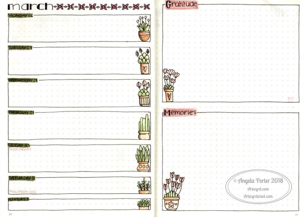
After working with my BuJo for a month, I decided that I needed a different design for the Monthly overview, where I’ll add in my appointments and events later on. I also wanted to change my mood tracker to one that lets me track my  mood through the day.  I thought it would be a good idea to add the other things I want to keep track of – meditation, walking and hand lettering practice.

I used dangles to join the various boxes to the headers on this page.

I also used Tombow Dual Brush Pens to colour in the designs on this page; and you can see the key to the colours used on the Trackers page.

Angela Porter April Weekly Spread

I’ve also set up one of my weekly views.  I really liked having a page for week’s diary/notes and one where I can write my gratitude and memories.  It’s worked well for me the past week.

I will set up the other weeks as I head towards them through the month, but they’re likely to be similar with just different header and divider designs being used.

A look back at my first month with a BuJo

I’ve certainly had an interesting and fun time with my BuJo this month, and I’ve been finding out how it works for me.

My days are often very simple in terms of what I need to do, so I don’t really need or use large amounts of space for each day.  What I tend to record for each day is a list of tasks accomplished along with appointments.  The memories section is really valuable as well; for me a BuJo is more like a memory store rather than planning out my life in detail.

I’ve done a huge amount of work on collections; these include charms, dangles, bugs, botanical drawings, floral wreaths, feathers, crystals, cacti and succulents, and favourite patterns. My BuJo is becoming a kind of visual directory for me, which will be very useful as I look to start my next book project soon, as A Dangle A Day is nearly complete.

Creating the spreads is a rather soothing, meditative process for me, especially colouring.  It also gives me the chance to practice drawing dangles and other items too. I usually start my day be adding to a collection or colouring some of the drawings already done.

I do tend to keep a list of important things to do on a post-it note, but as I do them I write them down as having been done in the appropriate day.  I’ve mentioned it before, but I find ‘to-do’ lists not very motivational for me and a source of me beating myself up.  For me, lists of things I’ve achieved that day helps me far more.

I’ve added hand lettering practice to my trackers as I want to practice that a lot more.

Practice makes progress – a Dangle Design

Angela Porter Dangle Design 23 March 2018

I’ve just completed this dangle design, which features a very appropriate message.

Learning to recognise when something is good enough has been a hard lesson for me, but bit by bit I’m getting there.  The ‘practice makes perfect’ adage puts a lot of pressure on a person, so I much prefer the use of the word ‘progress’ instead of perfect.

No one has ever picked up a pen or pencil or other tool for the first time ever and created a perfectly wonderful piece of art. It takes time, patience, and, above all else, practice.

Mistakes are made along the way, or I prefer to call them ‘happy accidents’ or ‘creative opportunities’.  They allow me to reflect on what I have done, to learn, and to improve or extend myself as a result.  Sometimes, the happy accidents teach me something I never would’ve come up with, a surprisingly pleasing result which becomes part of my artistic vocabulary. Sometimes, they result in me changing what the artwork was meant to be into what it needs to be.

To be flexible and not too invested in a definite artistic outcome, is another lesson that imperfections, happy accidents, or creative opportunities have taught me. Learning to go with the flow and work with what happens instead of fighting it and trying to force it into what I wanted it to be, which often then results in a horrible mess of a work.

I’m happy with this ‘dangle’.  If I drew it again, there are bits I’d change. If I were to colour it again, there’s bits I’d change. However, it’ll do as it is.

I sketched the design on dot grid paper, scanned it and then drew it digitally using my Surface Pen on my Microsoft Surface.

Next, I printed it out on watercolour paper and used some Tombow Dual Brush Pens to colour it.  I didn’t use many colours at all; the blender brush helped me to achieve colour gradients.

I did use some Copic Multiliner SP pens to add some more details to the printed image and coloured image; I regret the stippling on the centre pot, but it’ll do. I’ll remember next time to use the little lines for added shading!

My book, A Dangle A Day, due out in September 2018 and available for pre-order now, will show you how, step by step, you can create similar dangle designs.

Derwent Procolour Pencils and some cute bugs

IMG_20180321_120333

Today, I wandered into my local stationers – Churchill’s – and found some items for my stationery stash.  Included were some coloured pencils from Derwent that are new to me.

They’re called Procolour and I picked up a tin of 24 of them. and you can see how much I paid on the tin, though they are available for less on Amazon.

cof

I tried them out in my Leuchtturm 1917 Dotted BuJo on some cute bugs I’d drawn earlier today (yes, another collection is being assembled in my BuJo).  You can see the colouring at the top of the page, though I adjusted the brightness and contrast a tad.

The blurb on the tin says

Derwent Procolour pencils are the perfect combination of a strong point and smooth lay-down, with a texture that has the covering power of wax yet glides like an oil.  The richly pigmented pencils maintain a sharp point for detailed drawing; while minimal chipping and dusting keeps your work clean and smudge free. Suitable for a wide range of drawing techniques, available in a carefully selected range of 72 rich and vibrant colours.

I didn’t choose the best paper to test them on, though they’re more like to be used in my BuJo than anywhere else, but the colours are vibrant, even on the creamy coloured Leuchtturm paper.

They do lay down well, with a gentle pressure, and they layer nicely.

What I do like is that they have quite a wide ‘barrel’, which makes it a lot more comfortable to hold than other coloured pencils; my old, slightly arthriticy fingers don’t like narrow barrels when I need to press hard.  That’s why I tend towards water-based media or digital media these days; they keep my fingers happy and working.

The colour palette of the 24 set is actually nicely chosen, with plenty of my favourite colours.

I am very tempted to get the full set of 72, but I think I’ll wait for a little while.


Spring Equinox 2018

sdr

Yesterday was the Spring Equinox in the Northern Hemisphere.  The first day of spring, astronomically speaking.  I decided I’d do a little BuJo page about the equinox, and after spelunking through my memory, books and the world weird web, I pulled together some ideas about it, as well as a little illustration.

For the first time I can remember, I sketched out the flowers and leaves in pencil before colouring the shapes in.  Then I added outlines and details to the colour.  I think I got a bit heavy handed with the outlines, but it’s all learning for me, expanding my artistic ‘tool-box’.

BuJos and Tombows


Bujo01

Tombow Dual Brush Pens

Today, I recieved a full set of the Tombow ABT Dual Brush pens and I’ve managed to swatch them out in my BuJo.

So far, so good.  They ‘stick’ a bit more to the paper in my Leuchtturm 1917 dot grid BuJo than the Zig Art and Graphic Twin pens or my Zig Clean Color Real Brush Pens, but I like the colour palette.  I’m sure I will get a lot of use out of them for sure.

BuJo

Talking of my BuJo, I’m going to bravely share some of the ‘spreads’ I’ve done and share some of my thoughts on BuJo and how it’s working for me so far.

Bujo02 There’s a lot of stuff out there about bullet journaling, and a good place to start is bulletjournal.com, the website of Ryder Carroll, credited with starting the bullet journal system.

What attracted me to this system is it’s total flexibility and how you’re encouraged to make it work for you.

Rather than planning my day out, other than appointments or important dates, I use mine more as a journal where I record what I have done that day.

I find lists of things to-do can be counter productive for me; if I don’t tick things off I can be very hard on myself.  However, by recording what I have done, that just feels far more positive to me.

So, I do have a couple of ‘trackers’ in my BuJo for things I would like to do on a daily basis.

Notice I wrote ‘I’d like to do’, not ‘I must’.  That takes a lot of pressure off me, as well as the guilt I can have if I don’t get done what I thought I could get done in a day.  I’m far more ‘productive’ if I just get along with things.  I’m lucky to have the luxury of doing this as I’m self-employed, as well as being an arty, creative person.

So, here are my trackers, as they appear in my BuJo:

Bujo03

Bujo04

Bujo07

I’ve noticed I have some colouring to do on some of them.  I decided I’d like my trackers to span a whole year, which seems to be working fine for me now. I also wanted to add some of my favourite quotes to remind me of why I want to keep track of these things and their importance to me.

I decided to add the quotes in boxes, and connect them with strings of little ‘doodles’ called dangles (the book I’m working on – A Dangle A Day – is spilling over into other areas of my creative life!) I like how they’re not all symmetrical in shape and arrangement.

I like how I can use my BuJo for daily practices of all kinds of things from drawing to hand lettering.  I can keep lists and notes on things that grab my attention.  I keep pages where I write down notes and ideas; not to-do lists, just notes to myself, or things I need to ask others about.

I have sections with botanical doodles/sketches, a list of sizes of picture frames and mats, the size of card blanks.  I have examples of hand lettering alphabets, with notes about them.  I have dangle directories too, a result of my work on A Dangle A Day.

The index is invaluable in helping me keep track of the collections, especially when they occur over multiple pages with other stuff in between.

Of course,  I also have weekly ‘diary’ pages, and I’ve been trying out different formats for them, including these:

Bujo05


Bujo06

I’ve changed my monthly view for April, and here it is:

Bujo08

The one for march didn’t have any room to write appointments or events in.  This one certainly does.  Not sure what I’m going to put on the right hand page yet, though I couldn’t resist drawing part of a mandala there.

I’ve found it is easy to get lost in bullet journaling; especially the creative parts. That’s fine when it doesn’t take me away from things that must be done, such as doing books. But it’s a different way of practicing drawing, hand lettering, organising thoughts/interests/memories/ideas and so on rather than in multiple books (journal, diary, sketchbook, note book) – they can all go in one book.

If you’d like to see any of these, let me know and I may share some, or little tutorials on how I draw stuff.

The flexibility and the ability to change what doesn’t work easily is the biggest draw, as well as the ‘permission’ to do what you need to do, what is right for you.  There’s no shoulds or shouldn’ts about it.

The other thing is not to get hung up on perfection.  I get things wrong in it all the time, or don’t like what I’ve done.  These can be ‘fixed’ by the use of correction tape or sticking a new piece of paper over the mistake if it’s a biggie. I just have to remind myself it’s a work in progress, it’s hand-made (well the content is if not the notebook itself), and it will help me, I hope, to accept that something is ‘good enough’ without it having to be perfect in all ways.

I already really dislike the heading for my Mood Tracker, but it’ll do for now.  I may change it with paper and sticky stuff.  Or I’ll just leave it so I can see how my hand lettering progresses over time.


Spectrum Noir Artline Pens – a review

“These quality fine line pens are perfect for sketching, outlining and colouring fine detail.  Various line widths and colours.  Quality micro-pigment inks.  Light-fast and Water-proof.  Quick drying and smudge-proof.”

That’s what it said on the back of the pack of these pens.

After reading that information and watching a video on YouTube reviewing the pens, I thought ‘marvellous – I’ll give them a go’.

So, I ordered a set on Amazon and they arrived yesterday.

I was particularly interested in their waterproof and  quick drying smudge-proof claims. I tend to use a lot of water-based media in my work, my Sakura Pigma Microns and Uniball UniPin pens work perfectly adequately.

Naturally, I wanted to test them out.  In the back of my bullet journal (BuJo) I have pages set aside for testing media.  So, I drew some lines from each pen, and a pattern with the brush pen.  The pens wrote smoothly, though the nibs feel rather soft and I don’t know how they’ll hold up with  using them with my not very light hand.  Time will tell on that one.

The ArtLiner pens didn’t bleed through the Leuchtturm paper, though there was some ghosting, which happens with many pens.

The brush pen was not pleasant to use, but that’s down to personal preference.  I write/draw with quite a firm pressure, and this pen just doesn’t suit me at all.

However, I did manage to smudge the lines because the lines remained wet for quite a while.  I was disappointed with that.  Maybe these pens were a bit too ‘juicy’ to dry quickly, or maybe it was the smooth nature of the Leuchtturm paper that resulted in them taking a little longer to dry.

To test this out, I drew a design on some Canson Mixed Media Imagine paper using the 05 and 03 Spectrum Noir Artliner pens. Here’s a photo of part of the drawing.

cof

First thing I noticed was that the ink took a while to dry on this paper too, and though you can’t see it on this image, I did manage to smudge the ink on some of the leaves at the top.

I left the drawing to dry for a goodly amount of time (my cat, Cuffs, needed a long cuddle before he settled back down for big sleeps) and came back to colour it.

I started off using Faber-Castell’s Pitt Artist Pens, which I used to colour the top part of the image.  I noticed that the colours looked a bit duller than usual.  That signalled some warning bells in my mind.

I switched to Zig Clean Colour Real Brush pens with a Tombow Dual Brush blender pen.  I definitely noticed the black ink spreading.  You can see that in the rows of leaves dangling down, especially those on the right side.

I left this drawing overnight and went back to it not long ago.  I added just clean water to the bottom leaf on the right.  You can see how much the ink bled and smudged.

Not happy. But I wondered if it was the paper.  So I went back to the test I did in the back of my BuJo, and you can see here the results of that.

cof

The Tombow blender pen, Zig Art and Graphic Twin pens, Zig Clean Colour Real Brush and Pitt Artist pens all caused the ink from the ArtLiners to bleed.  All of these are water-based media.

So, from my little tests, these are not what they claim.  Maybe I had a dodgy set, but for all the pens to behave in a similar way?

I won’t be buying them again. I’ll stick to my trusty Sakura Pigma Micron or Uniball Unipin pens, and they are pens I would recommend to anyone.

Just to emphasise, I don’t have any connection with Spectrum Noir, I bought the product myself, and I just wanted to share my thoughts with you on these.

A Dangle A Day

As it’s WIP Wednesday, I thought I’d share the cover of my current work in progress – A Dangle A Day.  It’s all about drawing dangles and stuff the Angela Porter way. I’m doing all the illustrations plus the writing too!  It’s not a colouring book, it’s a tutorial book. There’s going to be a little bit in it about BuJos (bullet journals) too!

It’s available for pre-order now on Amazon; release date is 6 Sept 2018.

Mixed media 25 Feb 2018

Angela Porter mixed media 25Feb2018

I’ve been hard at work on my ‘A Dangle A Day’ book and felt I needed a break from the computer screen.  As much as I love working digitally, I believe it does the soul good to work in different ways from time to time.  A change is as good as a rest, it is said, and also a change can get the creative juices flowing!

A trip to Hobbycraft in Newport, Gwent, yesterday had me buying some A4 Daler-Rowney Mixed Media boards.

These are 1.4mm thick and sturdy board forms of their mixed media paper.  The board did warp when I added tissue paper with matt medium, and it’s still a little wobbly today.

The pictures shows how far I’ve got for now.  I’m letting the little drops of copper and golden glitter dry as I take a break from it to decide if I need to do any more to it.

The image I drew and then coloured using Distress Inks.

I’ve enjoyed getting a little inky, painty and messy for a change.

Doodleworlds 18 Feb 2018

AngelaPorter_Doodleworlds_Coloured_02

I’ve just finished colouring in this template from my book “Doodleworlds”.  I drew the template using pen and ink on paper, scanned it in for the book, but I chose to colour the template digitally using Autodesk Sketchbook Pro, my Microsoft Surface Book and Microsoft Surface Pen.

Doodleworlds is available on Amazon and in my Etsy shop – Artwyrd.

Brayered backgrounds with Distress Oxide Inks

Angela Porter Brayered Backgrounds 17Feb2018

The image shows some of the backgrounds I’ve made using a Speedball Brayer, a Gelli Arts Gelli Plate, white card and Tim Holtz’s Distress Oxide Inks.

I’ve been taking a little break from the work for the A Dangle a Day book, a change freshens up the creative part of my mind.

The process is quite simple.

  1. Press the oxide ink down onto the Gelli plate.
  2. Use the brayer to spread the ink over the Gelli plate. The Gelli plate acts as a blending mat.
  3. Use the brayer to add ink to the white card.  I find it helpful to have just printer paper under the card and to move the brayer from the paper onto the card.
  4. Build up layers of inks until you’re happy with the look.  Using one colour of ink you can quite easily build up an ombre background.
  5. Spray or dot water onto the paper and let the inks ‘oxidise’ if you wish.

I clean the brayer off on the copy paper between inks.  I also use the copy paper to lift off any residual ink from the Gelli plate between different ink colours.  Sometimes, I dab the Gelli plate with a baby wipe and then use copy paper to clean the plate, especially if the residual ink and the new ink will make a nasty brown sludgy colour.  In this instance, I wipe the brayer with a baby wipe and then clean and dry it on copy paper too.

Sometimes, the copy paper becomes a beautiful background paper too, so I store those away for future use, sometimes.

I’m going to scan some of these backgrounds in to use as backgrounds to my digital art, but then I’m going to draw on them.  I’m using quite a few in my Sketchbook Project sketchbook for 2018.