
Zentangle style abstract art is my sketchtember artwork today.
The small ones have colour added by Arteza Ever Blend markers. The larger drawing is having colour/shadow applied with Carbothello pastel pencils.
Zentangle style abstract art is my sketchtember artwork today.
The small ones have colour added by Arteza Ever Blend markers. The larger drawing is having colour/shadow applied with Carbothello pastel pencils.
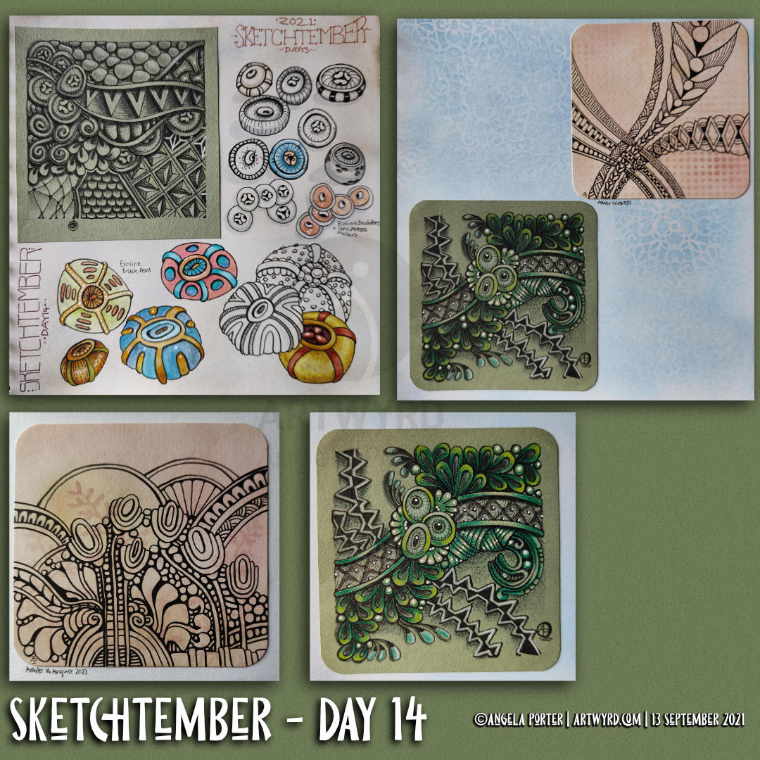
My art of the previous day or so. More seed pods for Sketchtember, this time colour’s been added with Ecoline Brush pens. Just for a bit of a change from alcohol markers!
There’s also some Zentangle-style drawings, small ’tiles’ approx 3.5″ x 3.5″ in size.
The green one has been coloured with Color Soft pencils. The peachy background ones are still works in progress, but fixed into my sketchbook.
You may notice patterns upon the backgrounds in some of these images. I spent some time yesterday using some stencils from my stash to add texture to the Distress Ink coloured pages. I wanted some subtle pattern/texture, so chose colours that toned in with the background.
It’s actually quite fun to draw on these papers. Leaving ‘windows’ to let the background pattern show through is rather fun and a bit of a challenge.
Yes, I’m dabbling in Zentangle again, which is a sign all is not well with me emotionally. I’ve been rather stressed the last couple of days. Nowt serious, just organising some health check-ups and becoming overwhelmed with information and making myself understood, both to myself and the receptionist. All’s sorted now, well the appointments anyway. But I’m still stressed!
It takes a few days for the stress hormones to leach from my body; about four or five based on my reckoning. I have the appointments later on this week, so the current high stress levels won’t have vanished before then. So, I guess I’ll be partaking of ‘comfort art’ for a while yet!

It’s Day 13 of Sketchtember, and another seed pod style drawing, with lots of variations today. But there’s also a Zentangle style drawing using one of these seed pod variants.
Drawing the more traditional kind of Zentangle of design was actually fun to do. It helped it was on a smaller scale, I think.
I used it as an opportunity to play with a dimensional feel to the design, using black and white drawing pencils and a tortillon. The paper was already coloured; it’s a small piece of the Faber-Castell Toned Drawing Paper, which is really robust as it has 15% cotton in it.
I messed up in the bottom right area and tried a fix. Ho hum, I tried. I know ‘there’s no mistakes in Zentangle’, but it was irking me I’d messed up on the repetition of the patterns.. Still, it’s in a sketchbook and so is a reminder to me to pay a bit more attention in future.
I do need to bring out the layers by adding some more shadow. I may do that with either alcohol markers or Pitt Artist Pens. The graphite pencil really isn’t dark enough, even though I added layers of it.
Nevertheless, it’s all a valuable experience and opportunities to learn, grow, develop and practice my artistic voice.
I wonder what will appear from the tip of my pen tomorrow – day 14 of Sketchtember.
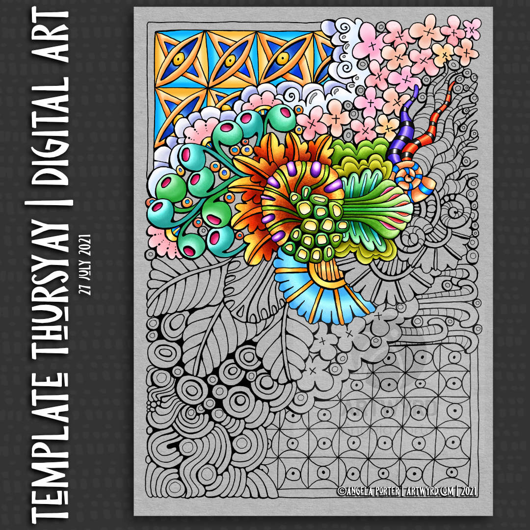
Thursday seems to come around so quickly, and each Thursday means it’s time for another coloring template for the Angela Porter’s Coloring Book fans facebook group.
Yesterday, I created a timelapse video of the pen drawing of this template. You can find the time-lapse drawing video by clicking on this link.
Today, it’s another time-lapse video of colour being added to part of the template. Click on this link to see the time-lapse colouring video.
I added colour digitally, using Clip Studio Paint. Also, I added a grey background. I much prefer using a coloured background, it’s easier on my eyes. Also, the colours seem more vibrant against the grey background.
The template is a typically ‘Angela’ entangled, stylised, abstract one, with some inspiration from Zentangle patterns too.
I always enjoy the way that colour brings the drawing to life, and helps to enhance the layers in the drawing as well. It’s a bit of magic in my daily life for sure.
I’m not entirely sure about my colour choices. I wasn’t trying to keep within a colour palette, just having fun with colour and figuring more about Clip Studio Paint brushes. I really enjoy adding colour to my artwork with both digital art and a limited range of traditional media. I enjoy digital and traditional for different reasons. Digital work takes away the stress of making sure the right colours are chosen. If I mess up, it’s easy to change things without having to start over. It’s relaxing to do, just as art with traditional media, apart from colour choice.
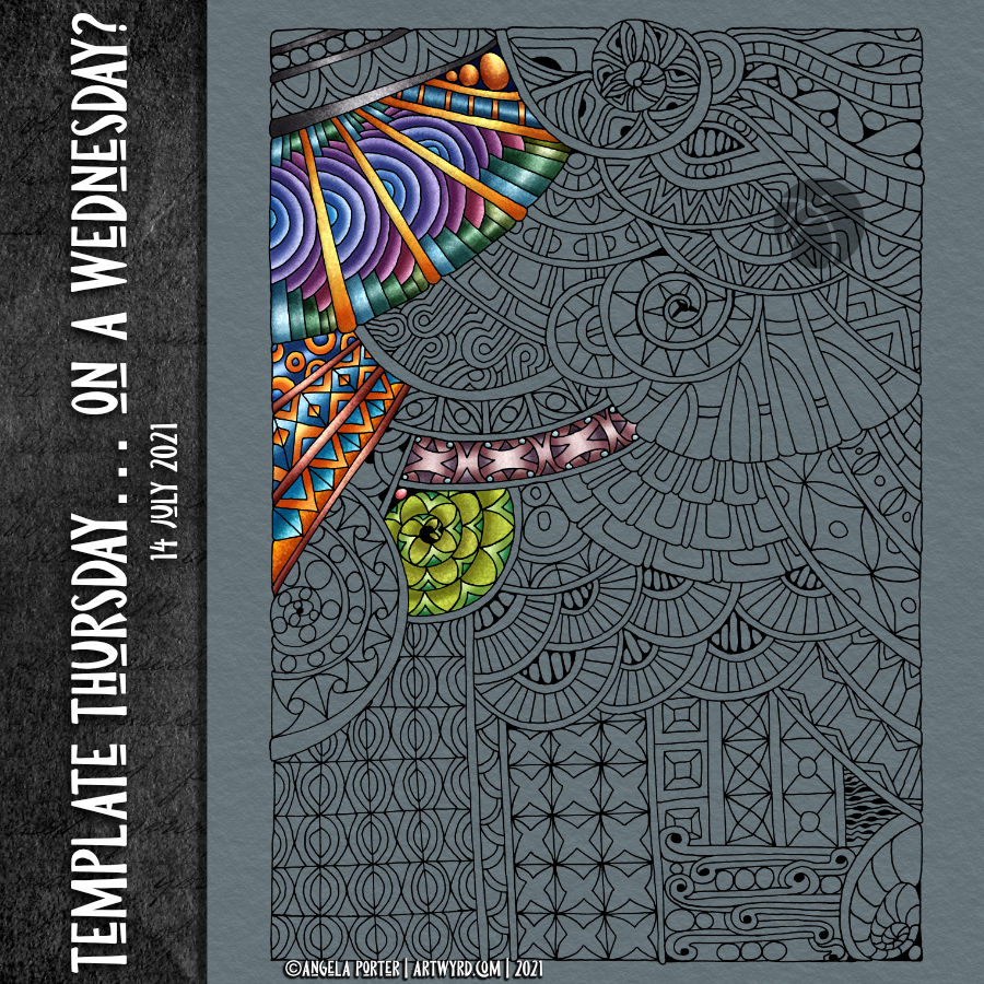
This morning, I drew this week’s coloring template / coloring page. The template itself will be available in the Angela Porter’s Coloring Book Fans facebook group tomorrow.
I did film the process, and two videos are available on Youtube. Both show the process of drawing, not adding colour. One is a vlog of the process, with about half in time lapse. The other is the time lapse version.
It was lovely to spend time drawing in a style that is very familiar to me. It’s lovely as a bit of a break from the more challenging explorations into abstract art I’ve been doing.
And of course, while the videos were uploading and processing, I decided to start to add some colour to the template.
Abstract, entangled, zentangle inspired coloring pages are not just fun to draw but to colour. They’re non-representational so any colours at all can be used.
I got carried away with the process of adding colour. The videos have long been uploaded and published.
Today, I share a bit of a vlog . I flip through my sketchbook pages of the past week or so, chatting about them. Then, there’s a timelapse of myself drawing my latest entangled art.

The uncoloured coloring page /coloring template is now available to members of the Angela Porter’s Coloring Book Fans facebook group.
I took some time earlier today to add some more colour to the template. You can view the YouTube video by clicking on this link.
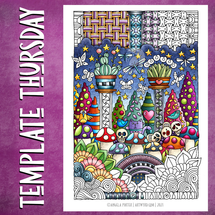
Here’s a partly coloured version of this week’s coloring template for the Angela Porter’s Coloring Book Fans facebook group.
This one contains some zentangle patterns, some of my typically entangled designs, and some cute and whimsical elements that are reminiscent of Doodleworlds.
I posted some videos yesterday showing me drawing this coloring template, or colouring page.
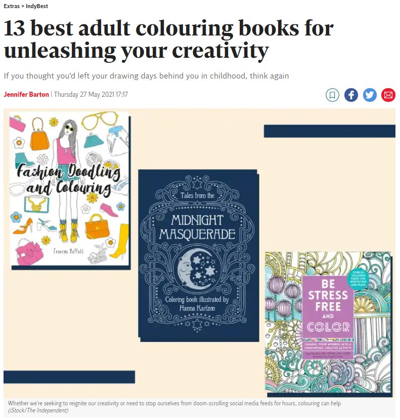
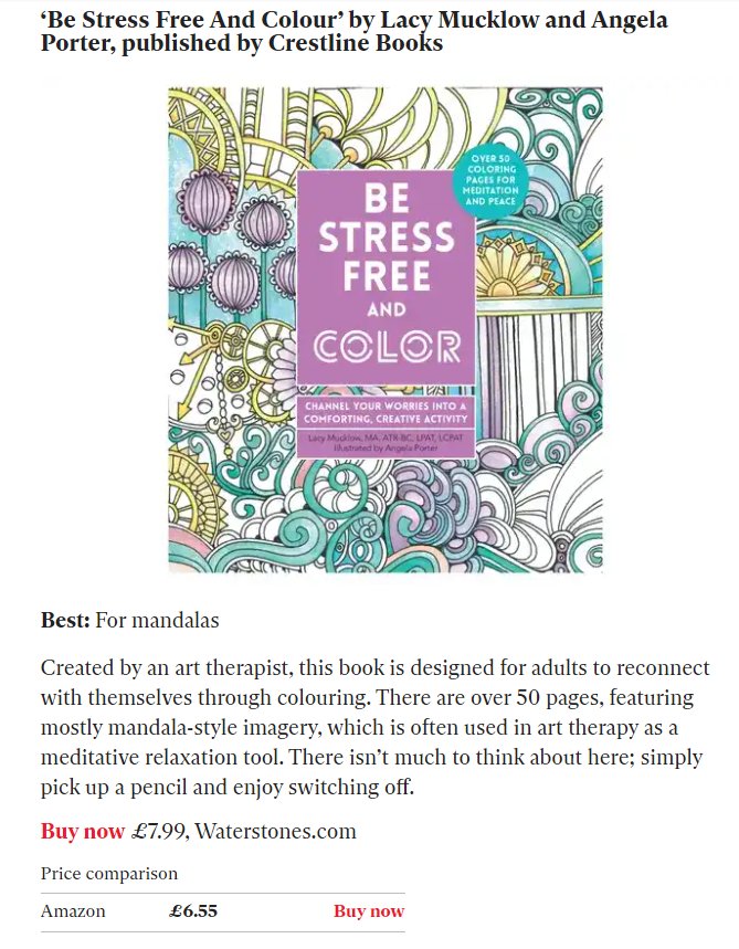
The good news bit is that Lacy Mucklow, the art therapist I worked with for the Color Me books, alerted me to the fact that our “Be Stress Free and Color” book is one of the best adult colouring books listed by The Independent, a UK newspaper. The book contains illustrations and text from the original books in the Color Me series.
This morning, I took some time to experiment with an inchie from my little stash of ephemera, a gold and a white gel pen, and Derwent Drawing Pencils on black paper.
Here’s the Time Lapse video of the process:
And, here’s the longer (approx 1 hr and 20 m) version. In this one I do talk about mental and emotional health, stigma and discrimination, so if you don’t want to listen, then watch the Time Lapse version 🙂
I did argue with myself about whether or not I should publish the full video with me talking about such things. In the end I decided to do so, along with the time lapse version. That way I can let people know about some of the content of my chatter and then they can choose for themselves which to watch/listen to.
It is Mental Health Awareness Month, so it was bound to spill over into my vlog at some point!
I’m feeling rather drained at the moment. I had my second dose of Covid vaccine earlier on. I don’t think that’s anything to do with the vaccine, I think it’s more to me being anxious about being out in the world! I did do other things – visited a Post Office and a shop as well. That’s enough of me being in places that are ‘peopley’, though just one or two people around me now counts as very peopley!
I’ve been awake since stupid o’clock. After trying to return to sleep, I decided, around 6am, to get up and do some arty stuff.
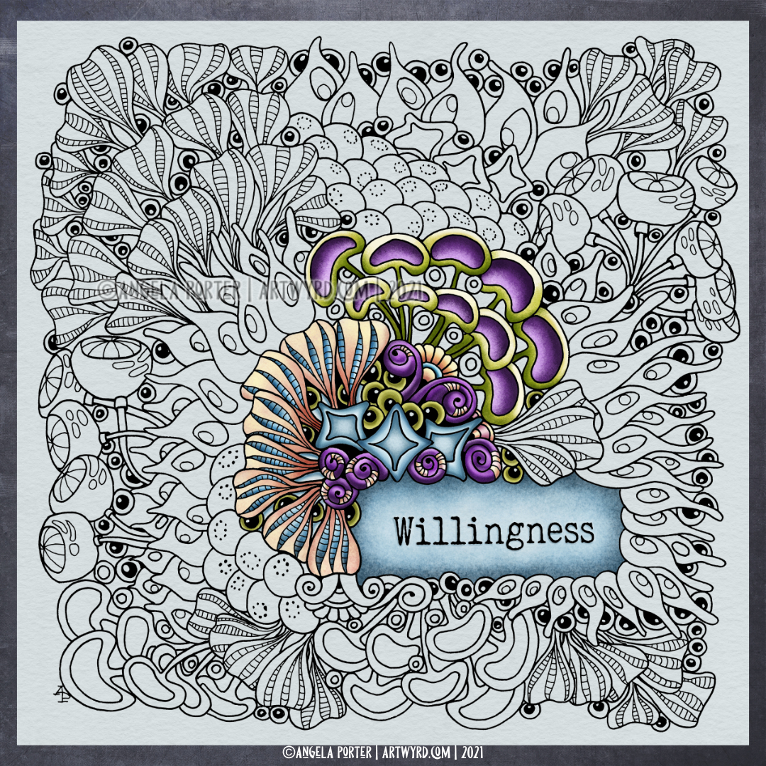
So, I thought I’d record my next stint at adding colour to ‘Willingness’. I’m doing this digitally, and I had figured out the colour palette I’d like to use for it. I made some adjustment to the dusky purples I had in the palette and added some brighter versions, but they’re a tad too saturated and bright, so I’ll adjust those colours and re-colour the areas in which I’ve used them.
I love how the peaches and yellows almost glow against the soft blue-grey background.
I spent nearly an hour on just a few bits and pieces, and while I was working I was chatting away. I then realised I’d started having a bit of a rant about a couple of poor shopping experiences I’d had with businesses abroad, and how products sent to me weren’t what I’d ordered or were not as they were described. Not just that, but the huge difficulty in getting a refund of any kind from them. With the latest one, I just feel like throwing the towel in. I’m out of pocket with product that is not fit for purpose, but they’re whinging about how they’ll lose profit if they refund me, even if I return it all to them, at my own cost, so either way I’ll be out of pocket, not them.
Sometimes, I really think it’s just not worth the hassle and stress.
Anyway, that made me turn the video into a timelapse with music. Nearly an hour of art condensed into about seventeen minutes. You can view it here.


