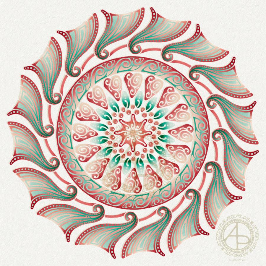
Today has been a bit of a busy day for me. I thought I’d spend a bit of time trying to reduce the level of anxiety I’m feeling at the moment by playing with my second mandala of yesterday in RepperPro. This is just one of twelve patterns I created quickly before dashing off out to a meeting this evening.
RepperPro is easy to use and has a variety of geometrical styles of seamless pattern that you can create. I sometimes like to do this with my artwork as it’s just another way of creating pretty art. Sometimes, the patterns/shapes that form inspire me for other art. Of course, if I choose to save the seamless tile, I can adjust colours and play with the patterns in it to create new tiles for seamless patterns if I choose to do so.
I’m absolutely sure it’s possible to create patterns like this in other ways, with pen and paper. I’ve tried to do so in the past, but my brain just doesn’t seem to understand the process. Software that does this for me is brilliant and a bit of fun for sure!
Don’t know what I’ll do with these patterns. Maybe use some of them for products in my Vida and Zippi shops – both of which need a serious overhaul and update.
This evening, I needed a bit of quiet, therapeutic arty-creative time. I had quite an emotional time in EMDR therapy (or not EMDR this week, a lot to talk about in preparation for the next phase of EMDR) and felt very much the need for some self-soothing and self-care.
I thought I’d spend some time drawing in colour again, using my digital toolbox of Autodesk Sketchbook Pro paired with Microsoft’s Surface Pen and Surface Studio.
I’m really quite pleased with how this little experiment has turned out. I like the way the colours play against each other – teal and coral being almost complementary colours. I like my La Tene/Celtic kind of swirls and motifs. I like the way I’ve put areas of background colour behind some of them to help them stand out from the background ‘paper’ more.
I’m getting more and more of a ‘feel’ as to how this style of art works for me, and I’m really enjoying creating these mandalas as a way of exploration.
People have asked if I’d turn these mandalas into a coloring book. The answer is probably yes. However it may take a little while to get to doing it.
Carl Jung is credited with introducing the Eastern concept of the mandala to Western thought and he believed it is symbolic of the inner process by which individuals grow toward fulfilling their potential for wholeness.
I’m sure Carl Jung would have a lot to say about my mandala and how it reflects what is going on inside me on an unconscious level, even though I’m not quite capable of making sense of it myself at this time of night!
While checking out the release date (which I’ve been getting a tad wrong, oops!) I noticed there were some reviews of the book. I’d like to say thank you to all the reviewers who wrote such lovely words about the book! It’s filled me with a bit more confidence and belief in myself as this is my very first art tutorial book.
There’s some hand lettering with the letter A. The letter A has dangles forming the inner part of the mandala. Then, the outer ring has simple and cutely whimsical doodle designs and yet another dangle forming it.
Of course, hearts and stars had to appear; they are my favourite design elements for many of my projects. I also like beads and gems too. Flowers and foliage are also favourite motifs, as are spirals.
I decided the ring of A’s need to be in a rainbow colour scheme and I chose a bright colour scheme for the design elements.
It looks complicated, but if you look at just one A and follow the dangle towards the centre and the design out to the outer rim you’ll see that it really isn’t all that complex.
Of course, drawing mandalas on paper can be time consuming. I usually draw mine digitally.
Autodesk Sketchbook Pro is now free and it’s my drawing software of choice. It has a symmetry tool that is really easy to use. You only draw one segment of the mandala which is then automatically repeated around the circle. I find Autodesk Sketchbook intuitive to use, and it’s easy to use almost straight away. It also has some rather sophisticated features on it and it does all that I need it to do, and more. I use a Microsoft Surface Pen along with Microsoft Surface Studio to draw and colour digitally, and they work wonderfully with Autodesk Sketchbook Pro.
I do colour my designs digitally. However, sometimes I will print out the black line art and then use traditional media (often Chameleon markers) to bring the line art to life with colour.
I do hope you will have a go at creating your own dangle designs. They look complicated, but they really aren’t! If you do have a go, then please share your designs with me on any of my social media homes – facebook, instagram, twitter or here!
Originally, I drew the original version of this design with pen and ink on paper. I wanted to edit the design and add a dangle to it, so decided to work digitally (Microsoft Surface Pen, Microsoft Surface Studio and Autodesk Sketchbook Pro).
By working digitally, I could edit and amend the design easily, using the original sketch as a guide. You can see that I made quite a few changes. I’m much, much happier with the blue version. The pink one is pretty and a good start, a way to experiment, but the blue one is the more polished, finished version, and not just because it’s been drawn digitally!
For the original sketch, I used a copic marker to draw out the basic letter shape and then used Unipin and Pigma Sensei pens to add the lie details. The copic is patchy, but that’s because it was a quick sketch.
I like the increased amount of white space in the new version – it does add a bit of a stained glass look to the design. I also like the stylised roses inside the ‘B’ in the revised version; adding the patterns inside the rose rather than on the edge helps the rose to stand out from the coloured section by giving a mostly white border.
Once I’d thickened the main beams of the letter, I added dots to carry the lines on. Then, I decided it could be fun to echo these dots by carving out dots in the flared ends of these lines. These dots have lightened those lines up, adding some airiness as well as interest.
Oddly, as I look at them I am minded of a very Old Bridge here in my home town. The bridge was built by William Edwards in 1756. When it was built it was the longest single span bridge in the world. The addition of 3 holes at each end of the bridge allowed it to bear the weight of the stone and not collapse. It is these holes, the lightness they gave to the design that I recalled when I was thinking about those ‘holes’ in my blue B.
I really wanted to add a simple dangle to this monogram – the letter is ornate enough that it could be too fussy if I’d added more than one dangle, or made the dangle ornate. Of course one of the charms had to be a heart! Simple beads and a diamond charm complete the dangle. My dangles often remind me of jewellery!
It’s not very often I show any kind of editing or reworking of my artwork, that’s because I do tend to work very intuitively and don’t really draft my work. Sometimes, I may do a pencil or pen sketch for an illustration for one of my colouring books, especially if it’s a kind of ‘scene’.
Since I’ve been working digitally, however, I do seem to be doing a lot more of the sketching out or working more roughly and using this as the sketch for the digital art.
An added advantage is that this satisfies my need to work with traditional media. Also, by working on paper I get a better idea of the scale of the finished artwork.
I think I’ve said it before that I do struggle with a sense of scale when working on a screen due to the ease of zooming in and out. Paper is a fixed size so I can appreciate the scale far more, and it seems easier for my brain to get a better idea of the whole design.
It’s all part and parcel of my artsy journey, figuring out what is best for me and not trying to work like others or being worried about how others judge me and my process. More than anything though, it’s about me learning not to be such a harsh judge and critic of myself. One negative review, and my inner critic gives itself a rocket boost and any belief in myself is kicked to the outer edges of the known universe. That’s why I don’t read reviews – I struggle enough with my own inner critic without battling others’ opinions.
I’m learning it’s far more important that I appreciate my own work rather than looking to others for approval. It’s always wonderful when people tell me they love my work. It’s always valuable when people, particularly my editors, give me honest feedback on what needs to be changed to improve things – they see things I miss by working all too close to the artwork.
I’m learning that it’s more important for me recognise that what I create is mostly good enough, sometimes I’m really pleased with what I’ve done, sometimes I can see something is truly awful or that there is room for improvement.
Reflection on my work is important as it helps me to learn, grow and develop, and helpful input is always welcome.
When I look at this blue B monogram dangle design, I can honestly say I smile. It’s an example of a design I am pleased with. It’s intricate, but not overly so. There’s empty space within the design
Wishing everyone who visits this little space on the interwebs all the very best blessings and wishes of the season.
I also wish to thank you for visiting, for sharing my posts.
However you spend this day, whether with friends, family, at work, or by yourself, I wish you well and the best.
About this image
I woke early-ish this morning and had an idea that involved creating this mandala/wreath design, so I had to do it!
Unusually, I drew the motifs in colour! Yup. No black line, just colour.
They’re all very simple with simple colour gradations. The black lines were created by removing colour so the dark background would show through.
I think the outer ring of leaves could be a little lighter, but then it does give a sense of the outer ring bending away, with the hearts and mistletoe on the high point of the ‘wreath’.
Adding texture to the design helped to scuff up the perfection of the colours.
I really enjoyed doing this, as simple as it is.
I am really grateful that I used an insulated mug for my gingerbread mocha latte this morning – I forgot all about it for over 3 hours, so engrossed in my art as I was, and it’s now just the perfect temperature for drinking!
My tools were Microsoft Surface Pen, Microsoft Surface Studio and Autodesk Sketchbook Pro. Yes, this is a digital piece of art.
The rest of the day I intend to spend in arty/creative pursuits, including finishing off my knitted cuddly triceratops (yes, I know yesterday I incorrectly said it was a stegosaurus).
I woke early this morning, it was still dark. The night has now lifted to reveal a dull, grey, misty, damp morning here in the Valleys of South Wales.
I wanted to re-colour the holly mandala in a more traditional colour scheme of red, green and gold, and so I have done so.
The colours help to give an illusion of dimension to the concentric rings in the design. Of course, the colours are kind of my signature – bright and jewel-like. I chose to change the background colour from stark black to a very dark, inky night-sky blue. I did add some lighter texture to the background to break the colours up just a tad.
It’s worked out ok. I think I prefer it muchly to the green foil version. The foil images are fun to do, that’s for sure. And of course they’ve allowed me to work out another way of creating art digitally, which is essentially by removing black to reveal the design. This has resulted in me drawing my motifs in a slightly different way to how I’d usually do them. They definitely have more of that lino-cut feel to them with the simplification of designs and lines. I like that.
I also like how the holly berries in the outer ring seem to be floating above and below the leaves. That wasn’t intentional! It’s just how it’s all worked out.
Sprinkling stars everywhere is one of my favourite things to do it seems and they do add a little magic to this design for sure.
Which version do you prefer? This one or yesterday’s green foiled version?
Tools used – Microsoft Surface Pen and Surface Studio. Autodesk Sketchbook Pro.
A mandala today. Cool, wintry colours over a white-pearl background for the mandala. Just something relatively simple for me to create, but quite complex looking in it’s final form.
I did draw this digitally using my Microsoft Surface Pen and Surface Studio along with Autodesk Sketchbook Pro. I also used a pearl white texture and starry backgroun I purchased via Creative Market.
I have also created a winter solstice dangle design for later in the week (Friday), as I know tomorrow I’ve got a bit of a busy day.
Today, though, is a quiet day for me. I’m not feeling too well. Nothing specific, but my appetite isn’t there, I’m a bit sniffly and I just feel more than a little ‘meh’. Mind you, I do feel a little better than I did yesterday.
Now, it’s time for me to go cuddle up and complete some more amigurumi tiny toys which will go to add to stockings for children spending Christmas in a women’s refuge local to me.
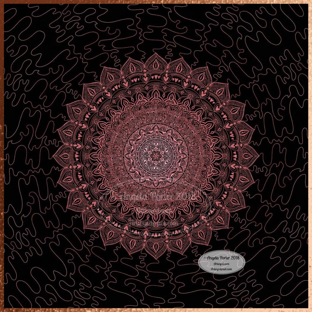
Another mandala resulting from my playing around with metallic textures and drawing to reveal the lovely shininess.
I know I got to the outer circle of the design and just felt the need to draw wiggly lines, like wires, connecting the mandala to everything outside of it, whatever that means.
These are fun to do. Mind you, I say that about all my art! And a bit of sparkle and shine is always welcome!
As a little bit of an aside, this weekend I added two coloring templates to the Angela Porter’s Coloring Book Fans facebook group for the exclusive use of members. One is the ‘Noel’ design I posted previously, the other is a design for 2019.
With the new year design, I’ve asked that those who colour it (or another template if they have no access to printers) as close to midnight between 2018 and 2019 at their local time as they can. It will be lovely to see a flurry of colour throughout the day as the world gradually moves into 2019.
This version is totally digital. I used the pen and ink drawn version to re-draw the design in Autodesk Sketchbook Pro, making use of a glitter texture.
I think I got my head around how to do this, and colour the images in and I’m kind of pleased with it, though I’d like a bit more of a highlight/shadow on the glitter bits. That will take some thought and experiments as to how to achieve that, but for now my head is overloaded with working in layers and with digital art techniques I’ve barely used before.
I’m pleased with how it looks rather medieval in style – medieval drawn using modern technology. This version doesn’t even exist in physical form, which is crazy!
I have no idea how this would print out as, say, a book mark or note card. As it’s a fairly high resolution file on my computer it would print as a photograph. Of course, there wouldn’t be any real glittery sparkle and shine.
Yes, I’m fairly pleased with this and for myself for figuring it out how to do it, though there’s lots of improvements that could be made.
I think I’d like finer ‘glitter’ on the texture background I used – that’s just a matter of creating another tiled image via GiMP. However, until I do something I never quite know how it’s going to work out, nor do I know if it’s going to be a good idea.
It certainly satisfies a part of me that likes glitter and sparkle and shiny things.
All I have to do now is try to remember how I did this so that I can repeat it in the future, if I’m so inclined.
I am waiting for some metallic inks to be delivered today, so no doubt I’ll be drawing with them on paper.
It’s stupid o’clock here in the UK and just as I was getting ready for bed I had an idea that I just had to try out. So, this was a very quick mandala where I used a gold texture background and drew on top of it.
Digital art this time. Had to try it out. My idea kind of worked out. Now how to figure out how to use this with dangle designs! But I think I may have to sleep first!
Microsoft Surface Studio and Pen, Autodesk Sketchbook Pro and a texture I found lurking in my files.