Abstract Entangled Art WIP | 02/08/21

Today has been a day of working with colour on various drawings in my sketchbook. This one is the one I’m most happy with; it’s been a bit of a frustrating day, colourwise.

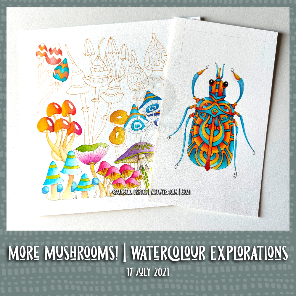
This drawing was finished earlier today, and before adding any shading I wanted to add colour. This time, Derwent Graphitint pencils were my medium of choice, along with a brush and water.

I really like the softer, earthier, more vintage-y tones of these pencils. I was getting frustrated with the brighter colours of the Ecoline watercolour inks and Derwent Colorsoft Pencils.

So caught up in the process of adding colour (along with joys and frustrations), I didn’t realise how much of the day had gone! It’s now about tea-time here in the UK, and normally I do my social media postings mid-morning.

I am tired today. Tired because I was up way too late last night. My mood is weird – I’m content yet at the same time feeling rather sad and teary for no reason that I know. My EMDR therapist told me that in the West, we are convinced we can only feel one emotion at a time, but in the East it’s accepted that you can feel more than one at a time. I certainly experience that quite often.

The sad and teary may be a manifestation of the tiredness, but it’s nice to know the touchstone of contentment is present in the core of my being. Contentment is always present, no matter what other emotional weather is being experienced. It’s a storm anchor that helps me keep balanced during the less settled periods of emotional weather. For like all weather, emotions do pass in time. For me, I’ll feel much better when I’ve had a good night’s sleep I’m sure.

Abstract Entangled Art | 01/08/2021

Yesterday, I took quite a large wedge of time to intensify the colours and adding shadow and embellishments to the art in my last blog post.

To do this, I used Derwent Colorsoft pencils, along with a blender pencil. The embellishments were added with White Sakura Soufflé, gold Sakura Metalic Gelly Roll, and clear Sakura Glaze pens.

It’s difficult to show the effect of the glaze pen on the artwork, though you can pick some up in the top right of the artwork on the left.

Is this the magic formula for me working with colour? A limited colour palette, simple watercolour washes, shadows added with a grey pen, intense colours with pencils, and embellishments with various pens? Maybe.

The drawing to the right was testing this idea out, though I didn’t use a grey pen to add shadows but a grey pencil. I really enjoyed how the coloured pencils added colour and depth to the artwork.

Too many dots? I don’t know. Probably. I do tend to get carried away with them!

I have learned that I can’t use the Zest-it blending fluid anymore – my asthmatic chest doesn’t like it at all! The Derwent blending pencils are a bit abrasive and moved some of the black pigment from the drawing. So, I switched to a Faber-Castell Blending pencil, and that worked just fine.

I also noticed that the blending pencil made the colours more vibrant – both the coloured pencils and the background watercolour wash. I think it’s because it leaves a glossy sheen, which I bring out by ‘polishing’ with a paper towel.

So, lots of learning and experiences yesterday and this morning, and perhaps progress in my use of colour by mixing media to my advantage.

Abstract Entangled Art | 31 July 21

This is, I think, finished.

It certainly was a task and I needed to persevere at the beginning. I was really hesitant about adding colour and seriously disliking the colour as I started to add it. The more I did, the more comfortable I became with adding colour.

I think what helped with the colours was the use of a limited colour palette. Indigo, prussian blue, gold ochre, burnt sienna and bronze green made the basic palette up. Mixing the colours gave me plenty of variation in colours and tones while at the same time keeping a coherence.

I started adding shading with a biro. As this drawing was a testing ground for various ideas, I used a cool grey Pitt Artist pen to add the rest of the shadows. I found the result pleasing, particularly after adding colour. A darker grey may have worked more to my tastes of high contrast, but this is a starting point.

Indeed, I rather like the combination of biro and pitt pens. I did end up adding some cross hatching to some areas to intensify the dark areas betwixt the elements of the design. That darkness helped to lift the colours somewhat.

To add highlights, a white Sakura Soufflé pen was used. I also had a hankering to add some metallic highlights too, so a gold metallic Gelly Roll came in useful.

Using flat colour washes and letting the grey shadows add volume seems to have worked well enough. I may, later, try out some coloured pencils to add more shadowing. But not until after breakfast!

Friday Flip-through

https://https://youtu.be/1dh93w3C6Fk

Friday seems the perfect day to have a look back on the week’s sketchbook art. A vlog seems the perfect way to do that.

I also start to add colour to the latest drawing using a limited colour palette of Ecoline brush pen colours – gold ochre, burnt sienna, indigo and prussian blue. Another colour (or two) may be added to the limited palette. I’ll see how I get along.

This particular drawing is being used as a place to test out ideas concerning adding shadow and highlight, simple colour washes, and anything else that springs to mind. It may never been completed, but that’s not the point! Experimentation and experience are the points of this particular exercise.

July Color Palette Challenge

Each month there’s a color palette challenge in the Angela Porter’s Coloring Book Fans facebook group.

This is my completed template using the colour palette for July.

Some of the colours in my finished artwork weren’t in the palette. I mixed colours from the palette to achieve the oranges and purples.

It was a fun project that I completed rather quickly for me. I used it as an opportunity to find out more about some of the blending options for the brushes in Clip Studio Paint. I’m not sure anyone could tell the difference with how this has finished, but I started to understand how some of these options work.

It’s nearly midday, and I think it’s time for breakfast before I turn my attention to this week’s template for the facebook group. Food first!

Abstract, entangled pen drawing

This drawing was finished a couple of days ago. I like the graphic nature of black and white, so am not at all sure if I want to add colour to this. I think this is a case of scanning the drawing in and adding colour digitally before deciding. My fingers, however, would like to make use of the Ecoline watercolour inks.

Time will tell what I decide to do. After all, there is no rush.

Today’s vlog is a continuation of the drawing I started yesterday (link to yesterday’s blog).

Here is the link to the vlog on YouTube.

Pen Drawing WIP

I have an introvert ‘hangover’ today. This has absolutely nothing to do with alcohol, just a bit too much socialising on Zoom yesterday! The headache will lift soon. The tiredness will gradually go, especially after some more sleep. It was lovely to spend time with like-minded people, particularly Brett from the Angela Porter’s Coloring Book Fans facebook group.

So, doing some entangled, intuitive pen drawing was just the thing to start the day off. Gentle, familiar, enjoyable, calming and peaceful.

I have no idea what this drawing is going to turn into. Time will tell.

I have created a time-lapse vlog of this drawing. Not only do you get to see how this WIP drawing was done, I also show some of the other work I’ve been doing in my sketchbook as well.

A fishy vlog …

Link to the vlog

It’s fishy because today I fancied drawing and painting some cute and whimsical fish! I drew the fish before I started filming.

Also, I wanted to try the Ecoline watercolour inks from the brush pens on a piece of the Canson Imagine Mixed Media paper. The watercolour ink works well enough on the paper, which is nice to know going forward.

Yesterday, I spent most of the day in the cooler realms of my downstairs living room. It was so hot, and it’s forecast to be so again today. A fair amount of time was spent filling pages in my sketchbook with drawings of whimsical birds and fish, simply because I could.

Today, it’s forecast to be as hot. It’s already almost insufferable upstairs (for me anyways). So, I’m going to be downstairs as much as possible today, except for three zoom meetings spread throughout the day. More time for drawing and sketching methinks. Perhaps using non-watercolour media to add some colour to the sketches. I’ll see how I feel.

More Mushrooms! Watercolour explorations

Link to today’s vlog

Ecoline watercolour inks, insects and mushrooms

As you can see, I finished the insect painting. I’m really quite happy with this artwork, even more so as it’s the first one done entirely with a new medium to me – Ecoline watercolour inks.

Of course there’s a lot more exploring and working with them to come, including a rather cute bunch of mushrooms!

I started drawing the mushrooms with a grey unipin pen. Then, I had a flash of inspiration; try using watersoluble fineliner pens instead and see if the line will disappear even more!

So, I dug out a fairly pale Chameleon fineliner pen (NU4), which was darker than I thought it would be. All the same, it would suit my purposes for this experiment.

The pen didn’t react with water/ink as easily as I thought it would. Perhaps that’s because I’m working on watercolour paper…maybe. Or perhaps because I’m using a fairly dry brush with the watercolours. If there’s too much wetness, the colour migrates to the edge of the wet area and the centre becomes pale to colourless.

No problem now I have recognised this. I just use a paler fineliner in future explorations.

I am still really enjoying the Ecoline watercolour inks. I know I said I thought I’d found my water-medium of choice with the Mijello Mission Gold watercolours. The Mijello’s are great, the best watercolour paints I’ve used so far. But, the Ecoline inks just seem to work so much better for me and my style of art.

Am I going to abandon the Mijellos? Nope! But for a while they’ll be put to one side as I work with Ecoline inks. It may be that I work out how I can best work with the Mijellos as a result of using Ecoline inks. Perhaps I’ll end up using them in concert from time to time. I don’t know for sure!

Of course, I won’t be abandoning digital art/coloring. Ideas, techniques, inspirations flow from one medium to another.

Template Thursyay! Adding colour to the template…

Yesterday, I shared a partly digitally coloured version of this week’s coloring template. Today, I’ve coloured some of the original template using Tombow Dual Brush markers with a waterbrush.

The template is now available in the Angela Porter’s Coloring Book Fans facebook group.

I filmed this process and turned it into a vlog. I speeded the footage up, as the original colouring took over an hour and a half.

I then spent another half hour or so experimenting with fineliners and white, metallic and glitter gel pens to add texture and pattern to the coloured areas. I didn’t film that though, but the results are in the photo above.

I set myself three intentions for this morning:
a) enjoy the process of working with the media
b) experiment with fineliners and pens to add pattern, highlight/shadow and texture
c) to not invest in the outcome or fret about colour choices

I think I achieved those intentions.

Sometimes, often even, just enjoying the process of creating, with no expectations or pressures of any particular outcome is so important. To be able to relax and enjoy the process, the colours, the way the media work is as valuable an experience as producing for a specific purpose.

It’s nice to be able to take the time to do this, without worrying about any particular project. Being able to put aside the “I should be doing x, y and z” and realising that just taking time to do something that makes me smile inside is as important as doing projects that fulfill a contract or business thingy.