Abstract Entangled Art | 01/08/2021

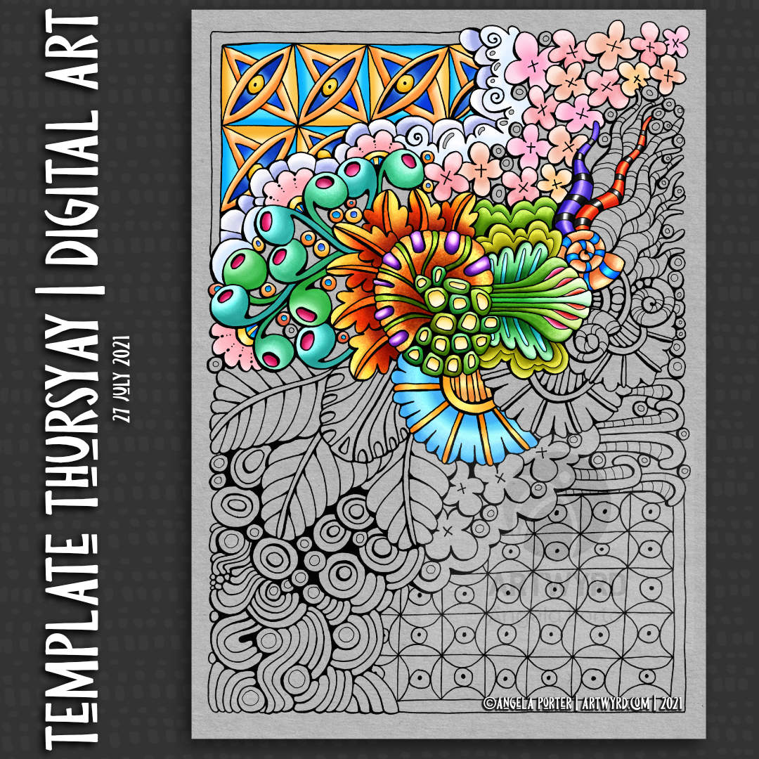
Yesterday, I took quite a large wedge of time to intensify the colours and adding shadow and embellishments to the art in my last blog post.

To do this, I used Derwent Colorsoft pencils, along with a blender pencil. The embellishments were added with White Sakura Soufflé, gold Sakura Metalic Gelly Roll, and clear Sakura Glaze pens.

It’s difficult to show the effect of the glaze pen on the artwork, though you can pick some up in the top right of the artwork on the left.

Is this the magic formula for me working with colour? A limited colour palette, simple watercolour washes, shadows added with a grey pen, intense colours with pencils, and embellishments with various pens? Maybe.

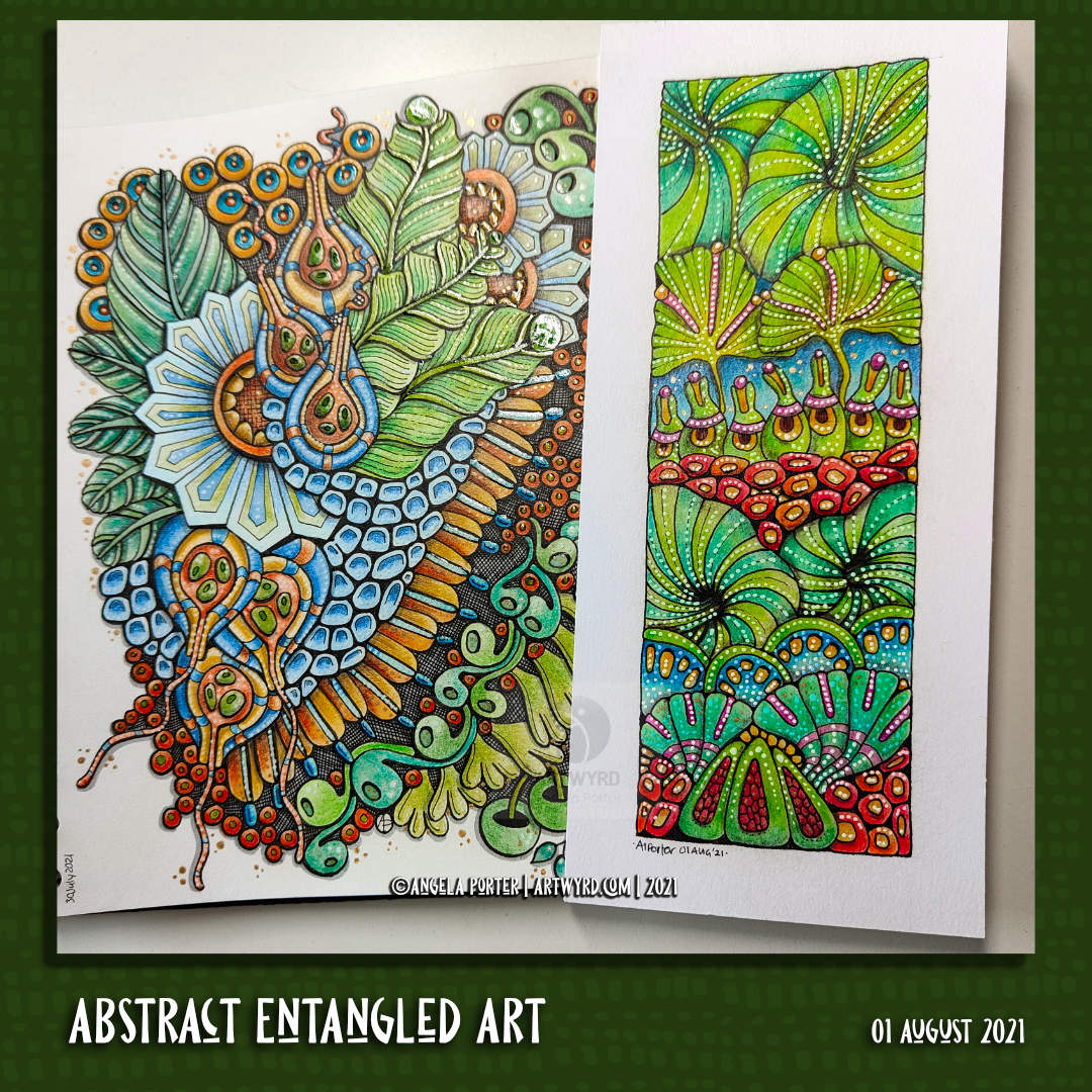
The drawing to the right was testing this idea out, though I didn’t use a grey pen to add shadows but a grey pencil. I really enjoyed how the coloured pencils added colour and depth to the artwork.

Too many dots? I don’t know. Probably. I do tend to get carried away with them!

I have learned that I can’t use the Zest-it blending fluid anymore – my asthmatic chest doesn’t like it at all! The Derwent blending pencils are a bit abrasive and moved some of the black pigment from the drawing. So, I switched to a Faber-Castell Blending pencil, and that worked just fine.

I also noticed that the blending pencil made the colours more vibrant – both the coloured pencils and the background watercolour wash. I think it’s because it leaves a glossy sheen, which I bring out by ‘polishing’ with a paper towel.

So, lots of learning and experiences yesterday and this morning, and perhaps progress in my use of colour by mixing media to my advantage.

Abstract Entangled Art | 31 July 21

This is, I think, finished.

It certainly was a task and I needed to persevere at the beginning. I was really hesitant about adding colour and seriously disliking the colour as I started to add it. The more I did, the more comfortable I became with adding colour.

I think what helped with the colours was the use of a limited colour palette. Indigo, prussian blue, gold ochre, burnt sienna and bronze green made the basic palette up. Mixing the colours gave me plenty of variation in colours and tones while at the same time keeping a coherence.

I started adding shading with a biro. As this drawing was a testing ground for various ideas, I used a cool grey Pitt Artist pen to add the rest of the shadows. I found the result pleasing, particularly after adding colour. A darker grey may have worked more to my tastes of high contrast, but this is a starting point.

Indeed, I rather like the combination of biro and pitt pens. I did end up adding some cross hatching to some areas to intensify the dark areas betwixt the elements of the design. That darkness helped to lift the colours somewhat.

To add highlights, a white Sakura Soufflé pen was used. I also had a hankering to add some metallic highlights too, so a gold metallic Gelly Roll came in useful.

Using flat colour washes and letting the grey shadows add volume seems to have worked well enough. I may, later, try out some coloured pencils to add more shadowing. But not until after breakfast!

Friday Flip-through

https://https://youtu.be/1dh93w3C6Fk

Friday seems the perfect day to have a look back on the week’s sketchbook art. A vlog seems the perfect way to do that.

I also start to add colour to the latest drawing using a limited colour palette of Ecoline brush pen colours – gold ochre, burnt sienna, indigo and prussian blue. Another colour (or two) may be added to the limited palette. I’ll see how I get along.

This particular drawing is being used as a place to test out ideas concerning adding shadow and highlight, simple colour washes, and anything else that springs to mind. It may never been completed, but that’s not the point! Experimentation and experience are the points of this particular exercise.

It’s Template Thursyay!

Thursday seems to come around so quickly, and each Thursday means it’s time for another coloring template for the Angela Porter’s Coloring Book fans facebook group.

Yesterday, I created a timelapse video of the pen drawing of this template. You can find the time-lapse drawing video by clicking on this link.

Today, it’s another time-lapse video of colour being added to part of the template. Click on this link to see the time-lapse colouring video.

I added colour digitally, using Clip Studio Paint. Also, I added a grey background. I much prefer using a coloured background, it’s easier on my eyes. Also, the colours seem more vibrant against the grey background.

The template is a typically ‘Angela’ entangled, stylised, abstract one, with some inspiration from Zentangle patterns too.

I always enjoy the way that colour brings the drawing to life, and helps to enhance the layers in the drawing as well. It’s a bit of magic in my daily life for sure.

I’m not entirely sure about my colour choices. I wasn’t trying to keep within a colour palette, just having fun with colour and figuring more about Clip Studio Paint brushes. I really enjoy adding colour to my artwork with both digital art and a limited range of traditional media. I enjoy digital and traditional for different reasons. Digital work takes away the stress of making sure the right colours are chosen. If I mess up, it’s easy to change things without having to start over. It’s relaxing to do, just as art with traditional media, apart from colour choice.

Template Thursday… on a Wednesday?

Full Vlog | Time Lapse Video

This morning, I drew this week’s coloring template / coloring page. The template itself will be available in the Angela Porter’s Coloring Book Fans facebook group tomorrow.

I did film the process, and two videos are available on Youtube. Both show the process of drawing, not adding colour. One is a vlog of the process, with about half in time lapse. The other is the time lapse version.

It was lovely to spend time drawing in a style that is very familiar to me. It’s lovely as a bit of a break from the more challenging explorations into abstract art I’ve been doing.

And of course, while the videos were uploading and processing, I decided to start to add some colour to the template.

Abstract, entangled, zentangle inspired coloring pages are not just fun to draw but to colour. They’re non-representational so any colours at all can be used.

I got carried away with the process of adding colour. The videos have long been uploaded and published.

Entangled art and my artistic style

Link to real time video of drawing and chatting
Link to time lapse drawing video.

Today, I started my arty day with some entangled drawing and a chat based around some interesting questions posed to me by various people on social media yesterday. The questions got me thinking and talking about my particular drawing and art style.

What I’m realising is, I’ve never really be provoked into thinking about/talking about my art style and where it has come from! For me talking and thinking are the same thing – there are two styles of inner monologue. One is where you hear thoughts in sentences throughout the

The topic of inner speech has caused a stir on Twitter after the user KylePlantEmoji  put out his own observation on the matter. “Fun fact: some people have an internal narrative and some don’t,” he tweeted. “As in, some people’s thoughts are like sentences they ‘hear’, and some people just have abstract non-verbal thoughts, and have to consciously verbalize them. And most people aren’t aware of the other type of person.”

https://mymodernmet.com/inner-monologue/

I have a mix of them. My inner monologue is one that ruminates on the past, is self-critical and so on. But I also have abstract, non-verbal thoughts that I need to verbalise to be aware of them. So, if someone asks me a question about, say, my artistic style and where it comes from, then I have to verbalise thoughts about it. Until I’m forced in some way to verbalise these kinds of thoughts, I have no idea what they are. Same if I’m, say, sitting in nature, observing the world around me. My thoughts won’t be on what I’m experiencing. Often, there are no thoughts, unless I’m stuck in a ruminating, worrying and self-critical mode, which doesn’t happen all too often.

Until I read this, and other articles, I thought there was something wrong with me, because so many others seemed to think in their heads about lessons, or experiences, or the news. But I never seem to do so. Now, I know and understand why that is. I think in an abstract way that I’m not particularly aware of as such. It just happens.

So, creating these daily (almost) vlogs is forcing me to talk about my artistic style, choices, process, lessons and so on. And such it is making me more aware of myself as an artist.

Most importantly, however, it is helping me to understand the value of all these things validating my art to me.

Yes, I do have a bit of ‘imposter syndrome‘ going on when it comes to my accomplishments in life. But, talking about my artistic journey, and how far back it started and where the observational skills and so on started is helping me see it’s been an almost life-long journey. It’s also helping me to accept and understand my artistic voice(s), style(s) as being an expression of my experiences in life where art and observation are concerned.

There’s plenty about this (though not the inner monologue and imposter syndrome stuff) in today’s real-time vlog. It is around 53 minutes long, so I have created a time lapse version with music as well.

Sketchbook Flip-through and Pen Drawing

Today, I share a bit of a vlog . I flip through my sketchbook pages of the past week or so, chatting about them. Then, there’s a timelapse of myself drawing my latest entangled art.

Template Thursday … on a Wednesday!

I have a time lapse / speeded up video showing how I created this image, from start to the completion of the partial colouring available to view on YouTube. Just click anywhere on this paragraph.

Well, more of a preview of this week’s template before I make it available in the Angela Porter’s Coloring Book Fans facebook group tomorrow (24 June 2021).

I felt the need to create a mandala today. Indeed I’ve not drawn a mandala for two or three weeks or so. A nice change for me, not just with the mandala, but working digitally after a while of working with traditional media.

Adding colour digitally makes me wonder why on earth I’m spending so much time struggling with traditional media – watercolours, coloured pencils, Inktense, and so on.

I think it’s the challenge, to work out how to make these media work for me. And to prove to myself I can work with them.

Still, I really do find working digitally a dream, but with it’s own challenges too. I know I have a lot to learn still, but in my own time. And I need to apply that to working with traditional media, though you’d think after 20 odd years of really focusing on arty pursuits I would’ve worked it out, wouldn’t you? Obviously not yet!

It may be that I have to work out which type of medium I work in depends on the purpose of the art. I think traditional media are more just for fun for me, for a change of pace, for a bit of a challenge, to use in sketchbooks and explorations of drawing/art, preparation for digital artwork even.

And that there, traditional media for fun, relaxation and preparation for digital work may be the function of traditional media in my artistic journey.

I’ve worked out that I enjoy drawing with pen, or pencil, on paper, though I do enjoy inking in sketches digitally too. Adding colour digitally to these drawings seems to work well for me.

I may come to a realisation that I really need to discard traditional colouring mediums in favour of digital colouring at some point in the near future, maybe reserving a couple for sketching trips out, perhaps. Only time will tell.

Except, I keep saying that, yet I keep on going back to the warring pleasure and frustration that comes with traditional media.

I may eventually work this out, or it may be a tug-of-war that I experience for the rest of my life.

Entangled Art WIP

Today, I finished drawing this entangled, zentangle inspired kind of floral/botanical design. I did start this yesterday afternoon, but continued it this morning before I settled back to sleep. I’ve had a poor night’s sleep thanks to yet another upset stomach, so after my Wednesday delivery from Abel & Cole, I drew and then settled back to sleep.

I’m still feeling very tired, my digestive system is still uncomfortable, delicate, upset. But I have to run an errand today. I’ll get to that soon enough and then I’ll see how I feel and how that dictates how I look after myself for the rest of the day. I suspect more sleep will be needed.

Anyways, this drawing is on an A5 piece of Canson Imagine mixed media paper. I used a 0.3 Unipin pen to draw the design, and I’m now adding colour using a fairly limited palette of Zig Clean Colour Real Brush pens:
*green gray
*pale dawn gray
*olive green
*deep green
*ochre
*bright yellow
*pale rose
*lilac
*english lavender

I’m considering adding a couple of browns to this palette, as well as using some olive green over the grays.

These pens do move easily with a barely damp brush on this paper making it so easy to get a colour gradient. It’s also easy to add more colour to intensify the dark area.

I have recorded my morning art session as vlog.

In the vlog I talk about how the pressures of being constantly productive turned me into a workaholic when I was a teacher, and then fed negatively into my self-image which ultimately led to my burn-outs/breakdowns. I have learned that taking time for myself, to just be, to relax, to do things I enjoy, to look at ‘goals’ in a realistic kind of way to limit the pressure I put on myself.

I no longer have the external pressures of my career as a teacher, and one of the many hard lessons I’ve had to learn as part of my healing is how to value self-care time, and how that time can change from day to day. It’s so important for me, otherwise life’s own stresses and strains can take their toll on me and leads to physical, emotional and/or mental exhaustion or even ill-health.

Taking time to rest, to relax, is being ‘productive’, but in an important way. The productivity is investing time in one’s self and one’s own well being. And that is so very important.

This is why I take time nearly every day to create art just for myself, for the pleasure of creating, of exploring and experimenting, with no pressure on myself to create a completed work of art or for commercial gain. Just for the simple joy it brings.

Admittedly, I can fixate on art and forget about doing other things I enjoy, such as playing my flute, or learning to play my harp or tongue drum, or reading, or journalling, or even getting out for a walk, or combining my walk with sketching.

I know this is something I do need to work on for sure. But, like everything else, it comes together in it’s own way, in it’s own time, when I am ready to do so.

Template Thursday…On a Wednesday?

It’s Wednesday, so one of my main tasks is to create a colouring template for the Angela Porter’s Coloring Book Fans facebook group. And as I drew this for my morning warm up art, I recorded it.

It took me over 1 hour and 20 minutes to draw the template and the full length video is here.

The time lapse version, which is about 15 minutes or so long, can be found via this link.

Yesterday, I wasn’t at all well. The usual upset stomach followed by a headache that needed sleeping off. The upset tummy had kept me up most of Monday night. What had caused it this time, I dunno. All I know is I slept a bit better last night, though I’ve been awake since 4:15 am and I’m beginning to feel rather tired again and my digestive system is still a bit tender. I’m sure I’ll be tickettyboo once again tomorrow.

It was lovely to spend some time this morning drawing just for pleasure. Don’t get me wrong, I do enjoy drawing for my publishers, but it’s different as there’s a lot more pressure on me to create templates that fit into a particular theme and their guidelines.

My weekly templates have no of those limits on them, so it’s a different kind of enjoyment.

There’s a lot of whimsical and cute elements to this weeks design, and I think that’s something I need to lift me up as I’m feeling a bit under the weather.

It was also a great pleasure to draw with pen on paper, and I think I’m going to have to do that with the templates for the book I’m working on. I get a much better sense of scale and overview of the design. Even when I scan a sketch in, I’m not all that happy with the digitally drawn version of it, usually.

So, that’s what I’m going to settle down to do for the rest of the day, once all my social media posts are done. Pen on paper, without the frustration I can feel when drawing digitally. Simple tools to focus on drawing ‘life size’ coloring templates.

And lots of tea is called for today, I think. Lots of good tea.