Mandala 05 March 2020

Mandala 05 March 2020 ©Angela Porter | Artwyrd.com

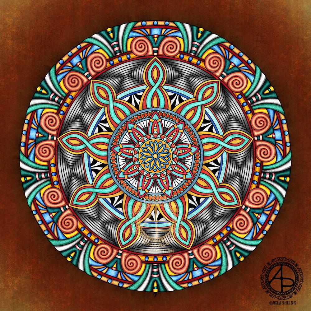
Today has been a funny day so far. I have, however, managed to get this little mandala done.

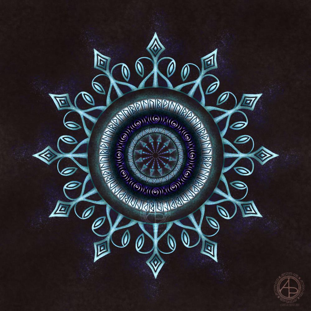
The runes represent growth (the rune looks like a B), joy (looks like a P), flow (half an arrow) and strength (a bit like an n), and you are welcome to read into that what you wish.

When I started this I had no idea at all what I was going to create. All I knew was that I wanted to end up with a mandala and try out some techniques to get things to appear to glow.

The artwork started with me creating a series of my own texture backgrounds, and this was the last one I created. I then created the ring of glowing runes, then worked inward. This is an unusual direction for me to work when creating mandalas; usually I work from the centre out. I did, however, add the final ring of the mandala last.

For some reason I needed to add arrows into the design; it was just an instinctive, intuitive kind of knowing. In the same way I knew that runes needed to be incorporated into the design. Spirals are one of my favourite design motifs and they made an appearance too.

The colour palette is quite a simple one, mostly cool tones of blue, purple, teal and greys, but with a little splash of warm pink and mauve.

I do like the illusion of dimension that I’ve achieved in this mandala by using high contrast. I’ve also enjoyed using texture brushes to help with the sense of dimension too.

This is digital art, created in Autodesk Sketchbook Pro and using a Microsoft Surface Slim Pen along with a Microsoft Surface Studio.

Mandala 04 March 2020

Mandala 04 March 2020 ©Angela Porter | Artwyrd.com

Finally! I have this mandala finished. Life events conspired over the past couple of days to keep me from paper and pen (digital or traditional) and the aftermath left me with a blinding headache and bone-deep tiredness this morning. Still, I did what I’d arranged to do today, and when I came home I had a late lunch and retired to bed to sleep the lingering effects of the extreme stress/introvert hangover off.

Before I left home this morning, I managed to get a little more of this mandala coloured. I’ve now finished it this evening.

The colours took an unexpected turn in places, as did the contrast betwixt light and shadow. The resulted in the outer rings of the mandala being more dimensional in appearance than the inner rings, less like decorative mosaic in a grand entrance hall and more organic, alive, vibrant.

I’m also glad that I’ve changed the background. The darker, richer colours really help the mandala to glow.

The colours aren’t my usual kinds of colour choice, that’s for sure. If I were to re-work this mandala, I’d most probably use a different palette. However, the colours kind of work.

Although I like the more mosaic forms of the inner rings, the dimensional nature of the outer rings really makes my arty heart smile.

I remember when I did my A level art and I produced three oil paintings, the only three oil paintings I’ve ever done and will ever do. I really disliked working with the slimy paints, despite the vibrance of the colours. These paintings were three abstracts – one from the folds in a Romanesque sculpture, another from some kind of worm screws from a steam locomotive, and the last from rusty gears from a diesel locomotive. Each was a monochrome study, focusing on highlights and shadow.

At the exhibition of students’ work (mine included), I was puzzled why people kept touching my oil paintings. I eventually asked someone why they’d done that. The answer was that they looked so three-dimensional they just wanted to touch them and were surprised that they were flat. I hadn’t seen the paintings that way myself, but when it was pointed out to me I could see the illusion I’d created.

Part of me would love to see mandalas of mine created as mosaics, to see people surprised that they’re not dimensional as they appear.

Working on this mandala today has reminded me of how much I love to create this kind of illusion. It may be stylised, not realistic, but it’s part of my artistic melody, a theme deeply embedded in my heartsong.

I created this mandala in Autodesk Sketchbook Pro running on my Microsoft Surface Studio and with a Microsoft Surface Slim Pen.

Monday Mandala WIP

Monday Mandala WIP 02/03/2020
©Angela Porter | Artwyrd.com

I woke a bit earlier than usual this morning, and while I was coming around I watched an Autodesk Sketchbook Pro tutorial by Trent Kaniuga – Sketchbook Pro for Absolute Beginners and came across an explanation and use of a tool I’d not worked out for myself.

This is the selection tool, and it’s a great way to select areas for adding colour, texture and/or effects to as well as copying, pasting, moving, rotating, resizing and so on. It does mean I need to use my keyboard along with my Microsoft Surface Slim Pen and Microsoft Surface Studio. That means using the screen at a different angle to my usual, which is a good thing I think as I now can’t hunch over the screen.

It was the way that when an area is selected and colour or texture is applied, the colour/texture only applies to that selected area, or areas. It masks the rest of the image from the selected areas.

This is going to be so useful for me going forward, now I’ve played with the techinique. It’s given me an elegant way to do something I’ve previously achieved by the use of layer after layer after layer.

I’ve been working with it to add colour to this mandala design from a collection of mandalas I’m working on.

The colours and textures remind me of polished stones, perhaps mosaic pieces. I’ve used fairly complementary colours, but they don’t quite play off each other as much as I’d like. I am, however, going to work with these colours going forward to complete the mandala.

Sunday morning mandala

Mandala © Angela Porter | Artwyrd.com

It’s a sunshiny morning in South Wales. A welcome respite from the rain we’ve experienced most of the week. The cleanup and return to ‘normal’ continue after the flooding that occurred just one week ago.

I had no idea what I would create this morning, other it would be a mandala.

I drew and painted the design digitally using Autodesk Sketchbook Pro along with a Surface Slim Pen and Surface Studio, both from Microsoft.

This one has the floral centrepiece with a zentangle-style background. The flower is an unusual colour choice for me; I tend not to use corals and red tones much. It’s easy enough to change colours digitally, but I went with it, knowing that my colour choice reflects how I’m feeling at this point in time.

Yes, I do tend to create rather intuitively. This design didn’t start with a sketch, but with the first shape to be drawn, which was reminiscent of a petal. The rest of the design grew from there.

I’m surprising myself with how I’m able to ‘paint’ digitally. I enjoy creating more stylised forms, but with added texture and contrast to bring them to life. I know I’m not an expert at this; however, each time I work in this way, I learn more.

Today’s big lesson was how to save a brush style I’d edited and liked as a new brush for my brush library.

I’m glad I’m learning and developing my digital art voices and styles and that it’s happening slowly over time and as my needs demand. I know if I watched videos or followed tutorials on how all this worked, I would become incredibly overwhelmed and frustrated.

I also know that by watching what others do, I would likely be tempted to emulate their style and way of working.

I need to work out my own style/voice and be comfortable with it.
So, I’m not putting any pressure on myself to do something that I’m not yet ready for or haven’t had an awareness of what I could do.

Leafy Mandala 22 Feb 2020

Leafy Mandala 22 Feb 2020 © Angela Porter | Artwyrd.com

Yesterday was a day where I was feeling ‘off’, ‘out of sorts’ and I needed to do a fair amount of self-care and self-soothing. That included painting this mandala. Leafy, frondy berry simplicity. Softer colours than I usually use.

I used Autodesk Sketchbook Pro, Microsoft Surface Studio and Microsoft Surface Slim pen to create this.

#Inktober52 Week 7 – Dinner

#Inktober52 Week 7 – Dinner ©Angela Porter | Artwyrd.com

The art…

What else could I do for dinner other than have the etymology of the word along with a collage of just a few of my favourite foods! And I do mean only some.

I looked up the etymology of ‘dinner’ on Etymology Online, did a little bit of typography using Affinity Publisher.

I then drew the foods on Claire Fontaine dot grid paper using an 0.8 Uniball Unipin pen.

I scanned the drawing in and removed the dot grid and removed smudges and so on in Autodesk Sketchbook Pro.

My next step was to add a coloured background and some colour to some of the drawings. Only to some, as this was a ‘for fun’ project as part of the #Inktober52 challenge organised by Jake Parker, the founder of Inktober.

Missing in action…

It’s been a couple of days since my last blog. It seems that life and demands on me have taken over arty pursuits. And when I wasn’t seeing to the life demands, I was taking some time out by needlefelting.

I managed to needlefelt a cute rabbit and owl over the last two or three days. I’ll post pictures of them in another post.

Seed Pods WIP

Seed Pods WIP ©Angela Porter | Artwyrd.com

I’m later than usual making my post to this blog today. For good reasons. The last couple of days have been a tad crazy. Here, where I live in South Wales, UK, we’ve had some really bad flooding thanks to Storm Dennis. The River Taff overflowed its banks in many places. The town centre where I live was under water.

Fortunately, no flooding or damage to my home, but it’s heartbreaking to see the devastation for others homes and businesses. The emergency services and Rhondda Cynon Taff Council, councillors and many, many others have worked hard, long and done amazing things. Communities have come together to help one another.

The rain has, finally, stopped, but the wind is very strong again. And we have another weather warning for rain on Wednesday evening into Thursday, so there’s a potential for flooding once again.

But today, the sun sets, turning the mostly cloudless sky lavender and pink.

I’ve been helping as I can, in my own ways, and that’s why I missed a post yesterday and am late with one today.

So, to calm, relax, I’ve done some art. I had no idea what was going to result, I’m not entirely sure I like the result, particularly the foliage in the background. However, I’m not entirely surprised that seed pods have emerged!

It has let me play around with different brushes and effects in Autodesk Sketchbook Pro.

Poppy Pods WIP

Poppy Pods WIP ©Angela Porter | Artwyrd.com

I’ve had a lovely, soothing, creative Saturday morning drawing, and this is the result so far.

I’m working digitally as I really wanted to give my new Microsoft Surface Slim Pen a workout. I have to say that I love it as it is so much lighter than the original Surface pen. It also has a different shape, which surprisingly sits well between my fingers. The lightness of the pen really does make it a pleasure to hold and use.

I am also in love with the way the nib glides across the screen. That’s one of hte issues I have with the interchangeable nibs that come with the original Surface pen – all but the ‘2H’ one is just too sticky for me to find pleasurable to use. I also don’t like the way the wear down relatively quickly either.

The Slim Pen is as responsive as the original Surface Pen and just as accurate.

All in all, it gives me a drawing experience that is very much akin to drawing on paper with a Sakura Micron, Uniball Unipin or Faber Castell Pitt artist pen. Having said that, the Surface pen does so too, except that it is much heaver than these pens and I prefer a lighter weight pen. Indeed, my arthritic-y joints seem to be happier with the Slim pen.

So, I’m a happy bunny with the purchase.

Unusually, I did a quick sketch to lay out where I wanted the pods and stems. And by quick sketch I mean the basic shapes using a digital brush.

Once I inked in the basic outlines of the poppy seed pods, I deleted the sketch layer and started to add detail with a flexible nib digital brush/pen. I still have a lot to add to this, but I’m quite happy with how it’s progressing.

#Inktober52 – Week 6

#Inktober52 – Week 6 – Hammer ©Angela Porter | Artwyrd.com

I’ve never drawn a hammer before, of any kind. I thought I’d have a go though and try my hand at a fantasy style, possibly dwarfish one.

Not only was designing one a problem for me, adding colour, dimension and texture were some other problems.

I think I’ve left areas a bit bare of line and pattern. Others I could’ve done a better job of creating highlights and shadows. However, overall I’m ok with this, especially as it’s not something I’d usually draw.

Next week’s prompt is ‘dinner’. Sheesh…

I made use of various tools in Autodesk Sketchbook Pro to help me design the hammer, some of the them tools I’ve not used before.

I did consider making a drawing of the hammer from a different angle, but this one has taken me so long that I now need to do some other stuff today.

Monochrome Monday Mandala

Monochrome Monday Mandala © Angela Porter | Artwyrd.com

This mandala took an unexpected turn as I was adding colour. I was experimenting with brush settings in Autodesk Sketchbook Pro, particularly the ‘colour’ setting. This will change the colour of any area, but preserves the shadow/light values. I thought I’d see what happened when I used grey as the colour, and I liked the monochrome that resulted. So, I completed the mandala in a similar way.

So, quite a different kind of mandala from me, and very different from my usual bold use of colour.