It’s the last Wednesday in the month, so it’s the end of this month’s color palette challenge.
I chose to add colour to the first coloring page of the month for Angela Porter’s Coloring Book Fans facebook group. The colours are bright, cheerful and tropical. I always enjoy a limited palette, though I also mix colours to add some variation in colours, particularly the greens.
I spent the morning drawing this week’s template for the facebook group. If you’d like a sneak peek of some of it, have a look at today’s vlog.
Instead of having an outer frame, I’ve included a frame, but behind the drawing. I wanted the elements to grow out of the frame in places, just for a change. And I’ve just noticed where I’ve not coloured a little piece of that frame! Oops! Still, I think that by colouring the frame in, it helps any colourist to work out some of the more intricate and fiddly places where it lies.
I’ve chosen a vintagey, halloweeny colour palette. As we’re nearing the end of August, autumn won’t be far away here in the valleys of South Wales, and the rest of the northern climes. I’m quite eager for nature’s change of clothing. Indeed, I’ve spotted some small changes in colour here and there, a quiet heralding of autumn.
Yesterday, I completed colouring the cover for the book I’m starting on soon for Creative Haven. It was proclaimed as being ‘the cutest thing ever!’ by my editor.
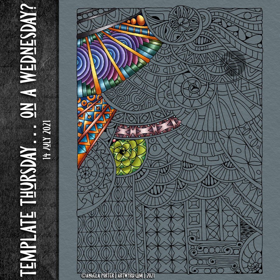
It’s an entangled drawing, but a bit of a difference too. I’m not entirely sure it’s worked out well. For now, I really do need to get the cover for the new book completed.
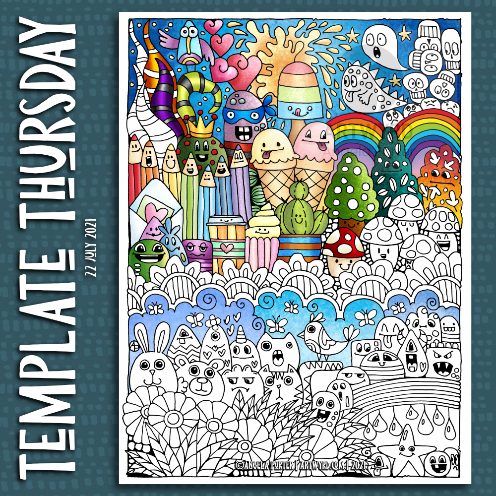
This week it’s a cute, whimsical and silly Doodleworlds design. Oddly, there’s not a skull in sight! Still, it’s a lovely mood booster, and I need that at the moment.
There’s also a new color palette challenge for August in the group – bright, cheerful and tropical colours. I used the palette to partially add colour to the template.
The template was drawn on A4 Canson Imagine mixed media paper. I added the colour digitally using Clip Studio Paint.
I’m looking forward to seeing how the template is coloured by group members, even using a limited color palette. It’s always great to see how people approach the template differently.
Some of the colours in my finished artwork weren’t in the palette. I mixed colours from the palette to achieve the oranges and purples.
It was a fun project that I completed rather quickly for me. I used it as an opportunity to find out more about some of the blending options for the brushes in Clip Studio Paint. I’m not sure anyone could tell the difference with how this has finished, but I started to understand how some of these options work.
It’s nearly midday, and I think it’s time for breakfast before I turn my attention to this week’s template for the facebook group. Food first!
Today, I felt the need for some cuteness and whimsy in my arty pursuits. So, I’ve drawn a Doodleworlds style template, with some ice-creams and an ice lolly included. It’s still blisteringly hot here today.
There is a time lapse video showing the process of drawing this template.
Today, I’m aching after my fall yesterday. At least the headache has gone! I’ll be glad to retreat to the downstairs rooms in a little while. It’s 26ºC outside according to the ‘puter. That means it’s rather warm inside too. It’s forecast to be cooler tomorrow, with the high being 25ºC, which will be manageable. Just.
Time to finish my social media postings and then to get more tea!
Yesterday, I shared a partly digitally coloured version of this week’s coloring template. Today, I’ve coloured some of the original template using Tombow Dual Brush markers with a waterbrush.
I filmed this process and turned it into a vlog. I speeded the footage up, as the original colouring took over an hour and a half.
I then spent another half hour or so experimenting with fineliners and white, metallic and glitter gel pens to add texture and pattern to the coloured areas. I didn’t film that though, but the results are in the photo above.
I set myself three intentions for this morning: a) enjoy the process of working with the media b) experiment with fineliners and pens to add pattern, highlight/shadow and texture c) to not invest in the outcome or fret about colour choices
I think I achieved those intentions.
Sometimes, often even, just enjoying the process of creating, with no expectations or pressures of any particular outcome is so important. To be able to relax and enjoy the process, the colours, the way the media work is as valuable an experience as producing for a specific purpose.
It’s nice to be able to take the time to do this, without worrying about any particular project. Being able to put aside the “I should be doing x, y and z” and realising that just taking time to do something that makes me smile inside is as important as doing projects that fulfill a contract or business thingy.
I did film the process, and two videos are available on Youtube. Both show the process of drawing, not adding colour. One is a vlog of the process, with about half in time lapse. The other is the time lapse version.
It was lovely to spend time drawing in a style that is very familiar to me. It’s lovely as a bit of a break from the more challenging explorations into abstract art I’ve been doing.
And of course, while the videos were uploading and processing, I decided to start to add some colour to the template.
Abstract, entangled, zentangle inspired coloring pages are not just fun to draw but to colour. They’re non-representational so any colours at all can be used.
I got carried away with the process of adding colour. The videos have long been uploaded and published.
This week’s template is a template I created for the Whimsical Cats book that didn’t make the cut. So, what a better way to make use of it than to release it for the members of the group to colour.
I did the inking in of the sketch in Autodesk Sketchbook. The colour was added using Clip Studio Paint.
I do have a timelapse video of how I added colour to part of this sample. Unfortunately, I forgot to record sound so it’s just video with music.
I like working on a darker, or coloured, background. The colours seem to much more alive than on white. Also, it saves me some eye strain!
It’s always fun to see how the template comes to life with colour. I’m often really unsure about my templates. Are they too simple, too naive, too intricate, not intricate enough. Adding colour helps me to see that they’re good enough, and also that they are created in my own artistic style. Cute, whimsical, imaginary. Places to play with colour and not worry too much about realism, if you wish. A skeleton that can be fleshed with colour however you wish.
I like that. It ties in with my exploration of abstract art. That’s on hold until later today, maybe tomorrow. I first need to focus on getting the last couple of templates inked in, though I am awaiting the review of the final one submitted. I have three to do, plus that last one. So, it shouldn’t take me all day to do!
It’s always exciting coming to the end of a book. Though not quite the end. I will still have three templates to colour in. I let the editorial team choose them; I never can! Also, they have a more objective view about what images will best represent the book.
Each of those images will take me a couple of days to add colour to, each! Not a quick process at all.
So, It’s time for me to finish my social media posts for today, get some breakfast while my computer installs and update, and then settle to work.