So frustrating!

It’s been a frustrating few hours. I scanned these two drawings in, went to edit and colour in Autodesk Sketchbook Pro, only to find that Autodesk has cancelled the pro, subscribed version and the only one available is the free version.

The free version doesn’t allow me to alter contrast, or work at different dpi, and it is a tad unstable it seems.

Also, there was no warning of this and I had no chance to save all my own custom brushes.

To say I’m gutted is an understatement. Sketchbook Pro has been my pathway into digital art and I absolutely love its intuitive interface.

So, I’m now looking into other software I have on my ‘puter. I learned to edit and colour and add texture layers, background and text using Clip Studio Paint.

It works well, but the interface isn’t so intuitive, it’s so much like the Adobe products, with menu after menu after menu. I can see that it’s more powerful.

Trying to look on the bright side, maybe I’d become way too comfortable with Sketchbook Pro and it’s now time for me to learn new digital skills and extend the ones I already have. So this may be a blessing in disguise.

All I know is that it’s going to be darn frustrating for a while until I get to grips with this new software.

I’m tempted to have a look at Corel Paint, but I suspect it’s user interface is as confusing and not intuitive either.

I still have access to the free version of Autodesk Sketchbook. But it is missing some of the features I loved so much about the subscription version.

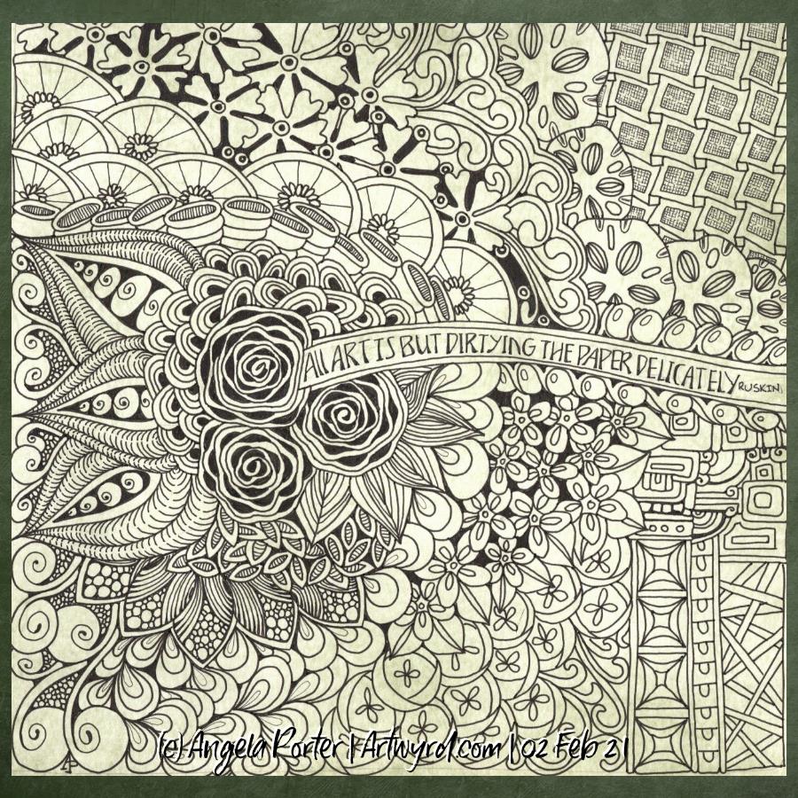
Anyways, I discovered the watercolour brushes in Clip Studio and used them to add colour to the top design, and I like these ones very much. I’ll see how I get along with it, but first I need breakfast. Yes, It’s nearly 2:30pm and I’ve not had breakfast yet! So I’m going to eat and then it’ll be onwards and upwards digitally, I trust.

Now I’ve had my moan, here’s some info about the drawings:

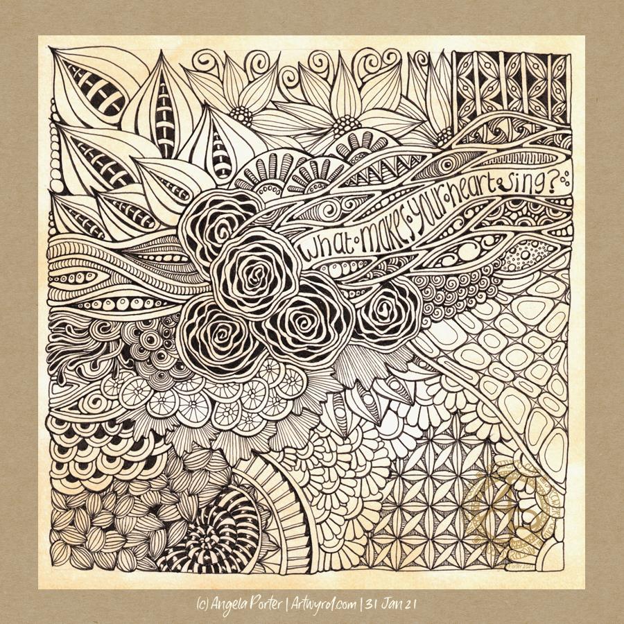
14.5cm x 14.5cm Bristol board
Faber-Castell fineliner pen
Colours and textures added digitally using Clip Studio Paint

Serendipity Part 3 – a video

Friday is YouTube video day for me. Before I’d even had breakfast, I was filming the next part of this video series. I did get myself a mug of mocha first, in an insulated mug so it stayed nice and hot throughout the filming.

I changed the pen I used today. I’d bought a couple of Faber-Castell Grip 2010 fineliner pens to see what they’re like. I like them. They’re refillable and the ink is document safe but not waterproof I will use them for art that I’m planning to scan in. Oh, I’m not being paid or sponsored in anyway to mention this pen.

Anyway, the video is nearly an hour long and I chat away as I draw, particularly about Romanesque architecture/sculpture and it’s influence on me, along with mentions of La Tene/Iron Age/Celtic art and others.

Little art

More small pieces of artwork today. These are perfect for when I’m feeling overwhelmed by a large sheet of paper. Also, they are sources of ideas for patterns and motifs for future work. I do need to spend some time with all this art and add some of the newer motifs and patterns to my visual dictionary/zibladone. Or, just stick them all into a sketchbook. At least then I’d know where they are!

It’s snowing outside. It’s cold outside, and warming up inside as I put the heating on a couple of hours ago. I think I may curl up in bed today with Din Djarin and Grogu. I still have three episodes of Season 2 to watch, and that sounds like a good plan to me!

Entangled Monograms

I’ve enjoyed doing these! The squares are 3.25″ x 3.25, 3.5″ x 3.5″ or 4″ x 4″ in size. The circles are almost 3.5″ in diameter.

The tiles were cut from a variety of papers – watercolour, bristol vellum and heavyweight smooth cartridge paper. I used Distress Inks to colour the paper tiles before drawing on them.

I’ve used Sakura Pigma Micron pens (05 and 01), along with some brown and one blue-green Stabilio fineliner pens.

I like them all, But my favourites are the ones that are much more geometric in nature – my initials and the A in particular. My least favourite is the E; the background to the letter just feels disjointed. I think that’s why I like the more symmetrical, geometrical designs more.

I’ve enjoyed using one or two tones of colour to add variety, interest and ‘dimension’ to the tiles. I’ve not added any shadow or highlight to these. That’s when things tend to go wrong for me as far as traditional media is concerned!

It also occurred to me that if I were to draw these on a different shaped paper, I could add dangle designs to them. (My book “A Dangle A Day” is still available). Maybe I’ll try that out in a while. Of course, I’d like to get a full set of monograms done too.

Small Art

Here’s just some of the smaller pieces of art I’ve done over the past week or so. They’re all entangled, zentangle, zentangle inspired. The biggest is 9″x9″, the smallest around 3.5″x3.5″ in size.

All have been fun to created, but I’m really not sure about colour choices, the backgrounds colours of the papers I used and so on.

I have yet more in the pile created over the past two or three weeks! They’ve been comforting to do, even if I’ve doubted myself with them and what I was doing. That’s often the case when my emotions are all over the place, as they still are to some extent.

All I know is that though it is bitterly cold outside, the sun is shining and I really do need to go for a walk, take in some fresh air, and blow some cobwebs from my mind. Well, that’s my plan. It may change once I’ve showered and so on!

WIP Wednesday

‘The pen is the tongue of the mind’ is a quote by Horace, a Roman who lived between 65 BCE and 8 BCE. Today, we may add that the keyboard is the tongue of the mind too. Though sometimes I wonder how many people actually think before they type what they do in social media!

The quote refers to writing, but I also think it refers to art. Not all of our thoughts are in words. Our subconscious/unconscious mind takes in a lot more information than our conscious mind does. Also, the subconscious mind works in metaphors, symbols, stories.

Sometimes I can manifest the abstract and symbolic thoughts that wander around my head in writing. Others need to be brought out in conversation, by questioning by another. And then there are times, when words aren’t adequate. That’s when art has its role to play.

I rarely plan art out, other than perhaps a vague guide as to where I’d like particular motifs to be. I tend to let it flow as it needs to. If I overthink my art, it all goes to pot. It feels disjointed, contrived to me and I end up quite dissatisfied with it. Going with the flow seems to work best for me.

This particular work in progress does have a little planning in it – the placement and arrangement of the quote along with the pencil border. I do like a border to work within and up to.The rose motif is a current favourite, so roses were the first part of the drawing to be done. Everything else will flow from there. I do like a border to work within and up to.

I’d like to finish this today. However, I do need to create a template for this week’s Template Thursday.

For those of you are curious, here’s the details of the materials used:
A5 natural Claire-Fontaine Paint-On mixed media paper
Faded Jeans Distress Ink
04 Sakura Pigma Sensei pen
05 Sakura Pigma Micron pen

Art is …

…but dirtying the paper delicately” – Ruskin

Note to self : Use a paper size that fits the scanner bed, or leave slightly larger margins.

I found this delightful quote by Ruskin yesterday and knew I wanted to use it in a drawing. So I did. Some of my favourite motifs, and some I don’t often use.

For this one, I used Strathmore smooth Bristol paper and as I cut it down into a square shape, I forgot that the width was too big to fit my scanner.

Anyway, I used bundled sage Distress ink to colour the paper before setting to it with Uniball Unipin pens. I’ve not added any shadow/highlights yet.

I’m fairly pleased with the vast majority of this drawing. There are bits at the bottom right I’m not happy with. However, shadows and highlights may help to sort that out.

A well read woman …

… is a dangerous creature.

Another entangled/zentangle style drawing. 21cm x 21cm square piece of Claire-Fontaine Paint-on mixed media paper coloured with rusty hinge distress ink (I think). Drawing done with a mixture of 03 Uniball Unipin and 01 Sakura Micron pens. Shading is in the process of being added with a deep red-violet Carbothello pastel pencil and a blending stump.

I think I’ll need to use a darker colour to really bring out the edges of layers as well and to help to separate each area of the design. I also have a hankering to add some gold to this one. I may or may not act on that very tempting idea though. I have a way to go yet before I decide on the final embellishments. White may win out!

This mixed media paper really holds on to the pastel pencil; it’s really difficult to blend out. However, that also gives an interesting finish and stops me from blending it out so much everything looks the same!

This was lovely to do, as art usually is for me. It’s quite different for me and it doesn’t seem to flow as well. Perhaps that’s simply because it didn’t feel like it was flowing as I was drawing it. I started with the large motif of three weird seeds and the ribbon border wrapped partly around it. Not something I would usually do and I think it threw me a little. But it’s done now, and I just keep reminding myself every drawing is an experiment. it’s only some time, paper and ink, so if thing’s don’t work out, nothing much is wasted and new lessons are gained along the way.

What makes your heart sing?

Lots of things make my heart sing. Doing art, particularly creating intricate, abstract drawings. Music. Nature. Architecture. Patterns. Archaeology. Geology. Astronomy. Stories and films that transport me to somewhere else with characters that feel like friends. Sunrises and sunsets. Birdsong. Tea at just the right temperature to enjoy it fully. Time with friends. Deep conversations about life, the universe and everything. Driving for the sake of driving. And so much more.

In this drawing, I’ve put in some of my favourite motifs and patterns, as well as a bit of (clumsy) hand lettering. I think I’ll be doing some more drawing this afternoon. It’s snowing out and the best place to be is at home, in the warm.

Materials used:
21cm x 21cm piece of Claire Fontaine Paint-On Mixed media paper coloured with Tea Dye Distress Ink
05 and 01 Sakura Pigma Micron pens
04 Sakura Pigma Micron Sensei pen
03 Uniball Unipin pen

Be gentle to yourself

I often say to myself, “Angela, what on earth were you thinking?” This is one of those times.

I started with hand lettering the words. Ok-ish Good enough to mess around with. And mess around them I did – with an “aura” and pattern, then more patterns and repeated motifs … until I’d mostly filled a square sketchbook page.

The drawing was OK. I liked some bits, others I didn’t.

Then, I thought, “What would it look like with colour? Let’s try Inktense and water!”

How often have I mused here about how I struggle with colour? All was going OK-ish with just pinks and greens … and then I added blues and browns…

The geometric pattern at the bottom were colours that didn’t fit well. So, I added watercolours to glaze the colours. Big mistake. I lost any sense of shadow and highlight …

So, I used a white graphite/chalk pencil to try to add the highlights back in …

YEUCH!

So, I put it to one side while I did some other stuff and had lunch.

Then, it caught my eye and with fresh eyes I thought that maybe it’s not as bad as I thought it was .. maybe.

I constantly do this – try to add colour with traditional media and fail. Monochrome seems to work best for me. Monochrome where I can play with shadow and light. Monochrome colours that are added digitally seems to work the best of all.

No matter how often I tell myself this, put notes up to remind me of this, I still insist on trying to use traditional coloured media.

I just think that I hope one day that something will just ‘click’ with me. Today wasn’t that day it seems!

So, back to either white or simple coloured backgrounds, and adding monochrome colours for the sense of dimensionality I like. And I have no hopes that I’ll remember this in a day, a week, or a month or two and I’ll end up asking myself the exact same question; “Angela, what were you thinking?”

The end result may be something I’m unhappy with, but adding colour was enjoyable. I just seem unable to stick to just one or two colours, with variations in their intensity and tone. Then, I descend, bit by bit, into insecurity and self-doubt and incredulity that I did it again!

Ho hum! Not to worry, it’s only pen, paper and some other media. It’s yet another experience to help me, hopefully, learn more and be more comfortable with my artistic style. If we did everything perfectly every time we’d never learn and grow.

So, back to a blank piece of paper with pens I go, and may make some art to remind me, “Angela, monochrome is best!”