In today’s YouTube video, I started to draw the design on the right. While the video was uploading, I finished drawing it. Also, I drew some motifs on a separate piece of paper so I could practice using alcohol markers (Arteza EverBlend).
Colour combinations do vex me, continually. And they certainly do on this practice sheet! But it’s best I practice somewhere before adding colour to my completed drawing. But first I’ll scan that drawing in so if all else fails I can add colour digitally!
Either way, it’s been lovely to spend time drawing and adding colour just for the joy of it. It is far too warm to do anything else.
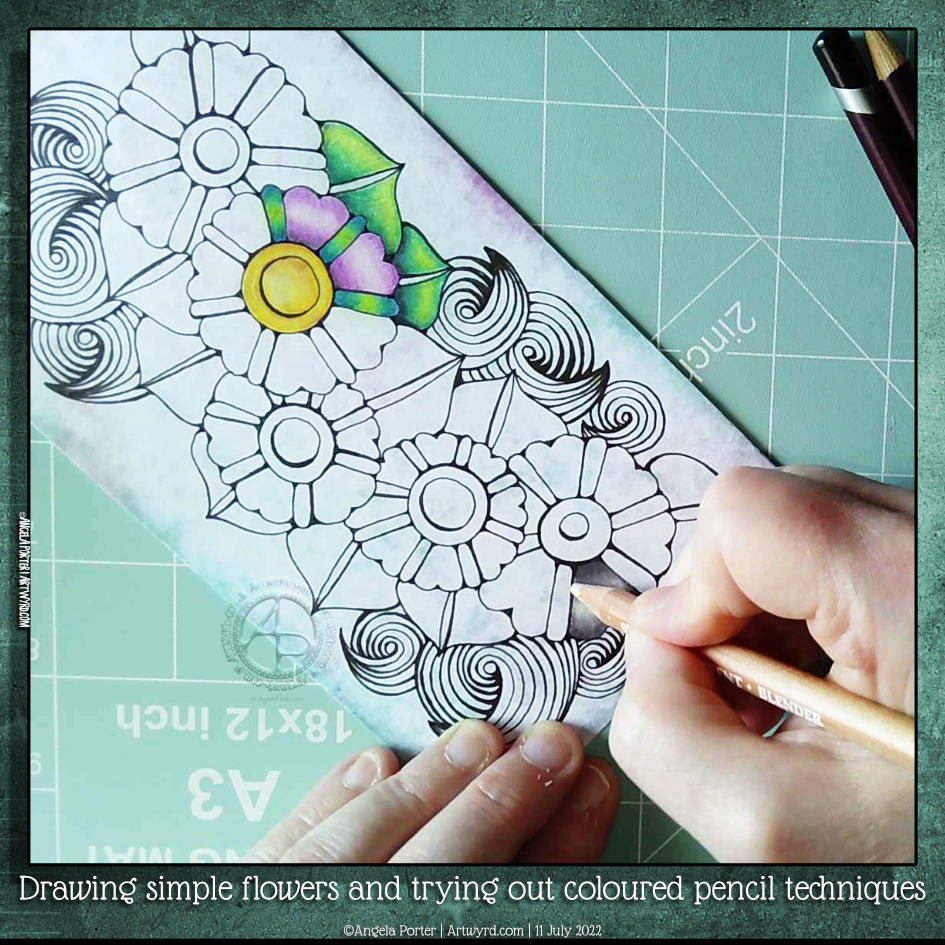
One of my YouTube subscribers (Chen Keith) requested I draw some simple flowers and show how I’d use coloured pencils to colour and add contrast.
Drawing, not a problem! Colouring? Yeuch colour choices! But I do show different approaches I use to adding colour with coloured pencils, or rather what I’ve done in the past. I rarely ever used coloured pencils now. Digital coloring or marker pens are my mediums of choice, with Inktense and the Karin Brush Markers close behind.
While the video was uploading and processing, I did try out other ways of adding colour and/or contrast. It’s way too hot here in the Valleys of South Wales for me to think clearly and explain things at the moment. The heat is making me feel very, very tired.
Please click on the button “Watch on YouTube”. Cheers!
I had a really, really cruddy, broken night’s sleep. So, doing art that doesn’t have a bit more than good enough was in order.
Getting the pen drawing done for this cute bird I started a couple of days back was just the thing!
It’s always interesting to look at my art, whether finished or, like this one, a work in progress after a day or so’s break from it. With fresh eyes there’s a different perspective. With this drawing, I needed to alter the design and size to get it to work. Not sure I’ve got it right, but it’s better than it would’ve been if I’d carried on as I originally planned.
The next decision to make, and the trickiest, is whether to just add shadow and highlight or whether to go with colour. The next tricky decision is what media to use to this.
I’m so aware that my colour choices can be … quite dire. And so I am tempted to add colour digitally initially. Maybe. Perhaps.
A little break from it will be in order before I make that decision.
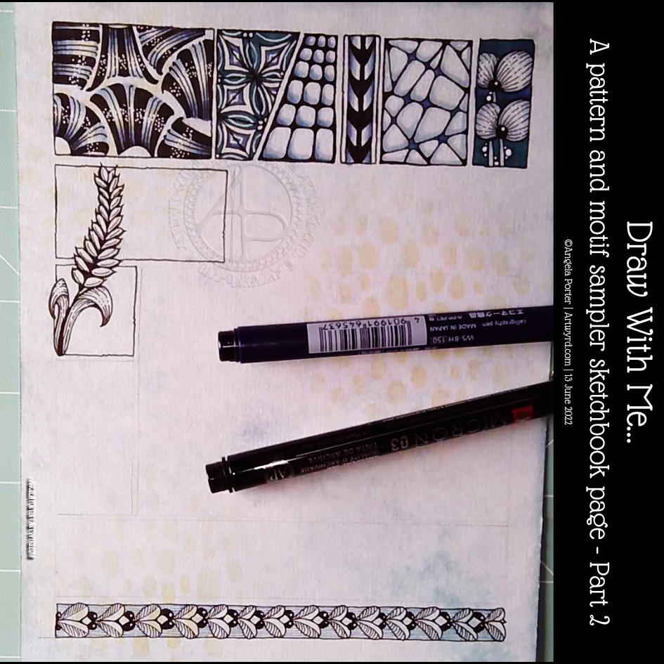
This was a lovely way to start my day. At the bottom is a tangle pattern that is new to me – Zhuer by Yuru Chen.
I also wanted to add a motif across a couple of boxes in the sample. This one ended up like a stylised ear of wheat. As I look at it now, I wish I’d had it going behind the boxes and maybe the top bending towards the left and reaching outside of the upper box. That’s something to think about for the next motif I add.
Still, it was a nice half hour or so before my attention turned to inking in colouring templates.
Please click on the ‘Watch on Youtube’ button. Cheers!
Step 1 – Create a Gesso and Neocolor II background
Yesterday, I had a delivery of Finnabair Art Basics Clear and Heavy White Gessos, made by Prima Marketing. Neocolor II backgrounds are a lot of fun to make, but they do leave a smooth, waxy finish to the paper. I like drawing on it, but my pens aren’t too keen.
So, I wanted a way to seal the Necolor IIs into the paper and a surface I could draw on. Yesterday, I tried some glassy gel medium from my stash. It worked well, and the colours appeared more vibrant. It was OK to draw on, but the pen took a long while to dry, and I’m not sure how permanent the Micron ink would be on it.
Synchronicity-like, some suggested videos cropped up on YouTube where gesso had been used to prepare the paper and then seal in the Neocolor IIs, even using the gesso instead of water.
I have used gesso in the past, but it always felt very rough and gritty. However, the Finnabair Art Basics gessos had reviews that suggested they are smooth and chalky in feel. So, I had to try them.
I’m glad to say that they are smooth and chalky! I did spend a little time last night testing them out and gessoing some “polaroid pops” image tiles.
In today’s video, though, I wanted to quickly show what gesso is and how I’m thinking of using it, particularly in my sketchbooks with paper that won’t take much water.
I covered a page in my Hahnemuhle D&S sketchbook. The paper in this book is for drawing and sketching and is not designed for water-based media. I can get away with a barely damp brush on the paper, but only one, maybe two layers are possible before the paper starts breaking down. Gesso solves this by sealing the paper’s surface and creating a thin, flexible layer that can be worked upon. I used the heavy white gesso to do this.
Gesso dries really quickly, but a craft heat tool (or hairdryer) can help to speed the process up.
The next step was to add colour with the Neocolor IIs. I used water to activate them, though I could’ve used gesso. I wanted to create an uneven, weathered or worn kind of background. I started with the browns, sealed them with clear gesso. After this had dried, I added the blues and finally another layer of clear gesso.
Then, I was ready to try drawing on this.
2. Drawing on the gesso surface
I really didn’t know what would happen. I know I’ve used gesso in the distant past, but couldn’t remember if I’d used pens to draw on it or not.
As it happens, it was really lovely to draw on! The Sakura Pigma Sensei 04 pen did feel like it caught on the tooth of the gesso from time to time, but nothing more than a rough-surfaced paper. It may be my imagination, but the ink seemed darker on the gesso, perhaps because it dries on the surface and doesn’t sink into it, like it would with paper.
I did a test to see if, once dry, the ink would be affected by water or gesso. There was a tiny amount of pigment that seemed to move, but nothing noticeable.
3. The arch motifs/fragments
I really love round arches! It stems from my love of Romanesque architecture. I use them a lot in my artwork. So, I thought it was about time I explored individual arches as if they were fragments of a tangle pattern.
4. Reflections
I’m so glad I rediscovered gesso. I’d forgotten how it could be used. I know the rough grittiness of the gessos I’d used in the past really did put me off using them again. However, this lovely, chalky smooth gesso is really nice to draw on. It also opens up more ways to create backgrounds and use colour. I’m sure I’ll continue to experiment and explore it going forward.
Please click on the ‘Watch on Youtube’ option. Cheers!
I spent some lovely time adding a bit more to this drawing. In the video, I share how, step by step, I draw some of the motifs so you can use them too!
Peace, calm, and just creating for the contentment it brings me.
Please click on the “Watch on YouTube” button to view on YouTube itself (and help the algorithm!).
I’ve now finished this drawing by adding two organic motifs, both fairly simple.
With the trailing flowers or leaves or stones, the hardest part is arranging them to look like they’re trailing and remembering to decrease the size towards the point.
The other motif, a stack of small seeds on a stem, is easy enough to draw.
After doing this, I thought it needed some colour to bring the motifs to life. So, I dug out some of the Neocolour IIs I’d used for the background and used them a bit like watercolour paints. I scribbled a little of each Neocolor II on my plastic palette, added water, and painted.
I’m not entirely sure about my efforts with adding colour – this is where it can all go wrong for me. Part of me knows I’d most likely be better off if I were to add shadow and texture using pens.
I did use some metallic watercolours to add some sparkle here and there too.
One thing I did notice is that I was glad I tried not to paint over the black lines. The pigment ink in Micron pens is usually waterproof, but, as the Necolor IIs are wax-based and coat the surface of the paper, the pigment doesn’t sink fully into the paper and so water will move the ink.
It’s not a problem, now I’m aware of this. Oh, it also means erasers will lift some of the ink as well as pencil lines. Again, just something to be aware of.
One other thing I did was to cut the paper down to frame the design a bit better. In my clumsy way, I managed to cut it just across the tip of one of the trailing thingies. So, no border around that area.
I will keep going with adding colour and see where it leads me, hopefully not into a disaster! Still, if that happens, it’s only a bit of time, ink, paper and colour and the design can be used as inspiration for the next one. Important lessons about the Necolor IIs are being learned, which is, perhaps, the most important thing.
It’s that time in the week again – Template Thursyay! Each week during the pandemic I’ve created a colouring page for the members of the Angela Porter’s Coloring books fans Facebook group. The template is only available to members, and it’s free to join the group and free to print the template for personal use.
It’s been almost two months since I last drew a mandala! So it’s understandable I felt the urge to create one today.
I used some of the motifs from myvideo in yesterday’s post. It’s always an enjoyable process using my favourite, organic motifs.
Using a limited, spring-time-ish colour palette also helped me get a coherent finish with the colours, almost. I’m really not at all sure about the purple pods!
Of course, the number of colour schemes that could be used is endless and down to personal preferences or desires at any time.
I can’t just leave a mandala on the page, there has to be a background of patterns too! The result looks like a huge dish floating above a window into some kind of sea habitat. I think that’s fun, even though I’ve only just realised that!
I had the hand-lettered part of this sketchbook page completed a couple of days ago. I didn’t really know what else to do with it. I knew adding colour with traditional media was likely to be a disaster.
This morning I woke up knowing what to do with this, along with other things. So, I spent some time adding a border around the lettering and starting to add patterns and motifs. And arches, lots of arches!
I then thought it would be nice to share some of the drawing process through a video, which you can see by clicking this link.
It feels like a long while since I did any entangled style art. The hand-lettering isn’t perfect, nor is the frame around it. But that’s OK. I think it goes with the ‘chaos’, the imperfection, the touch of an imperfect human hand.
A couple of months ago, I may have tried to do something like this, and would likely have been really dissatisfied with the result. Mainly because I wasn’t at all happy with my hand-lettering attempt. But now, after just a couple of months of working in lettering sketchbooks, working with different ways to form letters and finally accepting that whatever lettering I do doesn’t have to be perfect – good enough is good enough!
I’m using variations in the density of pattern and ink to create shadows and highlights in the design. I have no intention of using pencil or markers to add grey shadows to this one. If I decide to add colour, it will be in the style of a linocut or hand-coloured print, perhaps with some extra shadow and highlight added by the depth of colour. Perhaps. Maybe. And if I do, digital is the way I’ll go! First, though, I have to finish drawing this design.
In today’s video, I draw these three cute, happy, whimsical houses, and I always feel I mess them up when I add colour.
The first part of the video is a chat about organising artwork, using a dot grid notebook as a visual reference/collection of my favourite patterns and motifs and variations. I also talk about some requests/suggestions made.
But the very, very first part is a huge thank you to all my subscribers on YouTube for clicking that Subscribe button (which is totally free to do!). I hit 750 subscribers a couple of days ago and I’m amazed, surprised and a tad humbled by this. So, if you’re one of those subscribers, thank you so much!