Monday is, usually, mandala day. I have at least one mandalas-in-progress, but I started a new one today, primarily because I wanted to try out some different brushes in Clip Studio Paint Pro.
It took me a few experiments to settle on one brush to work with for this mandala – a coloured pencil brush.
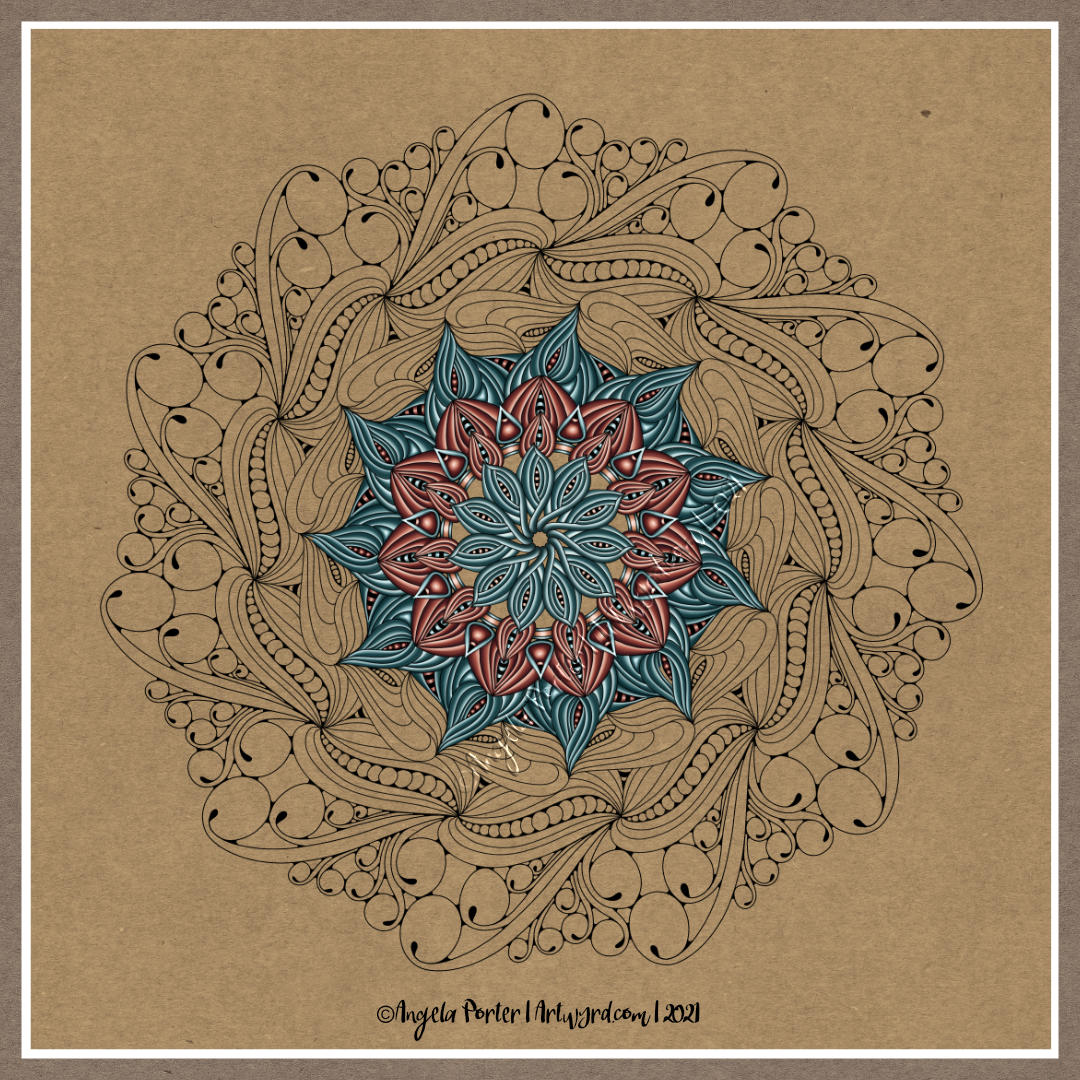
It also took me quite a few goes to work out how I wanted to lay down colour for this mandala too. Eventually I settled on highlight on one edge, shadow on the other, and quite a sharp delineation betwixt the two.
I didn’t realise it at the time, but the effect I was achieving reminded me of the abstract oil paintings I did many, may years ago. The abstract patterns came from Romanesque architecture and rusty parts of steam and diesel locomotives. I remember myself playing with light and shadow. I also remember at the AS level exam exhibition I was puzzled as people kept touching the paintings. I asked someone why they had. They answered that they wanted to see if the paintings were 3D in nature. I hadn’t seen that illusion at all, but once it was pointed out to me I could see what others could. I put it down to having worked so closely on the paintings.
This was around 17 years ago now, and I still tend towards working with highlights and shadows, and the resultant illusion of volume or dimension in my work.
I’ve also finally worked out that I tend to use light and shadow as part of the patterns in my work instead of related to a light source. I think that penny dropped when I was listening to a Zentangle video on youtube.
As lovely as it is to work with varied colour palettes, for this one I wanted to return to a simpler palette. I’ve chosen just two colours and various shades of those colours.
I can see how my colour blending technique has developed from the centre outwards! The difference between highlight and shadow has increased a tad.
I have so many works in progress at the moment, and I tend towards creating new all the time. I think I really do need to learn perseverance and get works finished more often!
I woke this morning and something had filtered through my unconscious mind about why I couldn’t get the record screen app in Movavi to work. I had to set my computer into tablet mode. And all worked well, including recording my voice as I worked.
I was a bit flustered and more than usually waffly, but if you’d like to see how I add colour digitally, then you can see the screen, and hopefully the ‘mouse’ pointer.
I can now calm down that I know I can do this!
If you watch the video and enjoy it, like and subscribe. If there’s any helpful advice you can give, or suggestions for future projects, then please leave a comment with them.
I’ve spent much of the day so far adding colour to my ‘Serendipity’ drawing that I completed yesterday. The whole process of drawing has been videoed and is available on my YouTube channel.
I thought it would be an idea to try to record a timelapse of my process in Clip Studio Paint Pro, which has a tool that does it for you. This just didn’t work, it caused everything to freeze up.
So, I thought I’d try the record screen tool in the Movavi Video Suite. It didn’t let me use my digital pen on the screen. So, I’m going to have to spelunk through the settings to see if I can resolve that issue, and the one with Clip Studio Paint Pro. A couple of things to sort out along with how to add a voice-over to a video!
So, after getting another mug of tea, I settled to starting colouring the image digitally. I wanted to use the rich colour palette I’d used for this week’s ‘Template Thursday’ design.
I’ve only got part of the design done. It’s taking me a little longer to add colour in CSPP (Clip Studio Paint Pro) than in Sketchbook as I’m not familiar with the tool layout yet.
Again, I’m taking this as an opportunity to learn more about CSPP, in very tiny, tiny steps. I seem to have found a watercolour brush I like that adds an interesting texture to the colour. Usually, my work is characterised by rather smooth colour gradients. To have such a textured finish is unusual for me, but I quite like it.
I have a lot more of this particular drawing to do, and as I’m working digitally I can always try a different colour palette or way of working.
I think I’m going to take some time away from the computer now, and return to ‘analog’ forms of art. If you’ve watched my video, I gave a short look at one of my collections of patterns and motifs. That notebook is almost full, so I had a new Leuchtturm1917 A5 notebook delivered yesterday. It turns out I’d managed to order a square grid rather than a dot grid. No problem. If anything it may work out better.
I’m not going to transfer the entirety of the nearly full notebook to this new one, just the motifs/patterns I use the most, and start to add others. They really are books full of inspiration, mostly images but sometimes words/notes too.
This week, I finish this particular drawing, apart from a few bits and bobs.
Partway through the video, the microphone just stopped recording. I have no idea why. So, for the last part of the video, I’ve sped my drawing up 5x and just put some music to go with it.
Guess I’m going to have to learn to do voice-overs as well as learning the new digital art stuff!
I’d appreciate likes for this video, as well as new subscriptions to my channel.
I’ve finished the line art for this particular design. Now, it’s adding colour to it, which is going to be a long job.
I’m trying out a color palette of greens, peaches and dusky pinks, but I’m not sure about them, or maybe I’m not fussed on the background. I’ll see how I get along. It’s definitely a work in progress.
I’m not sure what happened with the design. I had intended to leave open space in the design to add a lighter, airier feeling to parts of it. That just didn’t happen. I’m not sure about some areas, but I do know that colour can make all the difference to a design.
A4 Marker Paper Pentel disposable fountain pen, 02 Uniball Unipin pen, and a 0.38 Uniball Signo Dx pen Backgrounds and colours added digitally using Autodesk Sketchbook Pro
Note – I’m not paid, sponsored or supplied with any products.
Natural Paint-on paper by ClaireFontaine approx 8.25″ x 8.25″ (21cm x 21 cm ) Flower motif – Tim Holtz’s Ephemera Various other papers as mats. Black fine Uniball ‘Eye’ pen Gold Sakura Gelly Roll pen White Sakura Souffle pen White and brown pastel pencils
Today’s offering is another entangled/zentangle cartouche around a piece of vintage ephemera.
I’m trying to learn lessons of past attempts at these kinds of frames or cartouches. The layers of borders seem to work well for me. They’re balanced and cohesive. Also, the colours used help to bring them together as well.
Central focal image – Tim Holtz’s Ephemera. Various designer series papers as the mats for the focal image. Overall artwork size approx 7″ x 8″ (18cm x 21cm) Distress Ink to colour papers and mats. Mossy green Staedtler Triplus fineliner. Black 03 Unipin pen. Mossy green and black Carbothello pastel pencils.
This one I am happy with. For cartouches/frames I prefer to work in borders rather than a rambling series of patterns and motifs. This seems to satisfy my love of symmetry/balance, yet still allows the use of organic patterns. I really did breathe a sigh of relief when I completed this one.
I am considering adding either colour or metallic ink to the seeds in the outermost border, possibly some shadow within each triangular motif as I realised I forgot to do that.
I did start work on another similar project. I’m really not happy with the penwork. So, I’m going to remove the central motif and mount it on a new piece of paper on which I can draw the borders/frame/cartouche. Not everything has been lost in this case.
Over the past two or so days, I’ve not been feeling quite right. I’ve spent a lot of time cwtched up in bed, and about the only art I’ve felt like doing is small projects that I don’t feel overwhelmed by.
Zentangle Cartouches
I saw the idea of zentangle cartouches on the Zentangle YouTube channel a little while back and wanted to give them a go. I’d done one a little while ago where I’d used some vintage rose ephemera from a set of Tim Holtz’s Field Notes ephemera on a piece of natural coloured mixed media paper. I wasn’t at all sure with what I’d ended up with. However, I did want to revisit this idea once again.
So, I decided to explore the idea of cartouches once again. This time, I used smaller pieces of creamy Fabriano Medioevalis paper, which comes sized to 3.3″ x 5.2″ (85mm x 132mm), with lovely rough edges. This is really soft paper, the surface is easily damaged by using a tortillon too roughly.
I added the focal points, again from the Field Notes ephemera by Tim Holtz, along with some little quotes. The quotes are from the sets of ‘chit chat’ stickers, again by Tim Holtz. These items are in my stash from the days I messed around with mixed media, before I realised it really wasn’t quite for me. I admire what people can do with mixed media, but I just never seem to have found my way with it in a way that I’m happy with. I’m much happier wielding a pen (on paper or digitally) with love and a creative heart, than getting rather messy and frustrated with mixed media.
My Reflections on these Cartouches
Anyways, I’ve had mixed results with these experiments in cartouches. My favourite is ‘trust your crazy ideas’, closely followed by ‘be you, bravely’, then ‘treasure. ‘stay curious’ and ‘don’t forget to fly’ are very close to these in how much I like them.
‘trust your crazy ideas’ just seems to have colours and patterns that work harmoniously both with each other and with the mushrooms. Perhaps I got a little close to the motif with the pen work, something for me to consider with future projects of this ilk.
‘trust your crazy ideas and ‘be you, bravely’ are both designs that have a small number of different patterns on them.
‘treasure’ is similar in that respect, but it feels unbalanced. I think I need to consider where I put the central motif; more centrally may work in my favour. ‘stay curious’ is a much more balanced design than ‘treasure’, because I consciously decided to mirror the patterns used, even though the motif was not placed centrally.
‘don’t forget to fly’ is just not a coherent design at all. I like the borders and the seed pods around the motif, but then it all goes weird.
However, I’m really not at all pleased with ‘live gently upon this earth’. It’s incoherent, too many colours, and the words and motif are just not balanced at all. I would’ve been better with not adding the words to this one in the first place.
Actually. It may be that I don’t add the words until the design is finished, at the bottom as a kind of plaque or border, or floating over an area of the cartouche with a border around them, or just not use them at all. I need to experiment with these.
My own ephemera designs?
I also know I’m quite capable, I think, of drawing my own ‘epehemera’ to add as focal points. However, as I tend to draw at a much bigger scale, I’d either need to scan my drawing in, or draw digitally, and reduce the scale before printing them out. At this time, I have a laser printer, which is great for printing documents and so on but not so much for artwork. It changes the surface properties of the paper used. Also, I can’t use specialist art paper with the printer. If I’m going to go down this route of arty expression I think I need to consider changing this printer for an inkjet printer again, especially one that has waterproof, or at least water resistant, ink.
What to do with my artwork?
My home is increasingly becoming filled with my artwork. Most of it I have digital versions of them – either scans or photographs. I do need to decide what to do with my artwork as I really do need to let it go to new homes. Any suggestions, drop me a comment!
Also, I have a problem with putting a price on my artwork, if I were to sell it. I have absolutely no idea of what it’s value could be to other people, or even if anyone would want to purchase it. Again, any suggestions, drop me a comment! Any help or advice would be much appreciated.
Two drawings today, both done over the night as I couldn’t sleep as I really wasn’t at all well.
The larger one is a Zentangle ‘cartouche’. The central floral image is from one of Tim Holtz’s Ephemera packs. The paper is natural coloured mixed media paper by ClaireFontaine. I used a mixture of black, gold and rusty-red pens to draw the frame around the image. To add colour and shadow I used a mixture of pastel and graphite pencils, along with some tortillons. The design is approx. 12.5cm x 16cm (approx 3″ x 5″).
The smaller design is approx. 13cm x 8.5cm (3.3″ x 5.2″) in size. The paper is a piece of Medioevalis paper by Fabriano. This is lovely soft, gently textured paper that has a high cotton content. It’s easily damaged by the use of tortillons, however. So, I did add some shadows with a graphite pencil, but then added colour with Inktense pencils, brush and water. The paper really works well with wet media it seems. To draw the design I used a black fineliner, a brush pen and white and gold gelly roll pens.
I saw the ideas of cartouches, as a decorative frame around writing or image, and Zentangle designs on a youtube video and wanted to try it out. I decided to do that in the dark depths of the night when I wasn’t able to sleep. I may very well experiment with this idea as time goes on – particularly using drawings of my own as the focal point. I’ll see how it goes.
Yes, another WIP (work in progress). I’m fairly happy with the drawing, and I may re-draw it with less detail for this week’s coloring template. I’ll see how I get along.
This one is vexing me in terms of adding colour. I think that because elements of this are far less abstract my brain kicks into making things like life. I think I need to find a way to kick my brain into using shadow and light to bring dimension rather than focusing on colour.
This frustration may be because I’m feeling more than a little anxious and a bit like a startled rabbit. I have an appointment in a short while, and that means going into the world where there are people.
Design drawn on A4 heavyweight cartridge paper with Unipin pens. Background and colour added digitally.