I spent some lovely, peaceful time today recording a video showing how I work to create variations on a theme.This theme is motifs based around circles and how I go from simple to more complex, possibly over complex.
Between some adulting today, I’ve drawn this design in my sketchbook. I’m quite pleased with it, unusually for me!
I like black and white drawings. I like texture and pattern, and I like to then add colour and/or contrast to my artwork. I’ve yet to decide what I’ll do with this, though digital colouring is likely to be my thing. Traditional drawing followed by digital colouring makes it tradigital art! Whoever coined that term is fab.
In the last few days, I have played around with using coloured inks to draw designs. I’m happy if I use one colour for the drawing, texture and pattern. If I start to use other colours, I become confused and not at all happy with the outcome. It never looks ‘right’ to me. Not for my own art, anyway. I do like how other people manage to use different colours for various parts of the lineart, pattern and texture.
Maybe this is because I’m so used to drawing with just one colour. I then use colour to bring out dimension in the finished artwork. I have drawn designs in a colour other than black, using just that colour; I’m quite happy with them.
So, onwards I go, continuing to learn more about my style as I go outside the area I’m comfortable in. I may return to the experiments with different ink colours another time, or not. Only time will tell, though.
This design does make me smile gently! I’m rather pleased with the end result. If you’d like to #drawwithme, then the accompanying YouTube video goes live today, 3 June ’23, at 18:00 UK Time.
Distress Ink background. Design drawn with black Dokumentus ink in a TWISBI Eco EF fountain pen. Extra colour/shade added with Derwent Chromaflow pencils and Gamsol. Highlights/shimmer added using a white Uniball Hybrid Gel DX pigment ink pen and gold Winsor and Newton Calligraphy Ink applied with a brush.
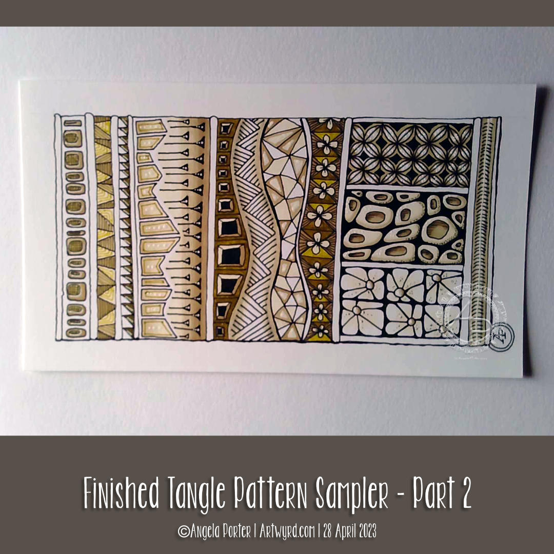
This little pattern sampler has been fun to do! I’ve used patterns inspired by the work of Rebecca Blair, some Zentangle style tangle patterns, and possibly some variations of my own too.
I do love Rebecca’s work. I can see the influence of medieval manuscripts on her work and her love of pattern, texture and a wonderful use of textured lines too! The simplicity of her colour palettes and the myriad of ways she combines her signature patterns/textures is wonderful! I really do suggest you take a look at her work on Instagram.
I used a piece of Ohuhu marker paper that measures 4″ x 7″ ( approx 10cm x 1.7cm) and marked out the basic sections with a Uni Kuru Toga 0.3 mechanical pencil (and a ruler for the straight lines). The pencil lines were just a guide for me.
In the first video, I did most of the black line work using an 03 Sakura Pigma Micron pen. In part 2, I added colour using Winsor and Newton Promarkers in Ivory, Sandstone and Caramel.
After that, I added some fine line work and some colours using three Stabilo Point88 0.4 fine pens. These had olive-green kind of tones to them that worked well with the soft browns of the Promarkers.
I also added some black lines in places using a 0.1 UniPin fineliner pen.
Finally, I added highlights using white gel pens.
I really like the more monochrome, subdued colours of this finished drawing. The various panels really do have the feel of a needlework or cross-stitch sampler; hence the name!
I spoiled myself with a set of Promarkers last week, and I don’t feel a bit guilty about it! I was getting frustrated with the Ohuhu markers – way too many bright, in your face, vibrant colours and not enough subtler, less saturated colours.
I’ve also found that as nice as the Ohuhu marker paper is (and it is lovely and smooth and fab to draw on), I much prefer Winsor and Newton, Daler-Rowney or Canson Marker paper for my alcohol marker work; the ink doesn’t sink into the paper as much and the colours are more vibrant. Also, you use less ink in creating the artwork!
Organising a new pattern, texture and motif ‘repository’ and a bout of illness
I keep faffing about with this. After getting frustrated with a six-ring A5 ringbinder and the limited number of pages that can be stored within, I discovered there’s such a thing as A5 landscape lever arch files! So one was bought post haste! I still can’t draw/write directly in it, but it makes it so much easier to store paper and finished pages. So, I’m one happy bunny.
I’ve spent quite a bit of time in the last couple of weeks starting to put together my collections of patterns etc. Especially as I’ve not been too well. I had been in contact with some people who subsequently tested positive for Covid. I had a nervous few days wondering whether I’d get it. I didn’t. Instead I had runny nose, slight cough, and a mild case or tonsillitis!
I’ve not had tonsillitis for the best part of twenty years. The last time I was getting it 4 times a year and was referred to an ENT surgeon. Let’s just say he didn’t need to use the tongue pressor thing to see my tonsils – they’re permanently large and have lots of tunnels (crypts) inside them from all the tonsillitis I’ve had from a young age. Seeing the surgeon seemed to scare the tonsillitis away; I elected not to go through with surgery to remove the tonsils. There are potentially serious complications that can arise in an, ahem, older person.
Anyhoo, It was a mild case. All covid tests for over a week were negative. But I’m left feeling run down from being ill. I’ll recover gradually!
Losing myself in reorganising and redrawing patterns etc was just what I needed. I’ve barely made a dent in my collection, especially as I’ve added loads more variations as I go! I know it’s going to be a long term project, for sure.
Other arty stuff
I have done other arty projects since my last post here. But the fatigue has been strong and my concentration and focus weak. I will post a gallery of them in the next day or two!
My latest page in my lettering sketchbook. I’m still working on finding how lettering can work for me. It seems that these kinds of letters are something I keep circling back to.
All drawn with various fineliners and some coloured with Arteza Everblend markers. Some highlight dots of white gel pen too.
Drawing Zentangle Tangle Patterns Spoolies and Swerve and adding contrast/colour.
What to do on a Sunday morning? Arty things of course!
So, yesterday I drew the design to the right and added some colour to it. But it was lacking something. I eventually worked out, at around the same time someone made a suggestion on my YouTube video, that it needed more contrast.
So, I set about doing just that, as well as showing/explaining how I add weight to lines to help increase the contrast and sense of volume. That’s what the greyscale drawing is all about.
For the other one, I used sepia and red oxide Inktense pencils and a damp brush to add more colour and increase contrast. I made some bad decisions in adding cross-hatching to some of the elements of that design. But that meant it was a great piece to work on improving my skills.
I’m often way too timid with contrast, at the start. But as long as I use a medium that allows me to gradually build up layers, I eventually get there.
Today’s video shows how I achieved this higher contrast finish with both line weight and colour/shadow, and you can watch it by clicking on this link.
I’m most probably not the first to discover this, but it is entirely new to me!
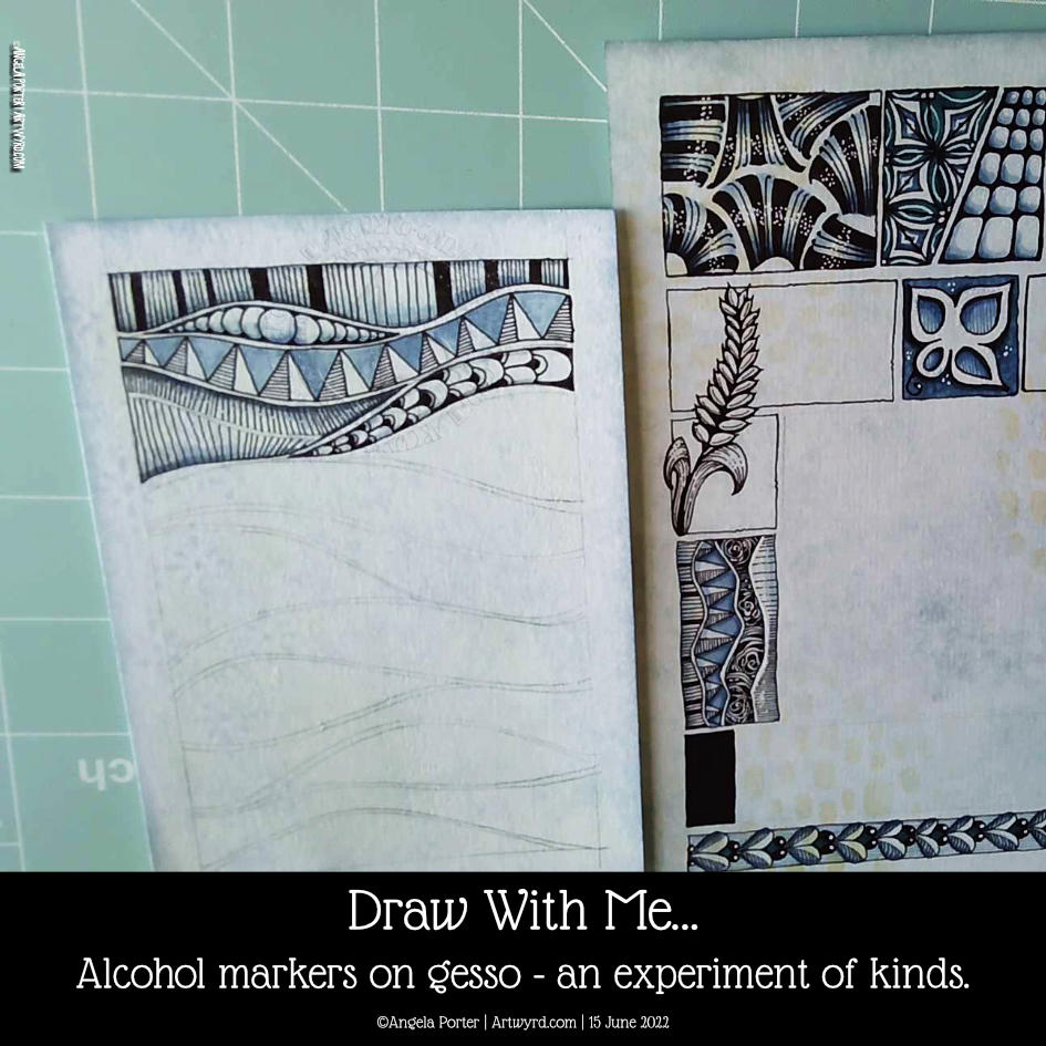
Early this morning, I added some alcohol markers to a pen drawing I’d finished. I’d drawn over a Distress Ink background with some old book pages collaged and gessoed onto it.
I know gesso coats a surface with a waterproof and slightly textured finish. I do know this. But that didn’t occur to me as I added alcohol markers to the drawing.
I was absolutely delighted with the interesting variations in the intensity of colour that resulted. Also, the application of alcohol marker also brought out the texture where the gesso was patchy, even a little bit. The paper soaked up so much more colour than the gesso – duh go me for not realising that first, but that’s not the important thing – it’s the effects that result!
It’s not all that easy to see on the image to the left. But, behind the triangular pattern, I used just one soft blue marker, but you can see the variation in intensity! Usually, it would be a very flat kind of colour. The darker areas are where there is no gesso.
This is something I really want to use as I go forward. I love the crazy, random variations in colour and texture that happen. It seems to me a way to bring a little unpredictability to the rather predictable results you get with marker pens.
I say ‘plants’ as they all have seeds inside them. They could, however, be critters of the sea urchin family, albeit a bit on the alien side!
I drew all five designs in today’s Draw With Me video on YouTube. I added colour to the first two on the video. But as YouTube was taking its own sweet time to upload and process the video, I decided to complete the group of designs.
There are a few favourite patterns that I tend use to add texture to my drawings these days – tangle patterns tipple, between, and diva dance. I do make use of other patterns involving lines and dots.
I think I went overboard with the tipple on the middle sea plant! Still, you learn by doing…hopefully eventually in my case!
Oh, I used alcohol markers to add colour and shadow. I chose yellow-green, yellow and yellow-orange colours today. Keeping to a limited colour palette really helps me work with colour in a way that is pleasing to me.
It was really enjoyable to do, as drawing always is.
I followed this up with work on my next colouring book. The style of drawing is different to what I’ve been doing of late, so the first template I’ve inked in and added colour to so I can see what it will look like coloured. Well, I’ve partly coloured it. Colour really does make all the difference. I do love black and white drawings/lettering. But for these stylised, whimsical, imagined kind of drawings, like my colouring templates, the colour is what really does bring them to life.
I felt the need to spend some time adding more pattern and texture to some of these abstract, stylised circular (ish) motifs. First, however, I added some colour to most of them. I used Ecoline Brush Pens which contain Ecoline watercolour ink. The colours are very intense and vibrant and so I use a water brush to add them to my drawings. I listened to Andy Serkis’ reading of Lord of the Rings while colouring before starting to video.
Water-based media do vex me somewhat. However, I’m beginning to see how the textures that can be achieved with them make interesting backgrounds behind the patterns/textures drawn in pen.
It was fun to experiment with dropping colours and/or water into the first layer of watercolour ink and watch them spread and mix. It’s a kind of magic and is totally mesmerising. The paper I’m using, Canson Imagine mixed media paper, isn’t the best for this, but it’s adequate. Time to dig out the watercolour paper again for sketchbook exercises like this I think.
It was a lovely way to spend a couple of hours this Saturday morning. I don’t know when I’ll add more pattern/texture with pens, or possibly metallic inks or paints with fine brushes, to the remaining motifs. What I do know is it will be both explorative and intriguing and mesmerising and magical, and I’ll work out my relationship with all these mediums a little bit more.
And, perhaps, have a better relationship with colour!
This is one of the important functions of sketchbooks. Yes, I often do complete, polished, finished drawings in them. But finally working out that I can also practice, experiment and ‘art’ just for enjoyment in them is a bit of a revelation. One that I’m enthusiastic to share!
It’s also lovely that, through the medium of YouTube, I can ‘teach’ and encourage others to do the same. Hopefully, I make things clear and simple. And increasing someone’s confidence, the willingness to give it a go and see what happens without judgement, just learning from the experience. Sometimes the lesson to be learned is that it’s a relaxing process, a break from the outer world that can bear down on us. Other times it is trying out media or colour schemes or just practising.
I’m sure I’ve not given a comprehensive list! One of the most important things is that, just like a diary, no one ever has to look inside your sketchbook, unless you choose to share.
Creativity is part of being human. Working out the ways to express that creativity, what expresses a part of the inner self, is part of who we are. Art is one way to do that, and the only person we need to compare ourselves to is ourselves! As we journey and try things out we find out who we are by discovering who we are not. And it’s a journey that never ceases!
Today felt like the right day to start jazzing up these simple circle motifs with some texture and pattern before adding colour.
I kept the methods of adding pattern/texture really simple – just lines and circles combined in different ways. It’s amazing how just small, simple patterns can make a difference to the motifs, making them look a lot more intricate than they are.
It’s sketchbook work, so this is a pretty messy page, but that’s fine. I’m learning that getting ideas down quickly as a reference/resource for future work is a good thing. And if they’re messy, then that’s fine! Even with the messy bits, the ideas are clearly seen.
Colour is still the thing that vexes me, and the sketchbook is where I can explore colours and, perhaps, find my confidence in them.