Thursday comes around quite quickly, and with it comes a new coloring page, or coloring template if you prefer, for the members of the Angela Porter’s Coloring Book Fans facebook group to bring to life with colour.
This week is a fabulous fungi fantasia. I really enjoyed drawing this one, and adding colour really brings it to life. I’ve chosen rather bright, almost psychedelic colours, as is often the case! So, I’m intrigued to see how others will use colour magic to bring the drawing to life.
The design was drawn with a Tombow Fudenosuke pen on marker paper. This version is coloured digitally in Clip Studio Paint.
Here’s the link to a timelapse video showing the drawing of this template.
Saturday is here again. So, over on my little corner of the YouTube universe, I do a flip-through of this week’s arty projects, and a bit of a chat about stuff at the same time.
Here, above, is my sketchbook page for Sketchtember 2021. For day 18, I’ve chosen to draw plants in pots, mostly cups, mugs, teapots and jugs it seems. They’re still plants in pots. They’re all drawn from my memory and/or imagination.
After completing the pen sketches, I added colour using Ecoline Brush Pens and a Water brush. I had to try to mix colours too, particularly varieties of green. I may have done OK with some of them. Others are abject disasters, such as the succulent style plant with red tips to it’s leaves. Ho hum.
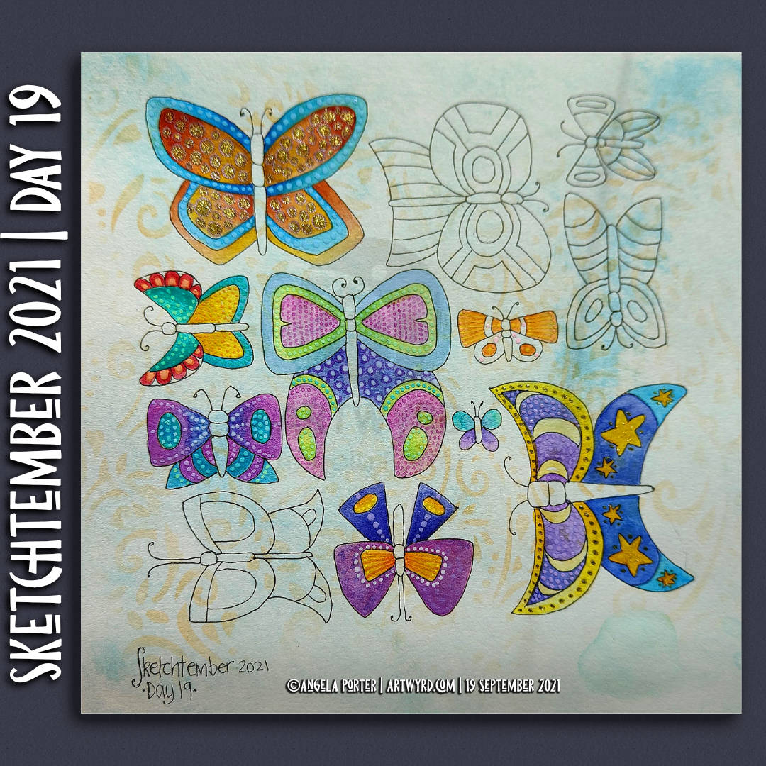
Everything is a bit wonky, but perhaps that is no bad thing at all. A lot of my artwork is a tad wonky, and that’s part of my signature style, probably.
I’ve also used a clear Glaze pen, a gold sparkle Signo gel pen and a clear Star Sakura Gelly roll pen to add shiny highlights. A white Sakura Soufflé pen added highlights to some of the areas too.
This, like yesterday’s buttons, has been a fun project. This time, though, I’ve completed adding colour, which has surprised me no end. I suspect that increasing familiarity with Ecoline watercolour inks and how I like to apply them has helped greatly with this.
Trying to work in a more ‘illustrative’ and a bit expressive way of adding colour is helping too. It’s a work in progress, but I may just get there!
Now, all I have to work out is what to do with the rest of Saturday!
I’ve had a few days of periods of intense anxiety/stress. The come down from each of these has left me exhausted and my mind unfocused. I’m much better now that all the appointments related to the anxiety are over, and all is well. I knew it would be, but my mind and emotions have other ideas about that at times!
Anyhoo, as I had a bit of focus yesterday afternoon/evening, I decided to draw a few buttons for Sketchtember Day 17. A few turned into a whole page full of pen drawings! And some really not good hand-lettering, ho hum.
So, I thought I’d spend some chilled out time this morning starting to add colour to some of the buttons.
Ecoline and an insight..
Ecoline Brush Pens were my medium of choice this morning. A lot of the details on the drawings were just a bit too small for marker pens to cope with. Also, I thought a change of medium could be good for me, and it was!
To start with, I scribbled some colour onto a palette and then picked it up with a damp brush and worked with it like watercolour. However, as the areas dried, the intensity of colour faded.
So, I decided to brave trying to directly add colour to the page and then spread it out with a damp brush. It worked! I suddenly realised that I have a much more illustrative way of adding colour, rather than realistic. It’s about time I accepted that and embraced it too!
A page full of different objects, rather than a single illustration, has helped me to realise this, as well as put it into practice.
Now, I just have to remember this insight, which isn’t as easy as you may think!
Perhaps I should write a list of Angela’s Artwork Insights to refer to before I do any work, as well as while I’m working.
Bright and cheerful!
The other thing I really loved was working with these really bright, vibrant colours. I’ve been using a lot of more muted and vintage colours of late, and I love them. But these bright colours were just what I need during a post-anxiety funk.
I’m still exhausted after a stressful couple of days organising routine appointments, then having the first yesterday. The rest of them are tomorrow afternoon.
As the stress hormones leach from my body, as I start to come down from the intense stress/anxiety I’ve experienced around the appointments, I’m left exhausted, with brain fog. Today, I’m not so brain foggy, but I am still really tired. I had a poor night’s sleep which didn’t help.
So, today is going to be a quiet one. I want to get this drawing finished, maybe my drawings for Sketchtember – Day 15 done too. But I’ll see. I think I need some more tea first!
It’s the last Wednesday in the month, so it’s the end of this month’s color palette challenge.
I chose to add colour to the first coloring page of the month for Angela Porter’s Coloring Book Fans facebook group. The colours are bright, cheerful and tropical. I always enjoy a limited palette, though I also mix colours to add some variation in colours, particularly the greens.
I spent the morning drawing this week’s template for the facebook group. If you’d like a sneak peek of some of it, have a look at today’s vlog.
It’s another Doodleworlds style template this week, simply because I needed some whimsy in my day today! Plenty of detail and variation in motifs, with some entangled arches too.
There is a time lapse video of the drawing – which took over two hours to complete.
The template will be available to members of the facebook group tomorrow.
This week it’s a cute, whimsical and silly Doodleworlds design. Oddly, there’s not a skull in sight! Still, it’s a lovely mood booster, and I need that at the moment.
There’s also a new color palette challenge for August in the group – bright, cheerful and tropical colours. I used the palette to partially add colour to the template.
The template was drawn on A4 Canson Imagine mixed media paper. I added the colour digitally using Clip Studio Paint.
I’m looking forward to seeing how the template is coloured by group members, even using a limited color palette. It’s always great to see how people approach the template differently.