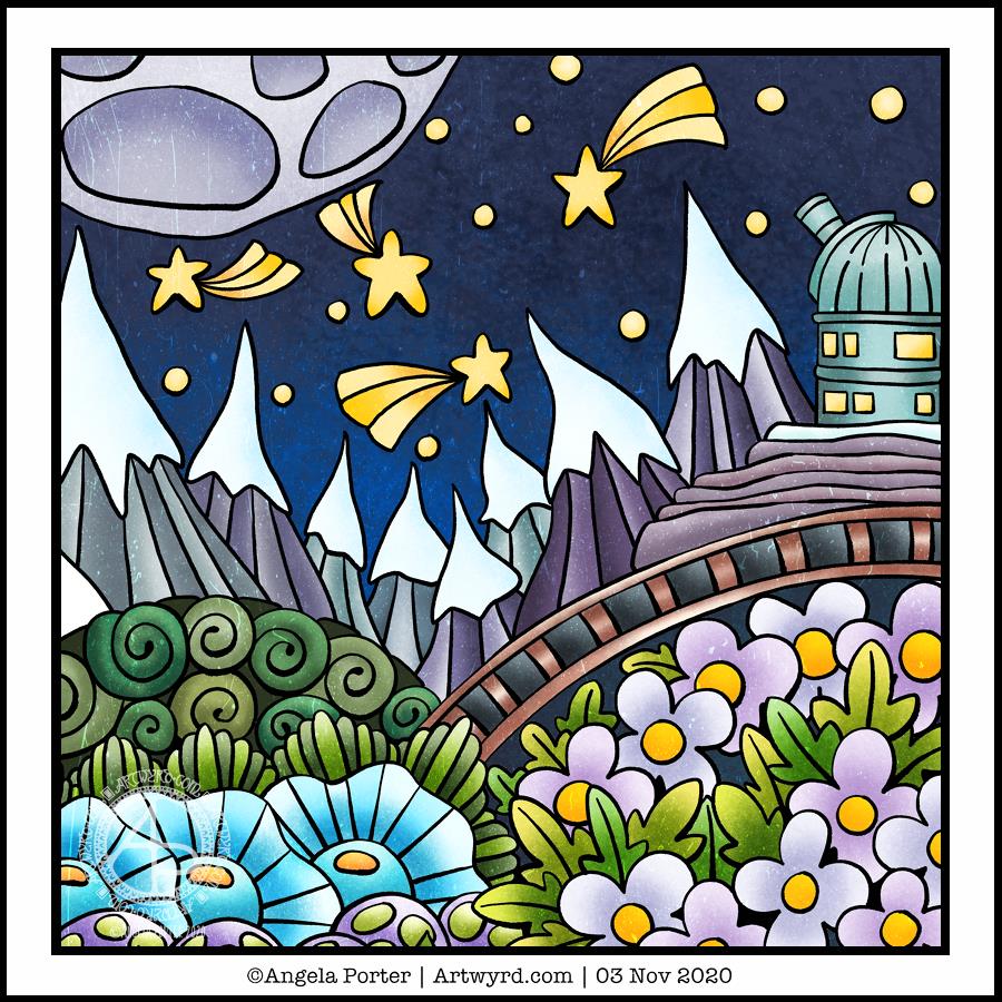
It’s Saturday. I woke early and got to work in one of my sketchbooks where I’m drawing thumbnails and design elements with a focus on things starry. I needed a break from that, so turned my attention to creating a mandala.
Pink seems to be a bit of a thing at the moment, today it being a dusky shade of pink.
Oddly, the mandala has a star-shaped motif in the centre. That was not a conscious decision!
Anyway, it’s been a nice way to spend an hour or two while listening to podcasts. But, after another mug of mocha, I’ll be going back to work in my sketchbook. Which is also pleasurable, but in a different kind of way. My drawings are definitely sketchy, but that’s the whole point! Just getting ideas down. A nice way to spend a lockdown day.
It’s funny how colours seem just right one day, and the next day I wonder what on earth I was thinking at the time.
Yesterday’s mandala, with it’s kind of yellow-brown background just doesn’t seem ‘right’ today.
I often mention about how I feel I really struggle with colour at times, but feel much better if I stick with simple color palettes, even monochrome ones, more or less.
So, this morning I wanted to draw a mandala, as is so often the case. They give me a chance to practice drawing digitally and using pattern and texture within them too.
The drawing was just fine and dandy, nearly always a pleasurable experience and I end up with a design I like well enough.
Then, there’s the coloured background. Today I wanted a soft pink colour. I like the colour I’ve chosen. Black lineart would look start on it, to my mind, but a soft, warm, cream was just perfect. It looks almost like lace.
And I can breathe a sigh of relief as my faith in my colour sense is restored somewhat. Monochrome is the way to go, unless it’s coloring templates. Though perhaps I should try a monochrome colour scheme for them, or at least analogous colours with a pop of complementary here and there. I’ll see what happens.
For the rest of my day, I’m going to be gathering sketches of ideas and elements for the coloring book I’m working on, and creating a mandala has got me somewhat in the right frame of mind to do this.
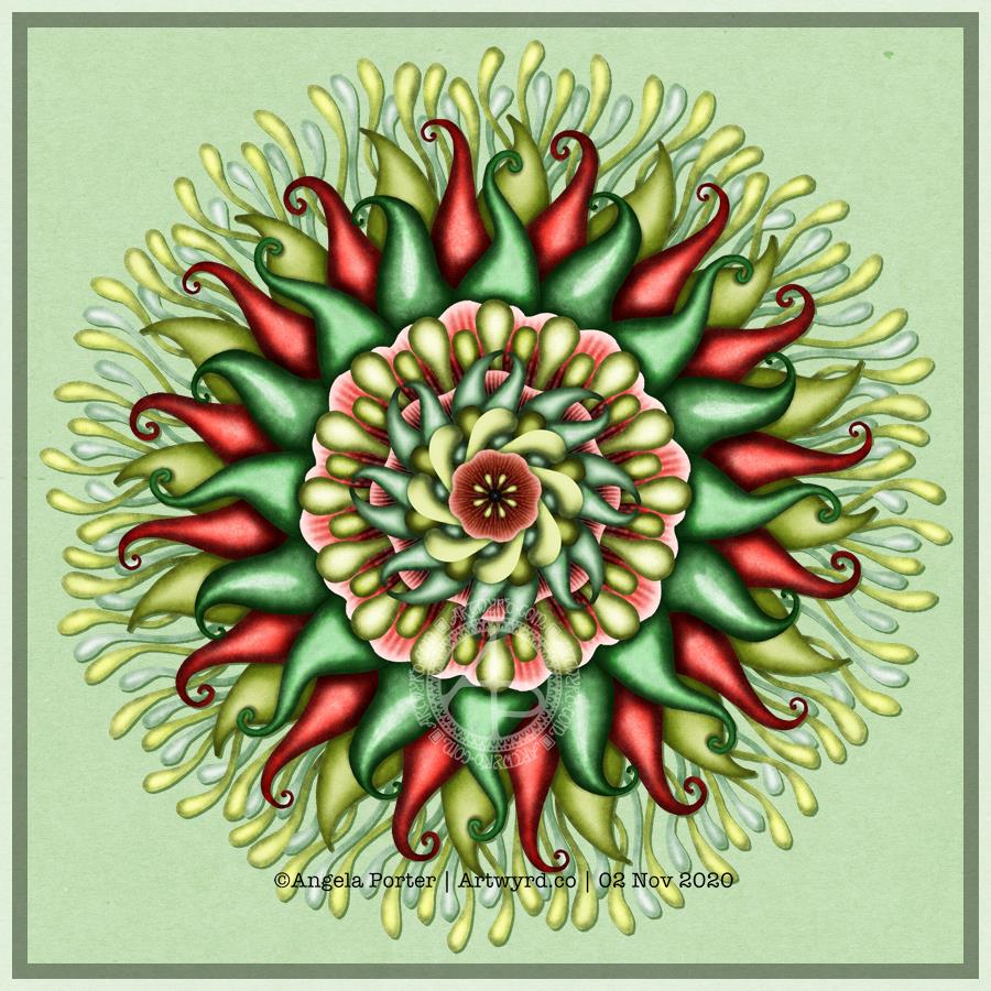
I was in the mood for a mandala this sunshiny morning in the Valleys of South Wales, so that’s what I created for this week’s coloring template for the Angela Porter’s Coloring Book Fans facebook group.
Some Mayan-style glyphs have been appearing in my sketchbook lately, and I felt I needed to incorporate them into a mandala design. So I did.
I also chose colours that reminded me of golden stone and primary coloured gems/paints/inks, including the golden-sand coloured kraft paper background. It has lovely warm, desert feel to it.
As usual, the uncoloured template is available to members of the facebook group. Membership is free, as are the pandemic templates, just some simple terms and conditions of use need to be adhered to.
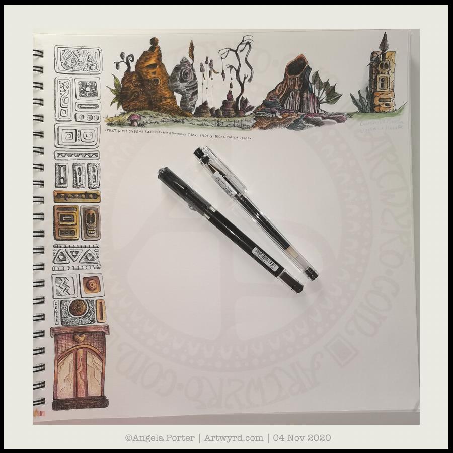
As it’s work in progress (WIP) Wednesday, I’m sharing my current sketchbook page. A sketchbook is always a work in progress.
At the moment, I’m being inspired by a couple of books : “Fantasy Genesis” by Chuck Lukacs “Fantasty World Building” by Mark A. Nelson
I’m using an Art Gecko sketchbook that is almost 12″ square along with Pilot Hi-Tec C and Pilot G-Tec Maica pens and Tombow Dual Brush Pens.
I’ve said it before – I’m not really into characters (unless they’re cute, whimsical, fun ‘doodle’ kinds of characters, usually non-humanoid). However, I’ve always loved to draw plants and patterns as well as designs from architecture, nature, machines and even animals (patterns, textures and such more than the animal itself).
My ‘Entangled’ drawings bring together these various elements to create more abstract or whimsical designs. But to put them together to create entirely new things isn’t something I’d ever thought of.
I’ve always admired fantasy and sci-fi artists, but never considered myself capable of anything like that. However, trying new stuff out is how you grow and develop as an artist.
Not that I’m going to become a fantasy artist, but maybe exploring these avenues will allow me to add new things to my art in ways I never expected. In much the same way my adventures in cardmaking, mixed-media journaling, watercolour and other such things have helped me to develop my digital art and drawing.
I’m also realising how important sketches are for my digital art – be it drawing or painting or just colouring in line-art of mine. I think it has to do with me being able to have a good overview of the whole design, something I seem to be unable to do when working digitally, even when I zoom out entirely. I’ve mentioned it before, but I do have a bit of a problem relating to size and scale even in everyday life.
There’s a different kind of sensory pleasure in working on paper – the tactile and sensory feedback is quite different to that gained from digital work. That’s not to say I don’t get pleasure from working digitally, it’s just different.
There’s also the fact that each page doesn’t have to be a complete or finished piece of work. It’s a place to try things out, explore, experiment, and just let the pen/pencil/brush take a walk across the paper to see what happens. Serious work and not so serious work all have a place in a sketchbook.
As do written notes, ideas, observations, sources of inspiration, lists, reflections and more.
This morning I woke and picked up the workload for the latest colouring book I’m working on. I completed drawing one template – first a sketch on paper, then inked digitally. After that, I thought it would be fun to colour a section in and share. So I’ve done so.
I’ll be quietly arting for the rest of the day. I had a broken night’s sleep back and forth to the toilet to either vomit or …well, I don’t need to detail that! My tummy feels better at the moment, but I’m tired.
Having quiet time is not a problem. I live alone. We’re on lockdown here in Wales, so staying home as much as possible is a requirement. I tend to stay home as much as possible anyway.
Anyway, I’ll be quietly researching references for the templates for the next book and creating my own reference sketches, as well as writing down ideas as they occur to me, and, hopefully, thumbnail sketches of ideas for templates, for as long as I can keep awake, anyway.
I have absolutely no idea what I was thinking as this mandala was created, nor why on Earth I chose these colours.
As it’s digital art, I could use digital tools to re-colour the image, but I’ve decided to leave it as is.
I know I wanted to do something that used similar techniques to the digital abstract paintings I’ve been exploring lately.
Similar. Perhaps. But definitely not the same kind of thing.
It’s like something out of a weird nightmare, or some bizarre, manufactured virus.
I think I can safely say my artistic mind is out of sorts today!
Fantasy Genesis
I think it may have had something to do with a book I briefly scanned yesterday. It’s called “Fantasy Genesis – A creative game for fantasy artists.” by Chuck Lukacs.
This is the introduction to the book:
Welcome fantasy geneticists! Here is a practice place of the imagination, a place where infinitely diverse forms and patterns will create concepts in infinite combinations, which you will bring to light with pencil and paper. One of the most important jobs we have as artists is to create inventive new ways of watching and documenting this beautifully diverse planet that allows us to live on it. We’re expected to see the world—from our cultures, habitats and technologies to the vast diversity of wildlife and plant life to the pores in our skin—in a slightly different light. Like scientists, we’re expected to experiment with new ways of expression, new sounds, new interpretations of old ideas, new solutions to old problems and new inspirations for images and change.
Fantasy Genesis – Chuck Lukacs
It caught my attention. As did the use of dice and tables for combinations of features appealed to me.
Not that I’m a fantasy artist. But it has sections to do with plants and landscapes and machinery and buildings. Things I am interested in. Creatures and characters not so much. I admire people who can draw such things, and create amazing artworks. However they really don’t have much interest for me artistically, apart from pattern, shape and texture.
I thought it may be a way for me to extend my drawing and imagination, as well as making more use of a sketchbook. I also thought that once I get my head around this kind of thing, I could create my own lists, incorporating patterns and favourite kinds of motifs to use too. I’ll see about that.
I know that my signature style of art is ‘entangled’ with some cute and whimsical elements from time to time and mandalas. I like working with abstract patterns and colours too. But exploring other genres, ideas, styles can only develop and add to my artistic skills and visual vocabulary. Even if I discover that some things are not for me, they will lead me down artistic avenues I may never have traversed.
So, one of my tasks today is to take time to properly read this book and work out how I can make the ‘game’ work for me!
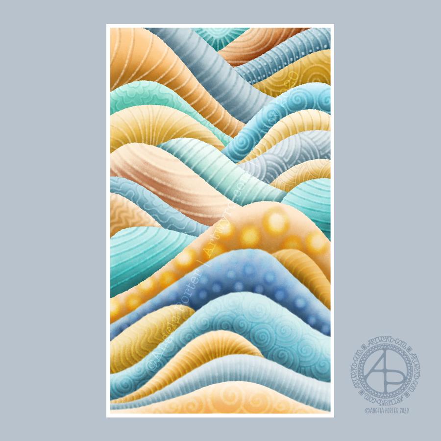
This was a lovely way to spend the first three hours or so of Sunday morning. Abstract digital painting. Chilled out music playing on Spotify. A slow sunrise behind the grey, rain-dropping clouds.
Again, the pattern was inspired by rocks and geology. Some of the patterns I’ve added remind me of rocks and shells, others are a bit too geometric.
It’s always nice to play around with pattern, texture and colour. And when I limit my palette to just a couple of colour families I get much better results. Today, I used the B and YR Copic colour families from the Copic palette included with Autodesk Sketchbook Pro.
While not reminiscent of rocks, the colours remind me of sea and sand. This year, I’ve not been able to get to the coast, other than once way back in February. The colour choice is a subconscious desire for the sea and shore, a liminal place, a boundary between one element and another.
The coast is a place where I feel my whole body exhale and relax. Sadly, it’s not possible to visit at this time, maybe not for a long while. However, the pandemic won’t last forever and the coastline will still be there.
Anyways, creating this artwork was a lovely way of spending some time on a Sunday morning. I can see where I’ve been clumsy with the patterns, making the layers look flatter than I wanted them to.
My favourite day of the year in my favourite season. I shall be observing it in my own way later on.
However you celebrate this day, as usual or changed as a result of the pandemic, have fun, be safe and be well and may your ancestors watch safely over you all.
It was an All Hallows’ Eve tradition in the UK to lay out places at the dinner table for those who had passed away during the previous 12 months as their one last meal before they finally go to the world of spirit, heaven, or whatever else you may call it. It was this night as it was believed that the veil ‘twixt the living and the dead was at its thinnest and loved ones could return to spend time here on Earth with their families.
This year, sadly, too many have done so as a result Covid-19, which has swept around the world taking far too many needlessly. While we no longer lay places for those who have passed, we can take time to honour their memory, their presence in our lives, how important they were and continue to be to us.
I actually finished colouring in one of my templates for this day. It has turned out both dark and colourful, and cutely spooky. While colouring today, I have been listening to a Hallowe’en playlist on Spotify.
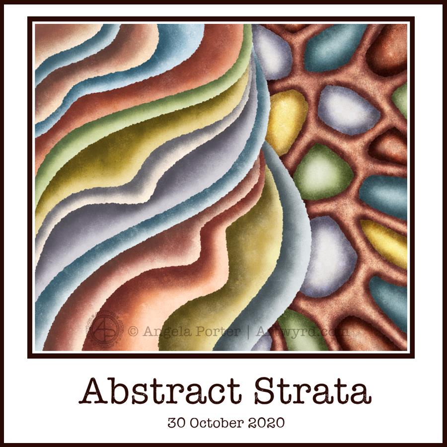
This morning’s warm-up art is another abstract digital painting inspired by patterns in rocks and strata.
It’s a very soothing process for me to create art like this, even though it lacks the intricacy and detail of my more usual ‘entangled’ style. Simplifying and stylisation is a feature of my entangled art; this artwork takes those processes a few steps further along.
I started the day sketching some simplified patterns taken from geology in general. I scanned them in and chose one to turn into a painting.
Layer by layer, I added colour and texture, choosing earthy colours. I paid attention to shadow and highlight making sure that there’s an illusion of dimesion in the painting.
I’m still experimenting with this style of digital painting. In this one, I think I’ve chosen one or two colours too many, and a couple of them are a bit brighter than the others which makes them stand out more.
I also need to work with different color palettes, limiting the colours to produce a cohesive design.
The ragged edges created by the brush texture I used make the layers look a bit like torn paper. However, I would like to try a smoother edge in future experiments.
It’s been a nice way to spend three or so hours this morning. It’s now time for me to breakfast!
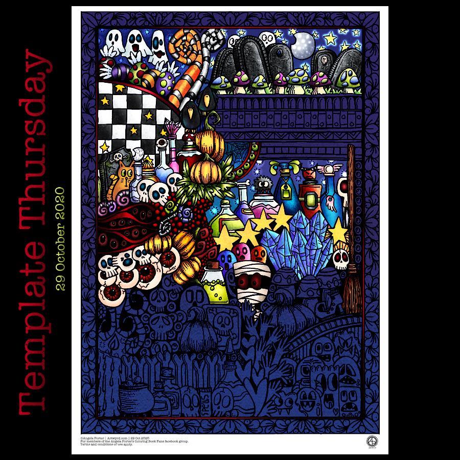
I always have a lot of fun with Hallowe’en themed designs, and this one is no exception. Lots of skulls, potion bottles, eyeballs, ghosts, monsters, pumpkins, toadstools, gravestones, and more!
It’s taken me several hours to colour in just a portion of the design. I’m going to try to finish this one off in time for Hallowe’en.
Drawn with pen on paper, digitally coloured.
The template is available for members of the Angela Porter’s Coloring Book Fans facebook group – free to join, and free to download. Terms and conditions for use apply.