New Watercolours, & arty lessons learned

New Watercolours

Late yesterday evening, my new set of watercolours arrived. I’m now the proud owner of a set of 36 tubes of Mijello Mission Gold Class watercolour paints, and a pretty neat palette too.

It was too late last night for me to think about adding the paints to the palette and setting up some colour swatches,. So I set to that this morning with a big mug of tea and a headache.

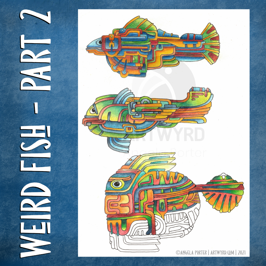
I used them to continue adding colour to this drawing, and I can easily tell the difference between the Mission Gold and Cotman Watercolours, not just because I know where I added each colour, but from the intensity and vibrance of the colours.

I know I got more vibrance from the Cotman colours when I was adding colour to this by adding water to the pans and letting them sit for a while to soften the pigments. But, it was so much easier with the Mission Gold to do this. Indeed, I had to be careful that I didn’t use colour that was too intense!

Some insight into watercolour and me

It was, and will continue to be, an absolute joy and pleasure to use watercolour paint tubes. I’m so glad I splurged out on them after I had a memory of using tube watercolours years and years ago.

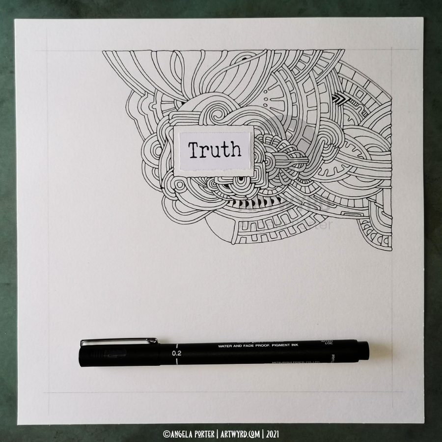
They were such a pleasure to use, both to create the swatches and in adding colour to this drawing. Bear in mind that this drawing wasn’t done on watercolour paper, but on creamy coloured Arteza mixed media paper! Also, I created the swatches on SeaWhite all media cartridge paper, which is a lovely bright white colour.

Now, I realise that a lot of my frustration with pan watercolours is with getting colours intense enough for my taste. That won’t be a problem with the Mission Gold set I’m sure.

I also feel that exploring and learning more about watercolour and colour mixing is something that I’d like to do now, and that I may not be quite so frustrated as I have in the past.

Coloring Template doubts and frustrations

Yesterday, I got a couple more templates drawn and edited, so I now have ten out of the thirty-one I need completed, editorial team’s feedback allowing that is.

However, I was really doubting whether what I’d done would work, was good enough. So, I thought I’d try colouring the template I was least happy with to see if that made a difference to how I viewed it, and hopefully the others.

That really did the trick! Just by adding a background colour/texture first, I started to feel better about it. Once I’d added colour and the line-art started to come to life, I started to feel even more confident.

This is something I need to remember going forward, when I doubt my ability to create colouring templates. All I need to do is see if they work with colour!

A bonus was that I really enjoyed adding colour.

Vlogging along …

I touch on all these things in today’s vlog, as well as showing the swatches and adding colour to the drawing.

I’ve also decided that I’m going to mostly keep my vlogs to no more than around 20 minutes, whether that’s real time or a time lapse version. I think they may work the best, though I may still record longer ones if there’s a need to do so.

Entangled Frame | Part 2

My morning warm up drawing was to do some more work on the entangled, abstract frame I started yesterday.

With fresh eyes, I could see I wanted to make the width of the design more consistent around the frame. So, my first job was to do a little bit more pen drawing.

Then, I could carry on with adding colour with Inktense pencils, the same colour palette as I used yesterday.

As is becoming my daily…habit? practice?…I also filmed the process and chattered away as I did so. And my chattering, rather, my thinking out loud actually helped me make some connections between my experiences of art from childhood through to the present day. And that helped me understand my perceived problems with using colour in drawings from real life.

I will need to spend some time with these memories and insights and journal later on. I can then work with them to help, hopefully, to overcome some blocks and difficulties in how I feel about my artistic expression. And then, hopefully I can become accepting of and comfortable with the way that I work.

I’ve been following a few courses on Domestika, and one of the common themes in the introduction by each artist is what has influenced them. Many go back to their childhood passions and how they have influenced their artistic voices.

That, I have discovered today, is so true!

Perhaps I’ll condense my words from today’s video at some point, once I’ve processed them myself. However, if you’d like to hear my thinking out loud while drawing/colouring today, then here’s the link to the video.

Weird Fish – Part 2

I’ve spent some time drawing a third weird fish and intensifying colour on the two original ones.

For the top fish, I used Derwent Colorsoft pencils to increase the colour. The watercolour underneath does add to the colour in a subtle way.

I used Derwent Inktense pencils and a damp brush to add colour to the central fish.

Finally, I’ve been adding colour to the bottom fish with Inktense pencils too.

As pretty as the watercolours were, they were a tad too subtle for my liking with not enough contrast. So, I used them as the underpainting and then added layers of more intense colour over them. It seemed to work out just fine and well.

I’ve kept the color palettes pretty similar for each of the fish.

Also, I’ve re-drawn them digitally as vectors and I’ve just started colouring one of them.

No matter how I add colour – digitally or using traditional media – it takes me a long time. I fuss around until I get things looking as I like.

This is very much a fun project, and I have no idea where it will lead, if anywhere. The important thing, however, is that I’m enjoying working with traditional media and I’m doing something a bit different too that I can learn from.

Here’s the video of today’s art. I’d appreciate it if you open it in youtube as then your views get counted.

Weird Fish?

Weird indeed are my drawings today. I had a delivery of some ultra smooth botanical watercolour paper yesterday, and so I had to try drawing on it! Yup, it’s nice to draw on. Then, trying out some watercolouring.

Instead of doing rather wet washes, I used the watercolour in a much more controlled manner, adding layers to get some shadow and highlight going. I’m either going to intensify those shadows and highlights with coloured pencils or digitally. But not now. I woke with a stinking headache and I’m just about at the end of my ability to focus enough to function. I’d like to go out for a walk to try to clear my head, but I’m not sure I’m safe to be let out to walk on the pavement let alone drive! This may need some serious sleep to clear. Ho hum.

The colours look different in ‘real life’ – the reds and oranges are more browny, and the yellows are more greenish. My problem in scanning the images in!

I did film my morning art for today’s vlog:

Template Thursday!

It’s Thursday, so that means a new coloring template for the members of the Angela Porter’s Coloring Book Fans facebook group.

This week it’s a typically ‘Angela’ entangled, abstract design. I’ve chosen to use a color palette of bright and cheerful rainbow colours, and that is the colour palette for this month’s challenge too.

If you’d like to print the template and add colour, all you need to do is head over to the Angela Porter’s Coloring Book Fans facebook group and become a member! It’s free 🙂

I’ve also made a timelapse video showing colour being added to the template. I condensed 2 hours of work into around 24 minutes I think it was. As I write this, the video is still uploading to YouTube, but when it’s done you can find it by clicking this link!

Monday Mandala WIP

I’ve had a busy day so far. First, I got a few sketches done for the next colouring book for Creative Haven. Then, after showering etc, I went out to do a little food shopping. The sun was way too bright for me and my sensitive skin, even with sunblock on! Next, after a mug of tea and some lunch, I turned my mind to creating a mandala and adding some colour.

Sorting out the colours I’d like to use for this design was a bit of a trial. But, I’m quite happy with the succulent kind of palette at the moment.

No YouTube video today. My morning warm up art was drawing for the book, and I don’t show my templates in advance, usually, though I may show a sketch here and there to whet the appetite, maybe.

An Entangled Drawing

I woke late today after a late night chatting to my friend, the lovely Brett who runs the Angela Porter’s Coloring Book Fans facebook group.

So, after breakfast and time to come around, I decided to have a bit of muck about with Affinity Designer – a vector graphics program that’s an alternative to Adobe Illustrator. I wanted to see how text can be added to a line or shape. It wasn’t that difficult, once I’d looked at the instructions. It’s harder to get it looking nice and well done. I used a quote from Terry Pratchett, and though it’s not exactly elegant or even well done, I thought I’d use it as the basis for adding some patterns around.

Today, I decided to use a Tombow Fudenosuke pen and to make patterns with lines of varying width. Right at the end of my drawing (and recording) session, I realised I could have ‘ink’ flow from some of the letters to break up the white edge of the quote.

This really was just me trying out the text thing and playing with line and pattern. And chatting.

If you’d like to see the YouTube video just click on this link!

Truth – Part 2

This morning, I finished drawing “Truth”, the beginning of which I showed yesterday both on my blog and as a timelapse video on YouTube.

Today, however, I wanted to just listen to an audiobook as I drew, so there is no chatty or voice over, just music with today’s time lapse video of Truth – Part 2.

It was lovely to lose myself in drawing, and I do mean lose myself. I just let the shapes and lines flow, without too much thought.

Over the past several weeks, I think, I’ve forgotten all about weight of line in my drawings. I’d forgotten about the interest it can add to the overall design, and how it can bring about more structure too. So, I particularly enjoyed adding weight to some lines today.

This drawing is scanned in, ready to be coloured at some point in time. I have a lot of drawings to add colour to!

Truth – Part 1

“A lie can run around the world before the truth can get its boots on.” – Terry Pratchett
There are three truths. There’s your truth. Then there’s my truth. And then there is THE truth.

Today’s morning drawing is the start of this rather abstract design around “truth”. The paper is 20cm x 20cm (approx 8″ x 8″).

There is a time lapse with voice over vlog available – click here.

I’m feeling fine today, so no side effects of the second dose of the covid vaccine, yet. It’s been barely 24 hours so I’ll be cautious about side effects for a while yet I think.

Template Thursday

It’s that time of the week again – a new coloring template for the members of the Angela Porter’s Coloring Book Fans facebook group.

This week, I’ve created a mandala and, as is my want, I’ve added some colour to the template to help bring it partly to life.

Early in June, it’s Brett’s birthday. Brett is the owner of the group and she looks after it fantastically. So, it’s always nice for the group to celebrate her birthday by sharing templates coloured in her favourite colours – PINK, purple, turquoise and teal. So, the group members have been asked to do this (as well as told when her birthday is).

I drew the template yesterday after having a nap in the afternoon. I’m still incredibly tired and my digestive system is a tad sensitive still to say the least, but I do feel better in myself emotionally.

There is a timelapse on YouTube of me adding the colour. I’ve sped it up so it’s about 15 mins long. I also did a voice over, so hopefully that works!.