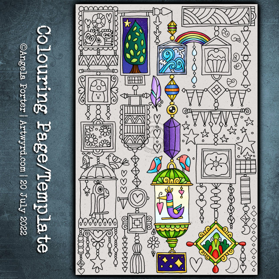
I was in a bit of a whimsical mood this morning, so spending some time visiting Doodleworlds was just perfect. I also got a tad lost in adding colour to this template.
These are a lot of fun to draw, and to colour. Because of their cute, whimsical and imaginary nature, any colours go! These are drawings I find easy to add colour to; it seems the brighter, more vibrant and varied the colours are the better! Unline a lot of my other art,w which can become confused and incoherent looking.
So, I lost myself in adding colour to this drawing, even though I’ve not totally coloured it in.
This week’s colouring page (colouring template) is a fun one. From time to time, I like to create a page like this – full of whimsy and cuteness and doodles and tangle patterns.
It’s perfect for trying out new colour combinations, new mediums, or new techniques as each image is self-contained yet part of the whole.
Also, it’s perfect if you only have a little time and struggle with leaving something partly finished. There are so many elements here that can be completed quite quickly.
This was just some fun! I had no idea where the drawings would lead … but drunken party skulls, mushrooms and tentacles seem to be the theme of the day! It’s nowhere near finished yet, but something fun for me to do later today, after I run an errand.
There is a video of me drawing this as far as it’s gone.
Today, I’m experiencing some emotional ‘weather’. I know what the trigger for this is. I know what to do. And I also know that being creative will help me greatly. So, I decided to start to add colour to this bird drawing.
This may not be the best time for me to tackle colour. I feel I struggle with colour at the best of times. Still, I worked with a limited colour palette of blues and turquoises, as well as yellow, orange and red.
The Distress Ink on the paper reactivates with water, so there is some ‘greening’ of the blues. I’m fine with that. The mixing of colours will lead to a bit more harmonious outcome, I trust.
Oh, I’m using Karin Brushmarker Pro pens to add colour. They have watercolour ink in them, so I’m scribbling them onto a white plastic palette and using them from there. This way, I have a bit more control of the intensity of colour and how they blend and mix.
So far, so … OK I think.
I now need to work out how to tackle the body of the bird. Do I use masking fluid to cover the dots before or after painting the body? Should I use something like a gel medium to seal the dots once I’ve coloured them in before tackling the body? Or what about a clear glaze pen, even though the dots will be slightly raised and shiny?
I don’t have any masking fluid, but I’m not sure what I want to do. So it’s time to sit and let the possibilities be worked through in my subconscious to come up with a decision.
One thing’s for sure, however. I will not be starting work on the flowers and leaves until the bird is finished! And I will need to be careful about the colours I choose. That’s where it can all go totally wrong.
For the rest of the day, I’m going to lose myself in some hand-lettering practice in my hand-lettering sketchbook. There’s a lot swirling around in my emotions, my mind and my subconscious.
Please click on the button “Watch on YouTube”. Cheers!
I had a really, really cruddy, broken night’s sleep. So, doing art that doesn’t have a bit more than good enough was in order.
Getting the pen drawing done for this cute bird I started a couple of days back was just the thing!
It’s always interesting to look at my art, whether finished or, like this one, a work in progress after a day or so’s break from it. With fresh eyes there’s a different perspective. With this drawing, I needed to alter the design and size to get it to work. Not sure I’ve got it right, but it’s better than it would’ve been if I’d carried on as I originally planned.
The next decision to make, and the trickiest, is whether to just add shadow and highlight or whether to go with colour. The next tricky decision is what media to use to this.
I’m so aware that my colour choices can be … quite dire. And so I am tempted to add colour digitally initially. Maybe. Perhaps.
A little break from it will be in order before I make that decision.
I’ve been busy inking in colouring pages (or templates if you prefer) for my next book – “Fanciful Birds” in the Creative Haven series. But at lunchtime, I took a break to do some drawing. And I drew another bird!
Actually, I started to plan out and draw an A5-ish-sized pen drawing that includes a bird, flowers and so on, all done in a whimsical, fanciful style.
In the video, I explain my thinking process as I lay out the basic design in pencil. And I do it all one step at a time, including the inking in the section I’ve already done.
Of course, the drawing isn’t finished… yet. This is but part 1 of a series. And given I have to focus on the inking in of templates, my videos may be more sporadic than usual, as will my social media posts. So please bear with me!
I seriously need some more tea and probably something to eat; it’s just about tea-time here as I type!
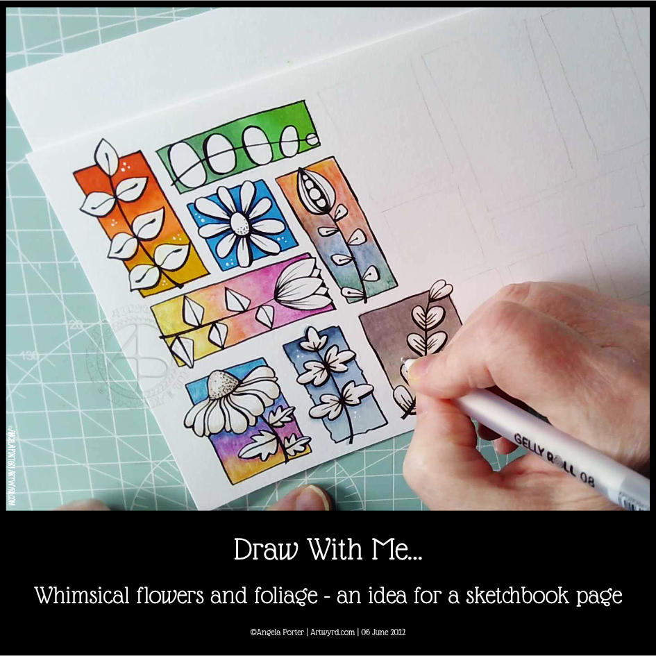
If you’d like to see how I created this partial page for my sketchbook, take a look at this video.
I spent an hour or so doing some warm-up drawing before turning my attention to inking in some colouring pages for “Fanciful Birds”, my next colouring book in the Creative Haven series.
Whimsy is always a welcome thing, flowers and foliage in particular. I also wanted to work with colourful backgrounds for each motif.
I really wasn’t fully awake and didn’t think through the type of paper I was using. I knew I wanted to use alcohol markers to add colour gradients to the background. Did it occur to me to use marker paper? Nope! Of course not! So they bled a tad – the Ohuhu brush markers I used for some of the backgrounds are rather juicy, too juicy for the paper. I liked the backgrounds, however, and knew I could fix the bleeds with a white gel pen.
So, I thought I’d switch to Inktense pencils and a damp brush. Not quite sure that they sit well next to the alcohol marker backgrounds. There’s lots of textureand an unevenness in the colour and gradient. Again, partly down to my choice of paper (all media paper from SeaWhite of Brighton).
So, for the last couple of images, I used some Arteza EverBlend markers for the blue and warm brown backgrounds. The bullet tips let less ink flow onto the paper, minimising the bleed. There was still some bleeding, which I made worse by trying to ‘erase’ it with a colourless blender pen.
I made use of the magic of a white gel pen to cover up these bleeds.
I definitely need to write some reflections for myself to add to this page when it gets put in my sketchbook. For now, I’ll just say that I like the last two I completed the most. Those are the blue and brown backgrounds on the bottom row. I do like the other alcohol marker backgrounds too, but there’s something about the more neutral backgrounds. I just can’t put my finger on what it is.
Right then, time to finish my mug of tea and get some more inking of colouring templates in!
Please click on the “Watch on YouTube” button – Cheers!
My page of whimsical houses is now done. Well, the drawing is at least! I think I’d be happy to live in any one of them, except perhaps the one that has a loooooooong ladder to climb up to. Need to have that changed to an elevator!
It’s always a happy and joyful time to draw houses of whimsy. In fact anything whimsical. It always makes me smile.
I’ve started adding colour to this drawing with Inktense pencils and a damp brush. I have a plan as to how I’m going to add colour – I talk about that in my video. All I have to do is remember what that plan is! Having said that, this is a sketchbook drawing so whether it gets finished or not is another matter. Colouring is not my favourite thing to do, nor an activity I feel I do well. Still, leave a comment if you’d like to see it finished!
In the video, I show, step by step how to draw the last couple of houses. Draw along with me! Follow my steps or change, adapt, or invent as you fancy. I’d love to see what you come up with, so tag me on social media.