A colourful bunch

IMG_0579

This is just finished, though the 3D Crystal Lacquer on the flower centres hasn’t dried yet, so they’re a tad on the cloudy side.

I’m really pleased with this.  Not least of which for bravely, possibly even crazily, using some of my entangled, abstract art to make the flowers!

So, how did I do this?

Firstly, I made the background.  I used a piece of cream paper that has a texture on it that is designed for use with pastels, charcoal and coloured pencils, and I added colour using Distress Oxide inks.  I then sprayed it with a solution of gold Perfect Pearls which gave water spots and gold shimmers to the background.

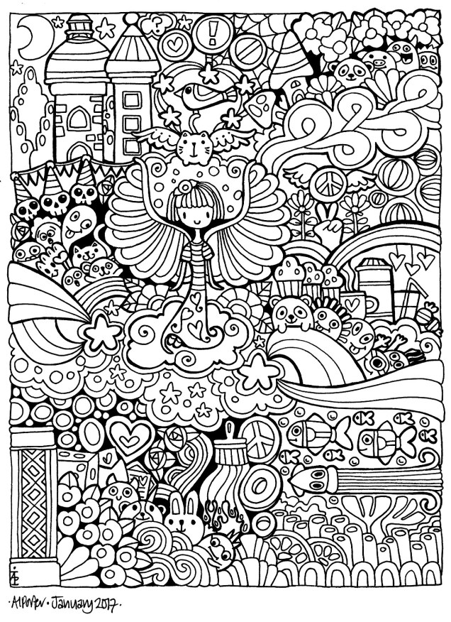
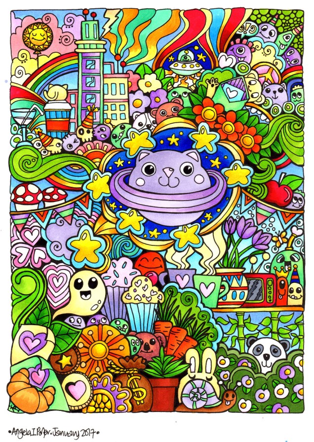
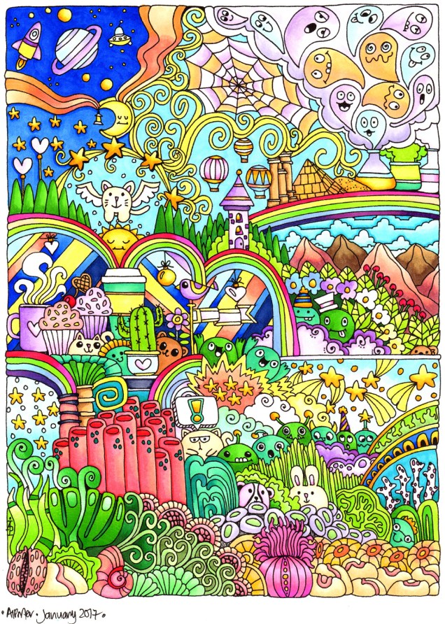
Next, I’d had this crazy idea to use some of my art to create the flowers.  I chose some art that had colours that would stand out against the background and each other and I used circle punches to cut out circles of varying sizes.  I used a mini ink blending tool and sponge to add jet black Archival Ink to the edges of the circles to distress them as well as to give them a definite edge against each other.

The circles were stuck together in groups of three and then stuck onto the background in a pleasing arrangement, as if they were flowers in a bunch.

Next, came the outlining with a black Sharpie, as well as adding patterns to the circles to create petals and so on.  The white was added using a Sakura Glaze pen.  I also added gold patterns and highlights using a UniBall Signo pen.

The next step was to draw the stems and leaves, which was done with the Sharpie pen.  I used a waterbrush with paint from some of Derwent’s line painter pens.

Next, I intensified and added shadows under and around the flowers, stems and leaves using Inktense pencils and a waterbrush.

This was followed by the creation of the border using a black Posca pen.

Finally, the mixed media panel was adhered to a black background and the gold pen was used to add lines around the panel.  Oh, and then I decided to add 3D Crystal Lacquer to the flower centres.  An accidental drop of the lacquer on the background led to me adding more drops.

I’ve really surprised myself with this project.  I really enjoyed it, and even though I was wondering what on Earth I was thinking in ‘destroying’ some artwork I liked, I came to realise it was repurposing the artwork to create something new, different and allowing me to explore the world of mixed media more, particularly how it relates to myself.


Six small tiles

angela-porter20170224_0003

I’ve completed the six tiles I cut from a single piece of mixed-media paper that I had coloured using Distress Oxide inks.

Next, I used Faber-Castell Pitt artist pens to draw the designs and add the patterns on each tile.

To add depth to the designs, I used Inktense pencils and Faber-Castell’s Albrecht Durer Watercolour pencils with a water brush.

Finally, I used either iridescent/metallic watercolour paints or a metallic gel pen to add some shimmering, shining details to each.

I really enjoyed doing these; again, they’re a little different to a lot of the work I’ve done for colouring books, so it’s nice to explore different ways of creating.

The thicker black lines I’m using at this time mean my art reminds me a little of stained glass and also of lino cuts.  I do like the very bold lines; it almost seems like I’m making a statement.

February’s First Doodle

This is a work in progress.  The line art is done and I’m starting to colour it in. I’ve used Chameleon pens so far, though as I progress I may use Copics or Promarkers to fill in some areas.

angela-porter20170201_001small

Today’s doodle

Me and people … it’s kind of a ‘meh’ thing.  I try … and it’s never right.  All the same, here’s today’s doodle, with a kind of fairy/angel person in the middle…

angela-porter20170130_018small

Top 20 Doodle Artist Sites and a coloured Doodlededoo

I had a big surprise earlier today when a facebook tag led me to a list of the top 20 doodle blogs/sites, and I appear on it at number 14!  I’m honoured to be listed alongside such great artists as are in the list.

Here’s the link to the list: http://blog.feedspot.com/doodle_blogs/

I also have used my trusty Copics to colour in one of the doodlededoos shown in the last post.  I think I’m getting a bit bolder in my colour choices. I’m also choosing to use a flat colour in background elements; on marker paper, the ink blends smoothly and seamlessly so large areas can be coloured in without any streakiness.

angela-porter20170130_017

Doodledoos from 29 Jan 2017

I drew two doodledoos yesterday; no colouring though.

Yesterday’s doodleedoo all coloured

I had a moment of ‘genius’ and printed out the drawing on Winsor and Newton Marker paper.  I checked my printer could take such light-weight paper, and it could, and am I glad it can!

Marker paper makes it so much easier to blend alcohol markers, such as Copic, and it’s very white colour means the marker colours remain luminous.

angela-porter20170128_014

Today’s doodlededoo!

A little bit different, just a little, but fun all the same!  I’m really going to have to print and colour this one I think!

angela-porter20170127_013small

Coloured doodle-de-doo

Between a couple of ‘meh’ days, busy days with appointments, I’ve managed to colour this particular illustration of mine.

angela-porter20170127_012

I coloured this one using copics, and the scan has washed some colours out.

Today’s doodle

I’ve had a couple of days busy with other matters and not much time to spend on drawing.  Today, however, I’ve taken the time to relax with pen and paper.  I’m feeling a bit out of sorts today.  I think that’s reflected in the drawing.

angela-porter20170125_011small