Rainbow Mandala – another

Rainbow Mandala01-Angela Porter

Late last night I spent some time playing with mandalas where the background is completely black and the design is in colour.  I came up with a few where the design was the same, but the colours were different.

This morning, I felt I wanted to try a bigger, more complex mandala, and this is what resulted.

I love the way the colours seem to glow against the black, there’s something almost magical about it.

Of course, I now want to play with different colour combinations, particularly complementary colours.

It’s fun!

Etsy Listings for Colouring Pages


In the last day, I’ve uploaded three more colouring sheets to my Etsy shop – Artwyrd.

For each, there’s either a fully coloured, or partly coloured, version of the line art to see.  Yes, I’ve been using them to practice colouring in digitally.

I’ve also started work today on a new book for Dover, the theme for it being eerie.

Dragonfly Mandala – available on Etsy

AngelaPorter_DragonflyMandala_29June2017

I’ve started getting my head together around colouring templates for sale on my Etsy shop, Artwyrd, and this is my first design – Dragonfly Mandala.

It’s offered as a high resolution pdf file for instant download.

As always, I love to see how people colour my designs in, and hope that people will share their finished works with me via social media!


Digital art musings


AngelaPorter_ColouredMandala2_26June2017

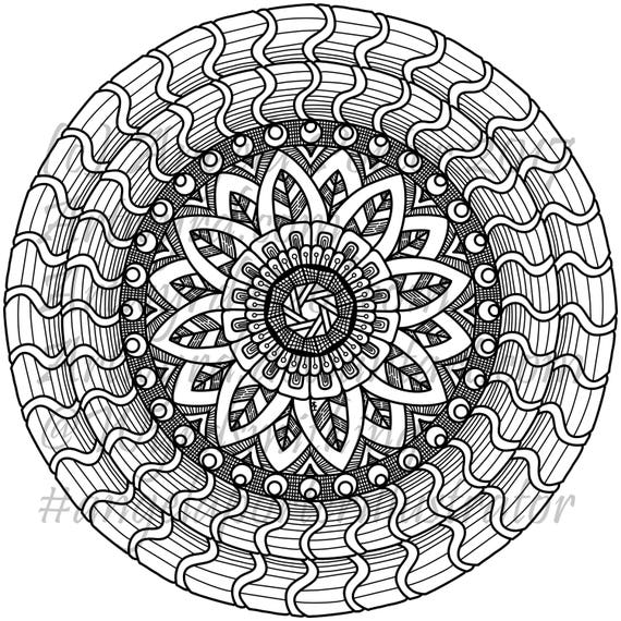
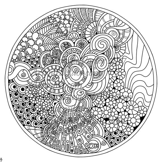
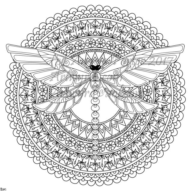
As you know, I’ve been spending quite a lot of time developing a good relationship with both my Microsoft Surface Book and Autodesk Sketchbook Pro.

I’m fairly happy with drawing on the surface, though I’ve yet to get the texture of the ‘pen’ I use to be a little less perfect and a bit more ‘human’.  There’s also the issue of not quite getting how big patterns will be when printed out, and then finding out that a powerful magnifying glass along with microscopically fine pointed pens/pencils will be needed to colour the patterns if not done digitally.

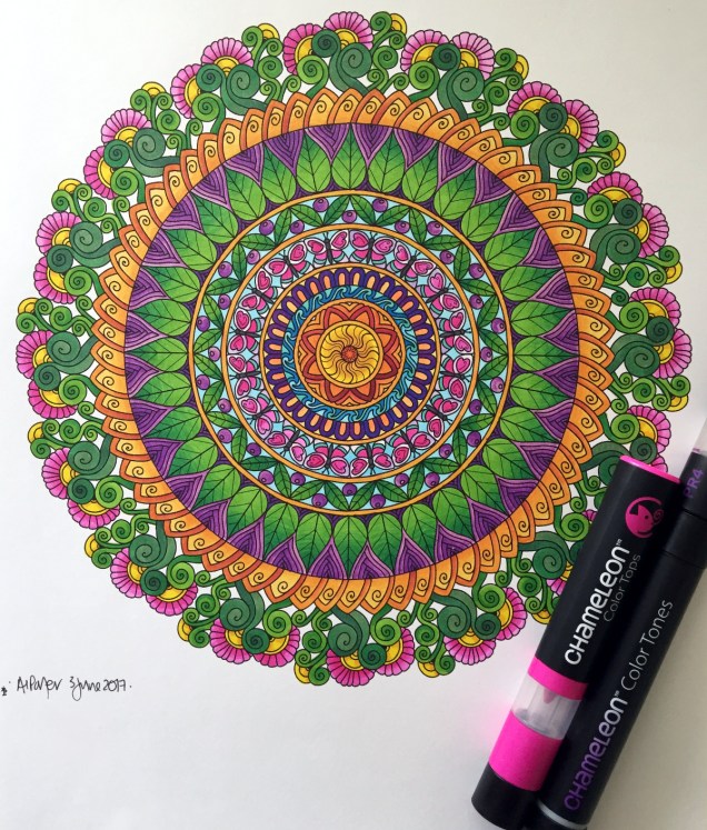
Now, I have mostly been printing my designs out and then colouring them with traditional media; particularly my Chameleon Color Tones and Color Tops marker pens.  I do love doing this – it’s a very sensory experience.

However, I am aware I have a different tool for colouring viz. Sketchbook Pro and it’s suite of brushes and textures and so on.

Believe it or not, it takes me longer to colour an image in digitally than it does with traditional media, and I mean a LOT longer.

AngelaPorter_ColouredMandala1_26June2017

I love the way the colours are clean, almost glowing, when I use the marker pen ‘brush’ or one of the watercolour brushes.  I’m getting to grips with which particular kind of blending or smudging ‘brush’ I like to use.  I’m starting to get the idea of working with layers.

What is vexing me, is how ‘perfect’ the finish is, and how simple it looks.  I wonder if it is way too simple a finish.  It also frustrates me that I’m kind of trying to replicate the effects of traditional media but with digital tools, and failing as everything either works out almost perfectly blended with bright, clear colours, or ends up as a bit of a mess as I try to use different brushes or textures.

5x7Flower3 coloured 1.1

A dear friend of mine pointed out to me that I’m trying to compare apples and oranges, that perhaps I should treat digital colouring as an art medium all of it’s own instead of trying to make it like traditional media.

It was also pointed out that I do have a tendency to give myself a hard time when things seem too easy to me, or end up too perfect.

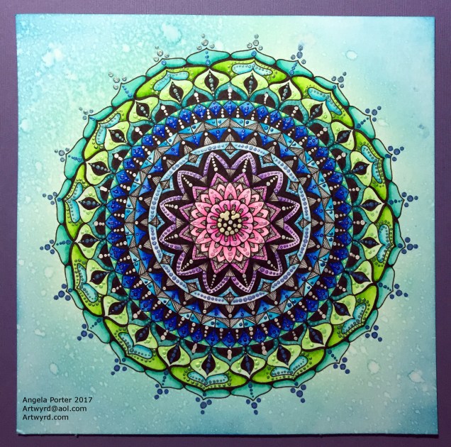
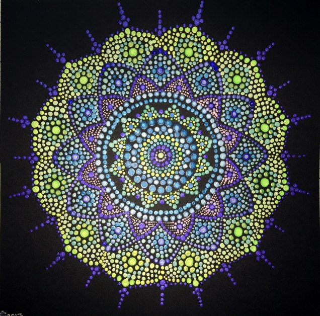
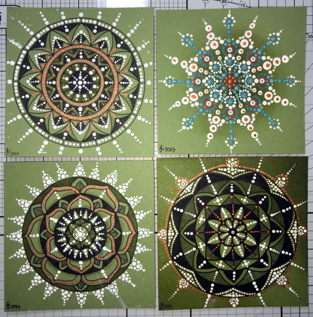
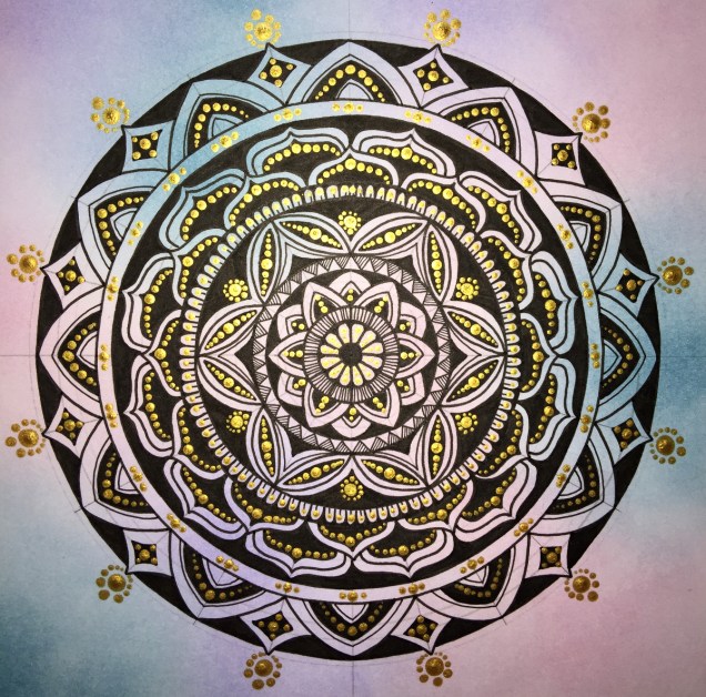
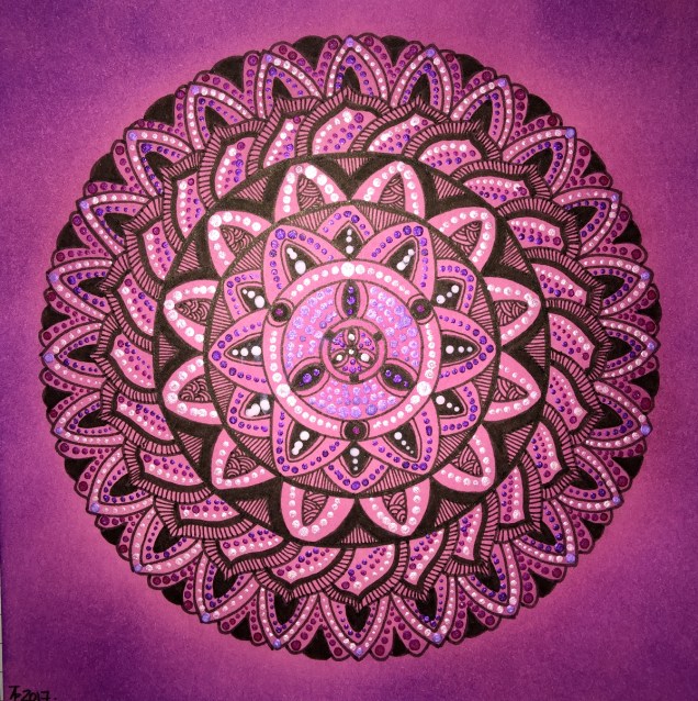
All of the images in this post have been coloured digitally, and the colours have shading/gradation in colours, but there’s no texture in them.  But then, there’s little texture in the colouring when I use marker pens, such as my Chameleons or Copics, unless I deliberately add it, which I’m always disappointed with.  I much prefer to add texture with black lines, which I need to bear in mind now as I work with digital colour.

I also recognise that I need to do a bit more to make more ‘contrast’ between the paler and darker shades of colours, as well as making sure there’s good deep shadows to add that illusion of 3D to the drawings.

I will continue to experiment and explore the other digital media and brushes, as well as special effects, and in time I may work out how it can all work for me in a way that I’m happy with.

Dragonfly mandala

DragonflyMandalaWatermarked_AngelaPorter_19June2017

Over the last couple of days, my focus has been on designing mandalas.  I also have been learning a little more about Autodesk Sketchbook Pro and how I can import images, cut them and have them as an opaque image that ‘floats’ on top of other layers or designs.  The image above is an example of the work I’ve done.

My only issue with it is that I’ve used too thick a pen for the mandala. Now I know how to do this, I can always re-do the mandala part, or the dragonfly!

I also spent a fair part of yesterday doing some mixed media work.  A friend of mine asked if I’d do something with her wedding speech for one of her family so it’d become a keepsake for them.

I’d been puzzling about how to do it, when inspiration struck with the colours I needed to use, and off I went!  I’ll post a photo of it once the wedding is all done!

Chameleon Color Tones, Color Tops and a Coloured Mandala

SixColoured_AngelaPorter_3June2017

Yesterday, I recieved a big box filled with goodies – a full set of the Chameleon Color Tops to go with my Chameleon Color Tones markers, as well as a full set of ink refils for them

I couldn’t wait to try them out, and did on a couple of small fungi I’d drawn, which you’ll see in another blog post as I want to use them on some mixed media index cards.  I loved using them, and so wanted to do something a bit bigger, and the mandala above was the result.

What I love is the ability to create smooth gradations between one colour and another, with out the fuss of using two color tone pens to achieve this.  Of course, I still love the original colourless to full colour color gradation, and have used this in the mandala on parts of the butterflies.

However, I love strong, bright colours, and the Chameleon Color Tops are fab for doing this!

Now, I do have a full set of Copic Ciao markers, which are great.  However, achieving a smooth colour blend is quite difficult, especially with colours that are far apart in intensity or colour.  You can use the tip to tip method of transferring colour from one pen to another and use the pen to blend the colour a bit better, but I still struggle, even on specialist marker paper.

Not any more!

What I haven’t done is to look at how the pens blend when the colours are from different colour groups, such as blending a green to a red, but you can guarantee I’m going to try them out.  Apart from them maybe creating some mud where the colours overlap (which would happen anyway), I have confidence they’ll do this just fine and dandy.

Mandalas a-plenty

Mandalas, Mia Chambers and Autodesk Sketchbook Pro musings

Mandala B1_Small_AngelaPorter_15May2016Mandala B2_small_AngelaPorter_15May2017

This morning, I’ve drawn the two mandalas above.  I used Autodesk Sketchbook Pro on my Microsoft Surface Book to do this.

I’m gradually exploring the features of Sketchbook Pro, and the more I use it, the more I like it, though making the transition from paper to digital drawing isn’t as easy as I thought it would be.  This is mainly because I find it hard to work at a detail level that doesn’t require a magnifying glass to see the detail or to add colour – particularly important when I’m doing work for colouring books.

This is partly because of the ability to zoom in so much on the artwork, and partly due to the screen size on my Surface Book being a little smaller than A4.

I have considered getting a Surface Studio, but that’s on hold until I’m sure I really want to go down the digital drawing route.  Having such a big screen is an alluring prospect, being able to work on the paper size at it’s actual size…but I’m still thinking about it.  Maybe when I find out my tax bill for the previous financial year I’ll make my mind up.

Now, these aren’t the first mandalas I’ve drawn using Sketchbook Pro.  In the past three or four days I’ve some some small ones (approx 3″x3″) to print out, colour and mount on blank greeting cards to be sold to raise money for Mia Chambers, Rainbow Warrior Princess to get her to America for experimental cancer treatment not available in the UK.

What I’ve always found tedious as well as a tad challenging mathematically, is setting out the angles and so on for a symmetrical mandala.  Sketchbook pro makes that easy for sure, as well as saving on the time in creating symmetry.

I’m still struggling with the idea that I may be ‘cheating’ by doing this.  However, I can logically accept that the tools available in Sketchbook Pro allow me to focus on my creativity far more.  Also, the ability to zoom in means I can add details and so on I couldn’t do easily when working on paper.

I have used mandala templates I’ve drawn on paper and scanned in Sketchbook pro to draw mandalas, as well as using sketched out designs so I can neaten up the sketch and add details (it saves erasing pencil lines and the mess and wrinkled paper and smudged in that can result).  I don’t really need to mention how easy it is to undo mistakes.

Certainly, the symmetry option makes creating these mandalas a lot quicker, and because I don’t strive for total perfection in the hand-drawn lines or added patterns, then even though the mandalas are drawn in a digital environment, they still have that feeling of being drawn by hand, which makes me happy – they’re still ‘perfectly imperfect’!

Of course, I’ve not really got to grips with colouring the designs in Sketchbook Pro, so printing them out and adding colour using a chosen medium is still my favoured way of working.  Also, I can add things like metallic highlights and sparkly gems to the mandalas, plenty of which appears on the cards I’ve made as well as the mandalas I’ve framed in order to raise money for little Mia.

Today’s Mandala

DotMandala_9May2017_AngelaPorter

I’ve spent much of the day working on this, and it’s been a pleasure to create as it has combined many of my favourite techniques.

First, I coloured the background with Distress Inks, starting at the centre with a pale pink, follwed by a pale blue, a sea green and finally a blue with a hint of green around the edge.

A light spray of water and a dry and the sheet was ready to have the black line design drawn on it, once I’d put a pencil grid down.

Next, the colours in the various sections were intensified using Zig Clean Colour Real Brush Markers from Kuretake, along with a brush and water to fade the colours out.

Finally, all the dots were addded using pearlescent/iridescent watercolour paints.

I’ve smudged some dots, others insisted in running into each other, but I’m fairly pleased with the outcome.  As I’ve already said, I really enjoyed doing this one.

More dottiness – in the form of mandalas!

DotMandala01_8May2017_AngelaPorter

Over the last couple or three days I’ve been playing with mandalas and dots, just purely for fun!

To create the mandala above, I used shimmery, iridescent watercolour paints on black card.  The photo really doesn’t capture the shimmery loveliness of the mandala.  The mandala measures approx. 8″ x 8″.

DotMandala05_8May2017_AngelaPorter

This next mandala, again 8″ x 8″,  was made using acrylic paints with green card as the substrate.  Once I thought the paints were dry, I tried adding some distress inks so that there were shades of green in the background.  However, not all of the dots were completely dry and some smeared.  Also, the ink coloured the white dots.  So, the lesson is to add the shading before doing the dotting!

DotMandala02_8May2017_AngelaPorter

These four small mandalas (approx. 4″x4″) I added shading using a damp paintbrush and Distress ink.  I thought I’d try drawing the design in ink in three of them then adding dots in white and copper to add more/different patterns as well a some shininess.

Oh, the mandala with the teal and red-brown dots had distress ink sponged in the centre. The white acrylic paint wasn’t stained by the ink.  These dots had a lot longer to dry than the previous mandala.

DotMandala03_8May2017_AngelaPorter

For this mandala (approx 8″ x 8″) I first applied some distress inks to white watercolour paper  Then I drew the mandala in black ink.  Finally, I added dots with gold acrylic paint.  You can still see the pencil construction lines as I want to give the gold paint plenty of time to dry before trying to erase the lines.

DotMandala04_8May2017_AngelaPorter

This final mandala, approx 6″ x 6″, was drawn using black ink on pink card.  Once the drawing was complete, distress inks were applied to give different shades of pink/purple.  Then dot patterns were applied using white acrylic paint and iridescent watercolour paints.