Entangled Art | Adding Colour Part 2

Link to today’s Vlog on YouTube

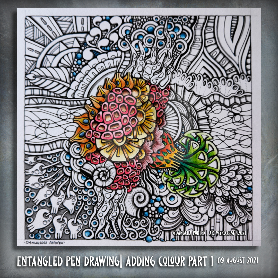
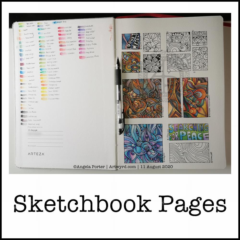
As I enjoyed my first mug of tea of the day, I continued to add colour to this entangled drawing.

The success of blending colours yesterday inspired me to do more of this. Little by little, I’m starting to get some sparkles of confidence in adding colour.

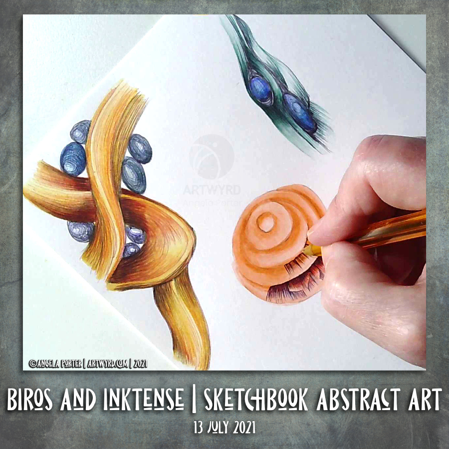
Inktense pencils do make this easy in a way. It’s a lot easier to control the application of colour.

Control – it’s that word again in respect to the addition of colour. Watercolour vexes me as I want to control a medium that isn’t easy to control it seems. Perhaps the exploration of watercolour and Ecoline watercolour inks are cul de sacs for me. They’re interesting to explore but lead nowhere except back to where I started, almost. I return with extra knowledge and experiences that can then be applied to other media.

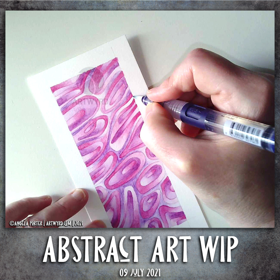
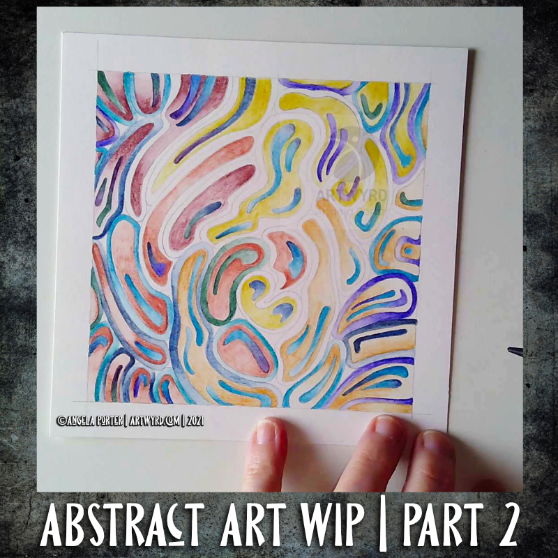
Indeed, the way that I apply colour digitally has partly inspired me in this artwork. But remembering my dabbling with abstract art back in my A level days gave me a few insights into my relationship with colour.

As a scientist, all my observations – drawn or written – had to be accurate, representative of what I could see. Colours had to be correct, as I could see, so others could check what I had seen and confirm those observations are correct.

As an artist, I can put that requirement to one side; but it’s not easy to do so, especially when I’m drawing from observations.

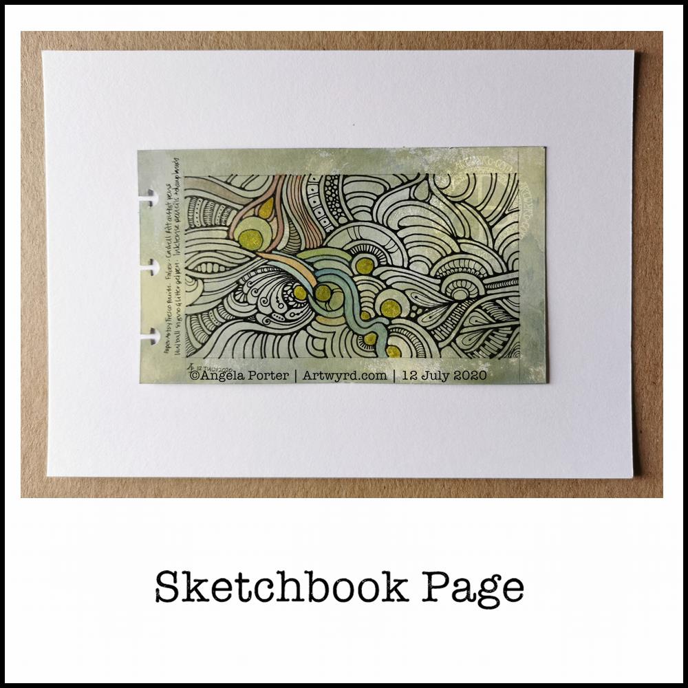
I have little problem adding colour to my cute, whimsical, entangled coloring templates. They’re not meant to represent anything ‘real’. They’re abstract in their own way. Though, when the motifs are based on observations, then I get into trouble with colour.

Remembering the abstract oil paintings I did back in the days of A level exams, I used colour to convey the mood, feeling that went with the time, place, experiences I had when taking photographs to use to work from. The final paintings were in colours that represented these personal, emotional, and sometimes intellectual responses.

Going forward, I need to remember this in my work and to transfer it to artwork. The actual colour of something is not as important as I think it is, and to remove that pressure from myself. If I want a record of the ‘real’ colours, I can take a photograph. But to record my experience, I need to give myself permission to express my feelings, emotions and my response to it in whatever colours suit me at the time. I need to allow my intuition and imagination a greater role in my work with colour

Hopefully I’ll get there, and I probably am little by little. The value of the vlogs is that I have to start to give words to the thoughts that come as I create, and this blog allows me to expand on them.

To give words to the ephemeral, abstract, metaphoric thoughts that wander around my head is to manifest them. The words result in conscious awareness of the thoughts. The awareness is then something that can be learned from, acted upon and put into practice.

I’m learning to externalise what has usually been an internal and fleeting process of thought and analysis, and it’s an intriguing and interesting experience for sure.

Entangled Art | Adding Colour Part 1

Link to today’s vlog on YouTube

I’m at a bit of an impasse with my other entangled drawing works in progress. So, I’ve started to add colour to this one.

Shadow was added with a grey Pitt Artist Pen on Saturday, along with some of the colour. I think my morning ‘art and a cuppa’ will continue for the next few days, with videos being released of the process.

I’m doing my best to work with a limited colour palette. I started with reds, oranges, yellows and browns. this morning I thought a couple of complementary colours were needed to lift the colours a bit. So blue and green was added.

Inktense pencils and a damp brush are being used, and the specific colours used so far are – Cherry Red, Madder Brown, Baked Earth, Mustard, Sienna Gold, Deep Indigo, Blue Aquamarine and Spring Green.

I did post a photo of the drawing with just reds/oranges/browns on Instagram on Saturday. Adding the blues and green is making the colours seem so much brighter. That’s the magic of complementary colours – colours opposite each other on the colour wheel.

The way that complementary colours, particularly blues with reds/oranges/yellows, is something I am really fold of. I think it harks back to the album covers designed by Roger Dean, to mention one artist! Being a child in the sixties and seventies and the preponderance of psychedelic art at that time.

My original plan was to use an analogous colour scheme (colours next to each other on the colour wheel). But as my mood is so much better and back to normal, complementary colours are totally necessary now!

Biros and Inktense Sketchbook Abstract Art

I am so, so tired today. So tired that my head feels heavy and my thoughts are slow. All due to me waking around 5 am and not being able to get back to sleep. So I drew. In my sketchbook. With biros.

I thought I’d like to see how adding colour to these drawings changes them. If it’s an improvement or a mess up. Whether it’s best to put the biro down first, or the colour, or a little bit of the biro shading.

So, with that intention I set to making today’s vlog.

I’ve found that either way of adding colour works, though it seems the pen lines are a little darker over the Inktense. Colours bring the drawings to life. The uncoloured biro drawings (other than the colour from different biros) work really well and nicely, but that addition of colour.

I’ve said (typed?) it before; I’m enjoying this journey of exploration with abstract art, the humble biros in particular.

Sketchbook Flip Through Vlog

Today’s vlog is a flip through the work in my sketchbook during the past month, give or take a week!

I take the time to look at my work with fresh eyes after some time away from it. I also explain some of my thinking and methods along the way.

Abstract Art WIP

Another day, another abstract WIP. This is an iteration of the first one from earlier this week. This time, I’m using analogous colours – Fuchsia, Thistle and Mauve Inktense pencils. I’m also using Canson Moulin du Roy 100% cotton paper, which allows the inktense pigments/dyes/inks to spread far more smoothly than other papers. The photo makes it look like the gradients aren’t all that smooth, but they are much better when seen with the eye. Though, I do have a little work to do with the purple mauve areas.

There is a vlog available for this work.

Today, I’m at a bit of a loss as to what to do with myself. I’ve done all the work I can on Whimsical cats for now. There’s just one template needed to make the total up to 31. I’m awaiting the review of the one I sent over recently. Then, I’ll need to work on colouring three templates, which are yet to be chosen.

I suspect I’ll spend some time today working on art. I’m lucky that it’s both something I love to do as well as my source of income too. Today, though, I get to spend as much time as I like on some personal projects, such as these abstract art experiments I’ve been doing.

Abstract Art WIP | Part 2

Time Lapse Video

I spent nearly an hour adding colour to the inner section of this artwork yesterday afternoon. This morning, I started work on adding colour around them. Again, I spent nearly an hour doing this.

I’m trying to play with where the lighter and darker areas of colour in the sections. I want dark next to light. It’s a kind of play with highlights and shadows, though I’m not quite sure how well it is, or isn’t, working.

Once I’ve completed this, I need to decide what to do with the tiny gaps between the various motifs. I’m tempted to fill them with black and then some metallic over it, gold or copper maybe.

Then, I need to decide if I leave the rest of the colour as it is, or whether I add more to intensify areas that are a bit insipid and to increase the contrast in colour saturation.

Finally, do I use a very fine brush to add metallic patterns/highlights to areas of these motifs, connecting them to the tiny pools of metallic between them. That’s if I use the metallic colours of course.

I think I may try this out first on the experiment I started with and see how I like it, or not.

The rest of the day…

For now, though, I need to get along with another sketch for the Whimsical Cat books. I realised I can’t count! I thought I’d done the requisite 31, but I’ve only done 30. So, if I can get one done and off, I’ll have it approved (or not) soonest.

I did get all the approved sketches inked in yesterday. So I’m now just waiting for approval/feedback on the sketches I submitted for review last Friday.

Entangled Frame WIP

Having a bit of a break from the weird fish today. Instead, I drew this abstract, entangled frame and started to add some colour to it.

I’m working on A5 Arteza mixed media paper which has been coloured with Aged Mahogany and Rusty Hinge Distress Inks. The pen drawing was completed with a 0.38 Uniball Signo DX pen, which is both a consistent, fine line and is waterproof. I’m adding colour with Inktense pencils ( Red Oxide, Baked Earth, Crimson, Deep Blue and Sienna Gold).

I may add some more pen work as I work out if I’m happy with the inner space; I hope to add quotes to that space once the design is finished.

As far as the weird fish go, I have scanned them in and re-drawn them digitally using the vector drawing option in Clip Studio Paint. I’ve been experimenting with adding the shadows and highlights first then using different layer to add colour to the sections. I’m bumbling around with this at the moment, but I expect I work out how to get it to work in a way I like.

Yes, I know there are going to be tutorials out there that will show me how it can be done, and lots of ways of doing the same thing. However, by me bumbling and bimbling around the software, I’m learning more about it on my own terms.

Oh, I also filmed my drawing and adding colour this morning and the video is below. If you do choose to watch the video, then please choose to view it in YouTube as your view then counts to the channel stats, along with thumbs-ups! Cheers!

Working with the ‘aha moment’

Sketchbook page

After a walk and lunch yesterday, I eventually settled to working with my aha moment. This sketchbook page is the result, though I have work left to do with it.

The designs are inked in with Pitt Artist Pens and I’ve used watercolours and Inktense paint pans and pencils to colour the motifs. Well, most of them. I’ve left some parts in black and white to show the difference that colour makes.

I used a Daler-Rowney artist’s sketchbook. The paper is acid free, but is not specifically for watercolours. It held up surprisingly well to multiple layers and glazes of colour, though it does grab the colour and it’s difficult to move it around as on watercolour paper.

I also found the wet brush lifted some of the pigment from the Pitt Artist Pens. That surprised me as they were totally waterproof on watercolour paper.

Reflections

Having an ‘aha moment’ and working with that realisation can be quite different. It’s nice to try different ways of using line and stippling to add shadow and volume to the drawings.

The half-beetle was an interesting one to work with. On the lower wing I could’ve used lines to add the illusion of curves, but for some sections I just used colour. I also used the beetle to practice adding lines and stippling.

I tried drawing the beetle digitally, but it just didn’t feel ‘right’. I didn’t get the same satisfaction as I did drawing it with pens on paper. I’m sure that’s due to me having my brushes set up incorrectly. That’s something I’m going to have to work on. I ended up with a drawing that was too perfect. That surprised me too, as I love to work digitally. Perhaps that was a function of my current mood and energy levels.

I do tend to switch between digital and traditional media, sometimes mixing the two. That is certainly an option moving forward – drawing the line art on paper, then colouring digitally.

I do like the earthy tones I’ve used to add colour to many of the design elements on this page. That still continues to surprise me, as much of my work has been brightly coloured, often with ‘in your face’ colour palettes used.

The smaller designs I’ve drawn here also have their own sense of satisfaction and enjoyment for me. Usually, I draw full page designs for colouring books. But here, I’ve drawn small compositions, and that is not so overwhelming for me at this time.

Sketchbook Pages

Today, I share a glimpse into my current sketchbook. It’s an Arteza watercolour A4 sketchbook.

I’ve completed all the drawings in boxes now, and am adding colour to them using watercolours, graphitint watercolours, graphitint pencils and/or inktense pencils.

The paper is rather nice to draw on with Faber-Castell Pitt artist pens or a Uniball Signo DX 0.38 pen.

On the cover page I swatched my collection of Inktense pencils, using a damp brush to bring their true colours out.

Inktense pencils are intense in colour when activated with water. Also, once activated with water and dry they are permanent.

I like all the media I’ve used so far on this page. Which I use does depend on my mood. Today, I wanted to choose an inktense palette of colours that is like the rusty colours I’ve been using with watercolours.

I really am drawn to this colour palette in my work at the moment. The dark blues, rich red-browns, blue-greys, earthy-dark greens and the vibrant mustards. One day I’ll look up the psychology of these colours and see how they relate to my mood/life at this time. But not today.

Today, I need to focus on adding colour to some templates for the Entangled Gardens colouring book that will be released early next year.

Sketchbook Page

The art

At 4¾” x 2¾”, this is a fairly small drawing.

I used a variety of PaperArtsy Fresco paints to colour a 5¾” x 3⅜” piece of ClaireFontaine Paint-On mixed media paper. I chose, for me, an unusual mixture of colours. It’s ended up looking like old, distressed and grungy painted walls.

Next, I drew the abstract design with Faber-Castell Pitt Artist pens. I did the basic outlines, leaving my decision whether or not to add details for later on.

Then, I tried adding some colour to the background with Inktense Pencils and a damp brush. As this is a sketchbook page, I tried different colours out to see which ones would work well with the background. The finish on the Inktense-d areas was rather chalky and dull, though a subtle colour was achieved on the acrylic paint background. I’m not sure if I like it or not.

I find it difficult to resist a bit of shimmer and shine on my art, so I used a Uniball Signo gold glitter gel pen to fill in some of the circles in the design.

Finally, I added some more complex patterns to some areas in the design. I could’ve filled in more areas, but I’ve decided that this is enough.

Other stuff…

This wasn’t the only piece of paper I coloured with the Fresco paints. As they’re for the sketchbook, I coloured each piece on both sides. So, I now have quite a few prepared pages in my custom sketchbook to draw on as time goes by.

I think I’ve finally settled down after the trip out on Tuesday. I seem to be more settled, for sure. Meditation, self-care, self-soothing and enough rest has worked it’s magic once again. Sunshine today is helping as well, along with the refreshing breeze that is gently flowing in through the windows.

The simple things in life are often the ones that bring most peace to me – art, meditation, quiet times, sunshine.