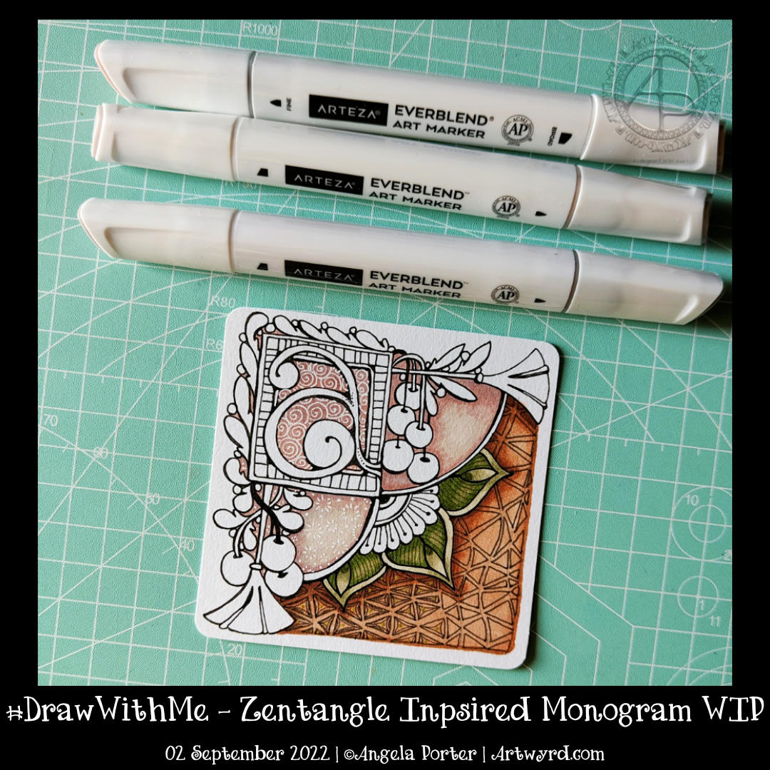
This morning, I thought I’d share how I’m exploring creating some Entangled art, particularly monograms, via YouTube.
This little drawing is 11cm by 11cm, which is approximately 3.5″ square – took about an hour or so to get to this point. I wasn’t sure of the green, but I think it’ll work out just fine. There’s quite a way to go yet, but that will have to wait for another time.
The materials I used are: * 03 black Sakura Pigma Micron * Various Arteza Everblend marker pens * Various fineliners in grey and green * A white Sakura Gellyroll pen * A metallic gold Uniball Signo pen
This week’s colouring page for the members of Angela Porter’s Coloring Book Fans Facebook group is intricate. Still, it uses only three motifs – spirally furled leaves, starry flowers and stripey, plumptious seed pods.
I drew the design using a fine nib TWISBI eco fountain pen, filled with Documentus ink, on an A4 sheet of Artway’s Eco paper. To add colour, I used various Arteza Everblend markers. The pattern, textures, and highlights have been added with various Arteza Inkonic, Uniball Signo and Sakura Gellyroll pens.
In today’s YouTube video, I started to draw the design on the right. While the video was uploading, I finished drawing it. Also, I drew some motifs on a separate piece of paper so I could practice using alcohol markers (Arteza EverBlend).
Colour combinations do vex me, continually. And they certainly do on this practice sheet! But it’s best I practice somewhere before adding colour to my completed drawing. But first I’ll scan that drawing in so if all else fails I can add colour digitally!
Either way, it’s been lovely to spend time drawing and adding colour just for the joy of it. It is far too warm to do anything else.
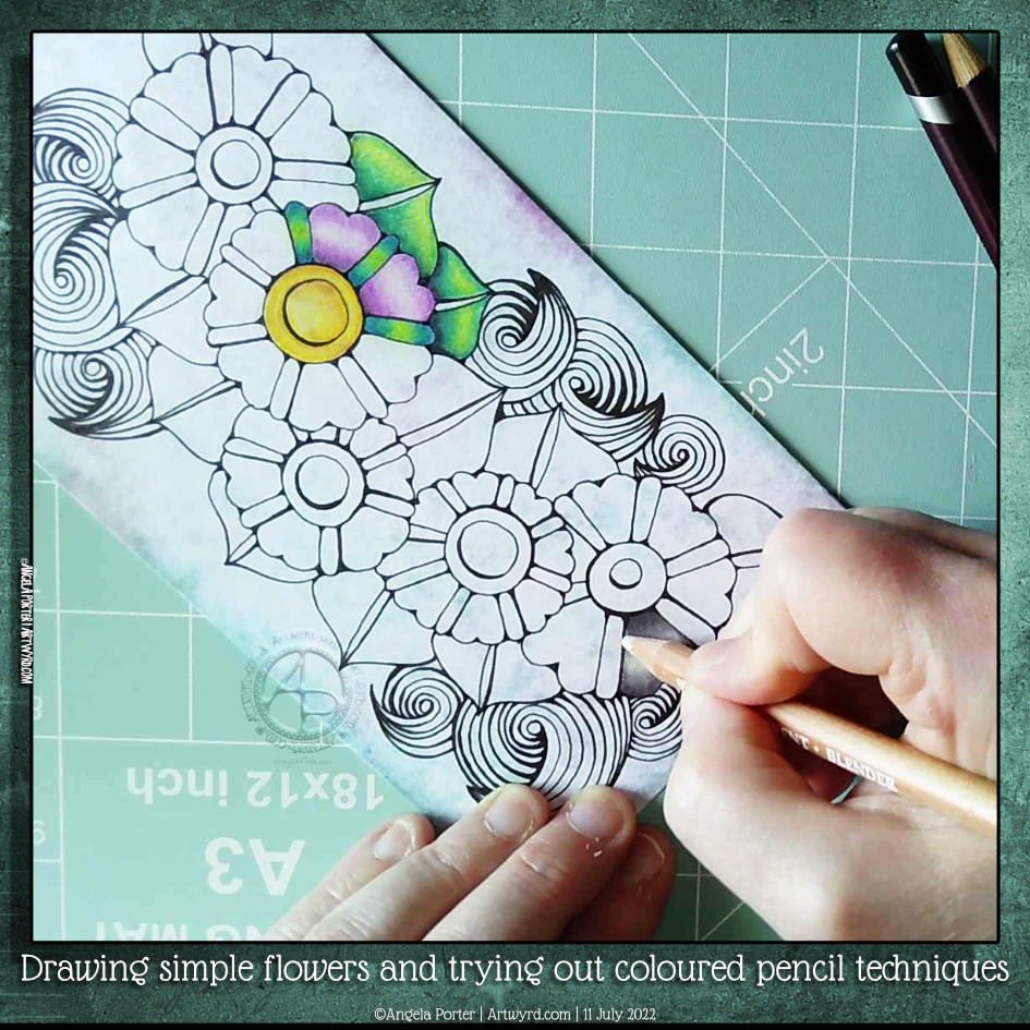
One of my YouTube subscribers (Chen Keith) requested I draw some simple flowers and show how I’d use coloured pencils to colour and add contrast.
Drawing, not a problem! Colouring? Yeuch colour choices! But I do show different approaches I use to adding colour with coloured pencils, or rather what I’ve done in the past. I rarely ever used coloured pencils now. Digital coloring or marker pens are my mediums of choice, with Inktense and the Karin Brush Markers close behind.
While the video was uploading and processing, I did try out other ways of adding colour and/or contrast. It’s way too hot here in the Valleys of South Wales for me to think clearly and explain things at the moment. The heat is making me feel very, very tired.
Please click on the button “Watch on YouTube”. Cheers!
I had a really, really cruddy, broken night’s sleep. So, doing art that doesn’t have a bit more than good enough was in order.
Getting the pen drawing done for this cute bird I started a couple of days back was just the thing!
It’s always interesting to look at my art, whether finished or, like this one, a work in progress after a day or so’s break from it. With fresh eyes there’s a different perspective. With this drawing, I needed to alter the design and size to get it to work. Not sure I’ve got it right, but it’s better than it would’ve been if I’d carried on as I originally planned.
The next decision to make, and the trickiest, is whether to just add shadow and highlight or whether to go with colour. The next tricky decision is what media to use to this.
I’m so aware that my colour choices can be … quite dire. And so I am tempted to add colour digitally initially. Maybe. Perhaps.
A little break from it will be in order before I make that decision.
I’ve been busy inking in colouring pages (or templates if you prefer) for my next book – “Fanciful Birds” in the Creative Haven series. But at lunchtime, I took a break to do some drawing. And I drew another bird!
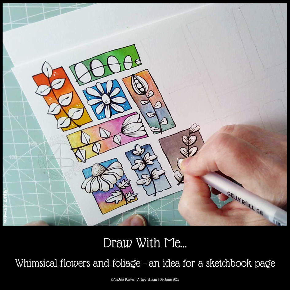
Actually, I started to plan out and draw an A5-ish-sized pen drawing that includes a bird, flowers and so on, all done in a whimsical, fanciful style.
In the video, I explain my thinking process as I lay out the basic design in pencil. And I do it all one step at a time, including the inking in the section I’ve already done.
Of course, the drawing isn’t finished… yet. This is but part 1 of a series. And given I have to focus on the inking in of templates, my videos may be more sporadic than usual, as will my social media posts. So please bear with me!
I seriously need some more tea and probably something to eat; it’s just about tea-time here as I type!
If you’d like to see how I created this partial page for my sketchbook, take a look at this video.
I spent an hour or so doing some warm-up drawing before turning my attention to inking in some colouring pages for “Fanciful Birds”, my next colouring book in the Creative Haven series.
Whimsy is always a welcome thing, flowers and foliage in particular. I also wanted to work with colourful backgrounds for each motif.
I really wasn’t fully awake and didn’t think through the type of paper I was using. I knew I wanted to use alcohol markers to add colour gradients to the background. Did it occur to me to use marker paper? Nope! Of course not! So they bled a tad – the Ohuhu brush markers I used for some of the backgrounds are rather juicy, too juicy for the paper. I liked the backgrounds, however, and knew I could fix the bleeds with a white gel pen.
So, I thought I’d switch to Inktense pencils and a damp brush. Not quite sure that they sit well next to the alcohol marker backgrounds. There’s lots of textureand an unevenness in the colour and gradient. Again, partly down to my choice of paper (all media paper from SeaWhite of Brighton).
So, for the last couple of images, I used some Arteza EverBlend markers for the blue and warm brown backgrounds. The bullet tips let less ink flow onto the paper, minimising the bleed. There was still some bleeding, which I made worse by trying to ‘erase’ it with a colourless blender pen.
I made use of the magic of a white gel pen to cover up these bleeds.
I definitely need to write some reflections for myself to add to this page when it gets put in my sketchbook. For now, I’ll just say that I like the last two I completed the most. Those are the blue and brown backgrounds on the bottom row. I do like the other alcohol marker backgrounds too, but there’s something about the more neutral backgrounds. I just can’t put my finger on what it is.
Right then, time to finish my mug of tea and get some more inking of colouring templates in!
Please click on the ‘Watch on YouTube’ button. Cheers!
This was a lovely way to spend an hour or so at lunchtime today. I’d finished the last couple of sketches for my next colouring book and just wanted some quiet, chilled, relaxing time drawing with no pressure at all. I woke with another migrainey headache today, and it’s left me so tired yet again.
Anyway, flowers and plants, and some rocks, were the perfect thing for me to draw during this time. I started to add pattern and colour to some of the motifs as well, with a surprising discovery!
Time to take a nap, I think, and sleep off this blasted post-migraine exhaustion.
Please click on the ‘Watch on YouTube’ option. Cheers!
Before filming this video, I primed a piece of watercolour card with white gesso. Then, I added colour using Inktense pencils and water. I added each colour separately, drying them before adding the next. Finally, a layer of clear gesso was added to seal the colours.
I had no particular idea as to how I would add the colour or what I wanted to use the paper for after this. But, as I looked at it, the pink areas just looked like very fuzzy flowers, so that was it! A floral based drawing it would be!
I do not intend to fill the whole area with flowers. I have plans for the ‘white space’ around the designs. But you’ll have to wait to see how that pans out!
In the video, I take you through drawing each flower design, one step at a time. I try to vocalise my reasons for doing certain things too.