Today’s mixed media ACEOs/ATCs

ACEOs_30May2017_AngelaPorter

Today’s ACEOs/ATCs

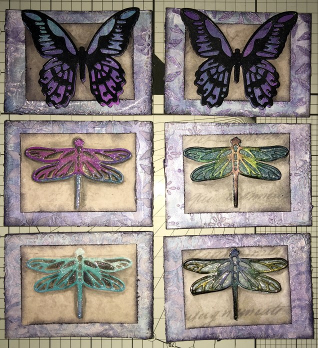
Today I’ve created a set of six ACEO/ATC cards using dragonflies and butterflies as focal images.

The photograph doesn’t do them much justice; the backgrounds are shiny purple and silver with some stenciled patterns created using modelling paste.  Peeking through in places are patterns from some reprints of first series Ordnance Survey maps as well as some torn text from an old mathematics text book.

I couldn’t work out how to use my cogs and gears on these, but remembered all the patterned paper I have, so I had a bit of a furtle through  and found some paper that looked nice against the busy background, which also the focal images looked good on.  Indeed, they look like mounted specimens.

I got the focal images from my stash, already painted.  However, I did put some painted and embossed papers behind the wings of two of the dragonflies, which looks quite nice.  I did add a wash of iridescent medium to all the focal images (can’t avoid adding some sparkle).

On returning from an appointment, I decided I would cover the dragonflies with 3D Crystal Lacquer, which has worked out really well I think (difficult to photograph though).

I’m really quite pleased with these ACEOs/ATCs; they’re simple, yet they just work and satisfy my need for ornate, sparkle and shine.  I’m glad I used the patterned paper to crated a calmer centre to mount the focal images on.

I don’t think I’m going to add any words/quotes to these, though a few gems or similar may be in order once the crystal lacquer has fully dried.

Drawing focal images

One thing I thought of as I was using the die cuts for focal images, is that I do need to find the confidence/courage to draw my own.  I have done some fungi, flowers and ammonites, but haven’t printed them out at the right size, yet.

Also, it may be that using the surface to do drawings for this may not be the best way for me to work; my drawings do tend to turn out a little too ‘perfect’ for my liking in some ways.  I’m still doing my best to work out how I can get my Surface Book to work for me as I’d like it too.  However, if I don’t use the smoothing tools in the software, the pen wobble just is totally annoying (it’s also something that is inherent in the Surface Pen/Surface book, which I really hope Microsoft will do something about sooner rather than later.

It’s really easy to use dies to cut out images for use, but to create my own…well…but we’ll see if I manage to use my own drawings in the next batch of ACEOs/ATCs.

So, my job this evening (apart from going out to do some food shopping) is to do some drawings, on watercolour paper I think, to cut out and use as focal images.

Oh, using scissors is a bit of an issue for me.  Despite me being right handed with pens and so on, I use scissors in my left hand.  In fact, there are quite a few things I can do with either hand, and many things I’m equally as bad at with either hand, such as using a badminton racquet or golf club!  Don’t ask.  Anyway, back to the scissors.  I’ve always struggled using scissors well, and I’m worse with left-handed scissors than I am with right-handed scissors.  Craft knives and me tend to be a slightly dangerous pairing – for me, not for anyone else!  I’m ok if I’m using a rule to cut straight lines, but anything else, well …

So, I will persevere, and perhaps the mistakes I make won’t be as noticeable to myself…

Mixed Media ACEOs, and updates

ACEOs_28May2017_AngelaPorter

Mixed Media ACEOs/ATCs

I’ve spent the last four or five hours creating this set of four ACEO/ATC cards.  It’s been a while since I did any mixed media work, but I felt the need to get a bit messy.

Each card measures 2½” x 3½” (approx. 6.5 cm x 9 cm) with the substrate being some fairly thick Kraft card.

I started by using some yellow Frog Tape to hold the cards together so I could make the background at the same time.

I started by applying PaperArtsy Fresco Paints to the kraft card until I had a finish I liked.  The colours I used were Cheesecake, Rose and Sherbet.

The next step was to add some Windsor and Newton Modelling Paste through a couple of stencils (one was the dot fade stencil by Tim Holtz, the other a mini dragonfly stencil by Creative Expressions).

Once the modelling paste was dried, which I hurried along using a Tim Holtz Heat Tool from Ranger, I watered down some Alchemy Waxes from Imagination Crafts  (white gold, tulip and apple green)and used a paintbrush to colour the dragonflies.  I then used the wax and a piece of Cut and Dry Foam from Ranger to apply some of the waxes over the dot patterns.

Once I’d finished applying the wax, I wasn’t happy with the result on the dragonflies, so I used Daler Rowney System 3 acrylic paint in Rich Gold to re-colour them. I was much happer with the results, especially the dragonflies that I’d coloured pink/red.

The next step was to have a furtle through various coloured diecuts I have in my stash.  Every now and again, I spend a day cutting out various die cuts (mainly cogs, flowers and foliage, but sometimes other things too) and then colouring them to add to my stash.  It saves on time when I have the urge to do some mixed media work. It also makes use of my rare urges to do die cutting, which I find a very tedious process.

After a good furtle, I found some cogs that would work on two ACEOs that had just the dots on the background. I couldn’t find anything I’d want to add to the dragonflies; I was just happy with them as they were.

The die cuts were applied with Cosmic Shimmer Acrylic Glue from Creative Expressions, then some Vintage Photo Distress Oxide Ink with a wet brush was used to add shadows.

I used a Quickie Glue pen from Sakura and Gold Superfine Embossing Powder from WOW to add some gold dots and to areas where there was no embossing paste.  Following this, I edged the cards using a piece of Cut and Dry foam and black Archival Ink from Ranger.


I then chose some words from the Tim Holtz Chit Chat stickers and glued them down with the Cosmic Shimmer Acrylic glue, and used a damp brush and a China Black Inktense pencil from Derwent to add shadows around the stickers.

The very final step was to add some sparkly gems, and they were done!  Once all is dry, I can add my information to the back and so on, and I have some ACEO cards to use on other mixed media projects or in my art journal.

Other arty news

Over the past week I’ve been keeping myself artfully busy learning a bit more about Autodesk Sketchbook Pro and how it works for me; you could say I’m building up a relationship with it.

For now, I’ve been drawing LOTS of mandalas!  I’m keeping them back from t’internet as I hope to publish them (some are already spoken for by the Colorist app), and other people asked if I was going to make some available for purchase.  So, I’m building up a collection of them for that purpose – either with a publisher, or I’ll self-publish if necessary.  I’ve also done a couple more small mandalas that work nicely as designs to be coloured and made into greetings cards, kind of like digital stamps.

Talking of digital stamps (digi stamps), there are some ideas rattling around my noggin that I’d like to try out, so there’ll be more news on this later on no doubt.

It looks like I’m going to be doing a colouring book of spooky templates in the near future, so if anyone has any ideas for ‘spooky’ or ‘eerie’ then feel free to share!

I also have a few ideas for written books rumbling around my noggin; however, it’s really hard for me to do something with them as I doubt myself so much, think they’re silly ideas, and so on.  The ideas aren’t wholly in my noggin, I do have notes on them on the ‘puter which need tidying up…but I’m finding it difficult to do this because of all my self-doubt and self-criticism. I just need to keep saying to myself, ‘But you have recorded these ideas so they are there for you, so you have made progress).

Other things going on in my life

A week ago, I finally had the hedge at the front of the house removed, as well as the back garden completely cleared.  My garden is tiny, but it’s amazing how much space was hidden by the cotoneaster and forsythia!  I do have some clean up to do, but there’s no great rush on that.  I also need to consider what to do with the back garden.

The process of getting this done has caused me great anxiety, but there was an ah-ha moment when I realised that some voile panels in the windows in my front room would help me to feel ‘safer’ and more ‘private’ while letting in daylight.  For a long time I’ve hid behind curtains; well, I still am, but at least I can see out through the voiles even if people outside can’t see in!  Why I didn’t think of this a long while ago, I don’t know, but thank goodness I did!

I’ve done a couple of anti-stigma talks for Time to Change Wales, and I’m seriously wondering if I’m really making any difference as my story is so bland and ordinary … after all it’s not a dramatic tale to tell, and I really don’t think it’s anything people haven’t heard/seen on TV on the soaps and so on…so I’m really feeling quite downhearted about that at the moment.

I know it may very well pass, but at the moment … it’s difficult….my therapy?  Art of course!


Mandalas a-plenty

Mandalas, Mia Chambers and Autodesk Sketchbook Pro musings

Mandala B1_Small_AngelaPorter_15May2016Mandala B2_small_AngelaPorter_15May2017

This morning, I’ve drawn the two mandalas above.  I used Autodesk Sketchbook Pro on my Microsoft Surface Book to do this.

I’m gradually exploring the features of Sketchbook Pro, and the more I use it, the more I like it, though making the transition from paper to digital drawing isn’t as easy as I thought it would be.  This is mainly because I find it hard to work at a detail level that doesn’t require a magnifying glass to see the detail or to add colour – particularly important when I’m doing work for colouring books.

This is partly because of the ability to zoom in so much on the artwork, and partly due to the screen size on my Surface Book being a little smaller than A4.

I have considered getting a Surface Studio, but that’s on hold until I’m sure I really want to go down the digital drawing route.  Having such a big screen is an alluring prospect, being able to work on the paper size at it’s actual size…but I’m still thinking about it.  Maybe when I find out my tax bill for the previous financial year I’ll make my mind up.

Now, these aren’t the first mandalas I’ve drawn using Sketchbook Pro.  In the past three or four days I’ve some some small ones (approx 3″x3″) to print out, colour and mount on blank greeting cards to be sold to raise money for Mia Chambers, Rainbow Warrior Princess to get her to America for experimental cancer treatment not available in the UK.

What I’ve always found tedious as well as a tad challenging mathematically, is setting out the angles and so on for a symmetrical mandala.  Sketchbook pro makes that easy for sure, as well as saving on the time in creating symmetry.

I’m still struggling with the idea that I may be ‘cheating’ by doing this.  However, I can logically accept that the tools available in Sketchbook Pro allow me to focus on my creativity far more.  Also, the ability to zoom in means I can add details and so on I couldn’t do easily when working on paper.

I have used mandala templates I’ve drawn on paper and scanned in Sketchbook pro to draw mandalas, as well as using sketched out designs so I can neaten up the sketch and add details (it saves erasing pencil lines and the mess and wrinkled paper and smudged in that can result).  I don’t really need to mention how easy it is to undo mistakes.

Certainly, the symmetry option makes creating these mandalas a lot quicker, and because I don’t strive for total perfection in the hand-drawn lines or added patterns, then even though the mandalas are drawn in a digital environment, they still have that feeling of being drawn by hand, which makes me happy – they’re still ‘perfectly imperfect’!

Of course, I’ve not really got to grips with colouring the designs in Sketchbook Pro, so printing them out and adding colour using a chosen medium is still my favoured way of working.  Also, I can add things like metallic highlights and sparkly gems to the mandalas, plenty of which appears on the cards I’ve made as well as the mandalas I’ve framed in order to raise money for little Mia.

Colorist app update

Doodleworlds1

I was pleased to be told by Shelly and Kelly at Faction Apps that there’s been an update to the Colorist app.  That means I had to have another play!

The image above is one from my first book for the Colorist app – Doodle Worlds.  Many areas have been filled in using the original pencil tool, which is great as it allows for overlaying of colours as well as being pressure sensitive if your device allows for that (my Microsoft Surface Book certainly does!).

It took me a while to get used to how the pencil works in the app, but that’s not a problem as either the undo or eraser tools allow you to completely remove anything you’re not happy with.  (The eraser is also useful for removing colour to create a highlight!).

Bucket Tool

One of the new tools is a bucket-fill, which is great for filling areas with flat, solid colour.  I used this tool for the pink monster.  The pencil tool can then be used to add shading/highlights over the base colour.

A useful tool is the bucket tool as it allows for quickly filling areas with a solid colour, even teeny-tiny areas thanks to the ability to zoom in on the image! This saves some time and effort, which can then be spent on carefully adding the shading and highlights to the area.

Marker Tool

This is my favourite addition to the tool box in the Colorist app!  I love the solid colour it lays down. The colours aren’t transparent, however, so blending isn’t yet possible with them ( perhaps that’ll appear in a future update of the app).  Markers (especially Chameleon pens) are my favourite way of adding colour to drawings like this on paper, so I look forward to this tool being developed more in the future (fingers crossed and maybe a bit of pleading from me!).

What I love most about this tool is that I can draw and doodle and add texture and pattern to the image with the solid lines that I prefer in my art. I did this with ease on the flower next to the orange and white stripey twisty thing.

The wide range of colours available in the colour palette mean that highlights and shadows can be achieved, so long as a subtle blend from one colour to another isn’t required.  However, I’ve just thought that a clever use of the pencil tool may allow this to happen.  I’ll have to try that out!

Eyedropper tool

I didn’t make any use of this tool, but I’m likely to in the future as it means that you can easily select a colour you’ve previously used in the image being coloured without going to the palette and ttrying to remember just which shade of, say, blue it was you used.

Sketching in the Colorist App

Angela one

The ability to sketch within the app, and save the drawings too, is the fab new feature.  I really like this, especially with the marker pen tool.

Usually, I use Autodesk Sketchbook  for drawing on my Surface book.  One of the weird things about drawing on the Surface with the pen is that there always seems to be some wobble in the line, even if the line drawn is smooth.  Autodesk has a smoothing tool, which in the Pro version you can set to a level that suits the art  you are doing at the time.

Although the Sketch function in Colorist doesn’t have the smoothing tool (yet?) it works just as well as Sketchbook for the kind of doodly, abstract, whimsical art I do.  The image above is a drawing I did in Colorist last night, it took an hour or so to achieve.

I enjoyed using this function, though not being able to rotate the digi-paper meant it was a tad awkward for me to draw certain things.  However, Colorist isn’t designed as a  dedicated drawing/art app, but I do wonder if a ‘pro’ version could be developed where a small fee is paid for such a functionality. The latest updates certainly suggest to me that there’s a possibility that this could be a direction the app could take in the future.

My verdict

I really like the updates, especially the marker and the sketch function. Congratulations to all at Faction Apps!

The suggestions I’ve made above for extending the additions in the future are not criticisms of the great updates made, but they would take this app beyond that of being just a colouring app, so I’m well aware they may not happen.

However, I do believe this app could evolve from being a colouring app into something more…

Doodle, illustration from 11 Feb 2017

angela-porter20170211_0016-watermarked

I’ve done it!  I’ve worked out how to easily add a watermark to my scanned artwork to try to protect it as I share it online.

Autodesk Sketchbook Pro made it a doddle to do and so I’ll make sure I do this in the future.

To draw this one I found, after much searching, my Rotring Rapidograph pens.  It’s been a while since we were acquainted with each other, but yesterday was the day!  I’d forgotten what a joy they can be to draw with.  Also, unlike the UniBall UniPin or Sakura Micron pens I generally favour to draw with, I don’t wreck the nibs in a short space of time. I must press a lot harder than I think I do with them…

So, onwards to more art.  A lesson learned about protecting my ownership of my art and some control of it when I release an image of it into the wilds of the world weird web.

Winter Wreath Coloured

The second of the templates I posted yesterday has been coloured.  I went with a cooler colour palette than I would usually choose.

Coloured using Caran D’Ache Luminance pencils and a blending solution was used, which actually brought out the colours beautifully!

I also forgot to mention that these wreaths were drawn in Autodesk Sketchbook on my Microsoft Surface Book.

Microsoft Surface Book, a dead printer and other stuff

angela-porter-colouredonehalloween-2016
My first digitally coloured and drawn line art created using my Surface Book.

The image to the left is my first digitally coloured drawing I’ve done with the Surface, but not the first drawing I’ve done with it.

The image to the left is my first digitally coloured drawing I’ve done with the Surface, but not the first drawing I’ve done with it.

I went and did it.  I really did.  I thought long and hard about it, I considered my various options, but after a lot of help and a play with a Microsoft Surface I decided that I was going to get one so I could explore the world of drawing digitally and digital art.

So, I ordered a Surface Book, it arrived and I picked it up from the shop at a time when the young chap who helped me with information about them was there so he could see it and try it out – my thank you to him. Apparently it caused a ‘nerdgasm’ as a fair few of the assistants came over to have a look and lust over the Surface.

That was around 3 weeks ago and I’ve certainly been giving it a good try out, and learning as I go, and I really do have a lot to learn! I will learn too, as and when I need to simply by exploring and playing.

One awkward task has been finding a program/app that will let me draw on the surface almost as if it is pen on paper.  So far, Autodesk Sketchbook Pro is my most used app.  I’m having to learn about using layers, the type of ‘brush type’ and thickness and the other settings to get my drawings to look the way they do.

One little tool that has been invaluable has been the ‘smooth’ function; the Surface screen is so sensitive to movement and there is such little friction between the SurfacePen and the screen that my usually smooth lines were all over the place!  This has solved it though, without making my drawings look like they’ve been computer generated.  I’d like some choices of amount of smoothing applied, however, and maybe that’ll be something the app designers will add to it in future updates.

I have already found it of great help as I had some small amendments to make to a couple of images for Color Me Grateful.  It was so easy to do these, once I’d worked out how to make the texture/randomness/spacing of the line drawn mimic the lines drawn with the pen I’d used on paper.  No messy white-out liquid, no dusty eraser mess, no awkward editing to do with a mouse.  I can do the editing and tidy up of lines as I work, easily erase ‘mistakes’ or alter elements wholesale.  That alone makes the Surface worth it’s weight in platinum!

Add to that that if I am going to do all my future drawings on the beauty then I’ll not need to do the rather tedious task of scanning in and then cleaning up the images laboriously, then it’s worth double its weight in gold-pressed latinum!

Oh, I know I’ll still have to scan in a few images – ones I’ve printed out and coloured using traditional media – but they will be far fewer than the numbers I’ve had to do.

I did consider a Wacom Cintiq, however I couldn’t find anywhere to have a ‘test drive’ of one, and that I really wanted to do before I bought one.  I was able to play with Surface and work out quite quickly that it would work for me, especially as there was software loaded on it that would do what I wanted to do with one.

Of course, it will lead me to exploring the world of digital art and how it will work for me and my style of art, but I also know it will open up new ways of working, new techniques and effects for me.

Printing

peace-3
Playing with the Surface

I have a fair few drawings I want to print out to colour in traditional media, and also to check the line thicknesses and detail of the drawings as I’m still in the process of getting used to drawing on a screen that is smaller than A4 paper, and a lot smaller than A3.  However, the more I use it, the easier it is becoming for me to adjust to this way of working.

So, I went to print out some art yesterday, to find my printer had died on me.  I can’t even get it to turn on!

The hunt for a new printer began, and I chose an Epson printer that uses the DuraBrite Ultra ink as it’s supposed to be at least water resistant and someone has posted somewhere that it isn’t affected by alcohol markers such as Promarkers or Copics.  That would be great if that’s the case!  I also understand that the printer will take fairly hefty papers/cards too, which is even better considering I’ll want to put watercolour paper and mixed media paper through it.  My dead Brother printer coped well with both of these, though the watercolour paper had to be fairly lightweight in comparison to some I have in my stash.

The new printer should be with me the middle of next week…

Other things…

I have a break for a while from working for publishers.  I’m using the time to explore the Surface book, to visit places to gain inspiration, and to get my head around ideas I have for books and illustrations and so on.  I also need a break from the wonderful, crazy but overly busy time drawing for so many publishers and books.

Crazily busy, yes, but something I’m so grateful for as it’s all allowed me to leave teaching and become self-employed.