Today, I start to draw a bookmark using the tangle pattern “Siros” by Simone Menzler CZT. I’ve yet to decide what I do with the background, which is why I’ve stopped part way through.
It was lovely to spend some time drawing variations of Siros, as well as gaining confidence in the steps needed. The reverse ‘fengle’ version vexed me for a while, but I think I’ve now got it!
The large, open spaces in each Siros were perfect for adding pattern to.
Here’s today’s video on YouTube. Please click on the ‘Watch on YouTube’ button, if you’d be so kind.
I used variations of the Zentangle tangle patterns Ginili, Gingo and Fragment D5, plus the little seeds/stones.
Not only did I use a limited number of patterns, but I’ve also used a limited colour palette too. That’s what I seem to do best with when it comes to colour.
As it’s grey and damp and a bit miserable out in the world here in the Valleys of South Wales, UK, warm, bright colours are very much needed. They serve as a reminder that spring is almost upon us!
This week’s colouring page (or template) is drawn and I’ve added a little colour to it. I decided to feature some of the tangle patterns I’ve been exploring in the last couple of days. These are Ginili, Gingo and Fragment D3.
It’s really unusual of me to stick to a fairly limited number of patterns/motifs in my drawings. It was a really good experience!
I was so tempted to use the space between the stems of the Gingo leaves to add various blues, making it a bit like stained glass. I didn’t this time. Maybe for tomorrow. I’m not too keen on my colour choices today. Perhaps I really do need to get to grips with the idea that a limited colour palette is best for me and to stick to it!
That’s if I can drag myself away from the hand lettering course and practice that I’m so enthused about. I quickly show the pages completed so far in my lettering sketchbook in today’s video.
In today’s video, I do a little pattern exploration of two lovely, organic tangles. Ginili is by Randi Wynne-Parry, and Gingo is by Lisa Chang CZT. The deconstruction of the tangle patterns can be found on TanglePatterns.com.
On the face of it, they may appear to be rather different tangles. However, there are some commonalities between them. This means it was quite natural to look at them together.
I particularly enjoyed using the brown 01 Micron pen for the textural lines in the patterns. It really helps to separate the different ‘petals’ or ‘leaves’ of Ginili from each other.
Gingo, based on the lovely Ginko leaves (my favourites of all!) also benefited from the use of the brown pen. It gave a light, airy feel to the pattern.
Also, I made use of a white gel pen to add dotty highlights. Sometimes, however, I used a finger to smudge the gel ink while it was still wet to give a softer, more natural highlight.
This was a lovely way to spend a little while in my sketchbook this morning. I hope you have a look at the video and try drawing these patterns and variations too.
I always enjoy exploring tangle patterns and motifs. I never quite know what I’m going to end up with. Today, I stumbled upon ‘Flurry’, a tangle pattern by Suzanne McNeill CZT. It reminds me of ‘Shattuck’, which is one of my favourite tangle patterns to use as a border or ribbon filler.
So, I took a look at variations of Shattuck that I often use before having a little exploration of Flurry.
So, as the video was uploading and processing, Used the time to draw some tripoli-style gridded patterns.
The one to the centre-right was not a happy outcome. The one to the left is much happier! It reminds me of the view through the Millenium Falcon’s windows when jumping to hyperspace, just a bit, not exactly the same. That was a fun realisation.
I didn’t do as many variations of the patterns as usual. I like the triangular shapes of the basic fragments too much.
On another positive note, I finally figured out how I can draw the tripoli style arrangement of triangles! I don’t know how long I’ve struggled with it, but finally, the penny dropped today. Huzzah!
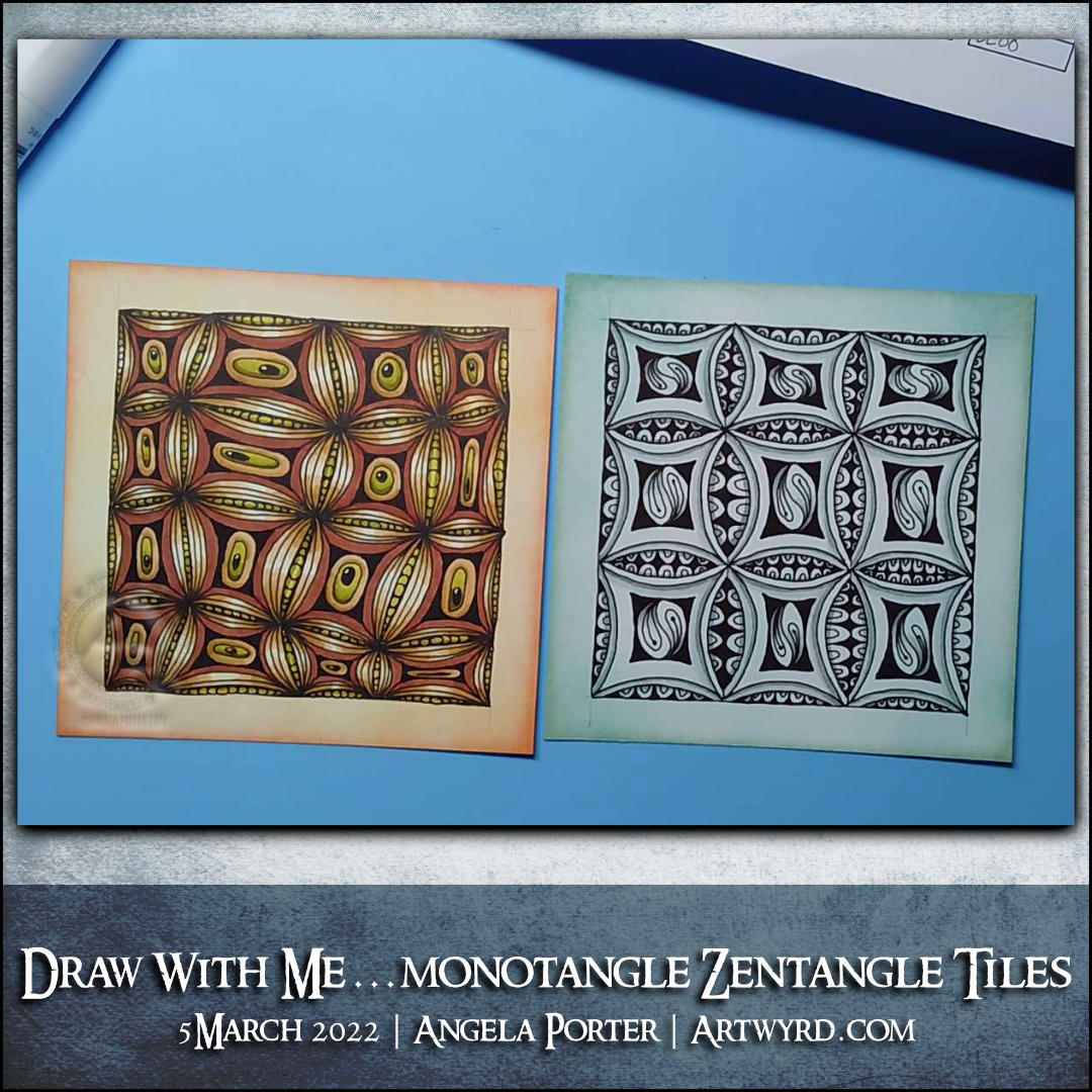
Each piece of paper is 4″ x 4″ or 10cm x 10cm. I coloured them with Distress Inks before starting to draw. For the orangey-yellow tile, I used mustard seed, dried marigold and abandoned coral. For the bluey-green tile, I used broken china, peacock feathers and evergreen bough.
Each tile is made of a variation of fragment D5 from the Zentangle Primer. I used 0.35 and 0.20 Copic Multiliner SP pens to draw the designs. Then, I used a black Ohuhu brush marker pen and various colours of Arteza EverBlend marker pens to add colour and shadow.
These tiles would look fab mounted on blank greetings cards, and that is to be their destiny!
I really enjoyed the two to three hours I spent this morning creating these designs. I’m quite happy with them. More-so as the Distress Ink worked well with the Ohuhu marker paper, and the alcohol inks worked well on top of that.
Which is your favourite one? Or, are you like me and I like them both equally!
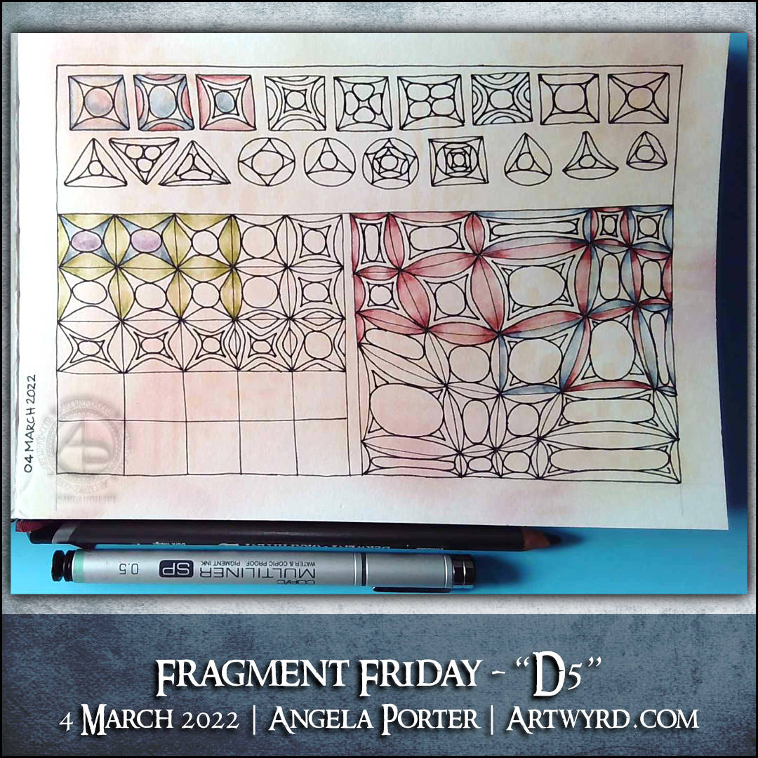
In today’s video, I explore fragment D5 from the Zentangle Primer. Some interesting variations appeared, which were more interesting when put into either a regular or a crazy grid (or reticulum).
I decided to use Graphitint pencils to add both shadow and colour to some of the drawings.
This week, a little more than usual, my thoughts have been on peace.
Mother Theresa said, “I will never attend an anti-war rally. If you have a peace rally, invite me.” The essence of this is that if we want peace, our thoughts, words and actions need to be on peace. That resonates with me a great deal, and I did before I’d heard of this particular quote!
However, if anyone wishes to send me an email to Artwyrd at AOL dot com, I can send them to you.
I was born in the early 1960s and have a sister who is ten years older than me. I was, from my birth, surrounded by music and imagery of the hippy era. So, it’s natural that some of the symbols of that time can be seen in my drawings.
Art is my way of not just expressing my creativity but is a way to take my mind off worries and troubles and to focus on more positive thoughts. Any creative activity that you can lose yourself in, not being aware of your thoughts, brings a sense of peace and calm, relaxation and pleasure. Colouring has the same effect on the mind as mediation, something else that I do.
Both templates were drawn with fineliner pens on paper. Colours and coloured backgrounds have been added digitally using ClipStudio Paint.
It’s been a funny old day. A load of deliveries were scheduled today. I’d woken way too early, and by the time I’d drifted back to sleep, well it was time to get up ready for the Abel & Cole delivery, which didn’t arrive until after 11am. If only I’d known, I could’ve had a couple hours more sleep! Ho-hum.
Still, I pottered around with different colours on yesterday’s ‘Give Peace A Chance’ drawing, as well as adding colours to some other drawings.
Finally, all my deliveries had arrived, the last one being my order from CultPens, which included a pair of D&S A5 landscape Hahnemuhle sketchbooks. So I just had to try one out.
The paper is quite thick, has some tooth to it, but not too much. You can very, very faintly see the pen drawing through the paper, but that’s not a problem at all. And adding some tinted charcoal to the drawing was a pleasure as it was gently eased into the paper fibres by the careful use of a paper stump.
I’ve tried some Graphitint pencils and a damp brush to see if that would be ok on the paper. So far so good!