I have inky fingers…

img_0574
An ATC or ACEO card made earlier today.

Mixed media experimentation is a tad addictive!

I spent yesterday creating more inchies and betwinchies, as well as shopping for some supplies.  This morning, I created the ACEO/ATC above.

The card itself is made by Strathmore and is some of their 400 Series Watercolour paper with a cold pressed surface.  I added layers of Distress Oxides, spraying with water to get the textures.  I also added patterns through stencils and stamps, followed by a final spray with gold Perfect Pearls.  I edged the card with Ranger’s Archival jet black ink.

It took a little while to rifle through my growing collection of inchies and other art tiles to find one that suit the background.  This tile has a faint crazing pattern and an aged/distressed look achieved by the use of Tim Holtz’s Collage medium – crazing followed by some distress ink rubbed on to bring out the crazing.  A layer of 3D Crystal Lacquer added a gloss finish to the tile.

Once the tile was stuck in place, I used a Pitt artist pen to draw patterns around it, added the words, more patterns and highlights using a gold gel pen. Finally, I added some small gems using Glossy Accents as a glue.

I do have a couple of things left for me to do with the ACEO/ATC – to add a layer of Micro Glaze to seal the surface so any water/moisture won’t affect it, and to add information to the back of the card.

I am really chuffed with this ACEO, as well as the background created with the Distress Oxides; I’ve achieved something I never, ever thought I could!  Before Distress Oxides I struggled to make backgrounds.  I don’t really get along with acrylic paints, spray generally are too messy for me, the original Distress Inks would run into one another and the colours become really poopy.

However, the Distress Oxides are a completely different medium, one that really seems to suit me and work for me and with me.  They are opening up doors for me to express and explore my creativity in ways I’d given up on with the failures (well, what I consider failures) with the arious paints and other media I’ve used in the past.

All it took was for me to find the right medium for me to use.


img_0576

Yesterday , I also I made two beautiful backgrounds that I just can’t bear to cut up or cover over, yet.  I’m sure I will. The photo doesn’t do them justice.  There are many layers of colour, all made using Distress Oxides on some really heavy and smooth waterolour paper (300gsm I think it is).  Patterns have been added using water, stencils and stamps.  Finally, the backgrounds have been sprayed with copper Perfect Pearls, which shimmer and also really bring out the depth of colours in the layers.

Mixed media

img_0569

Over the past two or three days, Ive been making ‘inchies’ and decided it was time to put them together as a mixed media artwork, which isn’t yet finished, as you can see above.

Inchies are 1″x 1″ pieces of art, though I have made some 1″ x 2″ tiles too.

There is something very satisfying in making such tiny pieces of art, and it’s nice to turn them into some kind of mosaic.  I’ve chosen inchie (and betwinchie) tiles that say something about me, some of them quite literally by the words on them, others more symbolically.

Making the inchies and betwinchies

To make the inchie and betwinchie tiles I started with mixed media paper.  My preferred brand is Claire Fontaine, and I used some sheets of white mixed media paper, and some that are natural in colour.

Distress oxide inks and a stencil brush were used to add colour to the sheets of paper, with a misting of water applied once this was complete to bring out the ‘oxide’ effect.  The Distress Oxides look quite different on the natural paper, more muted as the oxide ‘bloom’ is more apparent.

Next, I cut the sheets into 1″ x 1″ and 1″ x 2″ tiles.  I edged the tiles with black by using the edge of a wide tip on an alcohol marker.  Drawings and patterns were then added using Pitt Artist pens by Faber-Castell.  I wrote words on some of the tiles, on a few I used some ChitChat stickers from Tim Holtz’s Ideaology range.  Then,  Derwent Inktense pencils with a water brush and coloured pencils with a blending stick from Faber Castell were used to add colour depth to the tiles.  The next step was to add white highlights and metallic and iridescent details using gel pens and paints.

To finish the tiles, I added a layer of 3D Crystal Lacquer by Sakura Hobby Craft to give them a highly glossy, slightly domed finish.

I then had a small bowl filled with these tiles, and had to try to do something with them.  So, I thought I’d make a kind of mosaic of ones that said something about me.

Making the background and mosaic

I needed a background for this, so I took another piece of the  Mixed Media paper, in white, and added colour using ink blending tools and the Distress Oxide inks, followed by a light spray of water.

I used various stencils, again with ink blending tools and Distress Oxides to add patterns.  After each stencil, I sprayed the stenciled areas quite liberally with water so that the dye part of the Oxides inks ran, but the pigment ink remained in place.  I also let any puddles of water form or run as they wished to do so.  Finally, I edged the piece of paper with Vintage Photo Distress oxide ink, again using a blending tool, and then sprayed with water once again.

I didn’t take a photo of the background, which I was really pleased with and almost didn’t want to do anything with other than keep it and look at it.

However, I gritted my teeth and started to choose the tiles I wanted to use and to lay them out on the background.

I then used a collage medium to stick the tiles down, and the result is what you see.

It’s all a bit wibbly-wobbly, but that’s quite representative of me!

Learning points

I know it’s not finished yet, but it’s drying as I found that if I got the collage medium on the Crystal Lacquer finish I got dull patches, so an extra layer of Crystal Lacquer has been applied to the affected tiles and these are now drying.  So, I need to make the inchies and not finish them off before I adhere them to a project, or I need to find a different way to adhere them!

The background has warped – a lot.  I need to think about how to either keep it as flat as possible through all the repeated sprayings and dryings of the paper when the background is made, or I need to find a much thicker paper/card to use for this.


Abstract Drawing

angela-porter20170225_0004

This drawing is all but finished. I just have to decide whether I’m going to add any metallic or iridescent highlights to it, along with any extra shading.

The background was created by using a stencil brush to apply Distress Oxide inks onto Daler-Rowney Mixed media paper (A4 in size) until I was happy with the colours.

Next, I sprayed the sheet with water and let it dry. This lets the Distress Oxide inks ‘bloom’ and become ‘soft’ as well as creates some texture in the form of patterns where the water droplets landed.

Pitt artist pens from Faber-Castell were used to draw in the main design, to which I then intensified the colour in many areas to add depth and interest; I used Derwent’s Inktense pencils to do this, along with a Kuretake water brush.

Finally, I added the fine details and patterns with a really fine Pitt artist pen.

Six small tiles

angela-porter20170224_0003

I’ve completed the six tiles I cut from a single piece of mixed-media paper that I had coloured using Distress Oxide inks.

Next, I used Faber-Castell Pitt artist pens to draw the designs and add the patterns on each tile.

To add depth to the designs, I used Inktense pencils and Faber-Castell’s Albrecht Durer Watercolour pencils with a water brush.

Finally, I used either iridescent/metallic watercolour paints or a metallic gel pen to add some shimmering, shining details to each.

I really enjoyed doing these; again, they’re a little different to a lot of the work I’ve done for colouring books, so it’s nice to explore different ways of creating.

The thicker black lines I’m using at this time mean my art reminds me a little of stained glass and also of lino cuts.  I do like the very bold lines; it almost seems like I’m making a statement.

Little drawings

img_0564

Today, I’ve taken a bit of a break from drawing doodle art and played with Distress Oxides and other media.  The photo above shows just a couple of the small pieces of art I’ve created.

The top two are drawn on Strathmore Bristol paper with a vellum surface which was prepared with Distress Oxide inks brushed on using a stencil brush.  That worked really nicely!  I used a Faber-Castell Pitt Artists pen to draw the design on and then I used Inktense pencils to deepen colours and add shading, before adding just a few metallic highlights here and there.  I really enjoyed drawing these ones, and I have some more pieces of the inked paper ready to draw on – that’s the rest of my evening sorted then!

The bottom two are from some experimenting I did earlier in the day. Both were drawn using a Sakura Glaze pen.  I used Derwent Color Soft pencils to add colour to the design drawn on Kraft paper, and Inktense pencils with a damp brush on the other.

I also had some 3D Crystal Lacquer made by Sakura Hobby Craft arrive today, so I added dots of that to various elements in the bottom two to see what it’s like.

I have been trying out watercolouring with the Distress Oxides, and they end up with a finish that is similar to gouache.  I’m not sure I like using them in this way, however.

Distress Oxide Inks – my first play.

angela-porter20170217_0022

Today, I picked up the first 12 colours in the new Distress Oxide inks from my fabulous local art shop – Dandie Crafts. I’ve been looking forward to getting them since I saw them launched by Tim Holtz just prior to and during the Creativation 2017 craft show.

The above image is a typical ‘Angela-doodle’ drawn using Sakura Micron and UniBall UniPin pens on a background prepared using the new Distress Oxide inks.  Before I let you know what I think of them, here’s a little bit about them.

The Distress Oxide inks are designed by Tim Holtz and made by Ranger. This is the description of them from the Ranger website:

Tim Holtz Distress Oxide Ink Pads are water-reactive dye & pigment ink fusion that creates and oxidized effect when sprayed with water. Use with stamps, stencils, and direct to surface. Blend using Ink Blending Tools and Foam. Re-ink using Distress Oxide Reinkers.

My first job on opening my ink pads was to test them out on different papers so I gained an idea of the colours they’d be, as well as how they react with water.  To create these test swatches I stamped two ‘feathers’ with each colour on the paper/card.  I then used an ink blending tool to smear some colour onto the paper.  Next, I used a wet paintbrush to add water to the second feather before swiping the paintbrush across the smear and adding droplets of water to it.

Here’s the inks on watercolour paper:

angela-porter20170217_0019

Secondly,  here they are on Kraft card:

angela-porter20170217_0020

Finally, I made test swatches on black paper:

angela-porter20170217_0021

The first thing I noticed was how easy it was to stamp with the Distress Oxide inks.  The original Distress Inks tend to stamp ‘blotchy’ – that’s the nature of them though!  These, because of the pigment portion of the formulation, stamp with a more solid line.  Not only that, the Distress Oxide inks are much more opaque than Distress Inks.

Blending the Distress Oxide inks using a mini Smoothie blending sponge by Crafter’s Companion was an absolute dream!  The inks went on so smoothly and, because they stay wetter for longer than Distress inks.  Admittedly, I may not have picked the best paper for applying the Distress Oxide inks to, and there was some unevenness in the blend/smear, but it was much better than I’d manage to get with Distress Inks, unless I used a stencil brush to apply the Distress Inks very thinly and build the layers up.

I don’t think I let the inks dry for long enough before adding water as I did note that some of the pigment moved when I brushed the feather with a wet brush, and the smear.  That may be because I used a brush rather than using a spray bottle to mist water on them.

It took longer for the Oxide effect to develop as I’d added more water than a misting would have, but the colours kind of soften on the white watercolour paper, and brighten on the Kraft and black papers.  The opacity of the pigment ink is increased by the addition of water, and the colours really seem to glow.

I then just had to go and create a background using the Distress Oxide inks.  I used mini ink blending tools this time, and I used Strathmore Bristol paper with a vellum surface.  The inks didn’t want to blend all that smoothly on this surface, however I wasn’t really too concerned as I just wanted a background to draw on.  When I was happy with the colour blend, I did mist the surface with water to bring up the Oxide effect, as well as to have a few small water splatters on the surface.

The Distress Oxide colours are much more ‘me’ than the original Distress Inks. They’re so creamy and rich in colour thanks to the pigment part.  I also love the suede-like feel that results after a light misting with water.

I’m really happy with these new inks and I look forward to experimenting with them more.  I plan to use them like watercolour paints, I want to try using stencil brushes with them to blend the colours out, and no doubt I’ll find other ways to make colourful backgrounds for me to draw upon.

Drawing with colour…

I’ve been taking a little break today from the doodle art I’ve been doing lately, and the above is the result of a couple of pleasant hours this evening.

The image on the left has been drawn with Caran D’Ache Supracolour Soft watercolour pencils and a brush and water has been used to blend the colours.

On the right, I’ve used Derwent’s Inktense pencils, again with water and a brush to blend out the colours.

In each case, no sketch was made before drawing; I used the colours to create the patterns as I went.  So, I’ve been ‘doodling’, but in a different way to usual!

Doodle, illustration from 11 Feb 2017

angela-porter20170211_0016-watermarked

I’ve done it!  I’ve worked out how to easily add a watermark to my scanned artwork to try to protect it as I share it online.

Autodesk Sketchbook Pro made it a doddle to do and so I’ll make sure I do this in the future.

To draw this one I found, after much searching, my Rotring Rapidograph pens.  It’s been a while since we were acquainted with each other, but yesterday was the day!  I’d forgotten what a joy they can be to draw with.  Also, unlike the UniBall UniPin or Sakura Micron pens I generally favour to draw with, I don’t wreck the nibs in a short space of time. I must press a lot harder than I think I do with them…

So, onwards to more art.  A lesson learned about protecting my ownership of my art and some control of it when I release an image of it into the wilds of the world weird web.

Some rainbow doodles and a bit of a rant

The rant

Over the past week or so I’ve been feeling incredibly stupid and naive. I’m quite proud of the art I create; the process of creation brings me a lot of pleasure and I like to share images so others can share in the pleasure when they see the art and appreciate it.

I’ve had to think long and hard about whether to share my drawings on the internet, and if I continue do how I stop them from being treated as if they are free for all and sundry to print and use as they wish.

My art is how I make an income now, having gone self-employed last summer. Some of my recent images I shared and naively thought that I’d be able to put them together in some kind of publication to sell.

That is now impossible for many of the images as they’ve been declared and shared as ‘freebies’, even though I never gave express permission that this was the case.  I deliberately uploaded images of relatively poor quality and small size to discourage this from happening, and it’s still happened.

I feel really upset and rather low as tam really proud of my latest drawings and I thought they’d be of some commercial value.

Now they are of no value, to me or to anyone else.

Stupidly, naively, I forgot that as soon as you post something on the internet, you lose control of it, you seemingly lose your rights as the copyright holder.

A lesson to learn for me.  And I’m trying to remind myself constantly that the more I draw in this style, the better I get at it and the more ‘Angela’ it becomes.

Despite this, I still want to share some of my drawings, and I think the best way to do this will be to colour the images in someway to discourage this happening again.  I know it won’t discourage the determined die hards who have no conscience, but I do hope that it will make others stop and think about the consequences of their actions.

I do, from time to time, draw images that I do offer as ‘freebies’ via my facebook page, and I always say they are such.  What I don’t do I tell people that something is NOT a ‘freebie’, and I suspect even if I said that there would be some who would ignore it.

I hope that I have found a way round this…and that perhaps these words will make people stop and think.

What I’m trying to do is to learn from this, to take it as a message that I need to protect my work more when I put it on the internet, and to take it that the last few images I have been serving my apprenticeship in a slightly different art style as I make it ‘mine’, and keep work back that won’t be seen unless it’s published or in a portfolio for prospective employers.

If anyone has any suggestions to help me with this, apart from to never show my work (which I generally don’t do if I’m working for a publisher, but even then I do the odd sneak peek), I’d appreciate it greatly.

Rant over.

Rainbow Doodles

So, one of the things I’ve done to try to protect my work is to colour it in.  It takes way too long to break out media to colour in everything I draw, so I’ve made use of Autodesk Sketchbook to apply a rainbow colour gradient to my drawings.

I’ve also uploaded them to artwyrd.deviantart.com so they become watermarked as an added bit of protection.  I need to learn how to do that somehow…

I quite like the rainbow gradients.

Time to Talk day, Hirameki fun and a partly coloured doodleedoo.

Time to Talk 2017

Yesterday was Time to Talk day; a day with the focus on encouraging people to talk, especially about mental health in order to help to end the stigma and discrimination that people with mental illness experience.  Many celebrities and organisations supported this day, which is brilliant!

I’m a champion for Time to Change Wales.  This means I volunteer to go to events, businesses and organisations to encourage people to talk about mental health, as well as to tell my story of my mental health problems and the stigma and discrimination I’ve faced, as well as the help and understanding I’ve been given and the little things that employers did that helped me to remain in teaching for as long as I did.

It was quite appropriate that the first time I went to tell my story was on Time to Talk day!  I went to Remploy in Pontypridd and talked to both the employees and some of their service users.  Bev from Time to Change Wales was there to support me the first time I did this.

Getting the powerpoint presentation sorted was a major job for me and showed me how much my concentration has been affected by my extended bouts of anxiety/depression in the past few years.  It took me forever to add just five slides to the presentation!

Telling my story was easy, yet at the same time it was difficult.  It opened up some sores, brought back things I thought I’d left behind when I left teaching, and had me in tears at some points, which resulted in me making some self-stigmatising statments such as ‘sorry, I’m being stupid with these tears’ and then saying that was self-stigmatising.

I got through it.  Bev, the longest serving champion who’s done over 100 anti-stigma talks, said I did well.  People thanked me for sharing my story.

It was a good thing to do.

I came home emotionally drained and well out of sorts though.  I’m feeling a bit more me today, but still drained.  It was still worth it, still a good thing to do, especially if it gave one person what they needed to get the help or to talk about mental health themselves.

Arty goings on

One of the things I do to help re-balance me when I’ve been drained/overly emotional/triggered as I was yesterday is to have a nap.  The other thing is to do art.

Art has been my great source of solace and peace for me during my worst times, and it continues to be so.

I partly coloured in a doodle-type drawing, using my Copic markers this time.

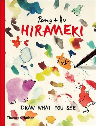
After the talk yesterday, I had a wander to Churchill’s stationery in Pontypridd to pick up some art supplies.  There, I found a little book called Hirameki:Draw what you see by Peng and Hu.

“In the beginning was the blot.

A flash of inspiration, a light bulb moment, a stroke of genius…

With just a few strokes of the pen and a dash of your imagination hirameki gives a sublime and unexpected sense of satisfaction and delights the hand, eye and mind.  The little blot will reveal its true self.

Hirameki: pleasure from the smallest things.”

From ‘Hirameki: Draw What You See’ by Peng and Hu.

So, I had to have a go at this!  Here’s my first go at it…

I had a lot of fun, both making the blobs of colour and then trying to let my imagination run free.  I found out, however, that my imagination isn’t what I thought it was, or that it is rusty and out of use.  I will persevere, however, as there are some characters/objects there that I can make use of in my doodly style of art!  They’ll be added to my visual vocabulary/library in my zibaldone.