Earlier today, I just wanted to explore a simple Zentangle Pattern fragment, or two. I started with two square fragments, each with a circle in the centre. One had a diagonal cross, the other vertical/horizontal. And I went from there to create some more ornate versions of them.
I never know where this kind of exercise is going to go, but it is always interesting and some pleasant kinds of fragments result.
These are just a few fragments I came up with during the course of the video; I’ve barely scratched the surface of all the possible variations.
This exercise is good for flexing your creative ‘muscles’, warming up hand-eye coordination and fine motor skills, and playing around with colour, shade and highlight. Also, it’s perfect for relaxing, taking a break from all that is happening in this world. Even if for just a short while.
Today, I am exhausted. I’ve had an incredibly busy three days, and as enjoyable as they all were, I managed to get over-stressed, over-anxious, over-wrought and exhausted. Oh, and an upset digestive system also always happens when I’m stressed.
All I need is a couple of stress-free and calm days to recover. Maybe more than a couple of days.
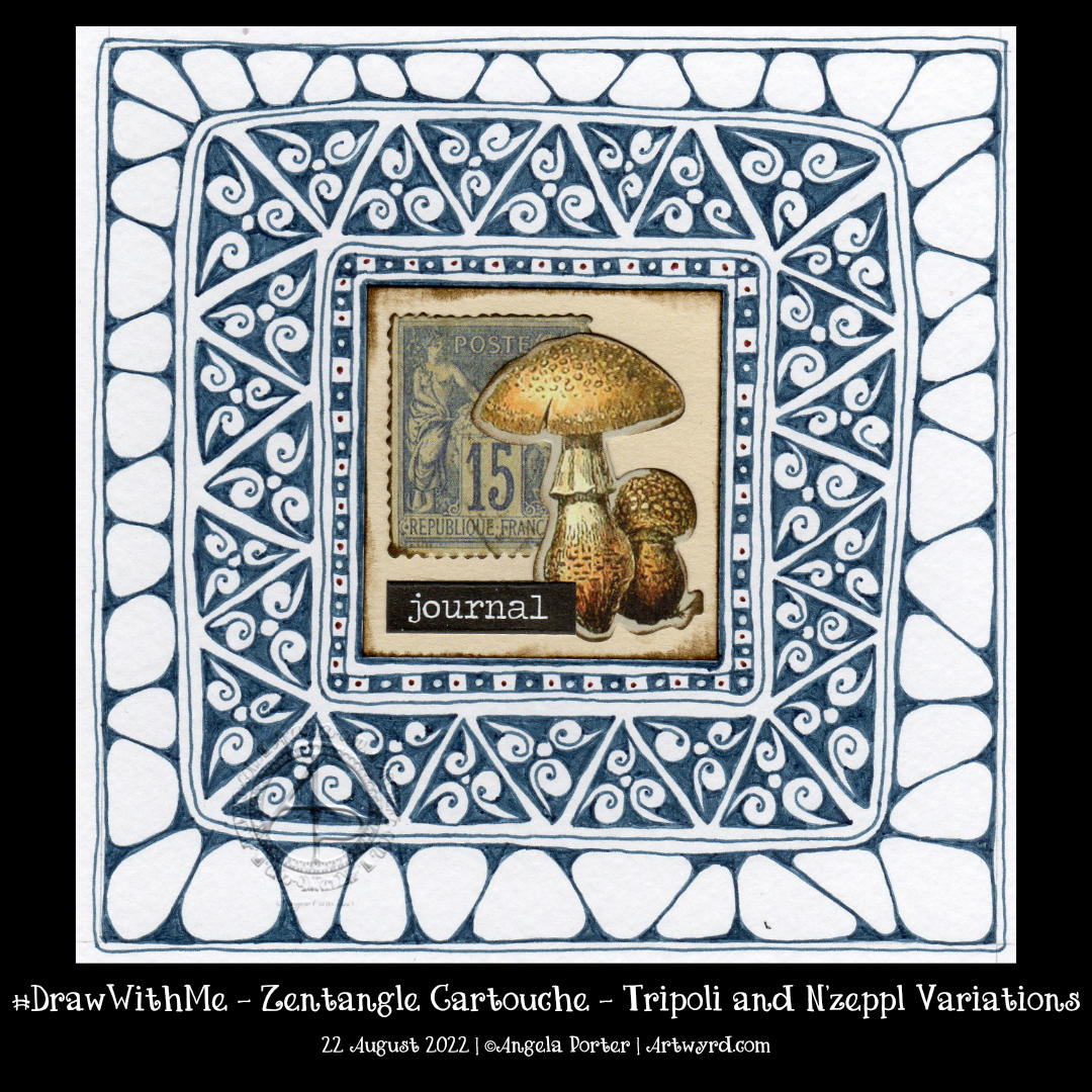
Earlier today, I wanted to draw, and I wanted to draw something that wouldn’t be too challenging – the focus being on calm and meditative. A Zentangle Cartouche seemed to fit the bill.
The central motif was a sticking point. Try as I might, it took me several attempts to get an assemblage of Tim Holtz Ephemera that was to my liking.
I knew I wanted to use a triangular fragment as part of the ‘cartouche’ to frame the focal point. I knew that black would most likely be too harsh. So, I went with a softer blue-grey. And that seemed to work out just fine. Apart from the fact I used a Zebra Sarasa 0.5 gel pen and the areas of dense ink are rather uneven. What is daft about this decision is that I have plenty of fine-liners that would do the job better!
Brain full of fluff and addlement today – told you so!
Anyhoo, I persevered and have got it to a point where I like the contrast between the ink-dense tripoli border and the more open N’zeppl. The next job is to decide how to add some contrast, colour, highlight or any combination of these! Oh, and what medium to use too, but that decision can wait until I’m less overwrought, brain-addled, and my head is less full of fluff to decide.
I have also managed to bake a cherry and coconut cake, which is remarkable, given I’m not too good at baking when I’m emotionally overwrought. It’s cooling down, so will try it later on for sure.
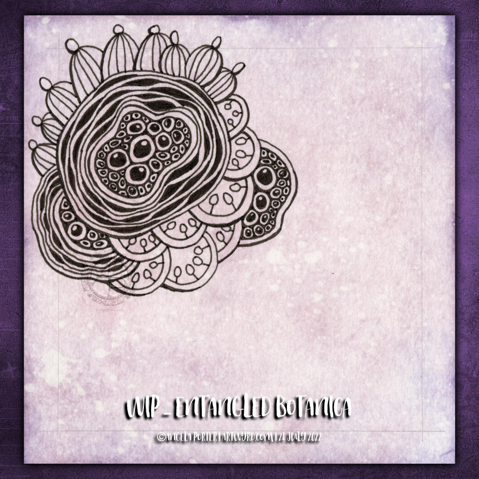
Botanica. Botanicals. Abstract, stylised and imaginary seed pods. Pen drawing. Entangled, intricate, with a touch of the Zentangle tangle pattern Diva Dance.
All some of my favourite things to draw. No idea how it’s going to turn out, just letting it flow as it needs to. One of my favourite ways to create!
And there’s a video showing how I drew this design, as far as it’s got, over on YouTube, if you want to draw along with me!
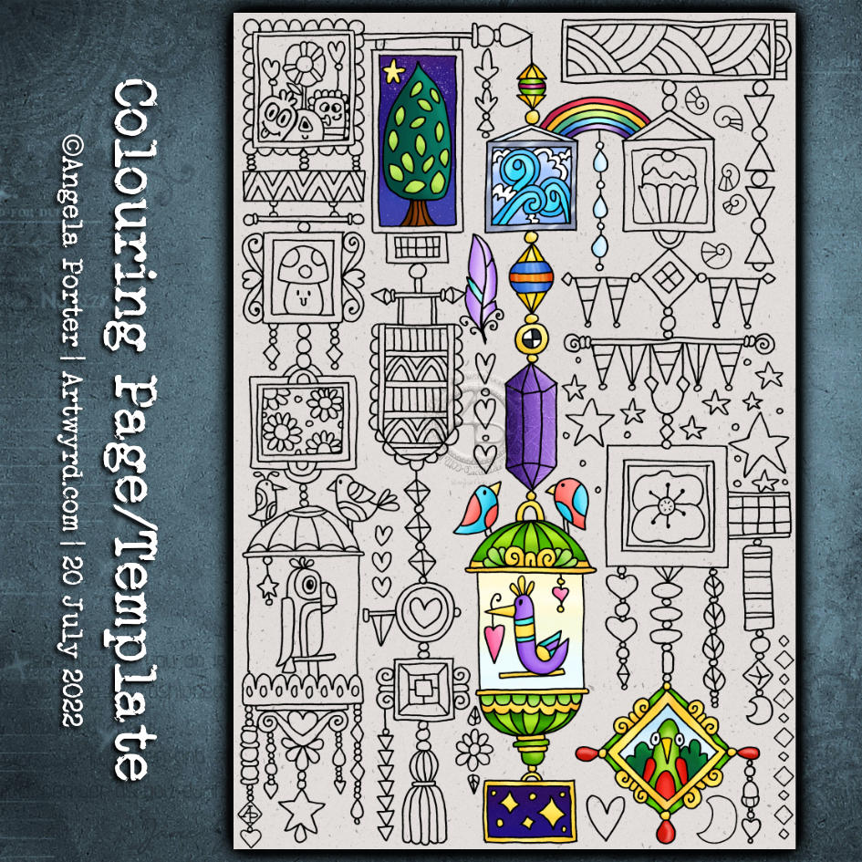
This week’s colouring page (colouring template) is a fun one. From time to time, I like to create a page like this – full of whimsy and cuteness and doodles and tangle patterns.
It’s perfect for trying out new colour combinations, new mediums, or new techniques as each image is self-contained yet part of the whole.
Also, it’s perfect if you only have a little time and struggle with leaving something partly finished. There are so many elements here that can be completed quite quickly.
This week’s colouring page (or template) is a rambling one, full of clusters of botanical motifs. There is no right way up for this design, despite me having included my initials somewhere.
I’ve gone for fairly pastel colours for this design, but the possibilities for colour palettes are endless.
If you’d like to download and print the colouring page, you need to visit and join the Angela Porter’s Coloring Book Fans Facebook group. It’s totally free to join and the template is free to download too.
Drawing Zentangle Tangle Patterns Spoolies and Swerve and adding contrast/colour.
What to do on a Sunday morning? Arty things of course!
So, yesterday I drew the design to the right and added some colour to it. But it was lacking something. I eventually worked out, at around the same time someone made a suggestion on my YouTube video, that it needed more contrast.
So, I set about doing just that, as well as showing/explaining how I add weight to lines to help increase the contrast and sense of volume. That’s what the greyscale drawing is all about.
For the other one, I used sepia and red oxide Inktense pencils and a damp brush to add more colour and increase contrast. I made some bad decisions in adding cross-hatching to some of the elements of that design. But that meant it was a great piece to work on improving my skills.
I’m often way too timid with contrast, at the start. But as long as I use a medium that allows me to gradually build up layers, I eventually get there.
Today’s video shows how I achieved this higher contrast finish with both line weight and colour/shadow, and you can watch it by clicking on this link.
In today’s YouTube video, I show and try to explain verbally, how to draw a different kind of shell, one step at a time.
This shell is, perhaps, a bit more challenging than yesterday’s. However, when broken down it’s not much more difficult.
Again, I add shadow to the drawings using a graphite pencil and a paper stump/tortillon or, in the case of part of the second shell, pen lines and density of pattern.
I also added some colour to the second shell, using a damp brush and lime green and turquoise Karin Brushmarker Pro pens. The graphite shading shows through the transparent watercolour inks from the pens.. I think this combination makes the image look quite metallic. Not surprising as graphite, as an element, is rather grey and shiny and metallic looking! Actually, it’s just the cool grey tones of the graphite that makes this so!
It’s really a lot easier to show than to explain in words, spoken or written. This is why I’m creating videos. It also makes that part of me that is a retired science teacher happy to use my teaching skills and feed my passion for helping others learn and grow.
I used variations of the Zentangle tangle patterns Ginili, Gingo and Fragment D5, plus the little seeds/stones.
Not only did I use a limited number of patterns, but I’ve also used a limited colour palette too. That’s what I seem to do best with when it comes to colour.
As it’s grey and damp and a bit miserable out in the world here in the Valleys of South Wales, UK, warm, bright colours are very much needed. They serve as a reminder that spring is almost upon us!