Please click on the “Watch on YouTube” button. Cheers!
Carrying on with my look at arches is an exploration of the tangle pattern “Kruffle” by Kelli King CZT.
It actually took me a little while to understand the deconstruction of this pattern, it’s deceptively tricksy! But, when I’d got it, quite a few variations appeared in my sketchbook.
Of course, I go through these, step by step, in today’s video.
I really do enjoy exploring tangle patterns, as well as all my favourite motifs. They are such a good way to get creative juices flowing, but also of practicing your drawing skills, as well as other techniques, such as adding shadows or colour, or further patterns.
Please click on the “Watch on YouTube” button to view on YouTube itself (and help the algorithm!).
I’ve now finished this drawing by adding two organic motifs, both fairly simple.
With the trailing flowers or leaves or stones, the hardest part is arranging them to look like they’re trailing and remembering to decrease the size towards the point.
The other motif, a stack of small seeds on a stem, is easy enough to draw.
After doing this, I thought it needed some colour to bring the motifs to life. So, I dug out some of the Neocolour IIs I’d used for the background and used them a bit like watercolour paints. I scribbled a little of each Neocolor II on my plastic palette, added water, and painted.
I’m not entirely sure about my efforts with adding colour – this is where it can all go wrong for me. Part of me knows I’d most likely be better off if I were to add shadow and texture using pens.
I did use some metallic watercolours to add some sparkle here and there too.
One thing I did notice is that I was glad I tried not to paint over the black lines. The pigment ink in Micron pens is usually waterproof, but, as the Necolor IIs are wax-based and coat the surface of the paper, the pigment doesn’t sink fully into the paper and so water will move the ink.
It’s not a problem, now I’m aware of this. Oh, it also means erasers will lift some of the ink as well as pencil lines. Again, just something to be aware of.
One other thing I did was to cut the paper down to frame the design a bit better. In my clumsy way, I managed to cut it just across the tip of one of the trailing thingies. So, no border around that area.
I will keep going with adding colour and see where it leads me, hopefully not into a disaster! Still, if that happens, it’s only a bit of time, ink, paper and colour and the design can be used as inspiration for the next one. Important lessons about the Necolor IIs are being learned, which is, perhaps, the most important thing.
Please click on the ‘Watch on YouTube’ option. Cheers!
In today’s tutorial video, I enjoyed drawing on one of my Neocolor II backgrounds. And I’ve just remembered I forgot to scan the background before cutting and drawing on it. Oh well. I’ll just have to make another one!
Anyhoo, I sometimes forget how much I enjoy working on a coloured background. The colours add an instant “feel” to a drawing. This one reminds me of sunrises and sunsets and the joy and awe that I experience when I see them. So, it was natural I’d choose a few of my favourite motifs to start filling this A5-ish sheet with pen drawings.
Of course, it’s lovely to share how to draw these motifs with others, helping them along their arty journey.
Yesterday, I recieved my tin of 40 Caran d’Ache Neocolour II watercolour wax pastels. I finally gave in to a long-held urge to try them. I kept telling myself, “I don’t need them. I have watercolours, distress inks, water-soluble pencils, distress oxide inks, and more”.
However, a couple of suggestions of videos about the Necolor IIs popped up on my YouTube feed. I looked, and thought that these could be perfect for backgrounds for my hand lettering, or drawings, or even for using like watercolours.
The colours stay nearly the same vibrancy when dry, even the rather watered versions. They can be opaque to fairly transluscent, though not transparent. This is great for layering as the translucency still lets the lower layers show through us much or as little as you want.
Although they can always react with wither, drying with a craft heat tool seems to help set them a bit; perhaps by melting the ‘wax’ into the paper. And of course, not working too hard with a brush helps with preserving the layers.
Brush? Did I say brush? I find that adds way too much water for my liking. So, I used a piece of cut ‘n’ dry foam, black side down, to add small amounts of water and blend gently.
I have had a lot of fun playing with them for sure. In this video I make the pinky background seen behind the Zentangle tile. I already have a use for that background!
I used one of my first experiments with Necolour IIs from yesterday to turn into a Zentangle tile (3.5″x3.5″ or approx 9cm x9cm) and to draw this monotangle on it. Instead of using a graphite pencil or chalk pastel or any other medium to add shadow I used varying line thicknesses and pattern to do this. I really didn’t want to take away the vibrancy of the colour, even in the shadows.
Of course there was another reason why I wanted to draw on a Neocolour II background – to see what it was like to draw on the surface with fineliner pens.
It was actually lovely! The Necolour IIs add a slight slickness to the paper that is just noticeable. That made it a bit nicer drawing on the fairly textured mixed media paper for the tile. The points of my pen didn’t catch as much on the texture, though I still got some wobbly lines thanks to the more bumpy bits!
All I need to do now is to remember to scan the background in before I work on it. That way, I will always have a background I love available for use in digital art or, perhaps, for printing out.
After getting my daily quota of sketches done for the next Creative Haven book, I turned my attention to some sketchbook work. This time I chose to do a tangle pattern exploration of Kangular by Tomàs Padrós CZT.
I love all of Tomàs’ patterns, and Kangular is no exception! It’s a charming, geometrical pattern with lots of possibilities for variations. And there’s only a small number here.
Adding shading really brings volume to the individual fragments and overall pattern, as does the use of fairly high contrast.
I enjoyed my time with this pattern, and you can see my explorations in today’s YouTube video.
I had the hand-lettered part of this sketchbook page completed a couple of days ago. I didn’t really know what else to do with it. I knew adding colour with traditional media was likely to be a disaster.
This morning I woke up knowing what to do with this, along with other things. So, I spent some time adding a border around the lettering and starting to add patterns and motifs. And arches, lots of arches!
I then thought it would be nice to share some of the drawing process through a video, which you can see by clicking this link.
It feels like a long while since I did any entangled style art. The hand-lettering isn’t perfect, nor is the frame around it. But that’s OK. I think it goes with the ‘chaos’, the imperfection, the touch of an imperfect human hand.
A couple of months ago, I may have tried to do something like this, and would likely have been really dissatisfied with the result. Mainly because I wasn’t at all happy with my hand-lettering attempt. But now, after just a couple of months of working in lettering sketchbooks, working with different ways to form letters and finally accepting that whatever lettering I do doesn’t have to be perfect – good enough is good enough!
I’m using variations in the density of pattern and ink to create shadows and highlights in the design. I have no intention of using pencil or markers to add grey shadows to this one. If I decide to add colour, it will be in the style of a linocut or hand-coloured print, perhaps with some extra shadow and highlight added by the depth of colour. Perhaps. Maybe. And if I do, digital is the way I’ll go! First, though, I have to finish drawing this design.
In today’s YouTube video, I show and try to explain verbally, how to draw a different kind of shell, one step at a time.
This shell is, perhaps, a bit more challenging than yesterday’s. However, when broken down it’s not much more difficult.
Again, I add shadow to the drawings using a graphite pencil and a paper stump/tortillon or, in the case of part of the second shell, pen lines and density of pattern.
I also added some colour to the second shell, using a damp brush and lime green and turquoise Karin Brushmarker Pro pens. The graphite shading shows through the transparent watercolour inks from the pens.. I think this combination makes the image look quite metallic. Not surprising as graphite, as an element, is rather grey and shiny and metallic looking! Actually, it’s just the cool grey tones of the graphite that makes this so!
It’s really a lot easier to show than to explain in words, spoken or written. This is why I’m creating videos. It also makes that part of me that is a retired science teacher happy to use my teaching skills and feed my passion for helping others learn and grow.
I continued the theme of sea plants today with a row of clusters of variations on a shape. Seriously, just one basic shape with small variations from cluster to cluster. The YouTube video that accompanies these drawings takes you through how to draw them, one step at a time.
Of course, I don’t stop with the main shape being varied. It was a lot of fun to add simple patterns and textures to these plants (or creatures if you will).
Alcohol markers in an analogous colour scheme of violet, blue, blue-green and yellow-green were used. The yellow greens were a late addition as I felt the first cluster needed an extra colour. The yellow-greens also link this row to the first one done yesterday.
The final steps are adding the detailed patterns and textures using both a black 0.1 fineliner and a white gel pen.
Oh, I did use a couple of cool greys to add shadow to the drawings before I added colour.
I’ve just realised I haven’t put any drop shadows behind these plants, or sea squirts, or… Maybe I’ll do that before tomorrow’s video session!
I’ve been having a lot of fun filling sketchbook pages with variations on a basic motif/pattern. It’s time, I think, to fill a sketchbook page (A5-ish) with variations of just one motif. Variations that include filler patterns, colours, shading and media used. I’m not sure that makes sense, but sometimes it’s easier to show rather than tell. Or perhaps tell while showing what I’m doing/thinking.
The video is much shorter than usual, at less than 30 minutes. I think that looking at drawing just one motif is a bite-sized activity, whereas a whole sketchbook page in one go can be a bit overwhelming.
There, I’ve got to a clear explanation of my intention behind this video!
So, I’ve decided to start with a page of variations of oyster shells. I start with line art in an Oysteroid style. Oysteroid is a tangle pattern by Eni Oken. I make sure that I use thicker lines to give the illusion of depth.
Next, add colour. I used two pale warm grey marker pens to add shadows. (Ohuhu WG1 and WG3). Then I used two peachy pinks to add colour (Ohuhu R18 and R21).
Using an 01 fineliner, I added the textural patterns. I decided to use a different one in each layer of the motif. Perhaps a bit too much pattern.
Finally, I added dots of white gel pen for the highlights.
I completely forgot to add a drop shadow beneath the motif to lift it off the paper a little. I’ll add that at a later point in time I’m sure.
The patterns added complexity to the simple colour/shadow. They also masked where my impatience meant the black pen hadn’t dried fully and the ink smudged a bit with the alcohol marker.
I do hope you’ll take a look at the video, get out pen, paper and some coloring medium and draw along with me.
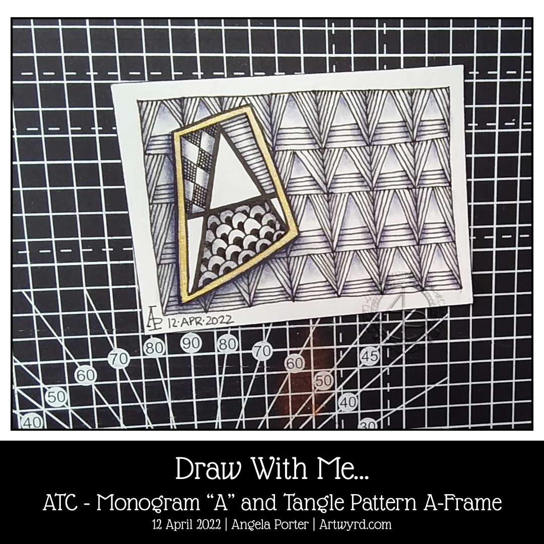
Today, I woke with the idea to create an ATC (Artist Trading Card) using a monogram from one of the hand lettered alphabets I’ve been drawing in my lettering sketchbook.
The monogram is a simple one, with some of the spaces filled with tangle patterns. The background is formed from the tangle pattern A-Frame by Angie Gittles CZT. When I chose it, I wasn’t fully aware it was based on the letter A; I really can be a bit dense at times!
Some indigo chalk pastel and a tortillon to add shadows and some gold watercolour paint to frame the monogram and all was done!
I enjoyed the process of drawing. I’m fairly happy with the end result. However, I think a more organic background may have worked better with such a strongly geometric shape. It’s all a experimenting, exploring, experiencing and learning.
I may end up doing a series of monograms. It’s a good way to work with lettering and to get some practice in of figuring out how patterns and letters/words can work for me.
Today’s YouTube video is a step by step tutorial of how you too can create this ATC.