Mandala WIP

It’s been too hot for me for the past few days. I’ve seriously wilted and haven’t been able to focus much. The very broken sleep during the hot nights hasn’t helped.

Today, however, it’s been cooler in my little nook of the world, thankfully. So, I managed to add colour to one of the two colouring pages I need to get done for Daydreams to complete that project.

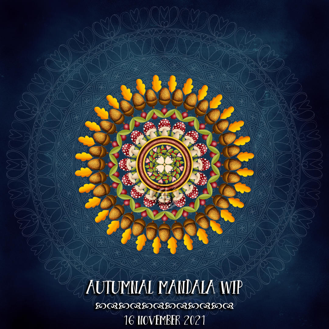
To keep myself awake this evening, I’ve had a bit of an exploration of creating art without any visible line art.

Now, this isn’t something I do much. I dip my toes into this style occasionally, particularly with digital art. I seem to get on better with it when working digitally.

Every time I work this way I wonder why I don’t do more of it. And then I get distracted by contracts and the like.

As I work this way it feels very uncomfortable, almost unnatural. There are bits of this work that I like. The bits I dislike are mainly the areas filled with blobs and the chosen colours. I really like the curves and the shapes created. I also enjoyed figuring out how to add texture to the areas of colour. Oh, I love the way the colours practically glow against the charcoal coloured background.

I realise I need to get my head around using layers in my digital work as that would make it a lot easier to change colours and parts of the design I don’t like. Tonight isn’t the night for that though; I’m just about asleep as I type and try to think!

Oh, the shapes and forms are very much inspired by the work of Ernst Haeckel. What has flowed from my surface pen onto the screen of my surface studio has definitely welled up from my arty heart and subconscious.

I started off without a sketch. But, I decided to sketch out the main shapes/motifs for the remaining layers. I rather like the ghostly chalk-like outline hinting at the next phases of work.

Adding a bit more colour to the bookmark

Accompanying colour with me video on YouTube.

I so love Inktense pencils! However, I noticed that a lot of graphite was picked up by the brush and dissolved Inktense when I was adding colour. I had a sudden flash of insight; try using a grey Faber-Castell Pitt Artist brush pen to put in the shadows. So I did.

The Pitt artist brushes have india ink in them; when the ink dries it is waterproof. If I was working on larger areas, I’d use a damp brush to soften the edge of the shadow before the ink dries. That wasn’t an option for me with this small drawing.

As I added Inktense, I could tell the colour was much more vibrant, but the shadows subtly show through. There was such a difference between the latest sections added and the ones in my previous video/post that I went back and added another layer of colour to these areas. That then matched the vibrancy and clarity of colour across the whole coloured area.

I decided to add some jewel-toned blue. Though I’m not sure that was a good idea at this point, it kind of works as it is kind of a complementary colour to all those yellow-orange-red tones! I also added the blue to the green areas, which seemed to make them more vibrant too.

I always find it easier to add colour to more abstract artworks, using a fairly limited palette too. I have started adding colour to the Entangled Botanic drawing in my previous blog post. I’m really not sure about the colours at all. Fortunately, I scanned the drawing in before setting to it with Inktense pencils and waterbrush. I also know that if some of the colours are a bit garish, I can always tone them down with a layer of another colour. I also think I may add some golden texture/dots to the design too.

Today, I spent a rather lovely couple of hours swatching all my Inktense pencils, including the new set of 24 released this year. There are some beautiful colours in that set and they fill in some holes in the original colour palette. I may very well scan my swatch in and use it to create a colour palette in Clip Studio Paint.

The pot I keep all my Inktense in is a tad small for them all, so I’ve splurged on a case that will hold all of the Inktense and my set of Chromaflow pencils (as long as I weed out the duplicate Inktense pencils). Putting them in order in the case will reduce the frustration of not being able to find the pencil I need in the pot they’re in now!

For now, I think I need some tea!

Entangled Art WIP

A new month today, and with it I’m adding colour to this drawing.

The drawing was done with pen on paper (05 Unipin fineliner). I’m adding colour with Clip Studio Paint. So, this makes this #tradigital – a combination of traditional and digital methods.

It’s taken me several attempts to settle on a colour palette to use. The brighter, more vibrant colours represent the way the world is starting to come alive this spring, for us in the Northern Hemisphere at least. Nature is quickening and lacy leafy green delicately cloaks the the skeletal winter trees and the ground. All the wonderful shades of green of spring make a beautiful tapestry , with texture added by the darker trunks and branches still peeping through. I delight in the variety of greens, that will soon darken to the truly monochrome green of summer.

Zentangle Inspired Monogram WIP

Click on this link to watch the Draw With Me tutorial video on YouTube

This morning, I thought I’d share how I’m exploring creating some Entangled art, particularly monograms, via YouTube.

This little drawing is 11cm by 11cm, which is approximately 3.5″ square – took about an hour or so to get to this point. I wasn’t sure of the green, but I think it’ll work out just fine. There’s quite a way to go yet, but that will have to wait for another time.

The materials I used are:
* 03 black Sakura Pigma Micron
* Various Arteza Everblend marker pens
* Various fineliners in grey and green
* A white Sakura Gellyroll pen
* A metallic gold Uniball Signo pen

Whimsical Work In Progress

This was just some fun! I had no idea where the drawings would lead … but drunken party skulls, mushrooms and tentacles seem to be the theme of the day! It’s nowhere near finished yet, but something fun for me to do later today, after I run an errand.

There is a video of me drawing this as far as it’s gone.

Template Thursyay! 09 June 2022

It’s that time of the week again – a coloring template for the members of Angela Porter’s Coloring Books Fans Facebook group.

This week it’s a mandala. I always enjoy drawing mandalas, and this one was no exception to that statement.

A page from my lettering sketchbook

I’m having a lot of fun practicing hand lettering! I’m taking a course on Domestika :

Hand-Lettering Sketchbook: Techniques to Unlock Creativity A course by Adam Hayes

I really am enjoying it and I’m gaining confidence in creating and using hand lettering. I suspect some of that confidence in playing around with shapes and patterns comes from all the pattern explorations I’ve been doing.

While this page isn’t strictly what the course involves, it is my kind of thing. It combines both hand lettering, my kind of pen drawing, and a way for me to get used to using hand lettering in artwork.

While the black and white version is just fine. I think it needs colour to bring it to life. So, Inktense and Colorsoft pencils are being used to do this. Once I’ve finished adding colour, I may add pattern/texture using other pens e.g. Gelly Roll pens, coloured fineliners.

Oh, I did scan this page before I started to add colour, just in case I make a total mess of it!

The words/phrases are just things that came to me as I was drawing, often commenting on my life at the time I was drawing parts of the design.

“Because I can!” is a phrase I use often during my video tutorials. Talking of videos, there won’t be one today. Time has run away with me and I have things I need to do today. There’ll be another video tomorrow, all things being well!

Draw With Me … A Zentangle Inspired Bookmark using ‘Siros’ – Part 1

Today, I start to draw a bookmark using the tangle pattern “Siros” by Simone Menzler CZT. I’ve yet to decide what I do with the background, which is why I’ve stopped part way through.

It was lovely to spend some time drawing variations of Siros, as well as gaining confidence in the steps needed. The reverse ‘fengle’ version vexed me for a while, but I think I’ve now got it!

The large, open spaces in each Siros were perfect for adding pattern to.

Here’s today’s video on YouTube. Please click on the ‘Watch on YouTube’ button, if you’d be so kind.

A Sneak Peek…

…of this week’s coloring template for the Angela Porter’s Coloring Book Fans facebook group members.

This week it’s another mandala. I’m still not feeling too well, so mandalas are great to create when under the weather.

This one is full of comforting items – a hot drink, cake (or ice-cream!), flowers, hearts and a lovely star. Well, I think the star is lovely!

I am feeling better today, just not quite well enough to do much. I did get a video posted yesterday. Today, I don’t think there’ll be one as I really need to sleep soon.

Autumnal Mandala WIP

Usually, my mandalas are line art. However, I wanted to try going ‘no-line’ and digitally paint one. Of course, I started with a mandala that was line drawn as a guide.

I’m not entirely sure of this. I keep trying different ways of adding colour/shadow/detail. The flowers in the centre have slightly darker line details on them. The hearts are built up of layers of different shades of pink. The leaves are, mostly, just two shades of green. But then I have the fancy acorns, more realistic mushrooms and berries …

It’s all a bit of a mish-mash, or is it? I don’t know. I’m migraine-y today after a poorly night. I didn’t want to focus on anything that I feel pressure to do really well, such as templates for Adorable Dogs. I’m not sure I’m up to creating a video today. But I still wanted some quiet time with arty things.

I’ve had thoughts wandering around my head about working with colour instead of black and white line. I think the explorations with colour and pattern that I’ve been doing in my ‘Pattern Explorations series is having an influence on me.

Today may not be the best day to make any decisions on what I’m doing here, what approach to adding colour I like best, if lots of different approaches work in one artwork, or if I should be consistent, and how to add more pattern to the various elements, and on and on.

My head needs to be clearer than it is. One thing I think I know is that I’ll eventually find a way, even if it is to realise that this isn’t my way.

I do keep coming back to this kind of art, and abandoning it as I become disillusioned with my skill and what always appear to be poor colour choices. I know I’m better with colour with limited colours, or even monochrome. Now it could be interesting to work this in monochrome. Why didn’t I think of that when I started? Basically, it’s because I didn’t think – damn migraine-y, brain-foggy, drifty-floaty, brain-achey-ness.