Kintsugi art therapy

My artistic method today

I do apologise for the poor photos. These were the best of many that I took of my arty pursuits this morning. I’m not sure if I’m finished with it or not.

This was an unusual excursion into the realms of art for me. I was feeling totally emotionally overwhelmed – scared, anxious, sad and confused.

So, I thought I’d try to express my emotions artistically, with watercolours.

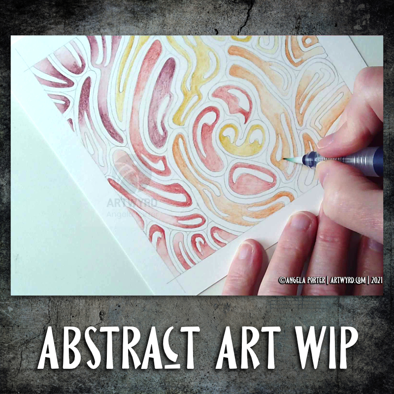
I used masking tape to edge an area approx. 6″ x 2.75″ (15.5 cm x 7cm) in my Arteza Watercolor Sketchbook. I used a new page for this, and it was the smooth side of the paper.

Next, I applied a wet wash of indigo watercolour, and then dropped in greys and rusty oranges, reds and browns into it.

The paper warped with the quantity of water. No biggie though, as this is a sketchbook. Once I’d finished adding colour and letting the watercolour do it’s magic, I used a heat tool to dry the paper. When I removed the masking tape, which was low tack, it lifted some of the paper with it, which was a bit of a disappointment. However, it is a sketchbook, so no biggie.

I then wanted to add some gold patterns and lines. I dug out a Cosmic Shimmer iridescent/metallic watercolour palette and a size 1 brush.

Finally, I thought I’d add some details in black pen (Uniball Signo DX 0.38), but I’m not sure about them at the moment.

Reflections

My emotions were, and still are to a degree, all over the place. I tried to meditate to find some peace and calm; my mind was just racing faster and faster and I just couldn’t sit with the emotions.

So, I decided to try to paint my feelings, to put into colour and pattern what I couldn’t put in words, or make sense of. I thought I’d try a totally intuitive block of colour where I asked my feelings what colour they wanted to use, where to put it and when it was done.

I chose dark, gloomy inky indigo for the background, and rusty yellows and browns. Indigo for both the sadness and upset I was feeling, but also the deep calm I was seeking. The rusty colours perhaps represent the blood, sweat and tears I’ve been expending for a while now. Or maybe the stains on my soul and emotions that have resulted in my struggle today. Either way, the colours just seemed the right ones to use.

There’s also a lot of depth in the way the colours sit on the paper.

Oddly, this is a colour palette I’ve been using for a while now, but never quite so dark. Perhaps my unconscious has been trying to tell me what was likely to come if I didn’t take care of myself.

Once I’d got the block of colour done, I knew I needed to add lines and patterns of gold, a kind of artistic kintsugi. I hoped that the gold would help to heal the shattered pieces of my emotions and mind in the way gold infused resin is used to repair much loved pieces of porcelain. I hoped that the gold would remind me that my healed trauma-wounds that have been filled with gold would remain healed and I could be reassured that I wasn’t going to break.

I won’t, but I could feel myself unravelling.

For some reason, once I’d calmed a little, I felt the need to put the pattern of black at the bottom. Piles of tiny little stones. What springs to mind is they represent the touchstones that are the foundation of my emotional wellbeing. There’s quite a few of them there! That surprises me, as my usual one is the one of contentment, a gentle smile in my heart. I may have to explore what these other touchstones are at some point.

As I look at the panel now, I can see there are lighter areas, where a storm seems to be breaking. Light is shining through, clarity perhaps. The photo doesn’t show the colours at all well. I really do need to learn how to use the camera on my phone or my DSLR much better I think.

A successful experiment

I know art always is a source of peace and calm for me. What surprised me was that I felt I was expressing my feelings in this little, very personal artwork.

I’ve never really used art as a way to work through difficult (or not so difficult) emotions before. I think it’s something I’ll be doing again in the future.

Watercolour practice

Good news – the headache has gone! Yay! The sun is shining, I have uplifting music playing, and I’ve spent some of the morning practicing watercolour skills and working out how to subtly draw/paint on top with white.

The little tiles at the bottom have designs painted on them with white gouache. There’s a lot more variability in line width with these.

The book marks have had the designs drawn using a white Soufflé pen by Sakura. The ink goes on clear but dries a matt and opaque white.

I used som Molin du Roy watercolour paper from Canson for these. The tiles are approx 2″ x 2″, the book marks are approx 2″ x 7″.

I may mount the tiles on greeting card blanks. The bookmarks need a hole punching in the top and then some string/ribbon threaded through.

I did try out the Sakura Quickie Glue pen and embossing powder yesterday, but really wasn’t happy with it. I also tried using a variety of Sakura pens to draw the outlines before watercolouring – black Glaze, metallic siver Gelly Roll and silver Stardust. They were waterproof, but just didn’t give me the borders for the patterns that I wanted. The black was very bold and gave a rather stained-glass feel to the tile. But, white turns out to be my favourite.

It’s been nice to spend quite a few hours working with watercolours and trying out ideas without any pressure to create anything that is finished. Sometimes making art for the fun of making art is enough and much needed to soothe some rather battered emotions.

Blessings

Wibbly-wobbly sculptural columns and arches surrounded by layers and layers of abstract bubbles, ripples and swirls of thoughts, wishes, blessings. Well, that’s what came to my mind as I added the architectural details.

No highlights, no sparkle, limited pattern and texture. Just flowing line work, for the most part. I’ve even left some ‘white space’ in the design, which is becoming less unusual for me.

Rounded arches with patterns reminiscent of Romanesque architecture. The columns are, however, more delicate, which is more reminiscent of the move towards Gothic architecture. Both forms or architecture have long been a source of artistic inspiration for me.

Soothing, relaxing and meditative to draw. Circles and spirals, arches and patterns are always comforting and endlessly fascinating to me.

Drawn using Faber-Castell Pitt artist pens on paper coloured by PaperArtsy Fresco paints. The drawing is approx. 2½” x 6¾”.

Entangled Art

Entangled Art © Angela Porter | Artwyrd.com

Last night, I carried on with the Domestika Course – Modern Watercolor Techniques by Ana Victoria Calderon. The last sections are all about painting ‘galaxy’ style backgrounds. Scientific pedantry here – they’re not really ‘galaxies’, more nebulae. Just had to say that and get it off my chest.

I painted along with her, and the first background I created was really not at all good, perhaps. I used White Knights watercolours, Cosmic Shimmer metallic gold watercolour and salt. Way too much salt and probably way too much water, and trying to work how someone else does. Still, you learn by doing, even if it doesn’t work out as you’d want it to.

I let the paper dry, did my best to remove the salt and then decided to use a 0.1 Sakura Pigma Micron pen to draw on the background.

I allowed the shape and flow of patterns in the colour to inform me as to how I could draw shapes and patterns, and the end result is today’s image!

As disappointing as my first attempt at a ‘galaxy’ background was, I actually rather like the end product that includes drawing, a typically ‘Angela’ entangled design.

What I am also kind of pleased with, is that I chose to leave some areas of colour without any drawing on them. That is something unusual for me to do.

I started with the floral motifs and let the rest of the design flow from there. As it flowed, the patterns became more and more of an abstract nature.

What you can’t see in the scan, are the subtle areas of gold shimmer that resulted from the spreading of the Cosmic Shimmer metallic watercolour paint. It gives a very subtle sheen in some areas.

While the first background was drying, I had a go at creating another, using what I’d learned from creating the first. Instead of the White Knights, I used Kuretake Gansai Tambi watercolours and I had a bit more success. I’m not entirely happy with the overall balance of the colour areas, but when I’ve decided what to do with it, I’ll share it.

The purpose of art…

©Angela Porter | Artwyrd.com

I often wonder about the purpose of art, the purpose of my art, and can never find the words or ideas to express. So, I’ve fallen back on a favourite quote of mine from Picasso.

It embodies how I feel about creating art. Being creative helps me to dust myself off, find myself back in the present, and to find my sense of balance and contentment. Being creative is so important to me each and every day, more so during the Covid-19 crisis and lock down.

I unashamedly make art that is a reflection of what makes my heart sing – line, pattern, abstract shapes, stylised forms, colour, intricacy. I soak up inspiration from all kinds of things and process it all unconsciously and intuitively to draw and paint things that are pretty and show what I find fascinating visually and that give me a sense of wonder and awe.

My art is, and will always be, a reflection of my heart, soul and mind.

I do, however, sometimes worry that my art hasn’t anything to say about the world, that makes people think about things. That my art is just … pretty.

What the world needs now, however, is some prettiness and beauty in it to dilute the worry and fear and ugliness that abounds. I’d like to think that my art helps in that process just a little.

Today’s mandala and typography were created digitally. I usually use a background from one of the collections I’ve purchased online, but today I used one I created. I used Affinity Publisher to produce the typography and Autodesk Sketchbook Pro for the artwork. My tools are by Microsoft – Surface Slim Pen and Surface Studio.

So much fun!

So Much Fun ©Angela Porter | Artwyrd.com

I had so much fun making these little abstract art creations! They really do go back to my roots, but in the way I like to create now.

To give you an idea of size, the purple one is 3″ x 4″, the other two are 2½” x 4″ in size. I have mounted them on cards that are 4½” x 5″ in size, made from some white Daler-Rowney mixed media paper, and I love how they look!

I started by creating the backgrounds using Distress Inks, a mini foam blending tool and a spritz of water.

Then, I painted on some basic shapes using a brush, water and either colour from Zig Clean Real Brush pens or Distress Inks, followed by some splatters of colour.

The the real fun began. Taking some things I really wasn’t happy with and adding line and pattern to them to give them form, definition, and some dimension.

I used Sakura Pigma Micron pens (05 and 02). I also used a glass pen and gold ink in the top right design. For all designs, I used a gold Sakura Gelly Roll pen to add gold highlights, which haven’t shown up well in the scans.

There was something so satisfying and pleasing in working with vague shapes and patterns, the random nature of the background, and using them to inform how my art would develop in each case.

I really, really enjoyed creating these, and I will do more in the future.

I’m not sure how I could create similar digitally – the randomness of wet media isn’t something I’ve worked out how to do…yet. Maybe I never will. Maybe it’s the case of me creating the backgrounds separately using traditional media, then adding the lines digitally. I don’t know yet, however. It may be that this is something I reserve solely for traditional media.

What I do know, is that each design is a work of art in it’s own right and these would look fab framed. In fact, I had a huge inner smile as I mounted them on the card blanks, giving them a simple frame, and saw how finished they then looked. Teeny, tiny pieces of art, by me, Angela.

Art Quote

Artwork (c) Angela Porter | Artwyrd.com

This is a drawing I did late last night as I settled down to sleep. It feels quite disjointed in places, which was how my mind felt in it’s state of tiredness. Even though I was tired, I wasn’t ready to sleep.

I thought I’d work with it, adding a background and colour to it. I wonder if adding colour will resolve the disjointed areas as it breathes life into the design.

I’ve only taken a short time this morning to ad some colour. I do have to do other things today. The colour certainly helps to lift it from the background, as well as adding dimension to the design.

I’ve chosen fairly dusky, dusty, pastel colours which seem to glow against the darker background. The pinks remind me of faded Victorian velvets.

I drew the design traditionally, using a Tombow Fudenosuke pen and ClaireFontaine dot grid paper. The flexible nib of the fudenosuke pen results in lines of varying thicknesses, and a drawing that reminds me of linocuts or woodcuts.

After scanning the drawing, I removed the dot grids and cleaned up the drawing digitally before adding a background.

I felt this needed quote to go with it, and this one spoke to me today. For the typography, I used Affinity Publisher. The rest of the digital work is being done in Autodesk Sketchbook Pro, using a Surface Pen and Surface Studio from Microsoft.

My art is always ‘pretty’, it’s how I express myself artistically. Some of my inspiration for patterns and motifs comes from things that other smay not consider ‘pretty’, such as rust, run down old industrial machines, ruined buildings.

My art does, I think, speak of who I am. It shows what I’m interested in, what patterns, motifs, shapes, textures, colours, and so on that I find aesthetically pleasing. It also shows, to those who look and think a bit deeper, what things interest me, from prehistoric art to Romanesque architecture to La Tene and Celtic art to Illuminated Manuscripts to flora, foliage, fungi, and lichen to fossils and shells to nature in general, and more besides.

I work very intuitively. It’s when I think too hard about what I want to do that things go to wrack and ruin.

By letting my intuition flow, then drawings have a way of coming together in a way that expresses how I’m feeling and what is fascinating me or soothing me at that time.

This drawing is an example of how my feelings come out. It’s only now I can recognise how disjointed I was feeling within myself last night, how I was out of sorts. I think that’s why the art jars with me today as that feeling has now passed by, like clouds in the wind. It’s a drawing that shows the weather my emotions were experiencing yesterday, weather that just happened and has no real source for it.

It’s time to make art.

I had the need to draw, just for the pleasure, comfort, and soothing that creating art brings. This quote perfectly expresses that need in me.

I drew the artwork with a Pigma Sensei 04 and Pigma Micron 005 pens from Sakura on ClaireFontaine dot grid paper. Pure intuitive art. I didn’t think about it, I just let it flow as it needed to do so. Working this way always soothes my soul, but it also usually works out really well. It’s when I over-think my art that things go wrong.

I digitally removed the dot grid and cleaned up a couple of smudges. I also make the centre and edge or the artwork transparent so that a pink ombre background would show through.

I have an introvert ‘hangover’ today after a get together last night. It’s not as bad as I expected it to be, but I still need a quiet, soothing time today.

Copper complexity

Copper Complexity © Angela Porter | Artwyrd.com

Seven plane symmetry, using a flexible nib pen to carve through black to reveal the design in copper. Done digitally using Autodesk Sketchbook Pro, Microsoft Surface Pen and Surface Studio.

I really have been enjoying creating this kind of design lately and I make no apologies for showing so many that seem to be similar. I find creating these so soothing and calming.

Here, I wanted to see how a metallic background texture would work, and it does really well, just not on WordPress and how the website shows images. The colours never seem to be as vibrant as they do elsewhere.

What I love about this process is that I have no idea of what the end product will be. It’s all about being in the flow, working intuitively, and trusting my skills and creativity.

Often, I’m so zoomed in to the section I’m drawing I’m not aware of how the overall design is looking and working. That means I really do have to trust my instincts, and trust that it will all fit together to create a satisfying end result, and I am happy with it.

Entangled Monograms

Entangled Monograms © Angela Porter 2019 - Artwyrd.com
Entangled Monograms © Angela Porter 2019 – Artwyrd.com

One of the things that is really nice about being between contracts is the opportunity to create art just for the fun of creating art and not having to stay within the limits of the contract. Not that drawing to fulfil contracts isn’t fun, it is. It’s just that I have to work within the remit of the contract.

Yesterday evening and this morning I’ve been having a contented time creating some entangled monograms. I’ve cut some Winsor and Newton Bristol Board down to approx 15cm x 15cm (approx 5.75″ x 5.75″).

I penciled in some guidelines for the edges of the artwork and for the position of the monogram.

First job was to hand letter the monogram. I did start with pencil guidelines for each letter, then used a hard Tombow Fudenosuke pen to ink them in.

Then, the real fun begins, which is the entangling of the space around the monogram. I used the Fudenosuke pen along with a Sakura Pigma Sensei 04 and Uniball Unipin 0.2 and 0.1 pens.

All done in plain black and white, with just the weight and concentration of lines adding depth and dimension to the finished design.

I do want to add colour to these at some point. I love pure black and white artwork, but colour can bring them to life as well. Digital colouring is my favourite way of adding colour these days, but I may print copies out on to marker friendly paper and then use Chameleon Duotones and Color Tops to add colour. I’ll see how I feel about that.

As is my wont, I had no preconceptions of how the entangling would unfold. I just let it flow. Some of my favourite motifs and patterns have been used. I did refer to my visual BuJo for ideas/inspiration from time to time too.

Visual BuJo

Yes, a visual BuJo (bullet journal). Or, rather, it’s a collection of motifs and patterns that are being organised using ideas from the Bullet Journal system of keeping a journal. It works for me. I have a way to help me find continuations of collections, or to start a new one, and not worry about a collection being on consecutive pages.

My visual BuJo is an A5 sized, dot grid notebook from Claire Fontaine. It’s a soft back one so isn’t quite as weighty as Leuchtturms and the like. It is also a little less bulky in size, which helps when I want to travel light on a day out.

Mind you, when fill this present visual BuJo I may use a Leuchtturm for my next one. We’ll see…

It is also something that encourages me to seek out new patterns and motifs to add to it, as if I didn’t have enough already! Doing this is a good way to just practice my drawing skills and observation skills, as well as analysing a motif or pattern, breaking it down into simple shapes and steps to draw a stylised version.

I do tend to favour more stylised motifs and patterns in my art, that’s for sure.

So, I now no longer feel the need to try new ideas out for keeping my reference material, constantly redrawing them again and again. The visual BuJo is working for me for sure.

When I’m having a tough time emotionally/mentally with my CPTSD and/or EMDR it can be soothing, comforting for me to use the familiar, and of course I can still do that. I just don’t need to spend a lot of time drawing and redrawing and redrawing again the same things in my search for a perfect record keeping system for patterns and motifs.

The BuJo inspired system may not be perfect, but it works for me.

One other positive that has come from me using a BuJo is that I’ve had to learn to let mistakes go and just leave them in the notebook. The mistakes are what I need to make in order to understand how to draw a pattern or motif. Sometimes, though, a new pattern or motif arises from the mistakes.

Something else I’m starting to do is to make notes alongside the patterns with where to start, the order in which to draw the parts of the pattern or motif, and ideas for varying it.