Slowpoke, by Cris Letourneau CZT, looks complicated, but it’s actually quite simple to draw, one step at a time! The fun comes in adding embellishments, which I did with a gold Uniball Signo gel pen. The central coloured panel with Slowpoke on is the only part that I did during today’s video on YouTube.
I coloured the paper with various Distress Inks before I started to draw. In person, the colours aren’t so garish, honest!
Around the panel with Slowpoke on, I’ve added a border of stylised flowers and leaves, all in a very Arts and Crafts Movement style. I need to fill out a couple of areas a little more, but I quite like the simplicity of the coloured panel with the black and white and rather dense border around it.
Thursday is the day I create a colouring page for Angela Porter’s Coloring Book Fans Facebook group. This week, I tapped into my need to create a calming, peace-inducing, relaxing mandala. I’ve been looking a lot at the work of William Morris, and this is rather influenced by that but in my own way.
I chose a rather vintage colour palette; the muted tones suit my mood today. It never ceases to amaze me how the addition of colour, even done fairly simply as is my wont, and as very much the style of William Morris.
William Morris, one of the primary founders of the Arts and Crafts Movement, is one of my favourite artists. I love the ornate botanical and nature-inspired designs of quite stylised motifs. I also love the way that colour is used simply in them. That is definitely something I can learn from!
It can take a while for pennies to drop with me, and I don’t know how it has taken so long before I took a look at Morris’s work.
Like myself, Morris was inspired and influenced by Medieval manuscripts. That explains a lot!
I use some motifs from Morris’s designs in this drawing. I applied colour with chalk pastels to the pen drawings, with subtle white highlights from white charcoal. I’m quite happy with the result; I’ve not decided what to do about the background.
Where is this study going to take me? I don’t really know! But I know it’s going to be an interesting one. I’m particularly interested in how Morris used colour, and I hope that will make me comfortable with my own simple way of adding colour to my art.
Today, I experimented with various things during this video. The first was putting a coloured background behind the drawing on vellum paper/parchment paper. Then, I coloured the back of a drawing with alcohol markers to show the difference. Alcohol markers work fine and well, but brush markers like Tombows, with water-based colours, work better. Coloured pencils will also work, as will most mediums.
The next experiment involved drawing on some vellum with a metallic gel pen and then a black fineliner and embossing from the back. These work really well. You could draw with any kind of gel pen, fineliner or just a pencil, graphite or white or another colour.
I also showed how you can add highlights to the drawing even when the colour has been added to the reverse. The embossed vellum will always look white on the front if you emboss it on the rear.
The final thing I did was to complete the drawing of scena variations, which you can see above. This will need a good while to flatten out under some heavy items before I can finish adding filler patterns and either colour or coloured background.
I have thoroughly enjoyed exploring vellum/parchment to create Zentangle-inspired art using not pens but ball styluses. It’s the same yet different to drawing on paper with a pen. But, I think it is worth continuing to explore and use from time to time.
Please click on the “Watch on YouTube” button. Cheers!
I had a lovely time this morning adding colour to yesterday’s drawing.
To be precise, I chose to use Arteza’s EverBlend markers. I’m not at all sure about that green at the moment, but it may look quite different when I’ve finished colouring the drawing in.
In the video, I focus on explaining my method of adding colour and showing how I’ll add colour and contrast to each section of the design.
In today’s YouTube video, I started to draw the design on the right. While the video was uploading, I finished drawing it. Also, I drew some motifs on a separate piece of paper so I could practice using alcohol markers (Arteza EverBlend).
Colour combinations do vex me, continually. And they certainly do on this practice sheet! But it’s best I practice somewhere before adding colour to my completed drawing. But first I’ll scan that drawing in so if all else fails I can add colour digitally!
Either way, it’s been lovely to spend time drawing and adding colour just for the joy of it. It is far too warm to do anything else.
The past couple of days have seen me creating videos that go in a slightly different direction to my usual.
Yesterday’s YouTube video was a look at using and blending coloured pencils – not a skill I’m great at, especially when it comes to choosing colours.
I carried on experimenting with my drawing and trying out various media either alone or in various combinations – coloured pencils, Inktense, and/or graphite. I quite like the way graphite dirties up the colours and creates an almost metallic feeling. Not a shiny metallic, but a dull kind of one.
Today’s video was a response to a comment left for me on YouTube about fineliners smearing with alcohol markers. So, I thought I’d do a look at some of the various fineliners I have, the tricks I use to avoid this, and a bit more about achieving contrast, volume and blending markers.
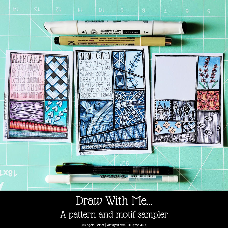
This seems to be the natural progression of my work earlier this week where I put motifs in boxes and added background colour only.
When looking at Rebecca Blair’s artwork, which I absolutely love, I got inspired to create the first ‘sampler’ on the left. I say sampler because splitting space up in this way reminds me of needlework samplers created to practice different stitches.
This is a lovely way for me to indulge my love of hand-lettering, patterns, stylised motifs, colour, shadow, texture and boxes split into boxes!
Colour continues to vex me. I think my favourite is the centre example in a monochrome colour scheme. No chance of any weird colour combinations with that one!
I keep saying this about me and colour, don’t I? But I really need a huge sign that lights up and flashes to remind me to stick to monochrome colours, possibly analogous, and with tiny flashes of a complementary colour. Actually, I need the sign to detect when I reach for colour and shout this advice at me!
Of course, I wanted to share my experiments with the world; well, a few hundred people may be, who may find this an interesting idea to try. If you’d like to see the video then click on this link!
It’s been a quiet day for me. My digestive system is playing up, and self-care is the order of the day. That means not doing anything that has to be the best I can do. I know today that it’ll be harder for me to get things done because I’m under the weather. Fingers crossed, I’ll be fine and dandy again tomorrow.
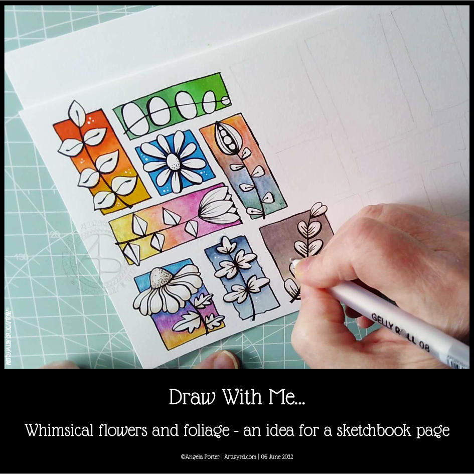
If you’d like to see how I created this partial page for my sketchbook, take a look at this video.
I spent an hour or so doing some warm-up drawing before turning my attention to inking in some colouring pages for “Fanciful Birds”, my next colouring book in the Creative Haven series.
Whimsy is always a welcome thing, flowers and foliage in particular. I also wanted to work with colourful backgrounds for each motif.
I really wasn’t fully awake and didn’t think through the type of paper I was using. I knew I wanted to use alcohol markers to add colour gradients to the background. Did it occur to me to use marker paper? Nope! Of course not! So they bled a tad – the Ohuhu brush markers I used for some of the backgrounds are rather juicy, too juicy for the paper. I liked the backgrounds, however, and knew I could fix the bleeds with a white gel pen.
So, I thought I’d switch to Inktense pencils and a damp brush. Not quite sure that they sit well next to the alcohol marker backgrounds. There’s lots of textureand an unevenness in the colour and gradient. Again, partly down to my choice of paper (all media paper from SeaWhite of Brighton).
So, for the last couple of images, I used some Arteza EverBlend markers for the blue and warm brown backgrounds. The bullet tips let less ink flow onto the paper, minimising the bleed. There was still some bleeding, which I made worse by trying to ‘erase’ it with a colourless blender pen.
I made use of the magic of a white gel pen to cover up these bleeds.
I definitely need to write some reflections for myself to add to this page when it gets put in my sketchbook. For now, I’ll just say that I like the last two I completed the most. Those are the blue and brown backgrounds on the bottom row. I do like the other alcohol marker backgrounds too, but there’s something about the more neutral backgrounds. I just can’t put my finger on what it is.
Right then, time to finish my mug of tea and get some more inking of colouring templates in!