Two Stylised Flower Designs, Both WIP

Yesterday, 1 July, and today I had a lovely time drawing and adding colour to some stylised flowers. The designs aren’t complete.

I need to add a background texture and a delicate pattern to the one on the left. I’ll do that digitally. If I try to do it now, I’ll end up messing up as I used watercolour inks to add colour. I also recorded a YouTube video of the process (view it here).

A background pattern or texture is needed on the one to the right and textural patterns being added to the flowers. This time, I remembered to add some background colour using Distress Inks. Again, I used watercolour inks to add colour.

I am spitting feathers, though; as for the drawing on the right, I recorded a video and promptly managed to delete it … permanently. Duh! I feel such an eejit! So, I’ll remake the video soon, I’m sure.

Entangled Monograms – D and F

Over the past couple of weeks, I’ve been experimenting with monograms and my style of art. It’s fun trying out different things, and it leads to new insights into how I can express myself.

My self-expression is constantly changing and evolving. Sometimes I seem to make some breakthrough and go forwards with it for a while. But something happens, like a slip into poor mental and emotional health, and I retreat into my familiar styles. That doesn’t mean progress is not being made. When I look back, I can see how even my ‘comfort art’ has subtly, or not so subtly, changed as the breakthrough shares its influence subconsciously.

I keep returning to hand lettering, hoping to find out how I can make it work for me. Monograms really do seem to be the way forward.

I’m also thinking about my relationship with colour palettes. I really do struggle at times with the colours I put together, particularly when using traditional media. They seem like a good idea at the time…but…that isn’t always how I feel about them as I continue to add colour.

Contrast can be a thing I struggle with too. I really do think very simple colour palettes – monochromatic or analogous, are likely to be the way for me to go at the moment. They always seem to work nicely, monochromatic, especially as I can focus on contrast far more.

Digitally, I feel I do better, but again a limited palette is the best thing for me.

I know that, like my drawing/design skills, this will improve with time and practice. But I get so frustrated when I make the same silly mistakes over and over with colour choices.

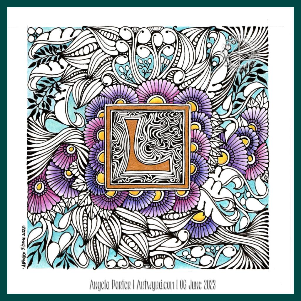
Entangled Monogram WIP 6 June ’23

I drew this design partly as I settled and calmed down for sleep, then completed it when I awoke at stupid o’clock until I was ready to settle back to sleep. Now, I’ve started to add colour – Derwent Chromaflow with Gamsol to blend the colours out. Oh and gold ink for the ‘L’ and the border around it.

This design was drawn on a 21cm x 21cm (8.25″ x 8.25″) piece of Canson Imagine mixed media paper. I used TWISBI Eco fountain pens filled with black Dokumentus ink, fine and extra fine nibs.

This is part of my preparation to throw myself into designing colouring pages for DayDreams. Getting back into my signature kind of art, maybe not this detailed, but …

There’s still plenty of colour to add. Then, there’s the highlights and sparkle and any other details that may be called for. A good level contrast is needed to bring out the illusion of dimension to this!

All the P’s! Pods, poppies and poppy pods!

Click on this link to watch the accompanying Draw With Me video on YouTube.

I really enjoyed creating this small design. And it is a small design. The tag it is on is just 12.5cm x 6.8cm (that’s approx 5″ x 2.75″).

I chose to mix seed pods, poppies, and poppy pods in this drawing. Lots of Ps for my surname! A different way to create a ‘monogram’ – all motifs beginning with P (apart from the leaves … but I think I can be forgiven for that).

My emotions are still all over the place. But I’ll get back to a stable footing, for a while at least. Drawing is always a soothing thing for me, especially when the motifs or patterns I’m drawing are familiar. Familiarity is soothing. Drawing. Star Wars. Various books and audiobooks, and TV series. No change in the story or relationship with me. Not at all difficult to navigate as the world of actual humans. Having said that, each time I watch a film, re-read a book or listen to it once again, or watch a familiar TV series, I gain something new. An insight here and there, a connection, some piece of understanding.

Knowledge. Insight. Understanding. Important things for me.

Infinity Card – Part 3

I’m really enjoying adding panels to this infinity card. Each panel is a quick project, with no pressure to be perfect or polished. I’m finding them a fun way to explore patterns that develop from one into another, that share common features in some way, or that spark off an idea for another. It’s always a bit of a mystery trip, never knowing what the destination is, only where the journey began.

Today’s journey started in the bottom right with the Zentangle pattern “TagH”. The plumptious, rounded shapes of each part of Tagh, led me to think of circles with flowers inside, like blooming discs or spheres. That led me to Moonberry by Debbie New CZT at the top right. I used some of my favourite leaves and more TagH to fill in the remaining space.

To add volume, I used some red-grey Ohuhu brush markers. Oh, and to draw the design, I used a black Uni Emott everfine pen.

Oh, you may have noticed the notch at the top left. That shows this is also a pocket!

If you’d like to watch this panel being drawn and some sample shading click on this link to watch on YouTube.

Moon Poppies

A bookmark decorated with whimsical and stylised ‘moon’ poppies.

I really enjoyed drawing this one and adding shades of blue-grey to bring out the volume in the drawing. Of course, there is a drawing tutorial on YouTube showing how I created this bookmark.

Whimsical Flowers – Creating Variations

Please click on the “Watch on YouTube” button to view in Youtube. Cheers!

Flowers are things I really enjoy drawing, particularly whimsical and stylised ones. So, today I drew a few for a drawing tutorial YouTube video.

“Thistle” – An Art Nouveau Inspired Drawing

I’ve spent some time over the last day or two looking at Art Nouveau flower designs. I was particularly fascinated by a thistle design.

This is my interpretation of the design drawn with Copic Multiliner SP pens (0.1, 0.25 and 0.5) on paper. Then, after scanning the drawing, I added colour digitally using Clip Studio Paint. So, this counts as ‘tradigital’ art!

I chose a simple colour palette; I was inspired by William Morris, the Arts and Crafts Movement and Art Nouveau. And, the colours are more mellow than is, perhaps, characteristic of my work.

The version on the left has just flat colours, no shade or highlight; I let the contour lines suggest volume. This is more true, I think, to the Arts and Crafts Movement and Art Nouveau.

To the version on the right, I added some shadows and highlights, but subtly for me. And even though they are subtle, they have a distinct effect, which surprised me.

These show just two of the many coloured backgrounds I tried out. This is why I love adding colour digitally! It’s so easy to try out different colour combinations, methods of adding colour, and so on.

Which version do you prefer?

I like them both, but I think the one on the right is my favourite; I like the stronger background colour which allows the flower to ‘pop’. I also think the subtle shadows and highlights do add a little something to it too.

William Morris Inspired Botanica

Click on this link to view the accompanying Draw With Me tutorial video on YouTube.

William Morris, one of the primary founders of the Arts and Crafts Movement, is one of my favourite artists. I love the ornate botanical and nature-inspired designs of quite stylised motifs. I also love the way that colour is used simply in them. That is definitely something I can learn from!

It can take a while for pennies to drop with me, and I don’t know how it has taken so long before I took a look at Morris’s work.

Like myself, Morris was inspired and influenced by Medieval manuscripts. That explains a lot!

I use some motifs from Morris’s designs in this drawing. I applied colour with chalk pastels to the pen drawings, with subtle white highlights from white charcoal. I’m quite happy with the result; I’ve not decided what to do about the background.

Where is this study going to take me? I don’t really know! But I know it’s going to be an interesting one. I’m particularly interested in how Morris used colour, and I hope that will make me comfortable with my own simple way of adding colour to my art.

Draw With Me | Using a coloured background to inspire a floral drawing

Please click on the ‘Watch on YouTube’ option. Cheers!

Before filming this video, I primed a piece of watercolour card with white gesso. Then, I added colour using Inktense pencils and water. I added each colour separately, drying them before adding the next. Finally, a layer of clear gesso was added to seal the colours.

I had no particular idea as to how I would add the colour or what I wanted to use the paper for after this. But, as I looked at it, the pink areas just looked like very fuzzy flowers, so that was it! A floral based drawing it would be!

I do not intend to fill the whole area with flowers. I have plans for the ‘white space’ around the designs. But you’ll have to wait to see how that pans out!

In the video, I take you through drawing each flower design, one step at a time. I try to vocalise my reasons for doing certain things too.