
Zentangle style abstract art is my sketchtember artwork today.
The small ones have colour added by Arteza Ever Blend markers. The larger drawing is having colour/shadow applied with Carbothello pastel pencils.
Zentangle style abstract art is my sketchtember artwork today.
The small ones have colour added by Arteza Ever Blend markers. The larger drawing is having colour/shadow applied with Carbothello pastel pencils.

Two sketchbook pages done over the past four days. Abstract patterns and shapes, that’s the theme! Just small drawings, lots of them. Perhaps they’ll inspire work in the future.
Pen drawings done on paper coloured and patterned with Distress Inks. Colour adding using Inktense pencils or Cartothello pastel pencils.
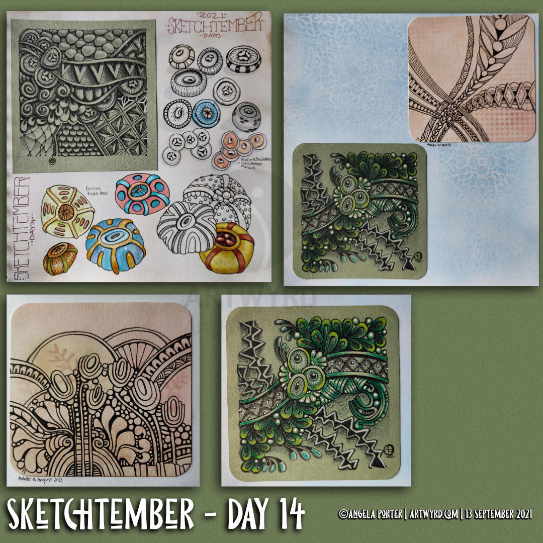
My art of the previous day or so. More seed pods for Sketchtember, this time colour’s been added with Ecoline Brush pens. Just for a bit of a change from alcohol markers!
There’s also some Zentangle-style drawings, small ’tiles’ approx 3.5″ x 3.5″ in size.
The green one has been coloured with Color Soft pencils. The peachy background ones are still works in progress, but fixed into my sketchbook.
You may notice patterns upon the backgrounds in some of these images. I spent some time yesterday using some stencils from my stash to add texture to the Distress Ink coloured pages. I wanted some subtle pattern/texture, so chose colours that toned in with the background.
It’s actually quite fun to draw on these papers. Leaving ‘windows’ to let the background pattern show through is rather fun and a bit of a challenge.
Yes, I’m dabbling in Zentangle again, which is a sign all is not well with me emotionally. I’ve been rather stressed the last couple of days. Nowt serious, just organising some health check-ups and becoming overwhelmed with information and making myself understood, both to myself and the receptionist. All’s sorted now, well the appointments anyway. But I’m still stressed!
It takes a few days for the stress hormones to leach from my body; about four or five based on my reckoning. I have the appointments later on this week, so the current high stress levels won’t have vanished before then. So, I guess I’ll be partaking of ‘comfort art’ for a while yet!
In today’s vlog I show you my artwork of the past week or so, good and not so good!
Here’s the link to today’s vlog on YouTube.
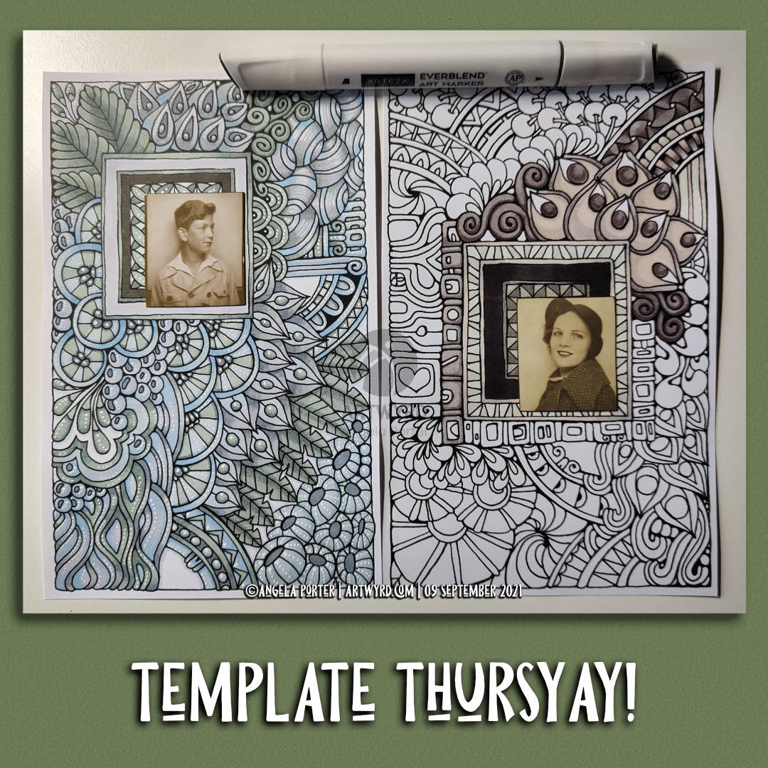
As the calendar turns to Thursday once again, it’s time for another coloring page / coloring template for the Angela Porter’s Coloring Book Fans Facebook Group members.
This week, I ran with a kind of request from a member and created two drawings which feature a rectangular area into which a photobooth photo would fit. Or anything else you can think of putting there – a precious button or coin mounted on card, a single earring kept for sentimental value, a ticket, a clipping from a magazine or newspaper, a tiny piece of embroidery, or needlefelting, or polymerclay, or fossil, or a tiny envelope containing a precious note/letter, or, or, or. You’re only limited by your creativity, and the sizes of the nested rectangles!
I’m going to be intrigued to see what people produce with these. I can be tagged in posts as @Artwyrd on Instagram or Twitter. And as Angela Porter on Facebook.
I’ve also added a geometrical pattern in the middle of the sets of nested rectangles if you don’t want to add anything to this space.
Both images would fit on an A5 card (metric/UK size), or a folded letter sized sheet of card for those of you in the US. They also could be mounted on card and framed if wished.
I’ved used Arteza Ever Blend markers from the Gray Tones set to add colour to the designs. And, for the design on the left, I’ve added white highlights with a Sakura Soufflé pen.
In today’s vlog on Youtube, I talk about the designs, and add the highlights to the left hand design.

Link to today’s vlog on YouTube.
Wednesday is the day when I create the coloring page / coloring template for the members of Angela Porter’s Coloring Book Fans facebook group. And I film and upload the process of drawing to YouTube.
This week is another page that is different. Someone said that they’d love it if I could create a drawing with a space for a photobooth image. So, I’m creating two such designs, in my signature Entangled art style.
I only have photobooth images from the Tim Holtz Idea-ology range, which I have in my stash. I’ve looked on Amazon Uk, and there are a few sets left, but not the pack I have. I think I’m going to have to trim the photo of the bloke down a bit.
Of course, if you don’t have photobooth images, you can use other photos, trimmed down, magazine or book images, stickers, or even buttons, coins, jewellery, and more attached to a sturdy piece of card sized to fit the frame. I’ll show some ideas, hopefully, in tomorrow’s video.

Link to today’s vlog on YouTube.
This morning has been an arty filled one. I woke around 5am and have been artsy-busy since then, apart from when having breakfast!
I spent time in bed drawing this design and listening to podcasts. An 0.5 Copic Multiliner on a sheet of Canson XL marker paper were used.
Next, it was time for some breakfast. Then, fuelled up, I did some pen sketches of bay leaves for Sketchtember Day 7. You can see this page in today’s vlog.
Yesterday, I had a delivery of Arteza Ever Blend Architectural Tones marker set. I bought these markers with my own money. I’m not paid, gifted anything nor sponsored by any product/company I mention. Just dropping that in here!
Anyways, I started by doing a swatch of the colours before starting to make today’s vlog.
This set appealed to me because of the more earthy, muted, vintage-y colours in the set. They were affordable, and so I bought the set, thinking that it could be useful for pens to add to an out and about sketching kit.
I had hummed and hahhed about getting the set for a while. After all I have a set of Chameleon color tones (and the color tops). And a set of Copic Ciao markers. Did I really need any more markers?
Well, the Chameleons are my favourites, but they don’t have many earthy colours. It seemed to me that these would fill in the gaps in my Chameleons.
I’m no expert on marker pens, nor in assessing their quality and so on. But they seem to work well on marker paper. They blend well, either on the paper or in the ‘tip to tip’ method.
I have no idea how long they’ll last in terms of ink. Unlike the Chameleons and Copics, they aren’t presently refillable, even though replacement nibs can be bought. Maybe that is something that Arteza is thinking about in the future.
The other thing that I’d like is a brush nib instead of the chisel nib. A brush nib that is more like the ones on Copics than the Chameleon so that I can get into teeny-tiny spaces in my artwork. The fine/bullet nib is OK for this, but won’t work on the tiniest spaces in my art.
Other than that, they do what they’re supposed to do! Color, blend well, and have a nice range of colours, apart from R13 Red which is glaringly bright against the other pens in the set. Personally, I would’ve liked another muted orange, or perhaps a soft greyish mauve or lavender.
Another bit of nit-picky-ness; a colourless blend would’ve been nice in the set. I find them useful, especially if I want to fade a colour out to practically colourless. That is something that is really easy to do with the Chameleons. No doubt I’ll try this out with a tip-to-tip experiment with either a Copic or Chameleon colourless blender to see how things go.
Oh, the pens have a triangular barrel, which means they don’t roll around the desk. My small hands do find it a bit chunky and a bit awkward to hold. That’s only because I’m used to slimmer barrels on pens/pencils/brushes/digital pens that I do most of my work with.
So, overall I’m really pleased with the pens for the price I paid. I’m sure I’ll use them an awful lot, as much as the Chameleons and Copics no doubt, especially as I’ve rediscovered markers and how much I enjoy adding colour to them.
Link to today’s time-lapse drawing on YouTube.
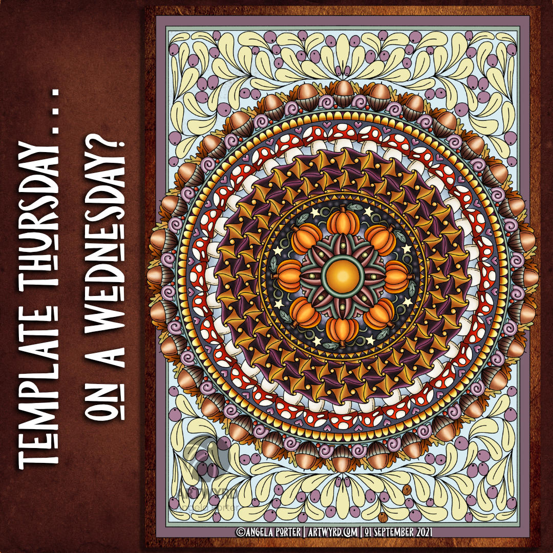
Here it is, the sneak peek at tomorrow’s coloring template for the Angela Porter’s Coloring Book Fans facebook group.
This week, I was asked to create a mandala by Brett, who runs the group. So I did. And this one has a very autumnal theme to it. It is the first day of September and summer is waning away with autumn starting to make it’s way from the wings.
I’ve chosen a rather subdued palette for today’s addition of colour. No doubt I’ll have a different version for tomorrow’s posting!

Link to today’s vlog on YouTube.
After filming yesterday’s vlog, I decided to try using marker pens with a drawing I’d done on a Distress Ink background. The drawing on the left is the result of this experiment.
To add colour, I used Chameleon Color Tones marker pens. I chose colours that would be similar to those in the background.
I really enjoyed adding colour to this drawing. I’d forgotten how much I enjoy using the Chameleon pens and the ease of achieving gradients with these pens.
I completed the drawing with embellishments of white and yellow Sakura Soufflé pens, muted Sakrua Gelly Roll Moonlight pens, and some shiny areas of clear Sakura Glaze pen.
I was so happy with the result, that I started work on the drawing to the right, some of which I do in today’s vlog.
I really love the way that the background tones down the brighter colours of the marker pens. Which shouldn’t surprise me as marker pens are transparent! But it did surprise me!
Something else that I was struck with was how similar using markers is to how I add colour digitally. I haven’t made that connection before, but it is likely to inform me on my way forward in adding colour to my artwork. I may be trying to force water-soluble media and coloured pencils into behaving like markers, which is something that they’re not meant to do. I find it hard to work with the looser, possibly more chaotic water-based media, even though I love the effects that other seem to achieve with them. No matter what I do, I’m never totally happy with the end result, something I’ve blogged and vlogged about an awful lot.
Working with alcohol markers has shown me that I can work well with colour, with the medium that matches my artistic style – precise and controlled. The more chaotic, loose, aspects of this work come from the Distress Ink coloured backgrounds.
Now, if only I can accept this and focus on using markers in my work more than other media. Well, apart from digital coloring that is!

Link to today’s vlog on YouTube.
I realised that the pinks and purples I added to this drawing were just a bit too bright and vibrant for my current tastes. I decided to use an aubergine Graphitint pencil with a waterbrush to tone them down somewhat. And I think it’s worked. I’m much happier with this now. I even like the areas where I’ve added just graphitint.
I’m not quite sure how I’ll finish adding colour. Do I add some Carbothello to the graphitint areas? Do I just continue with Graphitint alone? I don’t know for sure.


