Entangled Art and Sketchtember

Entangled Art WIP

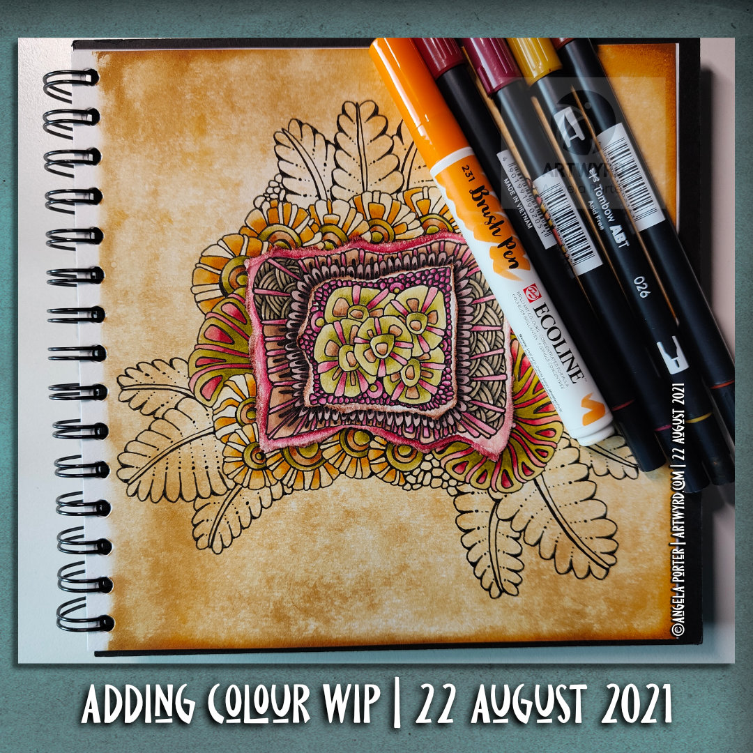
Adding more colour to the entangled drawing on the left has taken quite a bit of time this morning. As well as using the Arteza Ever Blend markers, I used some of my Chameleon Color Tones pens too. There were some colours that I wanted to use that aren’t in the Arteza set.

It’s going to take quite a few hours more to finish adding colour to this drawing. That bright green section in the bottom left is going to need toning down! But that’s easy enough to do by ‘glazing’ with a duller colour. I also went over the pods on the bottom right with the colours again to intensify them a little, and added some deeper shadows as I did so.

It’s coming along nicely, apart from that bright green! Ho hum, I really do need to pay more attention to which colour I’ve actually picked up to use rather than just assuming it’s the colour I wanted to use.

Sketchtember Days 7 to 16

Yesterday evening and this morning, I spent time drawing small drawings featuring various seed pods. I’ve decided to take a different direction for Sketchtember and abandon the prompt list I’ve been following.

Why? I was a bit bored with drawing leaves, the occasional whole plant, the odd flower and various enlarged views of the various parts of flowers.

I love plants. I do. But I really love capsules, pods and seeds! So, I went with this idea

After splitting the large 9″ x 12″ sheet of Arteza marker paper up into smaller rectangles and squares, I used Copic Multiliner, Tombow fudenosuke and Uniball Unipin pens to draw the designs.

When the drawings were complete, I went to scan the sheet in and realised it wouldn’t fit on the glass plate of my A4 scanner/printer! Duh! But not a problem, I just split the page up into smaller pieces.

Next, I spent some time adding colour to a couple of the designs using the Arteza Ever Blend markers to test out the Arteza marker paper.

This paper is noticeably thicker than the Canson XL marker paper I’ve been using. But it works just as well with markers. It’s also as nice to draw on with the various pens I used.

The only thing I wished is that I’d remembered my scanner takes paper that is a little bigger than A4, but not this big! Not a problem though.

Entangled Art | Arteza Ever Blend Markers

Link to today’s vlog on YouTube.

This morning has been an arty filled one. I woke around 5am and have been artsy-busy since then, apart from when having breakfast!

I spent time in bed drawing this design and listening to podcasts. An 0.5 Copic Multiliner on a sheet of Canson XL marker paper were used.

Next, it was time for some breakfast. Then, fuelled up, I did some pen sketches of bay leaves for Sketchtember Day 7. You can see this page in today’s vlog.

Yesterday, I had a delivery of Arteza Ever Blend Architectural Tones marker set. I bought these markers with my own money. I’m not paid, gifted anything nor sponsored by any product/company I mention. Just dropping that in here!

Anyways, I started by doing a swatch of the colours before starting to make today’s vlog.

This set appealed to me because of the more earthy, muted, vintage-y colours in the set. They were affordable, and so I bought the set, thinking that it could be useful for pens to add to an out and about sketching kit.

I had hummed and hahhed about getting the set for a while. After all I have a set of Chameleon color tones (and the color tops). And a set of Copic Ciao markers. Did I really need any more markers?

Well, the Chameleons are my favourites, but they don’t have many earthy colours. It seemed to me that these would fill in the gaps in my Chameleons.

I’m no expert on marker pens, nor in assessing their quality and so on. But they seem to work well on marker paper. They blend well, either on the paper or in the ‘tip to tip’ method.

I have no idea how long they’ll last in terms of ink. Unlike the Chameleons and Copics, they aren’t presently refillable, even though replacement nibs can be bought. Maybe that is something that Arteza is thinking about in the future.

The other thing that I’d like is a brush nib instead of the chisel nib. A brush nib that is more like the ones on Copics than the Chameleon so that I can get into teeny-tiny spaces in my artwork. The fine/bullet nib is OK for this, but won’t work on the tiniest spaces in my art.

Other than that, they do what they’re supposed to do! Color, blend well, and have a nice range of colours, apart from R13 Red which is glaringly bright against the other pens in the set. Personally, I would’ve liked another muted orange, or perhaps a soft greyish mauve or lavender.

Another bit of nit-picky-ness; a colourless blend would’ve been nice in the set. I find them useful, especially if I want to fade a colour out to practically colourless. That is something that is really easy to do with the Chameleons. No doubt I’ll try this out with a tip-to-tip experiment with either a Copic or Chameleon colourless blender to see how things go.

Oh, the pens have a triangular barrel, which means they don’t roll around the desk. My small hands do find it a bit chunky and a bit awkward to hold. That’s only because I’m used to slimmer barrels on pens/pencils/brushes/digital pens that I do most of my work with.

So, overall I’m really pleased with the pens for the price I paid. I’m sure I’ll use them an awful lot, as much as the Chameleons and Copics no doubt, especially as I’ve rediscovered markers and how much I enjoy adding colour to them.

Template Thursday…on a Wednesday???

Link to today’s time-lapse drawing on YouTube.

Here it is, the sneak peek at tomorrow’s coloring template for the Angela Porter’s Coloring Book Fans facebook group.

This week, I was asked to create a mandala by Brett, who runs the group. So I did. And this one has a very autumnal theme to it. It is the first day of September and summer is waning away with autumn starting to make it’s way from the wings.

I’ve chosen a rather subdued palette for today’s addition of colour. No doubt I’ll have a different version for tomorrow’s posting!

Chameleon Color Tones Coloring

Link to today’s vlog on YouTube.

After filming yesterday’s vlog, I decided to try using marker pens with a drawing I’d done on a Distress Ink background. The drawing on the left is the result of this experiment.

To add colour, I used Chameleon Color Tones marker pens. I chose colours that would be similar to those in the background.

I really enjoyed adding colour to this drawing. I’d forgotten how much I enjoy using the Chameleon pens and the ease of achieving gradients with these pens.

I completed the drawing with embellishments of white and yellow Sakura Soufflé pens, muted Sakrua Gelly Roll Moonlight pens, and some shiny areas of clear Sakura Glaze pen.

I was so happy with the result, that I started work on the drawing to the right, some of which I do in today’s vlog.

I really love the way that the background tones down the brighter colours of the marker pens. Which shouldn’t surprise me as marker pens are transparent! But it did surprise me!

Something else that I was struck with was how similar using markers is to how I add colour digitally. I haven’t made that connection before, but it is likely to inform me on my way forward in adding colour to my artwork. I may be trying to force water-soluble media and coloured pencils into behaving like markers, which is something that they’re not meant to do. I find it hard to work with the looser, possibly more chaotic water-based media, even though I love the effects that other seem to achieve with them. No matter what I do, I’m never totally happy with the end result, something I’ve blogged and vlogged about an awful lot.

Working with alcohol markers has shown me that I can work well with colour, with the medium that matches my artistic style – precise and controlled. The more chaotic, loose, aspects of this work come from the Distress Ink coloured backgrounds.

Now, if only I can accept this and focus on using markers in my work more than other media. Well, apart from digital coloring that is!

Pink and Purple Entangled Art

Link to today’s vlog on YouTube.

I realised that the pinks and purples I added to this drawing were just a bit too bright and vibrant for my current tastes. I decided to use an aubergine Graphitint pencil with a waterbrush to tone them down somewhat. And I think it’s worked. I’m much happier with this now. I even like the areas where I’ve added just graphitint.

I’m not quite sure how I’ll finish adding colour. Do I add some Carbothello to the graphitint areas? Do I just continue with Graphitint alone? I don’t know for sure.

Sunday Morning Entangled Art

Link to today’s vlog on YouTube.

A late summer, rather cool and sunny start to the day is something I’m luxuriating in, and that means arty pursuits.

I’ve completed one drawing, which I kind of review at the start of today’s vlog over on YouTube. I’m not too happy with the colour I’ve added at all. I started with Ecoline watercolour inks, but they felt too bright and jarring with the distressed, grungy, quite dark background. So, I then tried out distress inks, but I’d already gone down the rabbit hole of poor colour choices. When I’d finished adding colour, I had some rather dull, uninspiring colours that really didn’t fit in with other parts. So, I tried using coloured pencils to lift the colours, with not much success. Finally, I tried some chalk pastels, which helped somewhat. Finally, I added embellishments with a variety of gel pens,w hich helped to lift the colour somewhat, bu kind of seem over the top.

So, to shift my disgruntled arty mood, I thought I’d go back to an earlier drawing and use a really simple set of colours – cerise and purple – to add colour and shadow to the drawing. And white to help bring out highlights if needed, though I will use various gel pens to embellish this when I’m done. This is the drawing you can see at the top of the post.

I’m liking what’s happening with this drawing. I do have to layer the chalk to get an intensity of colour when using the tortillon to blend the colour out as well as working the chalk into the paper. I’m enjoying the way the different colours will blend nicely with each other. And I like the simple colour choices too.

I keep saying I’m going to complete drawings with monochrome, or nearly monochrome colour palettes. And I keep forgetting to do this when I leave a host of colours near me!

I shall persevere with this particular drawing, and see how I feel about once it’s all coloured.

As to the other one, well it’s being put to one side for a few days so I can return to it with fresh eyes and a fresh mind. Perhaps I’ll see it in a different way then.

Pen Drawing and Distress Ink Background

Link to today’s vlog on YouTube.

I woke to morning sunshine and the lovely coolness of an autumn morning. I feel so much more alive on mornings like this. The coolness is so refreshing, invigorating. Although we’re not quite into autumn yet, there are hints it is on the way. Hints of leaves changing colour. Sunlight is much more golden rather than the bright quality of summer light. It really is wonderful!

It put me in the mood to create a coloured background (or two) to draw on. This time, I’m using a vintage brown gel pen from Arteza. Usually I’d use black, but I’m starting to explore the possibilities of other colours, particularly on such distressed, grungy backgrounds.

Today’s vlog starts with the creation of two coloured backgrounds, then starting to draw the design. This drawing isn’t finished, yet. When it is complete, then it’ll be time to add colour and/or contrast and highlight. Finally, it’ll be time to add embellishments.

I know that when these gel pens are dry they are water resistant, so the world of coloured media is open to me. I am likely to keep the colours with in the green and brown palette of this background, however.

Pen and Wash | Entangled Art | WIP

Link to today’s vlog on YouTube.

A very small penny dropped yesterday. I realised that what I’m doing is pen and wash, or ink and wash, or line and wash. I’m not entirely sure that a label is required, but it seems to fit.

I’m adding watercolour of one kind or another – Inktense, Ecoline, Mijello Mission Gold, Distress Inks, etc – to a pen drawing. Why I haven’t made that connection to the description of the method/process? I have no idea! Still, I have made that connection and a realisation that it gives a sense of artistic legitimacy to my work. That is a function of my insecurities when it comes to my artistic espression.

Yes, that’s right. Insecurities. Lack of confidence. Lack of belief in myself. Self-questioning about what on Earth I’m doing.

It is always nice for me when pieces of a rather abstract, metaphoric jigsaw fall into place, giving me a more coherent view of my method, my artistic voice.

These pieces always fall into place at the right time for me. I’m ready to accept that line and wash is what I do well, when I work within ‘an elegance of limits’ to quote the team at Zentangle. In this case a limited palette of colours harmonious with the background.

As well as working on this particular drawing, I have included some views of recent work in my sketchbook in today’s vlog. This other work shows me trying to work out how to add more contrast to the wash of colour. Fine ballpoint pen, graphite pencil and tortillon or coloured drawing pencils/chalk pastels are what I’m exploring. Eventually, I will settle on a method that I particularly like. I’m not happy with any of these at the moment.

I will continue to explore an figure it out. That’s what I’ve done with adding colour to my drawings, and that’s what I’ll do when it comes to increasing contrast with shadows and highlights.

Of course, I’m talking here about traditional art. When it comes to digital art, I think I have found a way I’m comfortable with in adding colour to pen drawings. I’m not quite there yet with traditional media, as well as finding the traditional media I like to work with.

Painting with Distress Inks

Link to today’s vlog on YouTube.

I woke with a stinking headache this morning. So, spending some time adding colour to an entangled drawing, along with a couple of headache pills, was just what was needed. And listening to a podcast or three.

I decided to use Distress Inks as paints, along with a Caran d’Ache waterbrush. Here’s a list of the colours I used:
Forest Moss, Fossilised Amber, Weathered Wood, Broken China, Dusty Concord and Seedless Preserves.

Hindsight is a wonderful thing, and I think I really should’ve stayed away from Dusty Concord and Seedless Preserves – the purple and pink colours. Either other analogous colours and/or browns/greys would’ve worked so much better.

I keep doing this with colour. I’m so used to choosing complementary colours that I still reach for them. In this case it’s understandable as I chose some of the colours that were in the background.

Note to self – monochrome-ish or analogous colours!

To help tone these brighter pink and purple colours down, a liberal use of dot highlights from a white Sakura Soufflé pen was needed! I’ve not finished adding embellishments yet.

Nor have I started intensifying shadows. I’m not sure whether to use biro or either a graphite pencil or a chalk pastel and a paper tortillon. My head isn’t clear enough to decide about that! As the headache is wearing off, my need to sleep the last of it off is increasing.

Adding Color WIP

Link to today’s vlog on YouTube.

Yesterday, I added pieces of paper coloured with either Distress Ink or Distress Oxide to pages in one of my sketchbooks. These pages had been previously coloured with Distress Inks.

I wasn’t at all sure that what I was doing was a great idea. So, I decided to add patterns to one page using a micro Uniball Eye pen. I still wasn’t sure, but a bit more confident in my idea. So, I started to add colour to see if that would make me happier with what I was doing.

To add colour, I started with some Tombow Dual brush pens in rather vintage, autumnal colours that work well with the background.

As the Distress Ink tends to alter the properties of the paper, I thought I’d try the Ecoline Brush pens. And, they were so much easier to blend out with a waterbrush. Actually, the Distress Ink makes it much easier to blend the Tombow Dual Brush pen ink out too.

So, I’m quite happy with the result. Now, I can complete the drawing and finish up adding colour. And I look forward to working on the other pages in the sketchbook too.