Watercolour Experiments

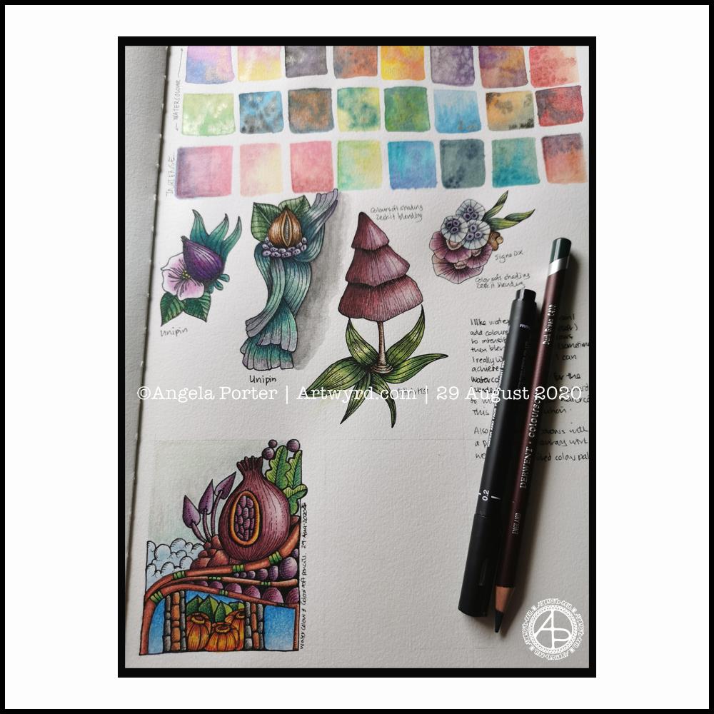
Firstly, let me apologise for the poor photo. I’ve tried a couple of times to take a photo of the artwork, but I just can’t seem to get it in focus across the paper. I did video all but one of these experiments, and a timelapse video is available on my YouTube channel.

I had a delivery yesterday of Canson Imagine mixed media paper. I mistakenly ordered A4 instead of A4, but no problem, it can be used in my disc bound sketchbook.

I wanted to see how various media would work on the paper so, I used
*Derwent Inktense Pencils
*Mijello Mission Gold Class watercolours
*Kuretake Zig Clean Colour brush pens
*Tombow Dual Brush Pens

In each case I used a barely damp brush; I’d already found out that using rather wet colours left edges of colour rather than the smooth colour I like.

I didn’t draw the designs with pen, just an 0.3mm, 2H mechanical pencil.

The inktense are Ok. The colours spread a little patchily as the pigment/ink grabs onto the paper very strongly quite quickly. As they dry permanent, it’s easy to add a glaze of colour to adjust the patchiness. The colours aren’t as bright as I would’ve expected from Inktense. Maybe the off-white colour affected them, or maybe the pigments/dyes sank into the paper more as they dried.

A dry brush technique is needed for the Mijello paints, and they move too easily on the paper with water. The paper doesn’t really grab them, which is surprising as it’s not watercolour paper. I didn’t really enjoy working with them on this paper. Also, the colours are so dull… the colour of the paper, or perhaps the colours sink into it?

I loved using the Zig Clean Colour pens! The ink moved so easily with the barely damp brush. Getting a gradient was so easy. Also, adding a bit more colour to the still damp area helped with this too. I also tried blending one colour into another, and that worked really well. The colours are so vibrant, I loved working with them. My only regret is I forgot to press record for them! However, I’m sure you’ll see more of them in future videos.

The Tombows aren’t my favourite pens to work with. But, in this instance I really did enjoy working with them. The colour grabbed onto the paper more than the Zigs. This made both blending out to a gradient and blending colours more difficult. The colours though are really vibrant.

I did write notes next to each little experiment with a 0.3 Unipin pen. It was a pleasure to write on this paper, and I think I’ll enjoy drawing on the paper too, so it will definitely be a good addition to the disc bound sketchbook.

Watercolour Experiments

Two watercolour experiments in the photo.

The leaves I did yesterday afternoon, just playing with colour, wet into wet, and then adding patterns to the leaves with metallic watercolours. It was relaxing, soothing, and the way the colours flow into each other is just … magical!

The watercolour process was helped by the paper I used – 100% cotton rag Khadi paper, which I just tore into a squarish shape.

The bottom one was this morning’s play around with watercolour in a Doodleworlds kind of way.

I started off with a pencil drawing – you can faintly see the pencil lines of the rest of the design. I wanted to try adding watercolour to the pencil drawing, no black line.

But, as I’d completed add colour as far as I had, I wasn’t sure I liked it. So, I used a Signo DX .38 pen to add some fine, waterproof, lines.

The black lines do help to define the elements of the design, but the drawing ends up a bit cartoonish, which is fine as it’s Doodleworlds.

Of course, I did video this morning’s session with watercolour. When I was looking back on it, the colours looked a lot more vibrant than I thought they were to my eyes, and also the painting looked better at such a distance.

So, I’m torn between whether to add line or not! I think I need to add some more colour to this drawing, without adding black lines, to see which I prefer for sure.

New Watercolours, & arty lessons learned

New Watercolours

Late yesterday evening, my new set of watercolours arrived. I’m now the proud owner of a set of 36 tubes of Mijello Mission Gold Class watercolour paints, and a pretty neat palette too.

It was too late last night for me to think about adding the paints to the palette and setting up some colour swatches,. So I set to that this morning with a big mug of tea and a headache.

I used them to continue adding colour to this drawing, and I can easily tell the difference between the Mission Gold and Cotman Watercolours, not just because I know where I added each colour, but from the intensity and vibrance of the colours.

I know I got more vibrance from the Cotman colours when I was adding colour to this by adding water to the pans and letting them sit for a while to soften the pigments. But, it was so much easier with the Mission Gold to do this. Indeed, I had to be careful that I didn’t use colour that was too intense!

Some insight into watercolour and me

It was, and will continue to be, an absolute joy and pleasure to use watercolour paint tubes. I’m so glad I splurged out on them after I had a memory of using tube watercolours years and years ago.

They were such a pleasure to use, both to create the swatches and in adding colour to this drawing. Bear in mind that this drawing wasn’t done on watercolour paper, but on creamy coloured Arteza mixed media paper! Also, I created the swatches on SeaWhite all media cartridge paper, which is a lovely bright white colour.

Now, I realise that a lot of my frustration with pan watercolours is with getting colours intense enough for my taste. That won’t be a problem with the Mission Gold set I’m sure.

I also feel that exploring and learning more about watercolour and colour mixing is something that I’d like to do now, and that I may not be quite so frustrated as I have in the past.

Coloring Template doubts and frustrations

Yesterday, I got a couple more templates drawn and edited, so I now have ten out of the thirty-one I need completed, editorial team’s feedback allowing that is.

However, I was really doubting whether what I’d done would work, was good enough. So, I thought I’d try colouring the template I was least happy with to see if that made a difference to how I viewed it, and hopefully the others.

That really did the trick! Just by adding a background colour/texture first, I started to feel better about it. Once I’d added colour and the line-art started to come to life, I started to feel even more confident.

This is something I need to remember going forward, when I doubt my ability to create colouring templates. All I need to do is see if they work with colour!

A bonus was that I really enjoyed adding colour.

Vlogging along …

I touch on all these things in today’s vlog, as well as showing the swatches and adding colour to the drawing.

I’ve also decided that I’m going to mostly keep my vlogs to no more than around 20 minutes, whether that’s real time or a time lapse version. I think they may work the best, though I may still record longer ones if there’s a need to do so.

Watercolour warm up art…

About the art

This morning, I started to add watercolour to the abstract drawing I started yesterday.

I spent over 45 minutes doing this, but I’ve sped it up and added music.

I’m not at all sure about the colours used. It may be the Distress Ink from the background interfering, or it may be that the Arteza mixed media paper is a creamy colour rather than white.

It led to me experimenting with colour, working out how to get more intense colours from the pans. Knowing that is what I’ve done is likely to mean I will put this to one side as a learning experience, some time to relax and enjoy being creative and not worrying too much about mistakes.

Still, I may persevere with this. Though it is yet another artwork that isn’t finished. I seem to be collecting art that I’ve not finished adding colour to.

I may have to question myself as to why I start but never follow through with so many pieces of artwork when it comes to adding colour. I never have a problem working on drawings that may take several sessions and many hours to complete.

Is it that I fear failure? Or is it that I loose the oomph if I don’t finish it in one session. Or is it that I worry I won’t remember what colours I used and how I mixed them? Perhaps it’s that I doubt my colour palette? Maybe it’s that I doubt my ability to work with colour? Or maybe it’s a combination of some or all of these.

For now, I don’t know for sure. But I do persevere, even in the face of the bleedin’ obvious yeuchy colours!

Other things

Yesterday, I managed to focus and get plenty of art done for the book I’m working on. Not only did I scan in and clean up the drawings I’d already done, but I have two new ones almost completed. I just have to finish inking in the second, then I’ll scan them in and clean them up and get them sent over to my editor for the team to critique/approve.

I really enjoyed the work I got done yesterday. It was easier to settle into it now I’ve decided that I’m going to work with pen on paper and use digital tools to clean up and edit the images. Except when mandalas are concerned, I’m still going to draw them digitally!

I felt really good about the amount of work I’d got done, even though I’d not had much sleep the night before and I still wasn’t feeling 100%.

I was hoping for a good night’s sleep last night. No such luck. I was awake again after just a couple of hours, all hot and bothered. So, I drew until I was ready to sleep again. And I only slept for a couple of hours then, waking headachy and tired again.

I started my morning off with a big mug of tea and some time to just watercolour, even with all the frustrations it can bring me. It’s about learning and practicing and experimenting with the medium to work out how it can work for me and my style of art. As always, it’s the choice of colours that seems to vex me so much.

Still, despite me often saying I’m giving up on watercolour and sticking to adding colour to drawings digitally, I keep going back to it, and other traditional media. This is, I think, as I do want to get out to sketch in old churches and abbeys, in nature, and museums. Although I’m happy to photograph what I see, there’s nothing quite like sitting with sketchbook, pens and/or pencils and taking quiet time out to just observe and draw for pleasure and relaxation. And I’d like watercolour to, perhaps, be one of the tools I can take with me.

I remembered yesterday, as I was playing with watercolour yesterday after finishing the drawing I started yesterday, that I found working with watercolour from tubes so much easier than the pans. Duh go me! So, I’ve ordered a set of Mijello Mission Gold tube paints and a palette that should arrive today. They’re not the top of the range sets from Mijello, but they should be good enough for me to work out if this is the way I want to go, and not too pricey either!

Then, my plan is to work out which colours would be useful for me in a travel palette and create such a thing.

Looks like I’m going to be spending some time setting up the palette that arrives today and swatching out all the colours. That’s kind of exciting!

First, however, I need to get these colouring templates inked in, scanned in, and edited before starting work on some more templates.

Weird Fish – Part 2

I’ve spent some time drawing a third weird fish and intensifying colour on the two original ones.

For the top fish, I used Derwent Colorsoft pencils to increase the colour. The watercolour underneath does add to the colour in a subtle way.

I used Derwent Inktense pencils and a damp brush to add colour to the central fish.

Finally, I’ve been adding colour to the bottom fish with Inktense pencils too.

As pretty as the watercolours were, they were a tad too subtle for my liking with not enough contrast. So, I used them as the underpainting and then added layers of more intense colour over them. It seemed to work out just fine and well.

I’ve kept the color palettes pretty similar for each of the fish.

Also, I’ve re-drawn them digitally as vectors and I’ve just started colouring one of them.

No matter how I add colour – digitally or using traditional media – it takes me a long time. I fuss around until I get things looking as I like.

This is very much a fun project, and I have no idea where it will lead, if anywhere. The important thing, however, is that I’m enjoying working with traditional media and I’m doing something a bit different too that I can learn from.

Here’s the video of today’s art. I’d appreciate it if you open it in youtube as then your views get counted.

Weird Fish?

Weird indeed are my drawings today. I had a delivery of some ultra smooth botanical watercolour paper yesterday, and so I had to try drawing on it! Yup, it’s nice to draw on. Then, trying out some watercolouring.

Instead of doing rather wet washes, I used the watercolour in a much more controlled manner, adding layers to get some shadow and highlight going. I’m either going to intensify those shadows and highlights with coloured pencils or digitally. But not now. I woke with a stinking headache and I’m just about at the end of my ability to focus enough to function. I’d like to go out for a walk to try to clear my head, but I’m not sure I’m safe to be let out to walk on the pavement let alone drive! This may need some serious sleep to clear. Ho hum.

The colours look different in ‘real life’ – the reds and oranges are more browny, and the yellows are more greenish. My problem in scanning the images in!

I did film my morning art for today’s vlog:

Morning drawing – failure and recovery?

Yesterday, I worked to add colour to my drawing using Distress Inks as watercolours. I was soon really disheartened and disappointed with the colours.

This morning, I decided to finish adding colour and then to try adding details with a white Posca pen and various fineliners and gel pens to see if I could achieve something I felt was OK. Also, I used it as an opportunity to learn.

I’m still not at all sure of the partly finished artwork, but it is what it is.

Sketchbook Saturday

What’s new?

I know, it’s that page in my Arteza watercolour sketchbook again! However, there are some changes, most noticeably the bottom left design.

I have added some depth and contrast in colour using coloured pencils to parts of the designs, and left other parts as just watercolour. I have used a blending solution and paper torchon to blend the pencils in most instances, but not all. Sometimes the blending just isn’t needed.

The bottom design was done today. It took around three hours to complete. Drawing the design with Pitt Artist pens, followed by the background washes of watercolour, finally the coloured pencils.

What I’ve learned

I like using coloured pencils on watercolour paper, and over a watercolour wash.

I find it really difficult to get the intensity of contrast with watercolours alone. Using coloured pencils makes that a cinch, especially on paper with a good ‘tooth’ to it, like watercolour paper.

I got a good sense of satisfaction as I completed the bottom design. I’m not all that happy with some of my colour choices, but that wasn’t my main consideration today; that was trying coloured pencils on watercolours on watercolour paper.

Working with the ‘aha moment’

Sketchbook page

After a walk and lunch yesterday, I eventually settled to working with my aha moment. This sketchbook page is the result, though I have work left to do with it.

The designs are inked in with Pitt Artist Pens and I’ve used watercolours and Inktense paint pans and pencils to colour the motifs. Well, most of them. I’ve left some parts in black and white to show the difference that colour makes.

I used a Daler-Rowney artist’s sketchbook. The paper is acid free, but is not specifically for watercolours. It held up surprisingly well to multiple layers and glazes of colour, though it does grab the colour and it’s difficult to move it around as on watercolour paper.

I also found the wet brush lifted some of the pigment from the Pitt Artist Pens. That surprised me as they were totally waterproof on watercolour paper.

Reflections

Having an ‘aha moment’ and working with that realisation can be quite different. It’s nice to try different ways of using line and stippling to add shadow and volume to the drawings.

The half-beetle was an interesting one to work with. On the lower wing I could’ve used lines to add the illusion of curves, but for some sections I just used colour. I also used the beetle to practice adding lines and stippling.

I tried drawing the beetle digitally, but it just didn’t feel ‘right’. I didn’t get the same satisfaction as I did drawing it with pens on paper. I’m sure that’s due to me having my brushes set up incorrectly. That’s something I’m going to have to work on. I ended up with a drawing that was too perfect. That surprised me too, as I love to work digitally. Perhaps that was a function of my current mood and energy levels.

I do tend to switch between digital and traditional media, sometimes mixing the two. That is certainly an option moving forward – drawing the line art on paper, then colouring digitally.

I do like the earthy tones I’ve used to add colour to many of the design elements on this page. That still continues to surprise me, as much of my work has been brightly coloured, often with ‘in your face’ colour palettes used.

The smaller designs I’ve drawn here also have their own sense of satisfaction and enjoyment for me. Usually, I draw full page designs for colouring books. But here, I’ve drawn small compositions, and that is not so overwhelming for me at this time.

The ‘Aha!’ moment

Finding inspiration

Yesterday evening, I found a little oompf to play with colour in my watercolour sketchbook. The little blocks of colour on the right hand side are the result.

I dropped wet into wet, both watercolours and metallic watercolours, and just let the watercolour do their thing. I also tried similar with Inktense ‘watercolours’ too.

Just doing something simple like this, playing with colour for the sake of playing with colour, led me to want to try something different.

I had got frustrated and not all that happy with the designs on the left page over the past couple of days. Browsing through Pinterest, my attention was caught by illustrations that use black line drawings with a wash of colour. So, I thought I’d try those out.

I also wanted to try different pens to see how waterproof they are on watercolour paper. Unipin pens in grey and black, Pitt artist pens and a Signo DX pen were what I had to hand.

I used the pens to draw some of my favourite kinds of motifs, but rather than leaving just the outline, I used the pens to add shadow and the illusion of shape to the motifs. Once I was happy, I added watercolours. I did go back and add more lines where needed once the watercolours had dried. I also used a white gel pen to add highlights.

Reflections

Firstly, all of the pens were waterproof. The grey Unipin pen did bleed more as I was drawing with it initially than the others, which showed little bleeding at all. Anyway, I’m happy that I now know for sure they are waterproof.

I have used colours that are different for me. They have more of a vintage vibe to them. I actually like the colours, a lot.

Still developing my artistic voice(s)

I keep trying to move away from black line drawings with colour, to paintings made solely of colour. Each time I do this, I’m never really happy with what I produce, it never seems to feel it is ‘me’. I love to see how others use just pure colour to create art, it just never seems to work out quite right for me, not unless I work digitally. Even then, the digital artworks make me smile, but they still don’t feel right.

I like to draw colouring templates that help others express their creativity and to use for relaxing, meditative, calming activities. These are lovely in their own right and for the purpose they’ve been created for. However, they lack the details that I find satisfying.

That ‘Aha!’ moment

And there it is, I’ve worked out why things don’t feel ‘right’. Detailed line work. Using line and pattern to create shadow and volume in a drawing. There’s also a need for me to use line to define and structure artwork.

That was something I always used to love to do in my earlier artsy years, and something that has gone by the wayside as I’ve used my skills at stylising motifs for my work as a colouring book artist/illustrator.

Those skills will never be lost and will always be used. However, I have a need to find ways to express myself in ways that satisfy my artsy heart, and this revelation is one answer to that.

It’s obvious when I look back at my blog, that I’m constantly trying out new things, going back to old things.

Sometimes I return to old crafts and styles I’ve tried in the past as they are familiar to me and that familiarity comforts me when I need time to just create and feel some level of satisfaction in what I do. Comfort art I’ve described this in past, and it’s just as true for me now as then. There are times when I’m not up to challenging myself as I try or develop a new style to me. Then, I go to art and craft styles that I know I can do fairly easily.

At other times, I’m seeking for the new, different and to stretch myself artistically. Out of a lack of inspiration over the past day or so has come a style that will stretch me, and perhaps will sit easily with me so it becomes one of my ‘voices.

Oh, I’ve not abandoned my new-found passion for typographic portraits/art. In fact, my mind is ticking over how I can incorporate that along with this coloured detailed drawings. Before I try the idea, I need to get some drawings done! I’d like to try the idea out digitally to see if it will work. That way, any drawings I’m really pleased with won’t be messed up.