Saturday is the day I look back over the art I’ve done from the past week, and a bit older than that too!
Inktober and Inktober Tangles 2021
Naaki by Nadine Roller CZT and ‘suit’ are the two prompts I worked with today.
Instead of creating one drawing, I decided to try out variations of the tangle pattern. And I included the symbols for the four suits in playing cards too.
I may do this for the rest of Inktober. It’s a lot of fun to do, no pressure to create a finished ’tile’ or ‘picture’. And no pressure on me is just what I need at the moment.
Today it’s only part of the template. Truly a sneak peek at a work in progress (WIP). I’ve used, so far, two Zentangle Patterns (oysteroid and flux) and a triangle leaf/seaweed kind of motif. I have no idea how this is going to finish, other than well, hopefully.
I’m drawing with a Tombow Fudenosuke brush pen on ClaireFontaine dot grid ‘Sketch’ paper. The pen dries quickly on this paper, there’s little to no feathering of the ink, and the dots I can remove digitally when I’ve finished the drawing. And then add colour…eek!
I started adding colour to another drawing early this morning. Mistake. A BIG mistake. You can see that drawing over on Instagram.
I have no idea why I keep inflicting the torture of colouring drawings in with traditional media upon myself. I don’t know how many times I say to myself I need to stop doing this, and then I go and do it again any way. “Insanity is doing the same thing over and over and expecting a different outcome”, is a quote mis-attributed to Einstein, but it seems relevant to myself and my colour struggles!
Today, I’m going to put it down to waking early for the weekly Abel & Cole delivery and being just plain tired. I had to return to sleep after that disastrous coloring session.
This template, when finished, will have some colour added to it digitally. I seem to do so much better when I work with colour in an art package, currently Clip Studio Paint Pro. I think it’s partly because I can make an awful colour choice and then correct/edit it easily. And I tend to stick to limited colour palettes a lot more easily than I do when I have a whole load of pencils, pens, or paints in front of me to choose from. Then it becomes a nightmare for me!
One day, I trust I’ll remember not to add colour when tired and to use limited colour palettes only. One day soon I hope!
As autumn has arrived, at least astronomically, As we’ve passed the astronomical point of season’s change, from summer to autumn here in the northern hemisphere, I continue to long for the fiery costume of nature. Warm memories to sustain us as the cold, architectural skeletons of nature are all that remain. A reminder burned in our minds that nature will once again blossom and bloom once the days begin to lengthen once again.
To complete the line art, I used a Tombow Fudenosuke pen. Colour was added with Stabilo Carbothello pencils and a paper tortillon.
Today’s vlog is a sketchbook flip-through showing my week in art.
Saturday is here again. So, over on my little corner of the YouTube universe, I do a flip-through of this week’s arty projects, and a bit of a chat about stuff at the same time.
Here, above, is my sketchbook page for Sketchtember 2021. For day 18, I’ve chosen to draw plants in pots, mostly cups, mugs, teapots and jugs it seems. They’re still plants in pots. They’re all drawn from my memory and/or imagination.
After completing the pen sketches, I added colour using Ecoline Brush Pens and a Water brush. I had to try to mix colours too, particularly varieties of green. I may have done OK with some of them. Others are abject disasters, such as the succulent style plant with red tips to it’s leaves. Ho hum.
Everything is a bit wonky, but perhaps that is no bad thing at all. A lot of my artwork is a tad wonky, and that’s part of my signature style, probably.
I’ve also used a clear Glaze pen, a gold sparkle Signo gel pen and a clear Star Sakura Gelly roll pen to add shiny highlights. A white Sakura Soufflé pen added highlights to some of the areas too.
This, like yesterday’s buttons, has been a fun project. This time, though, I’ve completed adding colour, which has surprised me no end. I suspect that increasing familiarity with Ecoline watercolour inks and how I like to apply them has helped greatly with this.
Trying to work in a more ‘illustrative’ and a bit expressive way of adding colour is helping too. It’s a work in progress, but I may just get there!
Now, all I have to work out is what to do with the rest of Saturday!
I’ve had a few days of periods of intense anxiety/stress. The come down from each of these has left me exhausted and my mind unfocused. I’m much better now that all the appointments related to the anxiety are over, and all is well. I knew it would be, but my mind and emotions have other ideas about that at times!
Anyhoo, as I had a bit of focus yesterday afternoon/evening, I decided to draw a few buttons for Sketchtember Day 17. A few turned into a whole page full of pen drawings! And some really not good hand-lettering, ho hum.
So, I thought I’d spend some chilled out time this morning starting to add colour to some of the buttons.
Ecoline and an insight..
Ecoline Brush Pens were my medium of choice this morning. A lot of the details on the drawings were just a bit too small for marker pens to cope with. Also, I thought a change of medium could be good for me, and it was!
To start with, I scribbled some colour onto a palette and then picked it up with a damp brush and worked with it like watercolour. However, as the areas dried, the intensity of colour faded.
So, I decided to brave trying to directly add colour to the page and then spread it out with a damp brush. It worked! I suddenly realised that I have a much more illustrative way of adding colour, rather than realistic. It’s about time I accepted that and embraced it too!
A page full of different objects, rather than a single illustration, has helped me to realise this, as well as put it into practice.
Now, I just have to remember this insight, which isn’t as easy as you may think!
Perhaps I should write a list of Angela’s Artwork Insights to refer to before I do any work, as well as while I’m working.
Bright and cheerful!
The other thing I really loved was working with these really bright, vibrant colours. I’ve been using a lot of more muted and vintage colours of late, and I love them. But these bright colours were just what I need during a post-anxiety funk.
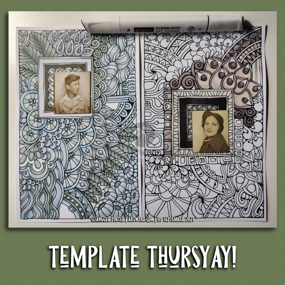
This week, I ran with a kind of request from a member and created two drawings which feature a rectangular area into which a photobooth photo would fit. Or anything else you can think of putting there – a precious button or coin mounted on card, a single earring kept for sentimental value, a ticket, a clipping from a magazine or newspaper, a tiny piece of embroidery, or needlefelting, or polymerclay, or fossil, or a tiny envelope containing a precious note/letter, or, or, or. You’re only limited by your creativity, and the sizes of the nested rectangles!
I’m going to be intrigued to see what people produce with these. I can be tagged in posts as @Artwyrd on Instagram or Twitter. And as Angela Porter on Facebook.
I’ve also added a geometrical pattern in the middle of the sets of nested rectangles if you don’t want to add anything to this space.
Both images would fit on an A5 card (metric/UK size), or a folded letter sized sheet of card for those of you in the US. They also could be mounted on card and framed if wished.
I’ved used Arteza Ever Blend markers from the Gray Tones set to add colour to the designs. And, for the design on the left, I’ve added white highlights with a Sakura Soufflé pen.
In today’s vlog on Youtube, I talk about the designs, and add the highlights to the left hand design.
This week is another page that is different. Someone said that they’d love it if I could create a drawing with a space for a photobooth image. So, I’m creating two such designs, in my signature Entangled art style.
I only have photobooth images from the Tim Holtz Idea-ology range, which I have in my stash. I’ve looked on Amazon Uk, and there are a few sets left, but not the pack I have. I think I’m going to have to trim the photo of the bloke down a bit.
Of course, if you don’t have photobooth images, you can use other photos, trimmed down, magazine or book images, stickers, or even buttons, coins, jewellery, and more attached to a sturdy piece of card sized to fit the frame. I’ll show some ideas, hopefully, in tomorrow’s video.
This morning has been an arty filled one. I woke around 5am and have been artsy-busy since then, apart from when having breakfast!
I spent time in bed drawing this design and listening to podcasts. An 0.5 Copic Multiliner on a sheet of Canson XL marker paper were used.
Next, it was time for some breakfast. Then, fuelled up, I did some pen sketches of bay leaves for Sketchtember Day 7. You can see this page in today’s vlog.
Yesterday, I had a delivery of Arteza Ever Blend Architectural Tones marker set. I bought these markers with my own money. I’m not paid, gifted anything nor sponsored by any product/company I mention. Just dropping that in here!
Anyways, I started by doing a swatch of the colours before starting to make today’s vlog.
This set appealed to me because of the more earthy, muted, vintage-y colours in the set. They were affordable, and so I bought the set, thinking that it could be useful for pens to add to an out and about sketching kit.
I had hummed and hahhed about getting the set for a while. After all I have a set of Chameleon color tones (and the color tops). And a set of Copic Ciao markers. Did I really need any more markers?
Well, the Chameleons are my favourites, but they don’t have many earthy colours. It seemed to me that these would fill in the gaps in my Chameleons.
I’m no expert on marker pens, nor in assessing their quality and so on. But they seem to work well on marker paper. They blend well, either on the paper or in the ‘tip to tip’ method.
I have no idea how long they’ll last in terms of ink. Unlike the Chameleons and Copics, they aren’t presently refillable, even though replacement nibs can be bought. Maybe that is something that Arteza is thinking about in the future.
The other thing that I’d like is a brush nib instead of the chisel nib. A brush nib that is more like the ones on Copics than the Chameleon so that I can get into teeny-tiny spaces in my artwork. The fine/bullet nib is OK for this, but won’t work on the tiniest spaces in my art.
Other than that, they do what they’re supposed to do! Color, blend well, and have a nice range of colours, apart from R13 Red which is glaringly bright against the other pens in the set. Personally, I would’ve liked another muted orange, or perhaps a soft greyish mauve or lavender.
Another bit of nit-picky-ness; a colourless blend would’ve been nice in the set. I find them useful, especially if I want to fade a colour out to practically colourless. That is something that is really easy to do with the Chameleons. No doubt I’ll try this out with a tip-to-tip experiment with either a Copic or Chameleon colourless blender to see how things go.
Oh, the pens have a triangular barrel, which means they don’t roll around the desk. My small hands do find it a bit chunky and a bit awkward to hold. That’s only because I’m used to slimmer barrels on pens/pencils/brushes/digital pens that I do most of my work with.
So, overall I’m really pleased with the pens for the price I paid. I’m sure I’ll use them an awful lot, as much as the Chameleons and Copics no doubt, especially as I’ve rediscovered markers and how much I enjoy adding colour to them.
I’ve had fun creating art this week. Here’s some highlights.
The rediscovery of how much I love my Chameleon markers was a wonderful thing. I love the way I get a smooth gradient of solid colour from them. Such a stark contrast to my bumbling, chaotic attempts with other media.
Taking up the Sketchtember challenge was a good idea to dust off some of my neglected drawing/sketching skills and ways of adding interest to a sketchbook. It’s also made me try to think differently to how I would when creating entangled art.
Hand lettering, and some typographic art today, has made a reappearance in my work. That’s a good thing; it’s something I would like to do more of.
Adding a rectangle of colour behind a drawing and adding handwriting to create texture is something I’ve not done before, but I like the results.
Thyme is the herb for today, day 4 of Sketchtember and my offering is in the photo at the top of the page.
There’s been some real lowlights too. Colour choices, mediums and doing things that seemed like a good idea when I started them! There’s a lot more about this in today’s vlog on youtube.
Even with the facepalm moments, it’s been lovely to spend time just drawing with no expectation of a finished project, polished work, or even perfection.
It’s hard work trying to convince myself that it’s ok to make mistakes, to mess up things as long as I learn from them.