I drew this a few days ago and have only got around to coloring it today.
The hand lettering and drawing was done with Uniball Unipin pens on paper. In black and white it has an almost vintage linocut feel to it.
I did scan it in and print it out on paper more suitable for alcohol markers. I used Chameleon Duo Tone and Duotop markers. Highlights were added with a white gelly roll pen from Sakura. I then added more black lines to add more dimension in places using a Staedler Mars Matic technical drawing pen.
Not sure I’ve done too good a job with the colours. Or line shading. Or the highlights in some places.
I’m quite pleased with the black and white line drawing however.
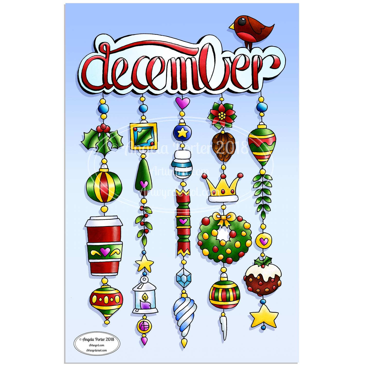
As one of my current goals is to improve my hand lettering I thought it would be fun to practice it with another dangle design.
For this one, I used some dangles from my book ‘A Dangle A Day’ to build the dangle designs with a wintry, Christmassy vibe to the finished design, thanks to the traditional Christmas colours of red, green and gold, along with with some blues, purples and cool pinks thrown in.
Of course, I could’ve chosen a non-traditional series of colours too, for fun. For example, the baubles on the dangles and the wreath could be done in pink, purple and blue. Whatever your decor at this time of the year it can be reflected in your colour scheme for your dangle design.
From the initial sketch to posting it on this blog it’s taken me around 6 hours to complete.
Yes, I started with a sketch and then inked it in traditionally, pen on paper. I scanned that drawing into GiMP so I could remove the dot grid and the faint echoes of erased pencil lines. This was followed by coloring the image. For this I used marker and blender brushes . The last steps were to add texture to the design, a coloured background, a drop shadow and then the watermarks.
I used a Microsoft Surface Pen, a Microsoft Surface Studio and Autodesk Sketchbook Pro to complete the digital colouring and so on.
The charms on the dangles are a lot easier to draw than they appear, it’s the colour that really brings them to life and gives them dimension.
It’s always fun to string charms together to make these dangles. I often tend towards more symmetrical designs, but ones like this are good to do too. They all have their own charm, pardon the dreadful pun there.
I take you designing dangles step by easy step in my book ‘A Dangle A Day‘. There are lots of examples of dangle designs in the book that are ready to use, but it’s easy to rearrange things to suit your particular needs. The release date is 8 January 2019, a new style of creativity to start in the New Year, and throughout the year as all the seasons and many different celebrations are covered in the book, along with suggestions for projects using dangle designs.
I’m absolutely dreadful at taking photographs! However, here is my coloured version of the dangle design I posted earlier today, all glued into my BuJo ready for the start of a new month tomorrow.
This is likely to be the only artsy stuff I do in my BuJo as the rest of my bujo is rather minimal – it’s functional and I can lose way too much time prettying it up. For instance, sketching, inking in the design and then colouring it has taken me most of my day! It’s been fun though, and a much needed ‘quiet’ day after a hectic week.
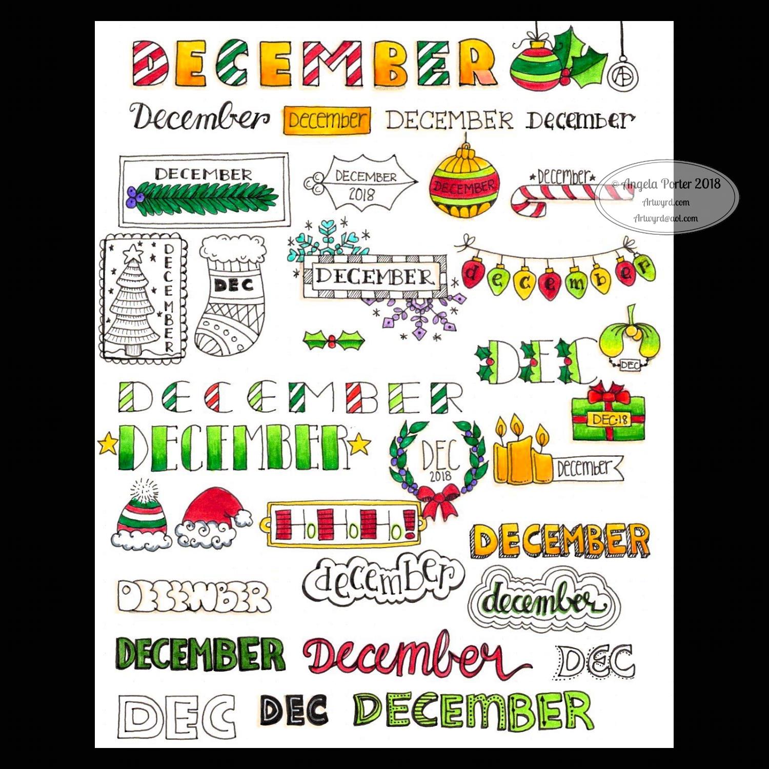
I realised after coloring the hand lettered December in that I’d messed up the letter M. The second vertical line should’ve been like the first one to give balance to it.
I also forgot that when I printed out the A4 sized design as an A5 that the lines would be reduced in thickness. So, I had to invest time in going over them with a thicker pen after I’d finished the coloring. Mind you, this helped to make the lines nice and bold again.
To colour I used Tombow Dual Tip Brush Markers along with glitter Signo gel pens from Uniball. I also used some Chameleon coloured pencils to add a bit of shading here and there and to add the shadow around the design.
I left the background white. I realised that I could’ve coloured it with Distress Inks and then coloured over them. So, instead of messing up the background by trying to colour it I elected to use silver and gold glitter gel pens to create patterns of ‘sparkles’.
Yes, glitter! I rarely get to add glitter or metallics to my work, especially if it’s for publishers as it really doesn’t photography or scan at all well. But as this is a personal project I did add a fair amount of sparkly highlights and elements.
I think this one may be my favourite BuJo monthly cover so far.
I must admit if I had time or desire to colour it again I’d not use the Tombows. I managed to smear the colours lightly here and there so I haven’t got a ‘clean’ coloured illustration.
I think I’d go with alcohol markers such as my Chameleon Color Tones along with the Color Tops.
However, I think I may find it difficult to colour the tiny spaces with the Chameleons. That’s the problem with printing the design smaller than the original.
It’s Friday, so that means it’s #dangleday! As it’s the last day of November it seems appropriate that I design a dangle design that would look fantastic as the monthly title page for a BuJO, journal, planner or just a fun design to color and frame or, printed out smaller, used on a greetings card.
As usual these days, I sketched the design out on dot grid paper and then scanned it in. I used Autodesk Sketchbook Pro and a technical drawing pen ‘brush’ to ink the design, as well as make adjustments to the design.
The final steps were to add a background colour and watermark it for sharing on the internet.
Naturally, I used my Microsoft Surface Pen along with my Microsoft Surface Studio to do the digital drawing. I think I’m going to print this design out so it will fit in my BuJo and colour it with traditional media.
I’m going to make this available as a coloring template in the Angela Porter’s Coloring Book Fans facebook group. So, if you’d like to download and print the template, pop along to the group and join in!
This is quite a complex dangle design to look at, but it’s not that complex to create. In my book ‘A Dangle A Day’, released on 8 January 2019, I take you step by step through the process with loads and loads of examples of monograms and dangle designs for all seasons and all occasions, along with ideas of how to use them. There’s also a fair number of tips and encouraging words within the book.
If you do download, print and colour this design, I’d love to see how you’ve coloured and used it! You can find me on twitter, Instagram and facebook.
December is nearly upon us and my mind is turning to ideas that could be used to brighten up BuJo pages with simple lettering and design ideas. And this sheet is what I’ve come up with … thus far!
If you use any of them for inspiration in your BuJos, planners, journals, or in card making or any other way I would love to see how you’ve used them! If you share on Instagram then tag me in your post @angela_porter_illustrator. On twitter you can tag me as @artwyrd and you can find me on facebook as @Artwyrd
All are hand lettered and hand drawn. I used Crayola Supertips to colour the images in. I used Uniball Unipin pens for the black lines and I worked on dot grid paper to help me keep the letter sizes and spacing consistent.
I can see that the bubble lettered ‘December’ has a weird looking M. It looks more like Decewber! Oops! Practice is needed with bubble lettering methinks.
This was a fun project, that took a bit more time than I thought it would.
Of course, the next thing for me would be to choose some of these and convert them to dangle designs, a process I cover in my upcoming book ‘A Dangle A Day’.
I’m finding that I’m enjoying hand lettering a bit more now that my conversation with myself in an earlier blog is setting in – about making it mine and accepting the little imperfections as they are what make it unique, just as they do in my drawings.
Today’s hand-lettering is just a variation on the one I posted on Monday.
For this one, I’ve used simple patterns to fill the white space in the letters and added a ‘line shadow’ to left and below the letters. To do this I used a Uniball Unipin 0.5 pen.
I like the graphic nature of just black and white as well as the intricacy of the patterns.That intricacy is something that warms the cockles of my artistic heart.
I didn’t only add details to the letters – I’ve added details to the dangle too! Simple additions but add a feeling of complexity.
I feel at the moment I’m in a position both in terms of demands on my time but also in how I feel about myself and my artistic nature to explore hand-lettering so it’s an ‘Angela’ thing that I’m comfortable with.
Not just comfortable, confident in my skills too. So, re-working a fairly open hand lettered word like this in different ways.
So, it’s possible you’ll see variations on a word appearing on this blog, my Instagram, deviantART, Twitter and facebook accounts as time goes on.
We’re rapidly approaching December so it’s time for a number of personal artistic pursuits :
my christmas/winter cards for 2018 need to be designed and printed
‘freebie’ templates need to be designed for the Angela Porter’s Coloring Book Fans facebook group.
BuJo spreads and design elements
I’m sure there’s some other things that need doing, but this morning they escape me. Of course I’m going to note these things in my BuJo.
I’ll also be starting work on a new book for Creative Haven by Dover Publications.
So a nicely ‘busy enough’ time ahead.
Yesterday, I had a lovely day out to Aberglasney Gardens for lunch with my pal Liz. It was hammering down with rain during our journey there, but the rain cleared up by the time we’d finished a leisurely lunch.
It had been many years since I’ve visited Aberglasney and I’d forgotten how interesting it is. I’ll return sometime soon with sketchbook in hand for sure!
My evening and night until well past midnight were taken up designing a birthday card for someone. The design was finally uploaded to Moonpig ready for posting today near midnight. To say I was, and still am, shattered could be an understatement today! Still, I can have a semi ‘self-care’ day today to recover.
Yesterday, after completing the basic hand-lettering reference sheet and my blog musings about believing in myself, I was inspired to hand letter something. So the natural choice was the word inspire. I also added a little dangle to the initial letter.
I used dot grid paper to help me keep the letter sizes and heights consistent, though I can see there are places where the width of the letters has varied. I’m working on telling myself that is fine, that it is all part of my hand lettering style and journey, that it adds that ‘human’ quality of perfectly imperfect to the design.
I scanned the design into the computer and used GiMP to remove the dot grids and then create a transparent background.
I could’ve printed the word out and used traditional media to colour it, but I decided to use Autodesk Sketchbook pro along with a Microsoft Surface Pen and Surface Studio to digitally add colour, a drop shadow for the image and a colourful background. Today, I chose to use the gradient tools as I have a limited amount of time before I head out for an appointment.
I woke up early today and thought I’d organise my ideas about basic hand lettering into a reference sheet, and this is what I’ve come up with.
The foundation of hand lettering, to my mind at least, is to practice, practice, practice drawing your basic letter shapes, both upper and lower case. Bullet journaling can be a good way to practice hand lettering and to try out variations in letter forms and styles. My current bullet journal is very functional and minimal, but I do use different letter styles in the headings for each day and collections and so on. Mind you, I could do with a lot more practice.
Notice is said your basic letter shapes, not my basic letter shapes The reason I say this is that the more I’ve struggled with my hand lettering and it not looking like other peoples, the more I’ve come to realise that it’s MY hand lettering, my style, that I need to work on.
Yes, I draw inspiration from other people’s work, but at the end of the day I’d like my hand lettering to be mind, with my ‘stamp’ on it, my uniqueness, my quirkiness, my imperfections.
I struggled with this idea in the early years of my artistic journey, and now I’ve realised I’m having the same struggle with my hand lettering.
Hand lettering is exactly that – done by hand, not by machine. If I want perfect letters, then I can use fonts on the computer. What I can’t have is perfect hand lettering as in perfect like a computer font.
What I need to work on accepting is that my hand lettering is good enough, it’s human, it’s an expression of myself.
I spent a lot of time and effort in my teenage years to change my handwriting. I realised it looked a lot like my mothers. I didn’t want to be anything like my mother, even down to my handwriting, which actually is more like fast hand lettering as I really do draw each letter. I gave up joined-up cursive writing at this time too. My handwriting isn’t entirely print, some letters do get joined up.
I came up with my own style of writing that I like, mostly. It’s usually teeny-tiny too, so writing BIG is a problem for me.
Hand lettering is, for me, an extension of my own style of printing/drawing my letters.
This doesn’t sit all that well with me at this moment, but it feels more authentic to me.
I want to use my own letter shapes as the basis for my own hand lettering, along with all the imperfections that my bring. After all, it’s all the little imperfections in my drawings that make them uniquely mine, that make them human. Even when I draw digitally I make sure that there are imperfections in my work – the slightly wobbly lines, the imperfect circles and shapes and so on.
I am working on having the same kind of attitude towards hand lettering and stop thinking that mine has to be perfect like computer fonts, that it is just another way of artistic expression and perfectly imperfect.
Notice that I say this is about me and my attitude towards myself and my hand lettering. I’m not criticising anyone who has different opinions. I just know I can be incredibly hard on and brutally critical of myself.
It’s so easy in this day and age with so much available on social media that you compare yourself to others and judge yourself as seriously inferior or a failure. As my inner critic already believes that I am a failure and useless at anything I do and tells me this, it can be a lot harder for me to believe that what I create is good enough. I believe that about my drawings, I don’t believe that about my hand lettering, yet.
What I’d like to achieve is hand lettering that stands out as being ‘Angela Porter’ and for me to be comfortable with my hand lettering, not worrying that it’s nowhere near even good enough.
Today’s blog post is a different kind of one from me, and it’s a sheet that’s full of hand-lettering ideas. Ideas I can use in my BuJo or in illustrated quotes, greetings cards, note cards, dangle designs, monograms, and so on.
Earlier today – around 5 hours ago by my time here in the UK. I started to watch a video on YouTube by AmandaRachLee and I liked some of her ideas there.
So, I thought I’d create a reference sheet of ideas for hand-lettering to add to my arty reference folder/visual dictionary. This sheet is the result. I’ve numbered the ideas/variations that refer to the notes below.
I’m going to start, however, with the last examples first! I realised when I finished the sheet that I hadn’t included examples of my basic hand lettering.
42 – My lower case hand lettering showing how I like to make all the letters the same height. This gives a cute, whimsical feel to the lettering. 43 – My upper case hand lettering. 44 – Variations on how I sometimes form some of the letters, whether I do that as a conscious choice or not. 45 – My lower case cursive script. My cursive is my least favourite of my writing types.
All of the other examples on this sheet are based on this hand lettering.
What I’m coming to understand is that my hand lettering is uniquely me. I don’t want it to be like other peoples, though I do want to be able to vary the style to meet different needs. That means I need a bank of ideas of how I can do this to refer to.
So, onto notes about the ideas.
Draw the letters with a broad pen. I used a Crayola Supertip pen. Next, I added thick black lines to the left and bottom areas of the letter to create a shadow.Look carefully at where the black lines have been added so you can see where the bottom and left areas of the letters are. My preference for shadows is always to the left and bottom; you could choose a different combination, such as to the right and top.
This time I added lines to the left and bottom of the letter mirroring the shape of the letter. Look carefully at how this is done in the centre of these letters.
I drew lines from the corners that extend to the left and angling downwards to create a box around the letter and coloured them in black. This gives a very heavy, graphic box-shadow to the letter.
This shows how the lines form a box-shadow around a letter. Leaving the areas uncoloured gives a ‘lighter’ feel to the letter.
I used a black pen to outline the letter. This really defines the letter. It also allows you to smooth out any imperfections in the letter drawn with the broad pen.
This is just like version 2, but the shadow lines have been doubled up. If you spread the letters out more you could add more repeats of the shadow lines.
A variation on the box shadow where diagonal lines have been drawn without an outline for the box. This gives a lighter feel to the shadow. It’s not at all fussed on it, but I included it as it may be appropriate to use at some point.
A box-shadow where lines are used to fill in the outline.
Seriously heavy drop shadows here. You can even draw them without outlining the letters and let the negative space form the letters, as in the ABC example. You can also see how lines were drawn to form the box-shadows here.
Choose a point above or below the letters. Draw lines to this point from the corners of the letters. It gives a great sense of dimension.
I drew the letters with a broad pen. Then, I added black lines within the letter re-writing it.
Instead of solid black lines I used dashes and dots inside these letters. The dashed lines give a feeling of the letter having been ‘stitched’ onto the pate
White lines instead of black, with the E having the white lines added as highlights to give the letter a sense of dimension. This would be increased somewhat if black lines were added to the left and bottom of the letter.
White inside black; the inner lines really show up. White highlights on a black letter gives a sense of dimension.
Black solid lines, dashed and dotted lines within the letters, as well as partial lines as highlights.
More rounded letters with a shadow and highlights. These have a fun almost comic feel to them.
Write the letters using a broad pen. Use a fine pen to draw a line around the shape formed by the word. This line could be in any colour you choose.
Outline the letters in black gives a bolder feel to the lettering.
Doubling or tripling up on the outline gives a different feel. There’s also opportunity to colour between the outlines or to add patterns there, or shadows.
An example of cursive faux-brushpen hand lettering. This time, the outline has had a shadow added to it.
Here, the letters have had a black outline added. Look at how the lines help to give the illusion of dimension to the letters.
Draw outline letters then use a broad pen to write the letters again, but offset them.
The outlines have been filled in. I prefer this one as it gives clarity.
Instead of a solid outline usde a dashed line.
Fake brush pen lettering. Write in cursive. Then, add an extra line where the downstrokes of the letters would be.
You can leave the spaces in the fake brush pen lettering blank, or colour it, or fill it with black or even a pattern such as horizontal lines.
Fake brush pen lettering doesn’t have to be cursive! Just thicken the downstrokes of any letter you write.
Combining drop shadows with various ways of filling in the outline letters.
Colouring in the outlines and adding lines, both solid, dotted and dashed gives different ‘feels’ to the letters.
Add a bold box-shadow to the letter gives a great deal of weight to it.
Drawing a smaller version of the letter inside it and adding texture again gives a different feel to the letter.
Outline letters are perfect for adding colour or, in this case, patterns. The patterns can be simple lines to more complex ones. They can be dots, stars, hearts, leaves, flowers, anything that makes your creative heart sing! Shadows help add variety to the letters too and here you can see how the shadows ‘lift’ the letters.
Serifs are the little lines placed at the end of lines forming the letters. The simplest way to achieve this is to hand-letter your simplest letters and then add lines. Using a broad coloured pen to write over these letters add interest.
Serifed letters can have their downstrokes thickened too. The serifs can become triangular in shape too. Adding a drop shadow helps to lift the letter.
Adding white dots inside the letters adds a different feel to the letters – much more whimsical and less serious than serif letters can be.
You can add serifs to outline letters. This allows patterns to be added. I particularly like the F in this word.
Hollow letters are perfect for adding colour and here are some simple examples of how to do that. Putting the darkest colour at the bottom adds weight and the letter feels more ‘stable’.
Ombre colour fills from bottom to top and also from one side to another. You could also do them diagonally.
Sunburst lines have been added to the word. You could also add them all around the letter to make it feel like it’s popping or exploding.
Wiggle lines added to make the word appear wiggly!
Big, bold block letters with circles inside create a marquee letter.
A bold, black letter with white lines drawn across give a different kind of graphic feel.
Curlicues can be added to the letters at the start and end of words. They can also be added to letters with tails or the crossing of a t.
That’s a lot of words! Believe it or not, it’s a lot easier to do hand lettering than to explain how to do it.
Of course, I could start a YouTube channel myself and show how I do this … I’m thinking about that. Either way, I hope my reference sheet and words give you some inspiration. I think I’ve managed to cram a lot into an A4 sheet of dot grid paper!
Would you like to see more like this? Let me know!
It’s Friday so it’s #dangleday! E is for … echinacea (cone flower), envelope, earphones, Earth, eight (or eleven, or eighteen or eighty – you get the idea), eight-sided octagon, eighth-notes (semiquavers).
Purple and gold are complementary colours so I chose them for the pusscat, the monogram and the octagon with my initials in it. I chose silver as the colour for the frame around the monogram simply because it’s my favourite metal and I fancied a change from gold beads and so on. Pink hearts and earphone accents. Yes, the headphones had to have cat ears on them, and yes, I have a pair like this, but the ears are blue.
Cute kitties, cute charms and letters. Looking at the monogram now, the letter could do with a shadow around it, but it’ll do as is.
I sketched the design on dot grid paper. After scanning the sketch in, I inked it in using a Microsoft Surface Pen on my Microsoft Surface Studio screen. When I was happy with the line art, I added colour and texture to the dangle design. The final steps were to create a coloured and textured background and a drop shadow for the design.
A nice way to spend a couple of hours on a cool, grey, damp Friday morning.
If you like dangle designs and would like to try your hand at drawing your own then my upcoming book ‘A Dangle A Day’ is available to preorder ahead of it’s release in January 2019. In the book I take you through drawing monograms and dangle designs in easy steps. The book includes lots and lots of examples and ideas for designs too.