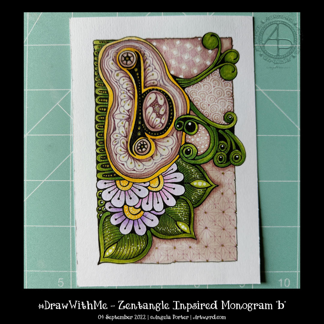
I’m continuing with my exploration of monograms and patterns. This one is a bit odd with the ba sitting above a pool or pebble..or something. But I quite like the patterns I’ve used to embellish it. I’m also rather fond of the background patterns, especially the very faint ones to the bottom right.
I’m not too fussed about the greens, yellows and the colours I used for the flowers. Pretty much every colour apart from the background colours and the colours of the patterns around the b!
Must write a HUGE reminder and stick it where I can see it “WORK IN MONOCHROME!”
All the same, it’s a learning exercise for me, as drawing always is. The ones that turn out not quite to my liking at the ones I learn most from. Having said that, I still haven’t learned that ‘work in monochrome’ thing yet! One day, maybe, I will.
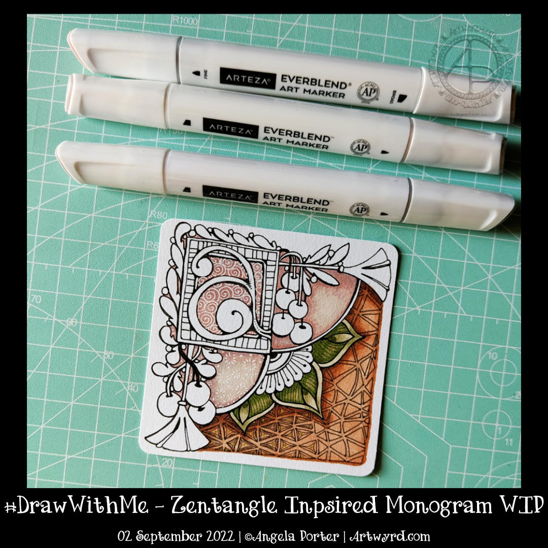
I’ve mostly finished this 3.5″ (11cm) square ’tile’ with a monogram. It’s changed a little since my last blog post this morning.
Apart from completing the colour, I coloured over the brown section in the bottom right. I used dark and light grey Gellyroll Moonlight pens to add the crazy ‘N’Zppel’ Zentangle pattern. It needs tidying up and perhaps some highlight within the inner black spaces.
But for now, it will do. I think I need a break from it to eat and do other things for a while.
This morning, I thought I’d share how I’m exploring creating some Entangled art, particularly monograms, via YouTube.
This little drawing is 11cm by 11cm, which is approximately 3.5″ square – took about an hour or so to get to this point. I wasn’t sure of the green, but I think it’ll work out just fine. There’s quite a way to go yet, but that will have to wait for another time.
The materials I used are: * 03 black Sakura Pigma Micron * Various Arteza Everblend marker pens * Various fineliners in grey and green * A white Sakura Gellyroll pen * A metallic gold Uniball Signo pen
This week’s colouring page for the members of Angela Porter’s Coloring Book Fans Facebook group is intricate. Still, it uses only three motifs – spirally furled leaves, starry flowers and stripey, plumptious seed pods.
I drew the design using a fine nib TWISBI eco fountain pen, filled with Documentus ink, on an A4 sheet of Artway’s Eco paper. To add colour, I used various Arteza Everblend markers. The pattern, textures, and highlights have been added with various Arteza Inkonic, Uniball Signo and Sakura Gellyroll pens.
I enjoyed losing myself in the intricate, flowing, Zentangle-inspired drawing done yesterday; I thought I’d use the idea as the basis of a colouring page.
Not quite so intricate, and everything drawn on a larger scale to make it suitable for colouring, it was still very much a lovely thing to do.
I thought I’d go with some more abstract, pattern-based templates. The last one I drew, at the top right, just ended up having some seed pods.
Abstract designs like these are great fun to add colour to as there are no pre-conceptions about what the colours should be. Also, they’re great for trying out new techniques, media and colour combinations. And, of course, they’re relatively quick to finish, which is great if you’re short on time.
Please click on the “Watch on YouTube” button. Cheers!
I had a lovely time this morning adding colour to yesterday’s drawing.
To be precise, I chose to use Arteza’s EverBlend markers. I’m not at all sure about that green at the moment, but it may look quite different when I’ve finished colouring the drawing in.
In the video, I focus on explaining my method of adding colour and showing how I’ll add colour and contrast to each section of the design.
It’s blessedly cooler this morning as I write this blog. There’s been a little rain, but not enough to help out nature. We have the potential of thunderstorms and torrential rain at some point today. I do hope we get some thunderstorms – I love nature’s fireworks and drama! Rain is fine, but torrential rain can cause huge problems.
Anyhoo, to arty things. There are two drawings in the photo. I completed the one on the right on Sunday and filmed a video tutorial. It explores a new fragment shared on day one of Zentangle Project Pack 18. It’s always fun to explore patterns; I get to understand the pattern more and discover variations.
One of those variations came out in my sketchbook on Sunday evening. I used the ideas of the fragment as a way of filling space. What resulted looked a lot like the tangle pattern Diva Dance. you can see this in the drawing to the right in the image above.
It never ceases to amaze me how patterns can segue one into another as variations are explored. Everything, even tangle patterns, is interconnected and related by not that many degrees of variation!
Of course, I filmed the drawing of the flower and tangle pattern tile as a video tutorial. Hopefully, slowly and clearly enough that it’s easy to draw along with me. I hope you give it a go!
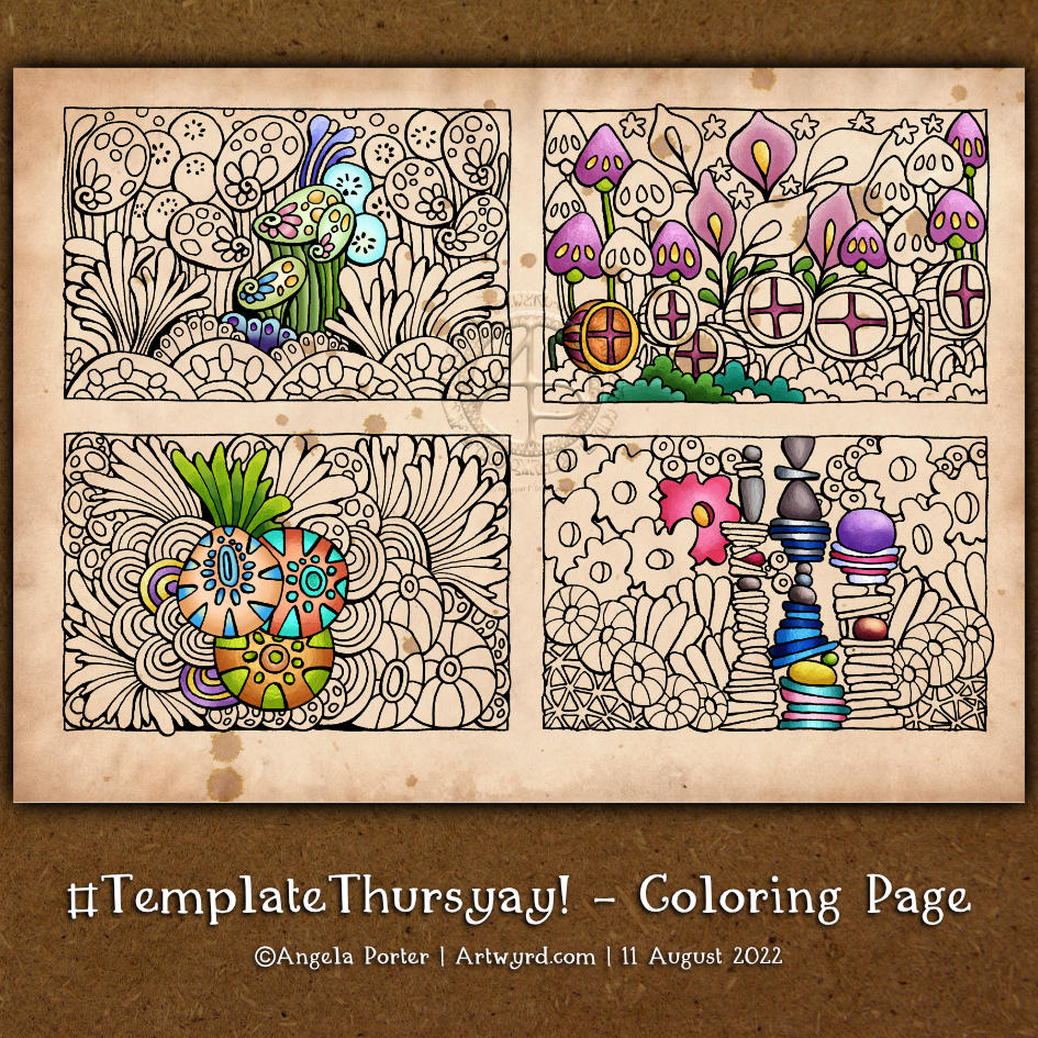
This week’s colouring page is a little different. It has four designs on it. Each one would look adorable when coloured and mounted on a blank or postcard card. They would make a lovely decoration for a bullet journal, journal or diary.
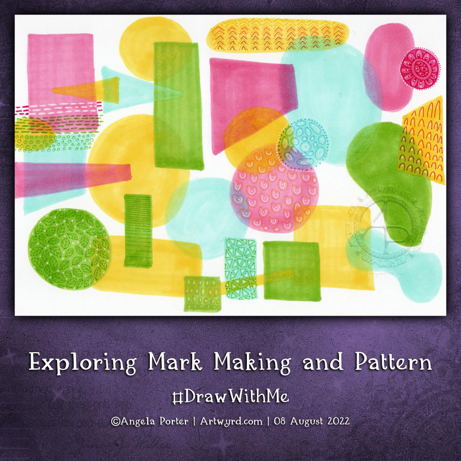
I had a lot of fun with this sketchbook page. It’s well out of my ‘comfort-zone’ as there are absolutely no black lines, not even the lines that define the basic shapes.
This is inspired by illustrator Kate Sutton, whose Domestika course I started watching yesterday. And there’s another project I have on the go that is inspiring me to explore this kind of drawing.
I’ve tried this before, but felt so uncomfortable with it that I gave up very quickly. Today, I was determined not to use any black lines at all. Instead, I picked a colour palette of just four colours of Arteza EverBlend markers. For each colour, I chose a similar one from my set of Zig Writer pens.
I started by creating the collage of simple shapes using the markers, overlapping them so that the colours mixed. I was careful not to mix the pink and green; I didn’t want to make mud!
Once I was happy with the basic design, I used the Zig writers to add patterns made from simple marks. To begin with, this felt really awkward, uncomfortable, and just plain wrong. However, the more I did, the easier it became, and the more I liked what was happening. I’m so glad that I persevered!
I dug out a white gel pen to add some brighter, lighter marks and to play with the ‘stitching’ to the top right. The idea that I was using pen ‘stitching’ to connect shapes and patterns amused me.
Using the white gel pen reminded me I had other gel pens to use, and use them I did.
I love the translucency of the marker pens and the way that the patterned shapes seem to float. The use of monochrome colours in these shapes, along with white, just gives an airy, delicate feel to them. I can now see the value of this way of using no black line. I have a lot more exploring and experimenting to do. My mind is ticking over how I can make use of this in a project I’m developing at the moment.
As eager as I am to continue my explorations, I have an errand to do first. But when I return home, well, I’m going to try out some of my ideas both on paper and digitally and see where this takes me.