Mandalas, Mia Chambers and Autodesk Sketchbook Pro musings

Mandala B1_Small_AngelaPorter_15May2016Mandala B2_small_AngelaPorter_15May2017

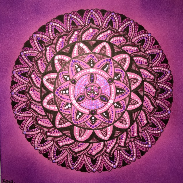
This morning, I’ve drawn the two mandalas above.  I used Autodesk Sketchbook Pro on my Microsoft Surface Book to do this.

I’m gradually exploring the features of Sketchbook Pro, and the more I use it, the more I like it, though making the transition from paper to digital drawing isn’t as easy as I thought it would be.  This is mainly because I find it hard to work at a detail level that doesn’t require a magnifying glass to see the detail or to add colour – particularly important when I’m doing work for colouring books.

This is partly because of the ability to zoom in so much on the artwork, and partly due to the screen size on my Surface Book being a little smaller than A4.

I have considered getting a Surface Studio, but that’s on hold until I’m sure I really want to go down the digital drawing route.  Having such a big screen is an alluring prospect, being able to work on the paper size at it’s actual size…but I’m still thinking about it.  Maybe when I find out my tax bill for the previous financial year I’ll make my mind up.

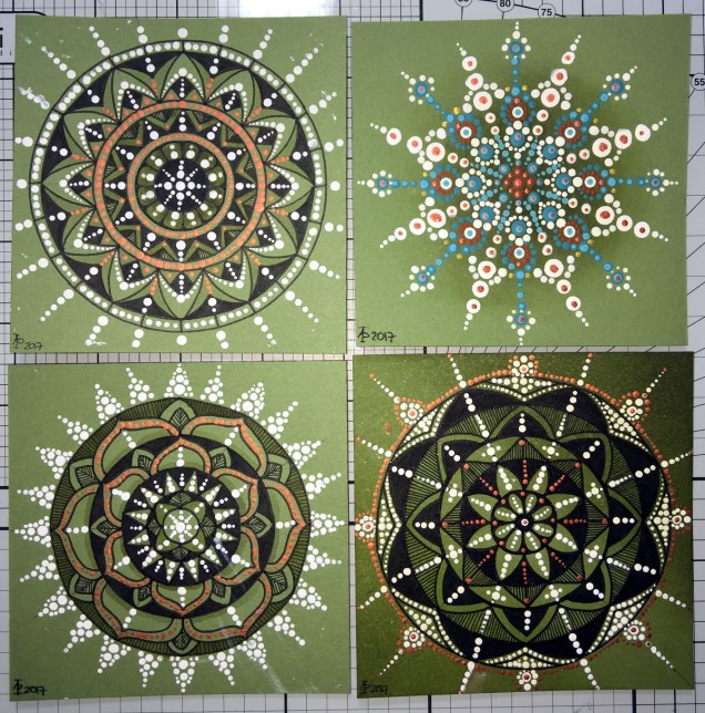
Now, these aren’t the first mandalas I’ve drawn using Sketchbook Pro.  In the past three or four days I’ve some some small ones (approx 3″x3″) to print out, colour and mount on blank greeting cards to be sold to raise money for Mia Chambers, Rainbow Warrior Princess to get her to America for experimental cancer treatment not available in the UK.

What I’ve always found tedious as well as a tad challenging mathematically, is setting out the angles and so on for a symmetrical mandala.  Sketchbook pro makes that easy for sure, as well as saving on the time in creating symmetry.

I’m still struggling with the idea that I may be ‘cheating’ by doing this.  However, I can logically accept that the tools available in Sketchbook Pro allow me to focus on my creativity far more.  Also, the ability to zoom in means I can add details and so on I couldn’t do easily when working on paper.

I have used mandala templates I’ve drawn on paper and scanned in Sketchbook pro to draw mandalas, as well as using sketched out designs so I can neaten up the sketch and add details (it saves erasing pencil lines and the mess and wrinkled paper and smudged in that can result).  I don’t really need to mention how easy it is to undo mistakes.

Certainly, the symmetry option makes creating these mandalas a lot quicker, and because I don’t strive for total perfection in the hand-drawn lines or added patterns, then even though the mandalas are drawn in a digital environment, they still have that feeling of being drawn by hand, which makes me happy – they’re still ‘perfectly imperfect’!

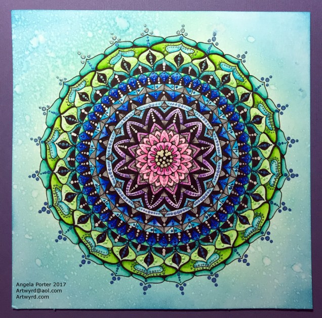
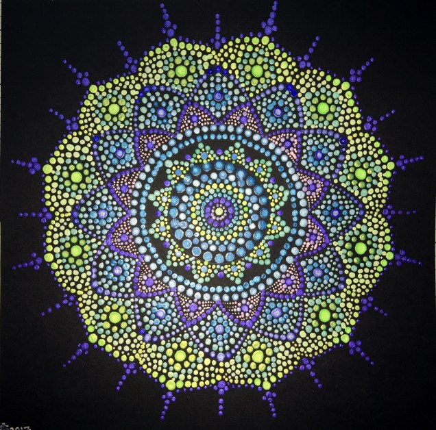
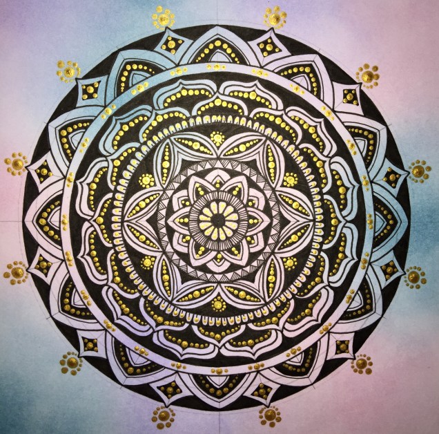
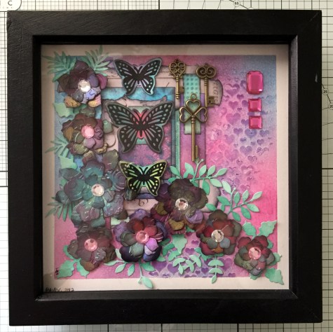
Of course, I’ve not really got to grips with colouring the designs in Sketchbook Pro, so printing them out and adding colour using a chosen medium is still my favoured way of working.  Also, I can add things like metallic highlights and sparkly gems to the mandalas, plenty of which appears on the cards I’ve made as well as the mandalas I’ve framed in order to raise money for little Mia.

Today’s Mandala

DotMandala_9May2017_AngelaPorter

I’ve spent much of the day working on this, and it’s been a pleasure to create as it has combined many of my favourite techniques.

First, I coloured the background with Distress Inks, starting at the centre with a pale pink, follwed by a pale blue, a sea green and finally a blue with a hint of green around the edge.

A light spray of water and a dry and the sheet was ready to have the black line design drawn on it, once I’d put a pencil grid down.

Next, the colours in the various sections were intensified using Zig Clean Colour Real Brush Markers from Kuretake, along with a brush and water to fade the colours out.

Finally, all the dots were addded using pearlescent/iridescent watercolour paints.

I’ve smudged some dots, others insisted in running into each other, but I’m fairly pleased with the outcome.  As I’ve already said, I really enjoyed doing this one.

More dottiness – in the form of mandalas!

DotMandala01_8May2017_AngelaPorter

Over the last couple or three days I’ve been playing with mandalas and dots, just purely for fun!

To create the mandala above, I used shimmery, iridescent watercolour paints on black card.  The photo really doesn’t capture the shimmery loveliness of the mandala.  The mandala measures approx. 8″ x 8″.

DotMandala05_8May2017_AngelaPorter

This next mandala, again 8″ x 8″,  was made using acrylic paints with green card as the substrate.  Once I thought the paints were dry, I tried adding some distress inks so that there were shades of green in the background.  However, not all of the dots were completely dry and some smeared.  Also, the ink coloured the white dots.  So, the lesson is to add the shading before doing the dotting!

DotMandala02_8May2017_AngelaPorter

These four small mandalas (approx. 4″x4″) I added shading using a damp paintbrush and Distress ink.  I thought I’d try drawing the design in ink in three of them then adding dots in white and copper to add more/different patterns as well a some shininess.

Oh, the mandala with the teal and red-brown dots had distress ink sponged in the centre. The white acrylic paint wasn’t stained by the ink.  These dots had a lot longer to dry than the previous mandala.

DotMandala03_8May2017_AngelaPorter

For this mandala (approx 8″ x 8″) I first applied some distress inks to white watercolour paper  Then I drew the mandala in black ink.  Finally, I added dots with gold acrylic paint.  You can still see the pencil construction lines as I want to give the gold paint plenty of time to dry before trying to erase the lines.

DotMandala04_8May2017_AngelaPorter

This final mandala, approx 6″ x 6″, was drawn using black ink on pink card.  Once the drawing was complete, distress inks were applied to give different shades of pink/purple.  Then dot patterns were applied using white acrylic paint and iridescent watercolour paints.

Artwork auction for charity – Mia Chambers, Rainbow Warrior Princess

AngelaPorter_AuctionPiece2

I have this piece of artwork on eBay to raise money to help send a little girl to the USA for cancer treatment not available in the UK.

Mia Chambers, Rainbow Warrior Princess has a facebook page .  She also has a Just Giving page where you can also read more about her journey.

Please either consider bidding for this artwork, making a donation to her Just Giving page, and/or sharing this post far and wide so other people can help get this brave little girl the treatment she needs, as well as helping other children with similar cancers.

Thank you.

Colorist App news, and my first dot mandala!

Colorist news!

A new book of ten images designed by me is now available in the Colorist app!  It’s called DoodleWorlds – The Next Frontier!

I had a lot of fun drawing these images, and who doesn’t need a koala planet or an angel pusscat in their life?  Not forgetting all the crazy aliens and critters and other things!

Colorist is an app that allows you to colour templates in like you’re using a pencil or a gel pen. Great fun, easy to use, and you can colour each template again and again.  Oh, and you can add doodles and patterns to the images too!

Dot Mandala

My youtube recommendations today included some videos about how to create ‘dot mandalas’ – the kinds that are seen on stones and also as paintings.  They’re made up of patterns of dots, and I watched a couple by Kristin Uhrig  and Travelling Kindness Rocks and they inspired me to have a go.  This is the result:

DotMandala_4May2017_AngelaPorter

It’s not perfect – I found out this is much harder than these two ladies make it appear.  It was, however, a lot of fun to create!

I used my embossing tools dipped in PaperArtsy Fresco Paint and some gold Liquitex paint, both of which were watered down a little, to make the dots.  I did draw some pencil circles on the black card to help keep the design circular; I drew three circles in total!  Then, I just let the design flow without over thinking it.

As I’ve said, it was great fun to do, totally engrossing, and I’m quite pleased with my first attempt.  I’m sure I’ll be doing more of these, on all kinds of scales!

Stay Strong – Mixed Media, now completed

StayStrong_Finished_2May2017_AngelaPorter

Yesterday, I posted a picture of this mixed media work.  I thought it was most probably finished,  However, as I looked at it, there was something not right about it, something, or somethings, missing.  I didn’t know what.

When I woke up this morning I knew what to do, kind of.  So, after searching through my stash of bits and bobs, I sorted it.

I think it is now finished, apart from some shadows around the cogs which I can’t do until the glue has set.

Much happier with it now.

Stay Strong – Mixed Media

StayStrong_1May2017_AngelaPorter

More Foamiran flowers, this time rather more stylised or abstract.  Background is texture paste mixed with distress ink and some pearlescent paint from Liquitex and stenciled over a distress ink background.  Papers coloured with distress inks or distress oxide inks.

Embossed paper and ACEO card are coloured with various acrylic paints from Pebeo and Liquitex.  They’ve been used to create a collaged pattern behind the previously made ACEO/ATC paint.

Liquid pearls have been added in places, and gems in the flower centres.

I die-cut the leaves from Centaura pearl paper and coloured them with Copic markers; the sheen they have is subtle and fits in nicely with the more pastel colours used.

Be Your Beautiful Self – Mixed Media

BeYourBeautifulSelf_30April2017_AngelaPorter

A second mixed media work from me.  Texture paste through stencils, distress inks, diecuts, various papers I’ve coloured, some that have been embossed.  Metallic and iridescent paints.  And gems.

Be Authentic – Mixed Media

BeAuthentic_30April2017_AngelaPorter

I’ve mostly finished this piece of mixed media art.  I think I need to add some pearls or similar, maybe some shadows around the flowers and foliage, but it is, in essence, complete.

I’m quite pleased with it, especially as I kept to a mainly monochrome colour scheme of blues and greens, but pinks and purples had to make a little bit of an appearance just to add some accents.

It’s another big one – A3 in size.  Lots of Foamiran flowers have been used; I used Distress crayons and a baby wipe to add colour to the white foamiran before heating and shaping each layer.  The colours are the same as some used in the background.

My focal point is an ACEO or ATC that I made a few weeks ago at the start of my mixed media explorations.

In places you can pick out the subtle sparkle on the background and foliage – achieved by spraying with a mist of gold perfect pearls.

Many of the coloured papers I used in the collage were created using a Gelli Plate and PaperArtsy fresco paints.

A fair amount of metallic and iridescent paints from Pebeo, Liquitex and Daler-Rowney have been used too.

Never give up and Foamiran flowers

AngelaPorter28April2017_01

Back to playing with mixed media today, and this is the result…

It’s around 8″ x 6″ in size and 300lb Smooth watercolour paper by Daler-Rowney is the substrate.

First, I coloured the paper using Distress Oxide inks, with a light spray of gold mica mixture.

Once that had dried, I added the diamond motif and text to the background using texture paste through stencils.  Once the paste had dried, I used a rich gold System 3 acrylic paint from Daler-Rowney to paint the texture paste.

Yesterday, I had used embossing folders with my Big Shot from Sizzix to emboss coloured card which I then added metallic and iridescent colours to.  The dark red-brown layer of cogs is part of one of these papers. Behind it, there’s a piece of patterned paper.  Both have had their edges roughed up (distressed) and then inked using black Archival Ink from Ranger.

I next chose an ACEO or ATC card from my stash to act as a focal point.  I also firtled through my stash of steampunk diecuts to find some cogs and a clock dial to add to the background.

The diecuts were all made from kraft card and I used Distress inks to add the base colours of a rich blue, an intense blue-green and a red-brown before dry brushing metallic and iridescent acrylic paints from Liquitex over them to give the appearance of old metal.

Finally, I assembled everything together in an arrangement that pleased me.  I used a Payne’s Grey Inktense pencil and a water brush to add shadows, and finally a few sparkly gems (I can’t resist the use of sparkle!).

I thought I’d finished, however, the postman brought me a box that contained some Foamiran sheets I’d ordered a couple of days ago, and I just had to have a go at making some flowers.  You can see one of the flowers on the mixed media piece.

The flowers are quite easy to make.  I die cut flower shapes from the Foamiran.  I then used a couple of Faber-Castell Gelatos and a damp baby wipe to apply colour the the front and back of the flowers.

Next, I used my heat tool to warm the foam so it curled up a little and then shaped the petals before using hot glue to stick the layers together to make fluffy flowers.  Finally, I used an alcohol marker to colour some clear gems in so they complemented the flowers and attached to their centres.

I think I’m going to be making more of the flowers, they are easy to make, if a little fiddly given the current manicure I’m sporting.  Next time my nails are done, I’ll make sure they are kept fairly short!