Yesterday, my day was taken up with phone calls and I didn’t get a chance to do any social media postings at all.
While I was taking the phone calls, however, I was able to continue to do art, which was the reworking of the mandala I started the other day.
This time, I chose a colour palette of vintage dusky pinky-purple, teal, moss and creamy colours, and I’ve stuck to it.
I absolutely love the motif in the centre of the mandala! Yes, you read that right, there’s a bit of art of mine I can say I love!
I was worried about the different sized rings around that motif being too simple, but I think they’ve worked out well. In the full resolution and size artwork, you can see pattern and texture on the rings that adds interest to them.
The last ring out I’m fairly pleased with. I’m sure it will settle better into the design once I’ve done some more work on it. I hope that will be later on today. For now, I need to run some errands and as the sun is shining I feel the need to use my DSLR again.
Digital art created using Autodesk Sketchbook Pro and a Surface Studio and Surface Slim Pen from Microsoft.
This morning, I had a hankering to colour a mandala. I had some ideas for techniques and effects I wanted to try out digitally.
So, the above is the result of over three hours of work.
I’m quite happy with each section of the mandala individually. I’m particularly pleased with the flower and leaves.
However, I really am not pleased with my colour choices. This is something I often say, and I really do seem to struggle with colours, unless I use a fairly limited palette. That may be the solution to my problems I think. If I have a huge range of colours to choose from, I’m a bit like a child in a sweet shop and have to try them all out! This approach works well with some kinds of my artwork, but with a lot it doesn’t seem to do so.
So, I may call this version of the mandala an experiment, a learning experience, an experiment, and re-work it using a limited colour palette, as well as using less saturated colours.
Regardless of my musing on the result of my artistic efforts today, I enjoyed the experience, the learning, the experimentation. I also think I’ve found a bit more confidence in various ways of working.
Artistic style and expression is always an evolving process. The more I do, the more things I learn, new effects and techniques I stumble upon, particularly where digital art is concerned. Learning is never-ending.
This morning I had a lot of fun drawing a mandala using the flipbook tool in Autodesk Sketchbook Pro.
I made a flipbook animation by recording each step in the process, so element by element you can see how I draw mandalas.
It took a bit of getting my head around the process, even after watching a youtube video about how to do it, but I got there.
For this short video I left the mandala without any shading or colour. I’m just learning how this could work for me.
I think it would work really, really well for creating little tutorial videos on how to draw patterns and design elements. If you’d like to see videos like that, then leave a comment!
Of course, I had to edit the video by adding intro and outro screens, music and transitions. I also slowed the flipbook animation down. I used Movavi Video Suite 2020 to do this.
I have to say that editing a flipbook animation is a lot easier than editing a video taken with my phone or by recording my computer screen as I create!
I do need to be brave and add some voice overs in the future, or subtitles including hints and tips. However, for me this is a little by little process and I will get to a place that I’m happy with, and that hopefully any viewers will be happy with too.
Oh, along with Autodesk Sketchbook Pro, I used a Microsoft Surface Slim Pen and a Microsoft Surface Studio.
I had a hankering to create a dragonfly this morning, and this how far I’ve got after 4 hours of work.
I’m fairly happy with the colours I’ve chosen; teals and purples are a favourite combination of mine. I do like the areas of green, magenta and blue in the background.
I’m not sure if the spiral bits work – they look a bit clunky to me. I will, however, let the artwork sit quietly for some time until I work out what to do to improve, or rework it. I may carve out some shapes to lighten the spirals. I don’t know for sure yet.
It’s very stylised, and I’d like to add some details to the wings in particular. I’m not sure what though. Again, I need a break from this particular artwork and come back to it with fresh eyes and a fresh mind.
One of the best things about digital art is the ability to edit work, to make changes without having to re-work everything.
I’m trying to work more without the black line art being visible in my finished work. It’s taken me a long time and lots of trials and errors to become comfortable with work that hasn’t got those outlines. I love to work with light and shadow, and learning how to use these instead of line art is a slow but enjoyable process.
This doesn’t mean I’m turning my back on line art, far from it. I do love to draw with pens on paper (either traditional or digital media). However, digital art is allowing me to explore different ways of expressing myself artistically, ways I’d never manage with traditional media. I think I’ve said that often, but it’s still as valid now as ever.
My digital media are, as usual, Autodesk Sketchbook Pro, Microsoft Surface Studio and a Microsoft Surface Slim Pen.
I now really do need a bit of a break from art and computers and I really do need some tea. I’ve not yet managed to shower and dress and I think I may go out this afternoon with my camera, maybe, if it stays dry.
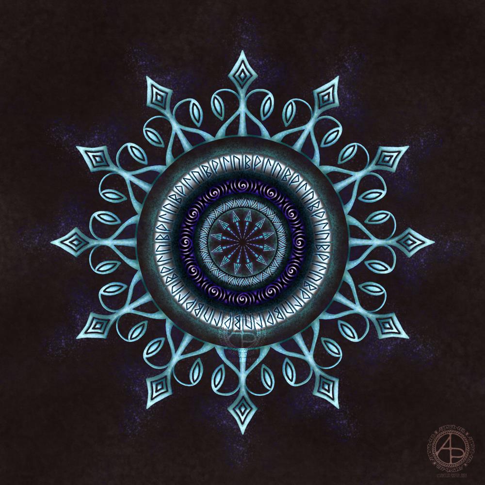
Today has been a funny day so far. I have, however, managed to get this little mandala done.
The runes represent growth (the rune looks like a B), joy (looks like a P), flow (half an arrow) and strength (a bit like an n), and you are welcome to read into that what you wish.
When I started this I had no idea at all what I was going to create. All I knew was that I wanted to end up with a mandala and try out some techniques to get things to appear to glow.
The artwork started with me creating a series of my own texture backgrounds, and this was the last one I created. I then created the ring of glowing runes, then worked inward. This is an unusual direction for me to work when creating mandalas; usually I work from the centre out. I did, however, add the final ring of the mandala last.
For some reason I needed to add arrows into the design; it was just an instinctive, intuitive kind of knowing. In the same way I knew that runes needed to be incorporated into the design. Spirals are one of my favourite design motifs and they made an appearance too.
The colour palette is quite a simple one, mostly cool tones of blue, purple, teal and greys, but with a little splash of warm pink and mauve.
I do like the illusion of dimension that I’ve achieved in this mandala by using high contrast. I’ve also enjoyed using texture brushes to help with the sense of dimension too.
This is digital art, created in Autodesk Sketchbook Pro and using a Microsoft Surface Slim Pen along with a Microsoft Surface Studio.
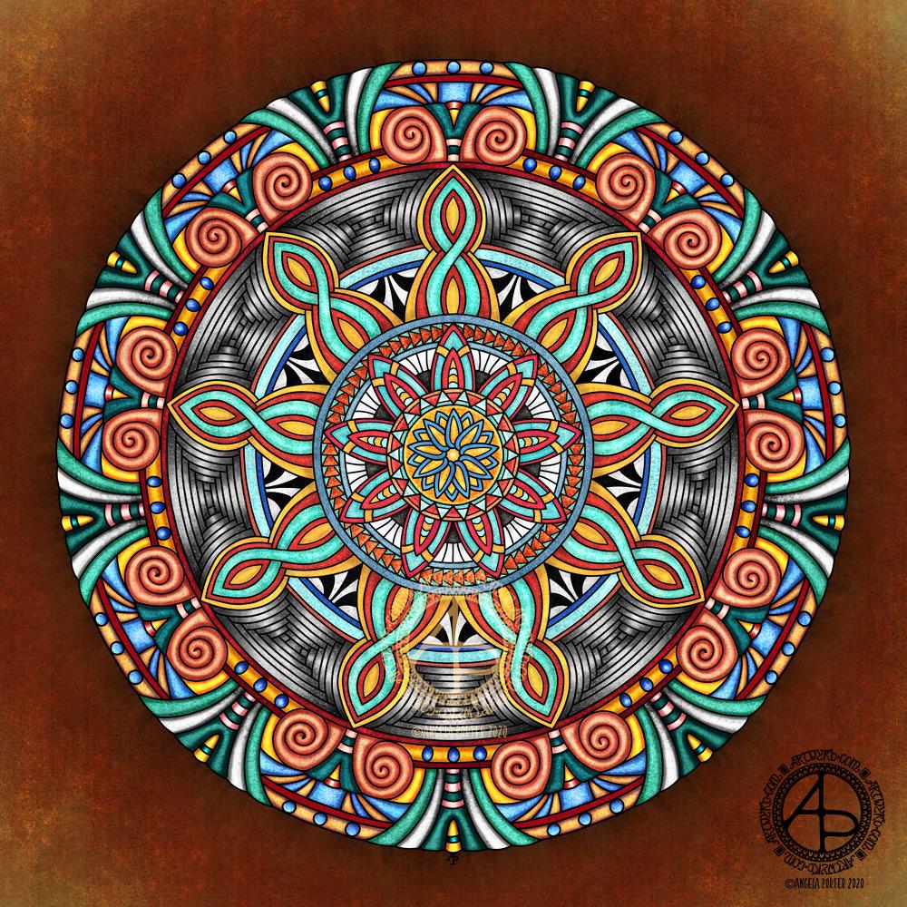
Finally! I have this mandala finished. Life events conspired over the past couple of days to keep me from paper and pen (digital or traditional) and the aftermath left me with a blinding headache and bone-deep tiredness this morning. Still, I did what I’d arranged to do today, and when I came home I had a late lunch and retired to bed to sleep the lingering effects of the extreme stress/introvert hangover off.
Before I left home this morning, I managed to get a little more of this mandala coloured. I’ve now finished it this evening.
The colours took an unexpected turn in places, as did the contrast betwixt light and shadow. The resulted in the outer rings of the mandala being more dimensional in appearance than the inner rings, less like decorative mosaic in a grand entrance hall and more organic, alive, vibrant.
I’m also glad that I’ve changed the background. The darker, richer colours really help the mandala to glow.
The colours aren’t my usual kinds of colour choice, that’s for sure. If I were to re-work this mandala, I’d most probably use a different palette. However, the colours kind of work.
Although I like the more mosaic forms of the inner rings, the dimensional nature of the outer rings really makes my arty heart smile.
I remember when I did my A level art and I produced three oil paintings, the only three oil paintings I’ve ever done and will ever do. I really disliked working with the slimy paints, despite the vibrance of the colours. These paintings were three abstracts – one from the folds in a Romanesque sculpture, another from some kind of worm screws from a steam locomotive, and the last from rusty gears from a diesel locomotive. Each was a monochrome study, focusing on highlights and shadow.
At the exhibition of students’ work (mine included), I was puzzled why people kept touching my oil paintings. I eventually asked someone why they’d done that. The answer was that they looked so three-dimensional they just wanted to touch them and were surprised that they were flat. I hadn’t seen the paintings that way myself, but when it was pointed out to me I could see the illusion I’d created.
Part of me would love to see mandalas of mine created as mosaics, to see people surprised that they’re not dimensional as they appear.
Working on this mandala today has reminded me of how much I love to create this kind of illusion. It may be stylised, not realistic, but it’s part of my artistic melody, a theme deeply embedded in my heartsong.
I created this mandala in Autodesk Sketchbook Pro running on my Microsoft Surface Studio and with a Microsoft Surface Slim Pen.
I woke a bit earlier than usual this morning, and while I was coming around I watched an Autodesk Sketchbook Pro tutorial by Trent Kaniuga – Sketchbook Pro for Absolute Beginners and came across an explanation and use of a tool I’d not worked out for myself.
This is the selection tool, and it’s a great way to select areas for adding colour, texture and/or effects to as well as copying, pasting, moving, rotating, resizing and so on. It does mean I need to use my keyboard along with my Microsoft Surface Slim Pen and Microsoft Surface Studio. That means using the screen at a different angle to my usual, which is a good thing I think as I now can’t hunch over the screen.
It was the way that when an area is selected and colour or texture is applied, the colour/texture only applies to that selected area, or areas. It masks the rest of the image from the selected areas.
This is going to be so useful for me going forward, now I’ve played with the techinique. It’s given me an elegant way to do something I’ve previously achieved by the use of layer after layer after layer.
I’ve been working with it to add colour to this mandala design from a collection of mandalas I’m working on.
The colours and textures remind me of polished stones, perhaps mosaic pieces. I’ve used fairly complementary colours, but they don’t quite play off each other as much as I’d like. I am, however, going to work with these colours going forward to complete the mandala.
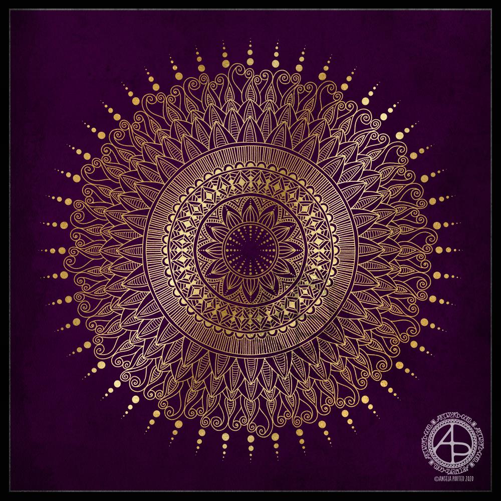
This morning, the rain has finally stopped once again, albeit for a short while no doubt. Blue skies and sunlight shine betwixt the broken clouds. Yesterday and last night the rain was relentless, including high winds at times, thanks to Storm Jorge.
I thought I’d do a golden mandala this morning, while I come around. A simple line-art drawing.
Yesterday, I was out with the DSLR and my friend Liz. We had a need to visit the sea. As we live in the Valleys of South Wales in the UK, we’re not far from either the sea or mountains, towns or country. So, we paid a visit to The Glamorgan Heritage Coast, specifically Southerndown and Newton in Porthcawl. If you’d like to read more about our day out and see some of my photos, visit Curious Stops and Tea Shops.
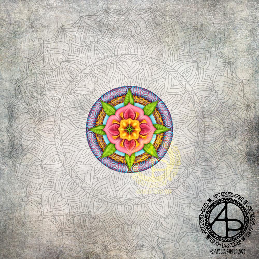
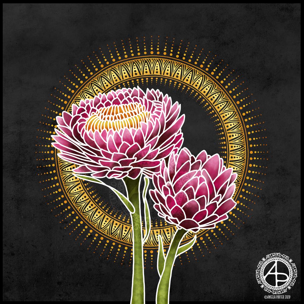
Today, after a busy week with people and errands, I need a day at home. I also needed some time to just create.
I turned to my folder of photos from my trip to the National Botanic Gardens of Wales last August and found a picture of flowers that inspired me to create this floral design.
I started with the line art with the intention of using it as a guide for painting each petal. However, once I’d completed the line art and added the base colour and some of the brighter tones, I realised I wanted to keep the white lines because it was reminding me of batik or silk painting, particularly as I’d chosen a black background to work against.
I love the vibrance of the colours against the dark background, again very reminiscent of silk painting/batik.
I reined in my usual inclination to intricate, detailed mandalas and kept this particular one quite simple. I decided to echo the golden tones of the stamens in the centre of the flower, and I think that has worked out really, really well.
If I were to try to change something in this artwork, I may try a gold outline – metallic gold. But I like it very much, just as it is.
My tools were Autodesk Sketchbook Pro, Microsoft Surface Studio and Microsoft Surface Slim Pen.
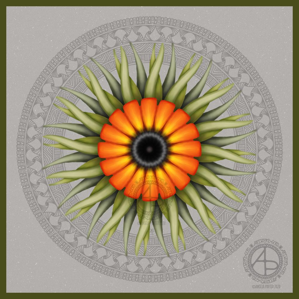
This morning, after a couple of topsy turvy days, I managed to get some art done before I get sorted for the day.
It’s always lovely to return to art after a little break from it. Today, I used a photograph I took last August while visiting the National Botanic Gardens of Wales. Gorgeously coloured flowers were blooming in the great glasshouse, and this stylised flower is based on some of them, including the colour palette.
A bright, sunshiny, warmly glowing flower is just what I needed to paint this morning. I think I’ve chosen a background colour/texture that allows those colours to shine too.
Digital art created with Autodesk Sketchbook Pro, Microsoft Surface Studio and Microsoft Surface Slim Pen.
Leaving therapy…
Monday was a crazy kind of day. In the morning I got sidetracked by a friend, all while I was trying to pack gifts up for my therapist before I headed to my last appointment, for the foreseeable future anyway.
That’s right. I’ve finished with EMDR therapy, for now. I feel I’m good enough learn to fly through life without the support net of my therapist. My wings haven’t spread much, and though weak, they’re strong enough for me to take my first bumbling, solo flights in life (solo as in not with therapy). I’m going to crash onto the ground, bump into trees and obstacles, even get tangled up from time to time in branches and brambles. I do feel, however, that I can cope with the bumps of my flight through my post-therapy life.
Getting tangled up may result in me needing help to untangle myself as something happens in life that triggers a part of the cPTSD that is still hidden and causes it to rise up to the conscious mind where it can be dealt with. This may mean a return to EMDR to deal with that particular set of traumas.
It was both a little sad and a fairly exciting and happy time too. My therapist and friends are proud of me for the work I’ve put in, as well as the perseverance and courage I’ve shown in facing some of the traumas that have resulted in the cPTSD.
New Camera!
I’ve had a need floating around my head for a little while – to buy a DSLR camera. I’ve looked at them, read about them, tried to decode the technical blurb, and finally found myself drawn to one particular model time and time again.
Rather than purchase it online, I steeled myself yesterday to take a trip into Cardiff to visit Cameraland. I’d looked at various shops where you can buy cameras, but this one really ‘felt’ right. And I have to say, it was the right choice.
So, after breakfast, I headed off to Cardiff, parked up, and walked from the Museum to Cameraland through the town. For many years I’ve not been able to go into Cardiff. Loud voices, noises and the high number of people ramp anxiety in me up to a level of startle and hyper-vigilance. So, I used noise-cancelling earphones and upbeat music to help me cope.
And I did! This wouldn’t be possible to do if I was with someone or people, but on my own it’s completely do-able.
Anyways, the chap I talked to in Cameraland was very helpful, knowledgeable. I explained what I’d like a camera for, my experience with SLRs in the past, and the model I’d had my eyes on. He did say there were other options, but none as good as the one I’d chosen.
He showed me around the camera, let me hold it, use it, and then when I’d decided it was the one for me helped me with a uv lens filter, memory card and a camera bag that is spacious enough for me to use as a handbag too.
This camera is a celebration gift to myself for completing therapy, to mark a kind of rite of passage for me. It’s also a way for me to encourage myself to explore the world a bit more. I’ve invested a fair bit of money in the camera and I really don’t want to see it sitting in the bag, being unused.
I still can’t just go out because I’d like to go out. I still need a reason to leave my home. Going out to use my camera is a good reason in my mind.
It also means that when I’m with Liz, or others, on days out, I can record things that catch my attention that I’d usually sit and draw. Yes, I can use the camera on my phone, which is a good phone camera. However, the images aren’t as clear or colour-faithful as I’d like.
So, I may be sharing particularly nice photos I’ve taken too, of all kinds of things that I find interesting, fascinating.