Draw With Me | Two More Organic Motifs

Please click on the “Watch on YouTube” button to view on YouTube itself (and help the algorithm!).

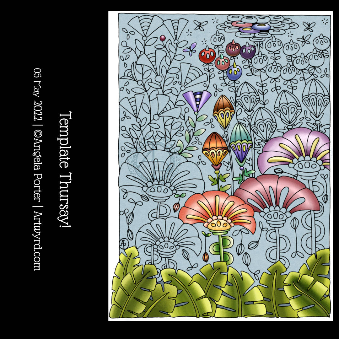
I’ve now finished this drawing by adding two organic motifs, both fairly simple.

With the trailing flowers or leaves or stones, the hardest part is arranging them to look like they’re trailing and remembering to decrease the size towards the point.

The other motif, a stack of small seeds on a stem, is easy enough to draw.

After doing this, I thought it needed some colour to bring the motifs to life. So, I dug out some of the Neocolour IIs I’d used for the background and used them a bit like watercolour paints. I scribbled a little of each Neocolor II on my plastic palette, added water, and painted.

I’m not entirely sure about my efforts with adding colour – this is where it can all go wrong for me. Part of me knows I’d most likely be better off if I were to add shadow and texture using pens.

I did use some metallic watercolours to add some sparkle here and there too.

One thing I did notice is that I was glad I tried not to paint over the black lines. The pigment ink in Micron pens is usually waterproof, but, as the Necolor IIs are wax-based and coat the surface of the paper, the pigment doesn’t sink fully into the paper and so water will move the ink.

It’s not a problem, now I’m aware of this. Oh, it also means erasers will lift some of the ink as well as pencil lines. Again, just something to be aware of.

One other thing I did was to cut the paper down to frame the design a bit better. In my clumsy way, I managed to cut it just across the tip of one of the trailing thingies. So, no border around that area.

I will keep going with adding colour and see where it leads me, hopefully not into a disaster! Still, if that happens, it’s only a bit of time, ink, paper and colour and the design can be used as inspiration for the next one. Important lessons about the Necolor IIs are being learned, which is, perhaps, the most important thing.

Template Thursyay! | 12 May 2022

It’s that time in the week again – Template Thursyay! Each week during the pandemic I’ve created a colouring page for the members of the Angela Porter’s Coloring books fans Facebook group. The template is only available to members, and it’s free to join the group and free to print the template for personal use.

It’s been almost two months since I last drew a mandala! So it’s understandable I felt the urge to create one today.

I used some of the motifs from my video in yesterday’s post. It’s always an enjoyable process using my favourite, organic motifs.

Using a limited, spring-time-ish colour palette also helped me get a coherent finish with the colours, almost. I’m really not at all sure about the purple pods!

Of course, the number of colour schemes that could be used is endless and down to personal preferences or desires at any time.

I can’t just leave a mandala on the page, there has to be a background of patterns too! The result looks like a huge dish floating above a window into some kind of sea habitat. I think that’s fun, even though I’ve only just realised that!

Draw With Me … Five of my favourite organic motifs

Please click on the ‘Watch on YouTube’ option. Cheers!

In today’s tutorial video, I enjoyed drawing on one of my Neocolor II backgrounds. And I’ve just remembered I forgot to scan the background before cutting and drawing on it. Oh well. I’ll just have to make another one!

Anyhoo, I sometimes forget how much I enjoy working on a coloured background. The colours add an instant “feel” to a drawing. This one reminds me of sunrises and sunsets and the joy and awe that I experience when I see them. So, it was natural I’d choose a few of my favourite motifs to start filling this A5-ish sheet with pen drawings.

Of course, it’s lovely to share how to draw these motifs with others, helping them along their arty journey.

“Embrace Beautiful Chaos”, a work in progress

I had the hand-lettered part of this sketchbook page completed a couple of days ago. I didn’t really know what else to do with it. I knew adding colour with traditional media was likely to be a disaster.

This morning I woke up knowing what to do with this, along with other things. So, I spent some time adding a border around the lettering and starting to add patterns and motifs. And arches, lots of arches!

I then thought it would be nice to share some of the drawing process through a video, which you can see by clicking this link.

It feels like a long while since I did any entangled style art. The hand-lettering isn’t perfect, nor is the frame around it. But that’s OK. I think it goes with the ‘chaos’, the imperfection, the touch of an imperfect human hand.

A couple of months ago, I may have tried to do something like this, and would likely have been really dissatisfied with the result. Mainly because I wasn’t at all happy with my hand-lettering attempt. But now, after just a couple of months of working in lettering sketchbooks, working with different ways to form letters and finally accepting that whatever lettering I do doesn’t have to be perfect – good enough is good enough!

I’m using variations in the density of pattern and ink to create shadows and highlights in the design. I have no intention of using pencil or markers to add grey shadows to this one. If I decide to add colour, it will be in the style of a linocut or hand-coloured print, perhaps with some extra shadow and highlight added by the depth of colour. Perhaps. Maybe. And if I do, digital is the way I’ll go! First, though, I have to finish drawing this design.

Whimsical houses, and other stuff…

In today’s video, I draw these three cute, happy, whimsical houses, and I always feel I mess them up when I add colour.

The first part of the video is a chat about organising artwork, using a dot grid notebook as a visual reference/collection of my favourite patterns and motifs and variations. I also talk about some requests/suggestions made.

But the very, very first part is a huge thank you to all my subscribers on YouTube for clicking that Subscribe button (which is totally free to do!). I hit 750 subscribers a couple of days ago and I’m amazed, surprised and a tad humbled by this. So, if you’re one of those subscribers, thank you so much!

Template Thursyay! 05 May 2022

Thursdays are fun days! I release a new colouring template for the members of the Angela Porter’s Coloring Book Fans Facebook group, which is free to join.

This week, I chose a rather stylised, whimsical kind of floral theme. Big, bold motifs, with some smaller details and elements.

If you’re into adding tangle patterns to designs, this one will lend itself well, even though it’s geared towards being coloured.

In adding colour, I’ve taken the opportunity to try out various colour combinations, as well as get some shading practice in.

I drew the design with an 05 Uniball Unipin pen on acid-free cartridge paper. Colour was added digitally using Clip Studio Paint.

On Template Thursday, I don’t release a video on YouTube. But there’ll be a new video tomorrow for sure!

Draw With Me | How to draw a stylised, whimsical shell using a reference – No 2

Link to the accompany video tutorial

In today’s YouTube video, I show and try to explain verbally, how to draw a different kind of shell, one step at a time.

This shell is, perhaps, a bit more challenging than yesterday’s. However, when broken down it’s not much more difficult.

Again, I add shadow to the drawings using a graphite pencil and a paper stump/tortillon or, in the case of part of the second shell, pen lines and density of pattern.

I also added some colour to the second shell, using a damp brush and lime green and turquoise Karin Brushmarker Pro pens. The graphite shading shows through the transparent watercolour inks from the pens.. I think this combination makes the image look quite metallic. Not surprising as graphite, as an element, is rather grey and shiny and metallic looking! Actually, it’s just the cool grey tones of the graphite that makes this so!

It’s really a lot easier to show than to explain in words, spoken or written. This is why I’m creating videos. It also makes that part of me that is a retired science teacher happy to use my teaching skills and feed my passion for helping others learn and grow.

Draw With Me – How to draw stylised shells from a reference image

In today’s YouTube video tutorial, I do my best to describe and show how I draw a stylised seashell or two from reference photos.

I had a request from one of my subscribers to do this. I find it hard to put into words how I do this, I don’t have conscious thoughts/words about it – I just do it. So, this forced me to slow my mind down and put into words what goes on. And I do hope those words make some sense.

The end results are good enough for my sketchbook, and the spiral shell is perhaps my favourite of all time that I’ve drawn, including realistic, diagrammatic, whimsical and stylised.

I’m particularly fond of stylised drawings. The spaces within them are perfect for adding pattern and texture. All my favourite things combined! Shading, highlight and/or colour can be the icing on the cake or shell.

This was a nice diversion from the lettering projects I have on the go. It was also something quiet, relaxing and soothing and perfect for me. Today, I’m exhausted after a stressful yesterday. It was a good kind of stress, but still stress/anxiety. I knew I’d be doing something yesterday a week ago, and so the stress built up gradually over the week. I’ll gradually recover, but today is a quiet, down-day with plenty of self-care, but not any naps as I’ll need to sleep properly tonight.

Draw With Me… Even More Whimsical, Imaginative, Stylised Sea Plants

This sketchbook page is now complete! I had so much fun doing this one for sure. There’s a whole host of plants to populate any number of whimsical worlds. There’s a third video tutorial showing how to draw, step by step, the last row as simple line art as well as the start of adding colour and pattern.

Some of the motifs look a bit ‘flatter’ than I like them to, and a couple I’m not quite happy with in terms of pattern/texture. But still, it’s a page full of inspiration and possibility, something I can look back on for inspiration.

Draw With Me | Starfish, Sea Urchins and Mussel Shells

Click on this link to view the tutorial video that goes with this sketchbook page.

Carrying on with the sea-life theme, I filled a sketchbook page with simple drawings of stylised, whimsical starfish, sea urchins and mussel shells. I recorded my process as a tutorial video, showing and explaining my step by step process of drawing. I start with simple shapes and gradually add more and more complexity.

There is something very intriguing and curiosity-provoking about exploring variations based on the same simple shapes and steps. The possibilities are endless and it certainly gives creativity a bit of a workout!

These kinds of exercises are what sketchbooks are perfect for. A sketchbook is a safe place to experiment and explore, and the end result is a valuable resource of ideas as well as a visual record of your development of artistic skills. They’re a place to practice fine motor skills, hand-eye coordination, and for trying out new media or techniques.

Sketchbooks chart the development of our skills, our pattern and motif preferences, and show how we develop and evolve our artistic style.

This revelation about sketchbooks is exciting to me. I don’t know why it’s taken me so long to work this out. I think the Inktober Tangle Pattern Challenge back in 2021, the Fragments of Your Imagination Challenge earlier this year (both challenges hosted by the 7F5R Challenge Facebook group) as well as the Lettering Sketchbook course on Domestika have definitely been significant activities that have helped me reach this realisation.

The other major realisation I’m having at this time is that I think I’ve finally found what kind of YouTube content I like to make!

I was a science teacher for 28 years. Teaching is part of who I am. My focus as a teacher was always to inspire and encourage my students, to help them to believe they could do science, and to have better self-esteem and self-confidence. I loved to see them grow and develop and gain skills and knowledge they never thought they could, and that was a wonderful thing to be a part of.

If I can do the same thing for others, who have no confidence in drawing. If I can use my love of whimsical and stylised art/motifs, the function of a sketchbook to encourage others to take up pen and paper and draw, then that is a good thing!

I also think it’s important that I show my process, warts and all. Variations that are lovely, and others that are not so. It’s all part of the process of developing as an artist. I think my work with traditional coloured media is a testament to my ability to make a total mess of a fairly nice drawing! I am better with digital colours, but not much!

It all takes time to work these things out, and I can be really dense and stubborn at times! But I do get there … eventually. ‘There’ being a point of understanding myself and accepting something or a sudden revelation, you know the kinds of things. But ‘there’ isn’t the final destination. The journey of exploration and development never ends, and a sketchbook is now, for me, a vital companion going forward.