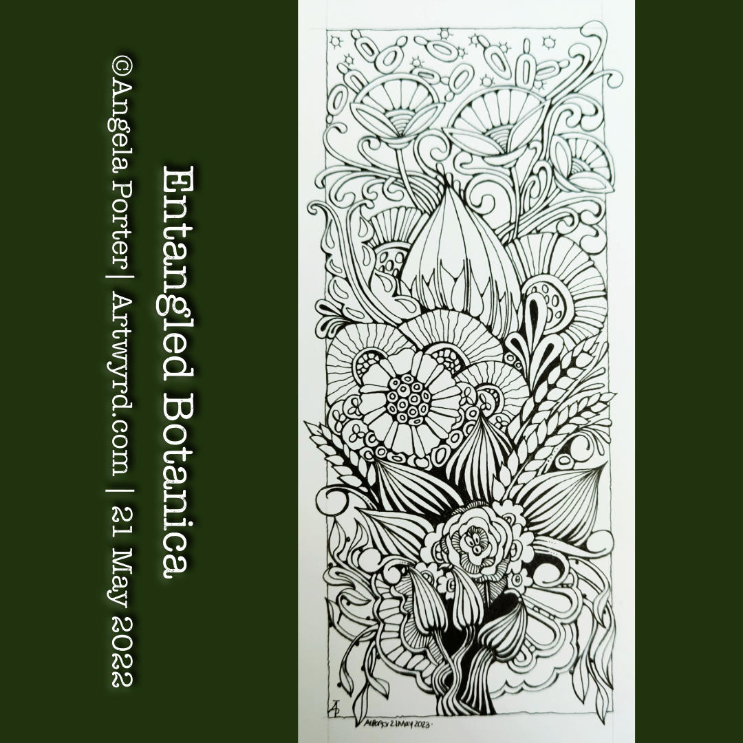
The need came over me to draw something botanical in nature. So, I picked up an 01 Sakura Micron Pigma pen and a piece of Canson Imagine mixed media paper approx 10cm x 21cm (4″ x 8.25″). I let the ink flow from the pen to form all the various stylised, imaginative botanical motifs.
It has been a lovely few hours drawing this small (in size) and intricate design. I now need to decide how to add shade and colour to it. But there is no rush on this. I’m accumulating a sizeable number of drawings that all need to be coloured either traditionally or digitally. This drawing I really do want to scan in before I start to attack it with traditional media, just in case I seriously mess up.
My favourite medium to use on the Canson Imagine paper is Inktense by Derwent. I love the vibrancy of the colours when they are activated with water. Tomorrow, I should have the new colours in the range delivered. So, I will definitely hold off adding colour until I’ve familiarised myself with them.
For now, it’s on to the next piece of small art, probably with a botanical theme, though who knows what kinds of patterns will fill the space too!
A new month today, and with it I’m adding colour to this drawing.
The drawing was done with pen on paper (05 Unipin fineliner). I’m adding colour with Clip Studio Paint. So, this makes this #tradigital – a combination of traditional and digital methods.
It’s taken me several attempts to settle on a colour palette to use. The brighter, more vibrant colours represent the way the world is starting to come alive this spring, for us in the Northern Hemisphere at least. Nature is quickening and lacy leafy green delicately cloaks the the skeletal winter trees and the ground. All the wonderful shades of green of spring make a beautiful tapestry , with texture added by the darker trunks and branches still peeping through. I delight in the variety of greens, that will soon darken to the truly monochrome green of summer.
I love seed pods! They are often so architectural in nature. They lend themselves to whimsy and stylised drawings so well too.
I love giving them sturdy stems with tops that look like column capitals. The leaves on these are inspired by medieval illuminated manuscripts, something else I absolutely love!
For the panel behind them, I decided to keep the pattern fairly simple – Tripoli, a Zentangle tangle pattern.
Strictly speaking, Lammas, or Lughsanadh, was yesterday, but I was busy getting all the work for ‘Fanciful Birds’ finished. I know I have a break before my next colouring book contract, and my attention will be on a couple of projects I’ve already started.
Back to Lammas. Lammas comes from the Old English hlafmæsse, which translates as ‘loaf mass’. It was a mass where the first loaves baked from the first wheat harvest were consecrated in thanks for the harvest. This celebration probably reaches far back in time to the first farmers. Having a good harvest was important so that people, and livestock too, had enough to eat through the dark, cold, lean times of winter.
So, I included some ears of wheat in today’s drawing, along with a happy sunflower, which just goes with the start of August and the height of summer.
This drawing isn’t quite finished. Shadow is needed, and colour. I’m likely to do that digitally. I also may use this drawing as the basis for a mandala design as well. But not now. I need another big mug of tea before I tackle that!
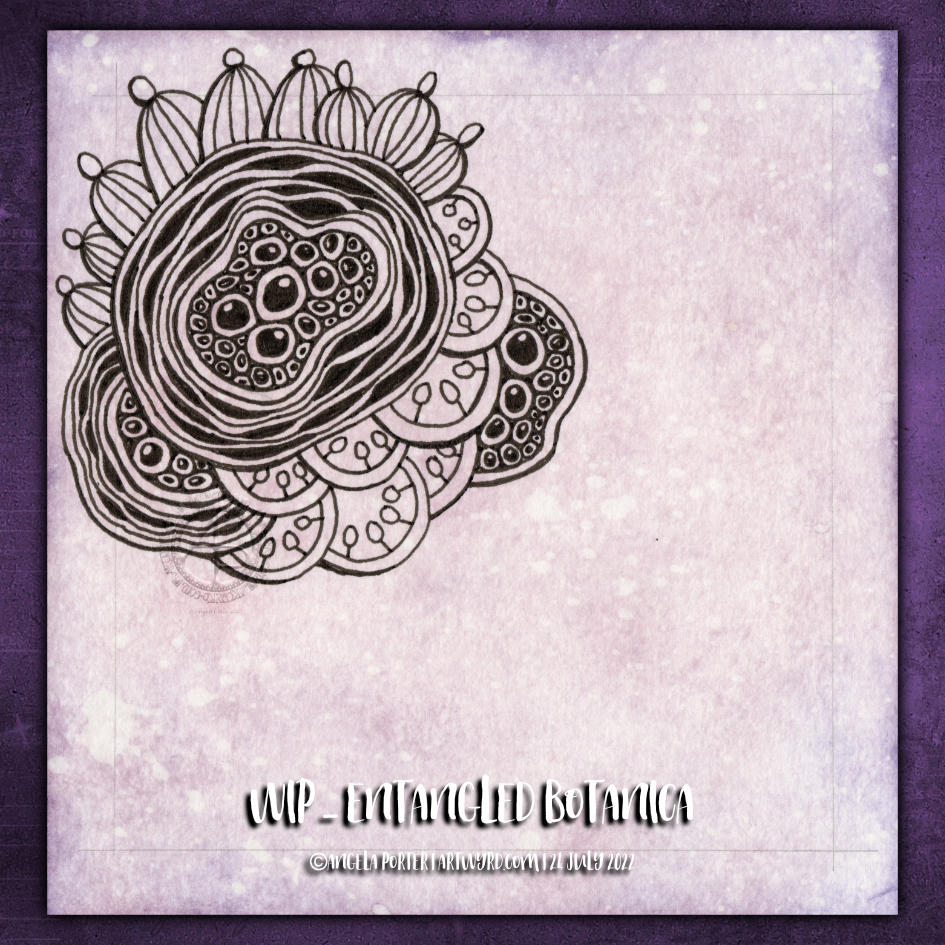
Botanica. Botanicals. Abstract, stylised and imaginary seed pods. Pen drawing. Entangled, intricate, with a touch of the Zentangle tangle pattern Diva Dance.
All some of my favourite things to draw. No idea how it’s going to turn out, just letting it flow as it needs to. One of my favourite ways to create!
And there’s a video showing how I drew this design, as far as it’s got, over on YouTube, if you want to draw along with me!
In today’s YouTube video, I started to draw the design on the right. While the video was uploading, I finished drawing it. Also, I drew some motifs on a separate piece of paper so I could practice using alcohol markers (Arteza EverBlend).
Colour combinations do vex me, continually. And they certainly do on this practice sheet! But it’s best I practice somewhere before adding colour to my completed drawing. But first I’ll scan that drawing in so if all else fails I can add colour digitally!
Either way, it’s been lovely to spend time drawing and adding colour just for the joy of it. It is far too warm to do anything else.
Please click on the ‘Watch on Youtube’ button. Cheers!
Step 1 – Create a Gesso and Neocolor II background
Yesterday, I had a delivery of Finnabair Art Basics Clear and Heavy White Gessos, made by Prima Marketing. Neocolor II backgrounds are a lot of fun to make, but they do leave a smooth, waxy finish to the paper. I like drawing on it, but my pens aren’t too keen.
So, I wanted a way to seal the Necolor IIs into the paper and a surface I could draw on. Yesterday, I tried some glassy gel medium from my stash. It worked well, and the colours appeared more vibrant. It was OK to draw on, but the pen took a long while to dry, and I’m not sure how permanent the Micron ink would be on it.
Synchronicity-like, some suggested videos cropped up on YouTube where gesso had been used to prepare the paper and then seal in the Neocolor IIs, even using the gesso instead of water.
I have used gesso in the past, but it always felt very rough and gritty. However, the Finnabair Art Basics gessos had reviews that suggested they are smooth and chalky in feel. So, I had to try them.
I’m glad to say that they are smooth and chalky! I did spend a little time last night testing them out and gessoing some “polaroid pops” image tiles.
In today’s video, though, I wanted to quickly show what gesso is and how I’m thinking of using it, particularly in my sketchbooks with paper that won’t take much water.
I covered a page in my Hahnemuhle D&S sketchbook. The paper in this book is for drawing and sketching and is not designed for water-based media. I can get away with a barely damp brush on the paper, but only one, maybe two layers are possible before the paper starts breaking down. Gesso solves this by sealing the paper’s surface and creating a thin, flexible layer that can be worked upon. I used the heavy white gesso to do this.
Gesso dries really quickly, but a craft heat tool (or hairdryer) can help to speed the process up.
The next step was to add colour with the Neocolor IIs. I used water to activate them, though I could’ve used gesso. I wanted to create an uneven, weathered or worn kind of background. I started with the browns, sealed them with clear gesso. After this had dried, I added the blues and finally another layer of clear gesso.
Then, I was ready to try drawing on this.
2. Drawing on the gesso surface
I really didn’t know what would happen. I know I’ve used gesso in the distant past, but couldn’t remember if I’d used pens to draw on it or not.
As it happens, it was really lovely to draw on! The Sakura Pigma Sensei 04 pen did feel like it caught on the tooth of the gesso from time to time, but nothing more than a rough-surfaced paper. It may be my imagination, but the ink seemed darker on the gesso, perhaps because it dries on the surface and doesn’t sink into it, like it would with paper.
I did a test to see if, once dry, the ink would be affected by water or gesso. There was a tiny amount of pigment that seemed to move, but nothing noticeable.
3. The arch motifs/fragments
I really love round arches! It stems from my love of Romanesque architecture. I use them a lot in my artwork. So, I thought it was about time I explored individual arches as if they were fragments of a tangle pattern.
4. Reflections
I’m so glad I rediscovered gesso. I’d forgotten how it could be used. I know the rough grittiness of the gessos I’d used in the past really did put me off using them again. However, this lovely, chalky smooth gesso is really nice to draw on. It also opens up more ways to create backgrounds and use colour. I’m sure I’ll continue to experiment and explore it going forward.
I had the hand-lettered part of this sketchbook page completed a couple of days ago. I didn’t really know what else to do with it. I knew adding colour with traditional media was likely to be a disaster.
This morning I woke up knowing what to do with this, along with other things. So, I spent some time adding a border around the lettering and starting to add patterns and motifs. And arches, lots of arches!
I then thought it would be nice to share some of the drawing process through a video, which you can see by clicking this link.
It feels like a long while since I did any entangled style art. The hand-lettering isn’t perfect, nor is the frame around it. But that’s OK. I think it goes with the ‘chaos’, the imperfection, the touch of an imperfect human hand.
A couple of months ago, I may have tried to do something like this, and would likely have been really dissatisfied with the result. Mainly because I wasn’t at all happy with my hand-lettering attempt. But now, after just a couple of months of working in lettering sketchbooks, working with different ways to form letters and finally accepting that whatever lettering I do doesn’t have to be perfect – good enough is good enough!
I’m using variations in the density of pattern and ink to create shadows and highlights in the design. I have no intention of using pencil or markers to add grey shadows to this one. If I decide to add colour, it will be in the style of a linocut or hand-coloured print, perhaps with some extra shadow and highlight added by the depth of colour. Perhaps. Maybe. And if I do, digital is the way I’ll go! First, though, I have to finish drawing this design.
Today is one of them days when I really needed some flowers in my life. So, I decided to create a bunch of them in my sketchbook!
I started with the one in the top left and just worked on variations as I went. I’m absolutely positive that I’ve not created all the possible variations, but these will do for now. Any number of them are starting points for more variations at another time.
There is a simple contentment in drawing simply. Focusing on the essential lines. Adding stylised and simple details, one by one. Using colour to add shadow and volume brings the line art to life.