Monogram K

©Angela Porter 2018

This is what I end up doing when I’ve fallen asleep earlier in the evening and end up being alert far later than I’d like to! All thanks to that one small glass of port after my lunch. I very, very rarely drink alcohol, so it always floors me either in terms of needing to sleep or in terms of my mood. At least this time it was the nap, so I’ve still got my calm, content mood intact at the end of this day – the first time I’ve felt this way on a Christmas Day for many, many, many years. In fact, I don’t think I’ve ever felt this way. Therapy is working! Yay!

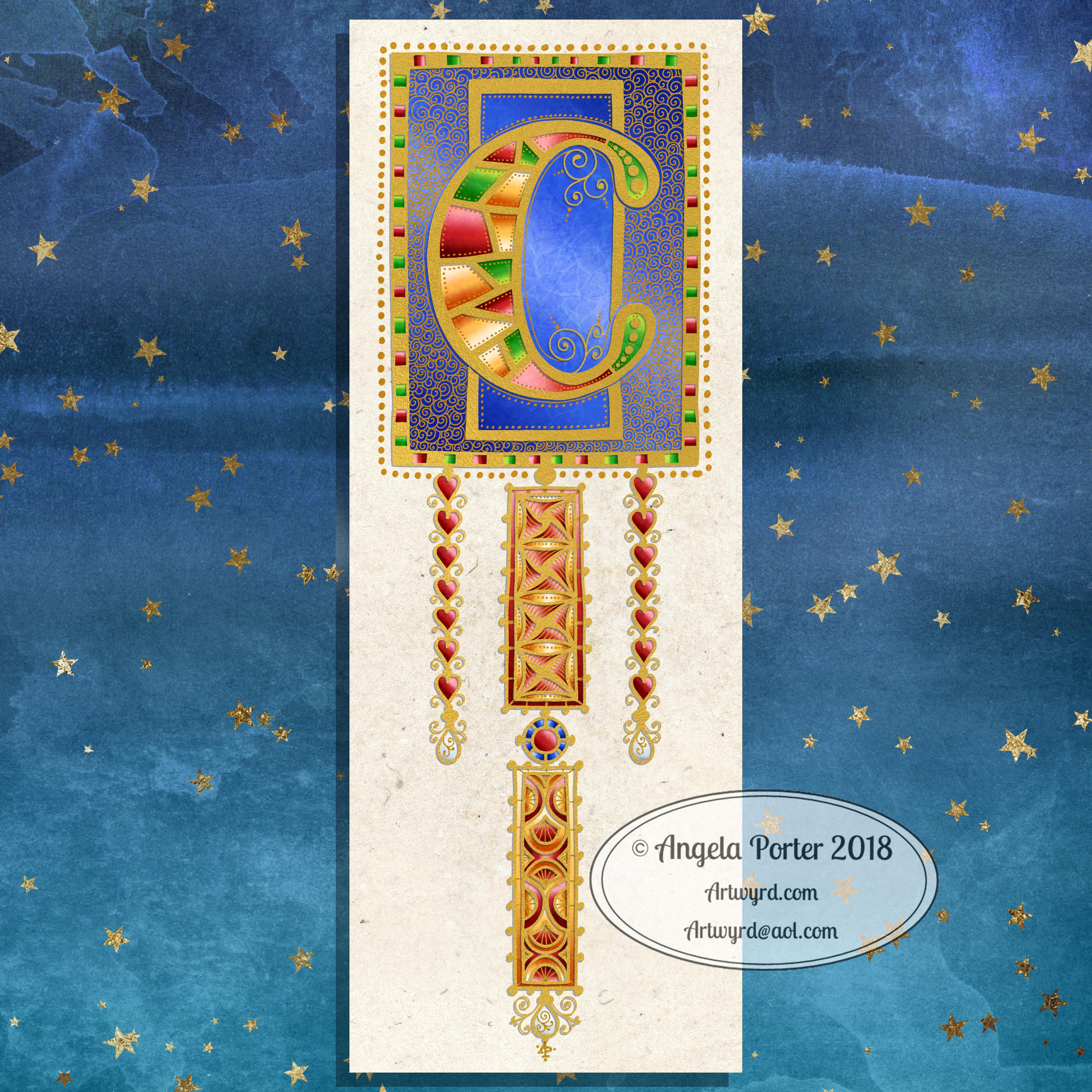
Anyways, after I woke, had a huge mug of tea, I picked up a dot grid pad and a 0.4 Sakura Pigma Sensei pen and started to draw variations on the theme of letter ‘k’ as I listened/watched the second part of the Fellowship of the Ring.

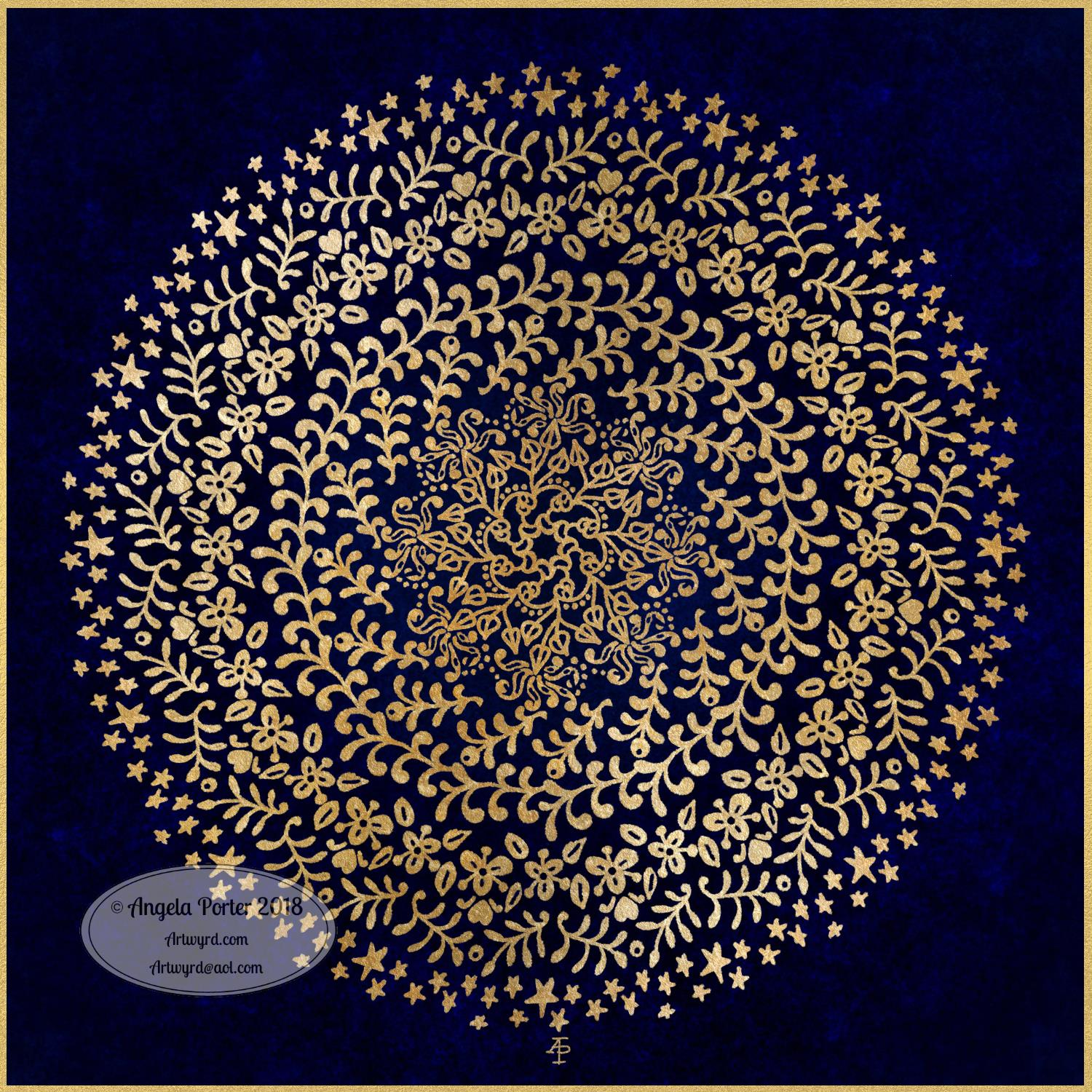
I then remembered that I wanted to try something digitally like I did yesterday, so this is the result. I’ve been working on it for over 2 hours (it’s now around 1:30am, so if some words don’t make sense it’s because I’m just about ready for my bed).

I started by sketching out the shape of the letter in Autodesk Sketchbook Pro, using a Microsoft Surface Pen on the screen of my Microsoft Surface Studio.

The next step was to finalise the shape and redraw it and colour it in. After this, I added the black lines round the K, then the curvy lines on the outside edges. The final step was to add the patterns and colour in small sections of the outside embellishments. Oh, and I created a thin drop shadow and plonked the monogram on top of a paper texture background.

What I want to do tomorrow is to add a dangle to the design. I started trying to do that this night, but my concentration is now going. I also want to try to add some shading to the patterns within the K too. I think they could do with a bit more illusion of dimension.

Oh, the knitted stegosaurus is now complete. I may photo and show. Not sure if I’ll be doing any more knitted dinosaurs. I much prefer amigurumi! I have started an amigurumi monster, but I need to remember to limit my time spent crocheting as it does make my finger joints ache in a way knitting and drawing don’t.

Merry and Bright

©Angela Porter 2018

A Christmas Greeting

Wishing everyone who visits this little space on the interwebs all the very best blessings and wishes of the season.

I also wish to thank you for visiting, for sharing my posts.

However you spend this day, whether with friends, family, at work, or by yourself, I wish you well and the best.

About this image

I woke early-ish this morning and had an idea that involved creating this mandala/wreath design, so I had to do it!

Unusually, I drew the motifs in colour! Yup. No black line, just colour.

They’re all very simple with simple colour gradations. The black lines were created by removing colour so the dark background would show through.

I think the outer ring of leaves could be a little lighter, but then it does give a sense of the outer ring bending away, with the hearts and mistletoe on the high point of the ‘wreath’.

Adding texture to the design helped to scuff up the perfection of the colours.

I really enjoyed doing this, as simple as it is.

I am really grateful that I used an insulated mug for my gingerbread mocha latte this morning – I forgot all about it for over 3 hours, so engrossed in my art as I was, and it’s now just the perfect temperature for drinking!

My tools were Microsoft Surface Pen, Microsoft Surface Studio and Autodesk Sketchbook Pro. Yes, this is a digital piece of art.

The rest of the day I intend to spend in arty/creative pursuits, including finishing off my knitted cuddly triceratops (yes, I know yesterday I incorrectly said it was a stegosaurus).

Holly Mandala – Version 2

© Angela Porter 2018

I woke early this morning, it was still dark. The night has now lifted to reveal a dull, grey, misty, damp morning here in the Valleys of South Wales.

I wanted to re-colour the holly mandala in a more traditional colour scheme of red, green and gold, and so I have done so.

The colours help to give an illusion of dimension to the concentric rings in the design. Of course, the colours are kind of my signature – bright and jewel-like. I chose to change the background colour from stark black to a very dark, inky night-sky blue. I did add some lighter texture to the background to break the colours up just a tad.

It’s worked out ok. I think I prefer it muchly to the green foil version. The foil images are fun to do, that’s for sure. And of course they’ve allowed me to work out another way of creating art digitally, which is essentially by removing black to reveal the design. This has resulted in me drawing my motifs in a slightly different way to how I’d usually do them. They definitely have more of that lino-cut feel to them with the simplification of designs and lines. I like that.

I also like how the holly berries in the outer ring seem to be floating above and below the leaves. That wasn’t intentional! It’s just how it’s all worked out.

Sprinkling stars everywhere is one of my favourite things to do it seems and they do add a little magic to this design for sure.

Which version do you prefer? This one or yesterday’s green foiled version?

Tools used – Microsoft Surface Pen and Surface Studio. Autodesk Sketchbook Pro.

Holly Mandala

© Angela Porter 2018

Holly is the major motif in this mandala, along with stars and geometric patterns.

Again, it’s a mandala I’m pleased with. The green metallic designworks quite nicely with the stark black background. I like the simplicity of the motifs too; they remind me of lino cuts just a little.

This one was, too, created with a Microsoft Surface Pen and Surface Studio along with Autodesk Sketchbook Pro.

Winter Solstice 2018

©Angela Porter 2018

Winter begins! It’s the end of one astronomical cycle and the start of a new one. Winter Solstice is one of my favourite days of the year, along with All Hallow’s Eve. There’s always a feeling of excitement on this day that’s associated with ending and beginnings. Time to lay to rest that which is completed to make way for the new that replaces them as the Sun symbolically ‘dies’ on this day and will begin to ‘grow’ again in the days that follow until the Summer Solstice. It’s also a time to be grateful too.

I know there are many endings and beginnings; every moment in our lives is both an ending and a beginning. However, I feel that days like this, where we can focus on this never ending process in a bigger, more symbolic, more formal way, is important. Traditions are important as they bring a semblance of order to our rather chaotic lives.

I spent some time yesterday drawing this mandala to go with today. The dull gold represents the weakness of the Sun, relatively speaking. I’ve included mistletoe, holly and ivy as they’re traditionally associated with this day. I’ve also added berries as symbolic of the fruits of gratitude I carry for all the days since the last Winter Solstice. And, of course, there are plenty of sun-ray-like motifs and patterns. And stars. Plenty of stars, which from a distance look like snow drifting down.

Yes, I can say I’m rather pleased with this mandala. That’s not something I say often as I’m highly critical of myself and my work. But this one I really do like. I like the more graphic nature of the motifs. I like my hand lettering. I like the rhythm and flow of the design with the rings of designs radiating out.

So, I wish you all the very best that comes with the Winter Solstice, for today and all the days ahead of you and yours.

This was created using a Microsoft Surface Pen and Surface Studio along with Autodesk Sketchbook Pro and a gold texture purchased via Creative Market.

Winter Mandala

©Angela Porter 2018

A mandala today. Cool, wintry colours over a white-pearl background for the mandala. Just something relatively simple for me to create, but quite complex looking in it’s final form.

I did draw this digitally using my Microsoft Surface Pen and Surface Studio along with Autodesk Sketchbook Pro. I also used a pearl white texture and starry backgroun I purchased via Creative Market.

I have also created a winter solstice dangle design for later in the week (Friday), as I know tomorrow I’ve got a bit of a busy day.

Today, though, is a quiet day for me. I’m not feeling too well. Nothing specific, but my appetite isn’t there, I’m a bit sniffly and I just feel more than a little ‘meh’. Mind you, I do feel a little better than I did yesterday.

Now, it’s time for me to go cuddle up and complete some more amigurumi tiny toys which will go to add to stockings for children spending Christmas in a women’s refuge local to me.

Medieval Monogram Dangle Design ‘C’ – 18 December 2018

©Angela Porter 2019

I’ve spent around two and a half hours on this monogram. I’m still playing with metallic/glitter textures rather than black line work.

I still haven’t ‘cracked’ how to achieve a more dimensional look to the gold lines/beads. No doubt I’ll have a bright idea to try sometime soon.

Medieval, Anglo-Saxon, Celtic and Romanesque art and architecture has long been an inspiration for me, though it’s not often I express it in such an obvious way. This definitely has a medieval ‘feel’ about it, but there’s also a more modern take with the rectangular dangle charms and the very  contrasting gradient colours that fill the patchwork pattern inside of the letter.

I was thinking of adding more complex patterns inside some of these patchwork sections. However, I decided that could be way too busy and went with the dots.

Dots are  a very common embellishment in Anglo-Saxon and Celtic manuscripts. After adding dots to those patchwork panels, I had to go and add them elsewhere. Such a simple thing, the humble dot, but how much it can add to a design.

I love the plain blue panel behind the C, so the letter doesn’t get entirely lost in the background pattern – my favourite little spirals. I like the thicker lines around the letter too, but they’re too ‘flat’ for my liking at the moment. The little square-ish gems in the main outline help to break that thick gold line up, adding a bit more opulence in the process.

I love the dimension in those rectangular panels, particularly the lower one. The high contrast gradations in colour really give it some dimension. I wasn’t at all sure about using the pale yellow to orange color gradations anywhere in the design, but once I’d completed this particular ‘charm’ I absolutely loved it!

Although I don’t show such complex monogram dangle designs in my book ‘A Dangle A Day‘, this design really isn’t all the complex to do. 

Talking of ‘A Dangle A Day’, Lydia at #quartocreates sent me a link to a nice review of the book by Funky Frugal Mommy.

This is a piece of digital art using my Microsoft Surface Pen and Surface Studio along with Autodesk Sketchbook Pro and some texture files purchased via Creative Market.  I did start with a pencil sketch of the monogram and dangle design which was then redrawn digitally.

Copper Mandala

©Angela Porter 2018

Another mandala resulting from my playing around with metallic textures and drawing to reveal the lovely shininess.

I know I got to the outer circle of the design and just felt the need to draw wiggly lines, like wires, connecting the mandala to everything outside of it, whatever that means.

These are fun to do. Mind you, I say that about all my art! And a bit of sparkle and shine is always welcome!

As a little bit of an aside, this weekend I added two coloring templates to the Angela Porter’s Coloring Book Fans facebook group for the exclusive use of members. One is the ‘Noel’ design I posted previously, the other is a design for 2019.

With the new year design, I’ve asked that those who colour it (or another template if they have no access to printers) as close to midnight between 2018 and 2019 at their local time as they can. It will be lovely to see a flurry of colour throughout the day as the world gradually moves into 2019.

Golden Mandala 16 Dec 2018

© Angela Porter 2018

A little bit of playing around with textures and so on and I created this fun mandala, more like a concentric series of ‘wreaths’, but it was fun to do and I’m quite happy with the result. It’s fun, whimsical and just a bit shiny.

I used simple foliage and floral motifs, with the odd berry and heart thrown in for good measure, not to forget dots and stars! It’s amazing how simple motifs can result in a fairly complex looking design.

Instead of a black background for the design I went with midnight blues, with some texture added, though it’s rather subtle. Blue and gold is a classic colour combination – rich and opulent. Mind you, I rather like a rich burgundy with gold.

I have no idea how this would look when printed out, however it’s pretty to look at on the screen.

However, the main purpose of me creating these kinds of mandalas is to have fun and to explore more in the way of digital art and how I can make it work for me.

My tools for this were Microsoft Surface Pen and Studio, Autodesk Sketchbook Pro and a gold texture that I acquired in a set from Creative Market.

Yesterday I didn’t do that much in the way of art. I did get a template done for New Year, but I’m not at all sure about it. My mood was ‘off’ yesterday so I just spent a fair amount of the day relaxing and resting up. Sometimes that’s what is needed.

I’m feeling a bit more upbeat today, but I have a case of the sniffles. I know I have things to do later on in the day, but this morning, now I’ve tidied up the house a bit, I’m going to relax and maybe do some arty stuff.

Monogram B – another version

©Angela Porter 2018

This version is totally digital. I used the pen and ink drawn version to re-draw the design in Autodesk Sketchbook Pro, making use of a glitter texture.

I think I got my head around how to do this, and colour the images in and I’m kind of pleased with it, though I’d like a bit more of a highlight/shadow on the glitter bits. That will take some thought and experiments as to how to achieve that, but for now my head is overloaded with working in layers and with digital art techniques I’ve barely used before.

I’m pleased with how it looks rather medieval in style – medieval drawn using modern technology. This version doesn’t even exist in physical form, which is crazy!

I have no idea how this would print out as, say, a book mark or note card. As it’s a fairly high resolution file on my computer it would print as a photograph. Of course, there wouldn’t be any real glittery sparkle and shine.

Yes, I’m fairly pleased with this and for myself for figuring it out how to do it, though there’s lots of improvements that could be made.

I think I’d like finer ‘glitter’ on the texture background I used – that’s just a matter of creating another tiled image via GiMP. However, until I do something I never quite know how it’s going to work out, nor do I know if it’s going to be a good idea.

It certainly satisfies a part of me that likes glitter and sparkle and shiny things.

All I have to do now is try to remember how I did this so that I can repeat it in the future, if I’m so inclined.

I am waiting for some metallic inks to be delivered today, so no doubt I’ll be drawing with them on paper.