Tangle Pattern Sampler

YouTube #DrawWithMe Video Part 1
YouTube #DrawWithMe Video Part 2

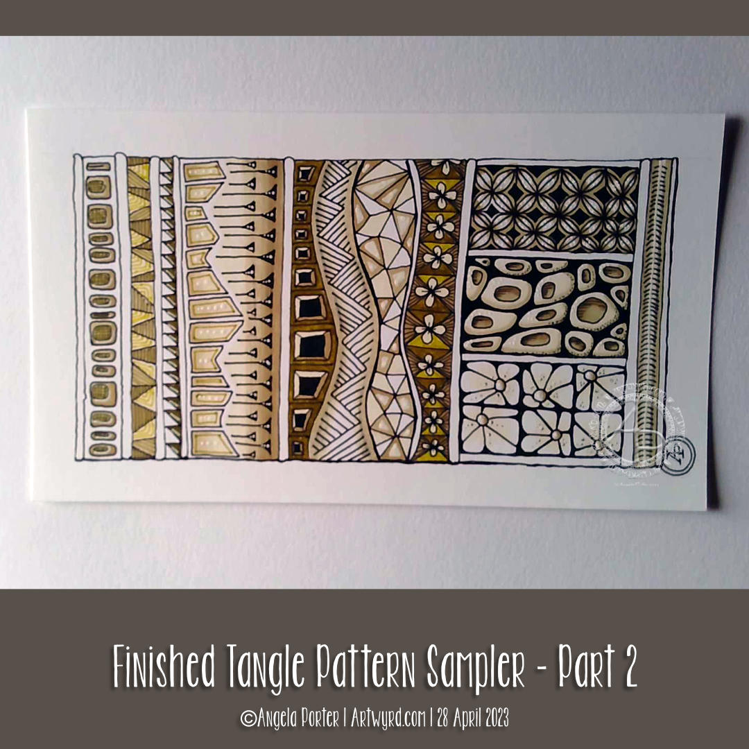
About the pattern sampler

This little pattern sampler has been fun to do! I’ve used patterns inspired by the work of Rebecca Blair, some Zentangle style tangle patterns, and possibly some variations of my own too.

I do love Rebecca’s work. I can see the influence of medieval manuscripts on her work and her love of pattern, texture and a wonderful use of textured lines too! The simplicity of her colour palettes and the myriad of ways she combines her signature patterns/textures is wonderful! I really do suggest you take a look at her work on Instagram.

I used a piece of Ohuhu marker paper that measures 4″ x 7″ ( approx 10cm x 1.7cm) and marked out the basic sections with a Uni Kuru Toga 0.3 mechanical pencil (and a ruler for the straight lines). The pencil lines were just a guide for me.

In the first video, I did most of the black line work using an 03 Sakura Pigma Micron pen. In part 2, I added colour using Winsor and Newton Promarkers in Ivory, Sandstone and Caramel.

After that, I added some fine line work and some colours using three Stabilo Point88 0.4 fine pens. These had olive-green kind of tones to them that worked well with the soft browns of the Promarkers.

I also added some black lines in places using a 0.1 UniPin fineliner pen.

Finally, I added highlights using white gel pens.

I really like the more monochrome, subdued colours of this finished drawing. The various panels really do have the feel of a needlework or cross-stitch sampler; hence the name!

I spoiled myself with a set of Promarkers last week, and I don’t feel a bit guilty about it! I was getting frustrated with the Ohuhu markers – way too many bright, in your face, vibrant colours and not enough subtler, less saturated colours.

I’ve also found that as nice as the Ohuhu marker paper is (and it is lovely and smooth and fab to draw on), I much prefer Winsor and Newton, Daler-Rowney or Canson Marker paper for my alcohol marker work; the ink doesn’t sink into the paper as much and the colours are more vibrant. Also, you use less ink in creating the artwork!

Organising a new pattern, texture and motif ‘repository’ and a bout of illness

I keep faffing about with this. After getting frustrated with a six-ring A5 ringbinder and the limited number of pages that can be stored within, I discovered there’s such a thing as A5 landscape lever arch files! So one was bought post haste! I still can’t draw/write directly in it, but it makes it so much easier to store paper and finished pages. So, I’m one happy bunny.

I’ve spent quite a bit of time in the last couple of weeks starting to put together my collections of patterns etc. Especially as I’ve not been too well. I had been in contact with some people who subsequently tested positive for Covid. I had a nervous few days wondering whether I’d get it. I didn’t. Instead I had runny nose, slight cough, and a mild case or tonsillitis!

I’ve not had tonsillitis for the best part of twenty years. The last time I was getting it 4 times a year and was referred to an ENT surgeon. Let’s just say he didn’t need to use the tongue pressor thing to see my tonsils – they’re permanently large and have lots of tunnels (crypts) inside them from all the tonsillitis I’ve had from a young age. Seeing the surgeon seemed to scare the tonsillitis away; I elected not to go through with surgery to remove the tonsils. There are potentially serious complications that can arise in an, ahem, older person.

Anyhoo, It was a mild case. All covid tests for over a week were negative. But I’m left feeling run down from being ill. I’ll recover gradually!

Losing myself in reorganising and redrawing patterns etc was just what I needed. I’ve barely made a dent in my collection, especially as I’ve added loads more variations as I go! I know it’s going to be a long term project, for sure.

Other arty stuff

I have done other arty projects since my last post here. But the fatigue has been strong and my concentration and focus weak. I will post a gallery of them in the next day or two!

Medieval Inspired Botanical Bookmark

I have no idea why, but tall, thin drawings (bookmarks) just appeal to me. Indeed, they always have.

I enjoyed drawing this one, and I’m fairly pleased with the chosen colours. There’s a soft, muted, vintage palette along with the flowers, seed pods, berries and leaves mainly inspired by Medieval Illuminated Manuscripts and the work of the Arts and Crafts Movement artists.

If you’d like to follow a #comedrawwithme video for this design, just click on this link!

Medieval & Zentangle Inspired Pen Drawing

Link to today’s video/vlog on YouTube.

Oh, I really enjoyed drawing this design!

The paper is 8″ x 4″ in size and coloured with various Distress Inks in shades of brown. The flowers and leaves were inspired by Medieval illuminated manuscripts, and there’s some zentangle-ish stuff going on at the bottom.

What I really enjoyed was adding contrast with pen strokes. Not graphite pencils, not chalk pastels or markers, just a very fine pen. The end results reminds me of an etching.

I have since added simple washes of colour, using the same colours I used on the paper, with the adding of Old Paper Distress Ink. I’ve mucked up a bit in trying to add shadows beneath the flowers, perhaps. I’ve also added some gold accents. This work isn’t shown in this photograph; I will show it when I’m happy with how things are. Well, happyish. I’m thinking that adding colour may not have been such a good idea after all!

The video is a long one, showing most of the drawing process. But hopefully I’ve done it in a way that if you want to ‘draw with me’, you can!

Medieval Monogram Dangle Design ‘C’ – 18 December 2018

©Angela Porter 2019

I’ve spent around two and a half hours on this monogram. I’m still playing with metallic/glitter textures rather than black line work.

I still haven’t ‘cracked’ how to achieve a more dimensional look to the gold lines/beads. No doubt I’ll have a bright idea to try sometime soon.

Medieval, Anglo-Saxon, Celtic and Romanesque art and architecture has long been an inspiration for me, though it’s not often I express it in such an obvious way. This definitely has a medieval ‘feel’ about it, but there’s also a more modern take with the rectangular dangle charms and the very  contrasting gradient colours that fill the patchwork pattern inside of the letter.

I was thinking of adding more complex patterns inside some of these patchwork sections. However, I decided that could be way too busy and went with the dots.

Dots are  a very common embellishment in Anglo-Saxon and Celtic manuscripts. After adding dots to those patchwork panels, I had to go and add them elsewhere. Such a simple thing, the humble dot, but how much it can add to a design.

I love the plain blue panel behind the C, so the letter doesn’t get entirely lost in the background pattern – my favourite little spirals. I like the thicker lines around the letter too, but they’re too ‘flat’ for my liking at the moment. The little square-ish gems in the main outline help to break that thick gold line up, adding a bit more opulence in the process.

I love the dimension in those rectangular panels, particularly the lower one. The high contrast gradations in colour really give it some dimension. I wasn’t at all sure about using the pale yellow to orange color gradations anywhere in the design, but once I’d completed this particular ‘charm’ I absolutely loved it!

Although I don’t show such complex monogram dangle designs in my book ‘A Dangle A Day‘, this design really isn’t all the complex to do. 

Talking of ‘A Dangle A Day’, Lydia at #quartocreates sent me a link to a nice review of the book by Funky Frugal Mommy.

This is a piece of digital art using my Microsoft Surface Pen and Surface Studio along with Autodesk Sketchbook Pro and some texture files purchased via Creative Market.  I did start with a pencil sketch of the monogram and dangle design which was then redrawn digitally.

Another, possibly the last, version of ‘B’ monogram dangle design

©Angela Porter 2018

The previous and latest version of the monogram dangle design. The variation is the background paper colour as well as a drop shadow for the design.

I had a lot of fun as well as some frustration when I found it difficult to do what I wanted to do, though I got there in the end, I think.

I certainly have a few more tools in my digital art toolbox.

Autodesk Sketchbook Pro really makes it easy to create art like this. Though this may have been simpler for more accomplished, learned digital artists, for me it was a bit of a process. However, I have managed to create something I could only dream about doing in traditional media, I think. 

The skills required are, in my opinion, equally as demanding, whether working digitally or traditionally. Don’t forget, this started out as pen and ink line art on paper – very traditional! I just made use of digital tools to develop it into something that definitely has a medieval feel to it but in a modern medium. Indeed, all the lines/patterns were re-drawn digitally using a pen and the screen as ‘paper’ to arrive at these final versions. I did make use of the color-fill tools to colour these ones in, but the addition of textures makes them less digitally perfect and more ‘perfectly imperfect’.

This certainly has inspired me to create a whole series of such monograms over the coming days, weeks or months. Goodness alone knows what I can do with the digital versions as having them printed wouldn’t result in any sparkle where there’s sparkle. However, I do have an idea about foiling my line art, as well as working with metallic inks once more. Indeed, I had a deliver of Encres A Decorer by Herbin yesterday and dug out my glass pen to use with them. So some experimentation with those is likely (as well as digging out my dip pens and nibs too). I think I have some calligraphy ‘parchment’ or ‘vellum’ paper lurking somewhere in my stash as well.

Finally, I think I’m getting comfortable with my style of hand lettering. It sure ain’t perfect. It’s sure ain’t as slick as that of others. But it’s mine, not theirs.

Of course, some of the ideas/tools/techniques I’ve used here I can make use of in my more usual style of art. For today, I want to work on a design for the Angela Porter’s Coloring Book Fans facebook page to help celebrate the changing over of the calendars at midnight on New Year’s Eve as it turns into New Year’s Day. A liminal point of time between one thing and another. A boundary between the old year and the new. 

So, finish my toffee nut latte mocha morning drink I will, then it’s to some hand lettering and drawing, while keeping warm and dry on a chilly, rainy and windy day.

‘A Dangle A Day’ is released on 8 Jan 2019.