Zentangle Inspired Drawing 29 July ’23 and why I’ve been missing…

A #DrawWithMe video tutorial featuring this design is available from 21:00 UK time today, 29 July 2023.

Missing from social media…

It’s been nearly two weeks since I last posted any art to social media. I managed to burn myself out with too much adulting, a people-y couple of hours, and pushing myself way too much to get all the sketches done for the Daydreams book. I just ended up exhausted, unable to focus, and couldn’t even muster the energy to draw for my own pleasure. That is a bad sign.

I’m having to learn and understand a lot about myself at this time in my life. Lots of things have changed – not the big things in life, but things of personal matters to me, including health, age and a couple of other things. This means I really need to make sure I start to set limits for myself as to how much I realistically can do. It seems that it may be better for me to do less, rather than push myself to my maximum limit which results in the start of burnout.

What does burnout look like for me? Intense fatigue, inability to focus, a loss of joy in things I usually enjoy, a desire not to communicate or leave my home, an upset digestive system, and frustration if I try to do anything slightly demanding.

I still remember how I was when I have my first huge burnout and all the health problems (physical, mental and emotional) that built up in the run-up to it. Back in February this year, I nearly ended up in such a state again. Just a few months isn’t quite enough to fully recover, however. It took me years to recover from the first two big burnouts, which happened within a year and a half of each other.

It’s taken me until now to recognise the connection between what’s happening to me, which is only being exacerbated by perimenopause.

This means that I’ve had two weeks without being able to make any social media posts. I’ve avoided social media, apart from reposting posts I’ve found interesting on the times I’ve checked in. I’m not the most sociable person, being an introvert, but am less sociable during times like this.

I’m exhausted not just from the pressure I’ve put on myself to get as much work done as possible. There’s also been the masking when I go out where people are so they don’t know how much I’m struggling inside. Keeping that appearance up is exhausting. I’m a bit like a swan – calm and serene above the surface, but underneath I’m going ninety-to-the-dozen to keep myself afloat and moving.

Yes, I know the expression is nineteen-to-the-dozen, but I really have felt like it’s ninety not nineteen.

The thing is, that’s how I’ve always been for as long as can remember. I didn’t have the words or way to describe how I felt or thought when I was a child or teen, or even an adult. In therapy, I had to learn what emotions were. I was astounded to discover that not everyone thinks or feels like I do.

Not having conversations about my constant anxiety bordering on fear, or my negative self-talk meant I thought this was all normal. If only I’d had those conversations as a child!

Still, I got there eventually…and am still learning about myself and how this impacts me, especially at this time. I have to know my own limits and do a lot more self-care of my energy and focus, mind and emotions, body and soul.

I’d like to think I’m making progress. However, when everything crashes in it can be hard to remember all of this. I get caught up in a maelstrom of fear and the old negative, destructive thoughts of that inner voice that is so damn judgemental.

The positive thing is I recognised that I was spiralling down back in February and sought out medical help. The hard thing is working out what my new limits are. I need to learn to stop before I start to crash and fatigue and low mood and other problems set in.

I think I may have overdone it today – I recorded, sorted out and am uploading a 2 hour how-to tutorial today. I enjoyed drawing and so on very much, but I feel so tired now. Perhaps all the social media was a bit too much! But I do want to do it and will take a break in a wee while for sure.

“Purple Roses” Entangled Botanica Tag/Bookmark WIP

Cool, soothing, calming blues, teals and purples are just what my migraine befuddled self needed this afternoon. The migraine had mostly lifted, but left me feeling tired, ‘off with the fairies’. I decided to film this drawing as I thought those who like to draw along with me would enjoy some flowers, this time roses.

I coloured the background with Distress Inks, and added a little texture with a stencil. Water splatters are a must, dried with a heat gun to give that darker edge to them.

I love the way the texture and variation in the depth of colour shows through the coloured pencils that are applied to bring volume to the drawing. I used Gamsol and tortillons/paperstumps to blend the colour pencils out and create highlights and shadows.

Touches of gold ink will bring some precious luxury to the design.

There’s still a lot to do, however. The first coat of added pencil colour needs to be completed. There may be a need to intensify contrast. And then there’s the patterns and contour lines to be completed with ink. A drop shadow, white ink highlights, and more shimmery golden details.

The appearance of torn, collaged, patterned paper to the right of the tag is becoming a favourite thing of mine to add.

I hope a good night’s sleep will come tonight and I’ll wake tomorrow feeling as ‘with it’ as I’m able to be. I have work to do for my next colouring book called “Daydreams”.

Accompanying YouTube #DrawWithMe Tutorial Premieres at 20:00 UK Time 5 June 2023.

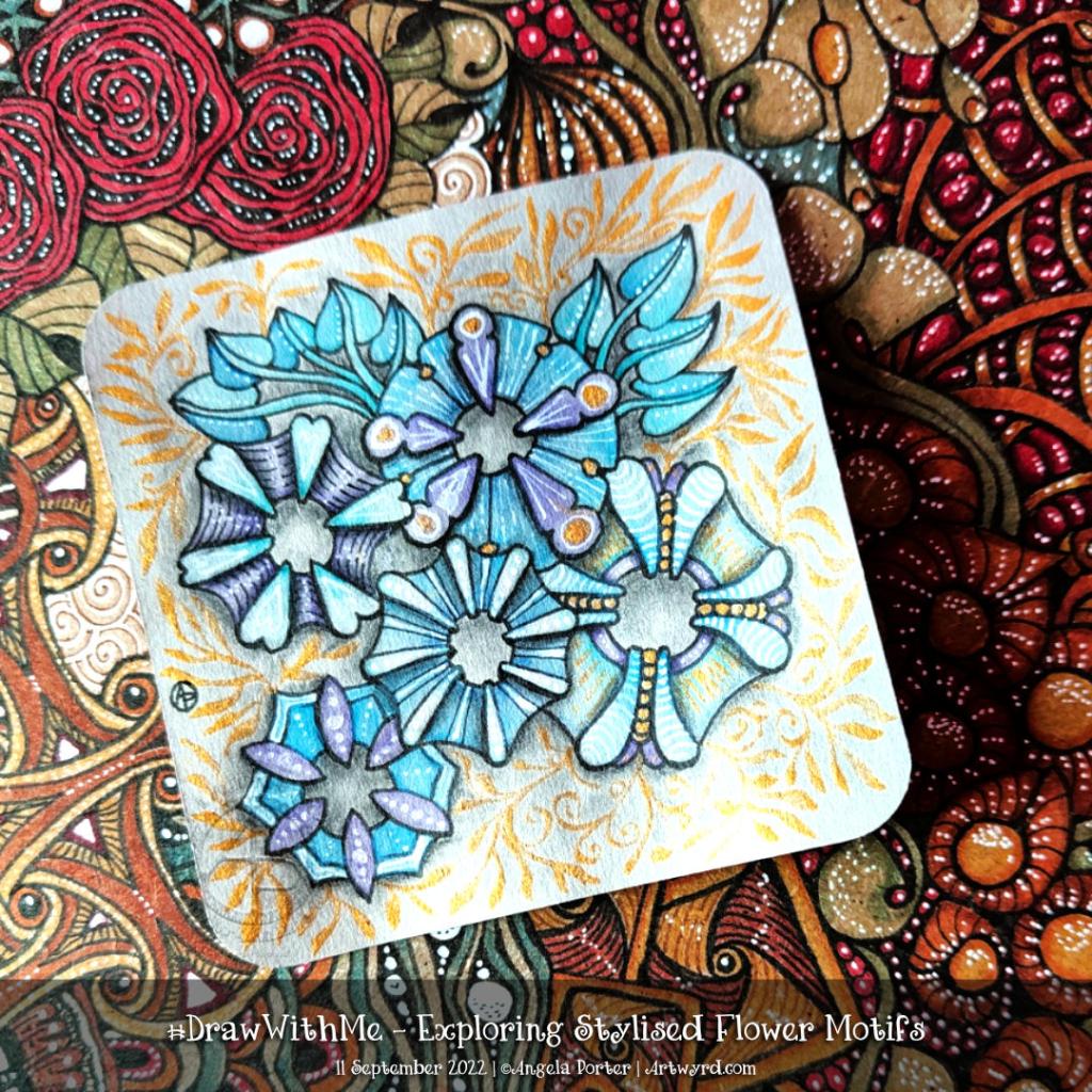
Exploring Stylised Flower Motifs

This morning I wanted to do something fairly simple, soothing and relaxing. So, I chose to look at some variations of a stylised flower motif.

The version I started with is in the centre bottom of the design.

I used various Distress Watercolour Pencils and a water brush to add colour.

The white and gold highlights and patterns were added using gold and white acrylic ink and a dip pen.

Finally, the more intense shade was added using a graphite pencil and a paper stump. I even put some graphite around the gold foliage surrounding the design.

Overall, I’m quite happy with this one. I like the mostly monochrome blue/teal colour scheme on the grey tile. I wasn’t sure bout the gold patterns, but now it’s finished, I think It’s turned out just fine.

Finishing Up a Zentangle Greetings Card

Link to today’s video/vlog on YouTube.

Actually, the title should be ‘How Not to finish up…’. I had a bit of an accident. More about that in a minute.

This morning, I decided to work on finishing up one card design. I knew I wanted to add another layer beneath the panel already finished before gluing it to the cream-coloured card blank.

I dug out some scrapbook paper from my stash. Nothing felt right. The colours were just ‘off’. That’s when I realised I needed to use Distress Inks to colour the lower panel.

I could have used them to colour the panel, then use pens (black, fineliner or metallic) to draw a pattern on it. Instead, I decided to try to emboss the pattern into the paper using a dotting tool / parchment craft ball tool / embossing tool.

Before I did this, I experimented on some scrap paper to see how I could colour the paper (more on this in today’s video).

I decided to emboss the paper first, then add Distress Ink (pine needles) with the black side of a piece of Cut ‘n Dry foam. That kept the embossing white. I found that if I used a blending brush (aka make-up brush!) more ink settled in the embossing. That is also a lovely look, but not what I wanted.

Inside this border, I added some gold ink to create a gold border around the upper panel.

That looked fine and dandy. The horror story came with the next step…

I added some foam tape to the back of the upper panel to add some dimension to the card, along with some glue so I had some wiggle time to make sure I got the panel centred.

The glue was the mistake I think. I had the panel nicely centred until I turned it over to add some pressure to get it to stick firmly. It must have wiggled and become de-centralised.

And when I noticed it was very firmly stuck.

I was so annoyed with myself as I know this is something that nearly always goes wrong when I try to make cards.

The only way I can ‘fix’ things is to cut out that central panel and re-make the embossed border and reassemble the card once again. This time I’d consider having the embossed pattern going under the central pattern so that if it is a little off it won’t be quite so noticeable.

I’m not, however, going to do that. This time, I’m going to make notes in the card about what I did, the media used, what I like, what I don’t like, and what I need to be very, very mindful of the next time I make a card.

Reflecting on the card creation

I know I’m fairly happy with the design. I like the central motif of holly leaves. The sutble pattern in the border around it is nice too, as is the embossed border.

I do wish I’d not used chalk pastels to add colour to this panel. There’s something dusty and muted about it that I’m not at all sure of. I think that keeping things mostly monochrome on a coloured background works best for me, with touches of gold and white, with some shading perhaps.

It’s that thing again. I love colour, but making use of it always has me feeling that it’s where I mess things up, unless I keep the colours really simple. Simple as in black, white, the background colour, and a shadow colour, and maybe touches of metallics for some sparkle and shine.

I do better with colour when I work digitally, but in traditional media I always feel like I struggle.

It’s always a learning experience, more so when things don’t go as planned or when I’m not entirely happy with what I produce. My problem is I try the same kind of thing over and over and expect it all to improve. I think I’m hoping that I’ll work out how to make the various media work for me at some point.

I say, often, I’m going to stick to monochrome, and then go and try working with colour, often with the same kind of feeling at the end. The feeling I like the pen drawing, but the colour/media isn’t what I’m looking for.

Perhaps time for me to make use of this colour printer and add colour digitally and print it out!

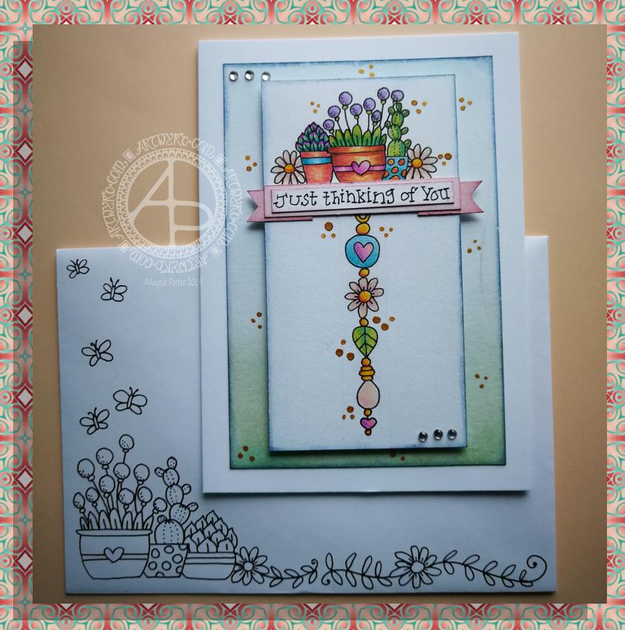
Thinking of you – a dangle design card

© Angela Porter 2019

This little card and envelope took me around 3 hours to make. I had to remember how to do various things and find my supplies to do them with!

My first task was to make the sentiment banner. I had the idea for this one after someone asked me for recommendations of good books for learning hand lettering as they’re not at all happy with their handwriting.

Hand lettering and handwriting are not the same thing. Hand lettering is something you unconsciously do. Hand lettering is the conscious and deliberate drawing of letters, one by one. Practice, like everything else you want to learn and become good enough at, is important. I suggested that they try printing the sentiments out on their computer or using words cut out of books or magazines or stickers or stamps and ink pads used by card makers until they’re comfortable with their own lettering style.

That led me to thinking that rather than writing the sentiment directly onto the paper that I’m going to draw the dangle design on, what about if I hand lettered it on paper again and again until I’m happy with it and then cut that version out. I could then layer it onto coloured card to make a border, or onto the paper or or or…

So, that’s what I wanted to use here. A variation on what I’ve done in previous cards. I cut two trips of mixed media paper, one around 1cm wide, the other around 0.7cm wide.

On the narrow strip I wrote my sentiment. I did this confidently as I knew if I got it wrong I could always write it again – I’d not ruin my dangle design in any way. I then trimmed the strip close to the start and end of the sentiment.

Next, I coloured the wider strip of paper with victorian velvet Distress Ink. I trimmed one piece so it was just a little longer than the sentiment. Then, I cut two rectangles from the coloured strip. I cut triangular notches into one end of each of the rectangles. I used the sponge applicator to make sure the edges of the coloured pieces, including inside the notches, and the sentiment strip coloured. By doing this, there’s a darker edge to the pieces and this defines them against the background. The final step in making the banner was to glue the pieces together as shown in the photo.

I cut two pieces of mixed media paper for the front of the card. The smaller one I made a little narrower than the sentiment banner; I wanted the ribbon to hang over the edge a little. I used a pencil to mark where I wanted the banner to sit on the card. I then used a pencil to mark out the centre of the card so I could position my dangle centrally.

Above where the ribbon would sit I wanted to place an arrangement of pot plants – succulents and a cacti. Below I wanted a fairly simple dangle, but one that had elements that appeared in the arrangement of pot plants. I drew these with a 05 Uniball Unipin Pen.

I then wanted to colour the two pieces of mixed media paper before I coloured the designs in.

For the larger one I used Peacock Feathers, Bundled Sage, Weathered Wood and Tumbled Glass Distress Inks to colour the whole of the paper panel. I edged this panel with Faded Denim Distress Ink. Then, I lightly sprayed the panel with water so that I’d get some faded watermarks as a texture in the colour.

For the upper panel, I used a very light hand to add the same Distress Inks to the paper, but in a much paler shade. I also edged this panel with the Faded Denim Distress Ink. I realised it hadn’t erased the pencil guidelines before I added the Distress Ink so when I went to erase them they wouldn’t fully erase. I’d forgotten that I had to do that! Still, it adds a bit to the distressed feel of the cards, that and the damage marks that were on the larger panel too.

To colour the dangle design I used Mitsubishi Uni coloured pencils. I used a fairly limited palette across the design.

The last two steps before assembling the card were add dots of gold ink and some shiny adhesive crystal gems.

To assemble the card I used glue to adhere the lower panel directly to the card. I then used foam squares to adhere the dangle design panel to the lower panel and the sentiment ribbon to the dangle design panel. This card has quite a bit of dimension to it.

My final job was to decorate the envelope. I decided to draw some pot plants and some of the daisies along the bottom. I added some butterflies to the left as the area above the pot plant seemed empty, unbalance. I haven’t coloured the envelope in as I’m in two minds whether to or not. Also, it would be nice to edge the envelope with the Faded Jeans Distress ink too, maybe even colouring the envelope with the same Distress Inks as the card. There’s also the back flap of the envelope that would benefit from a little potted succulent drawing I think.

Distress Inks are water-reactive, so if I do this, once the envelope is addressed a light application of Micro Glaze would seal the colour in so it wouldn’t be damaged in the mail.

I’m actually quite pleased with this card. It’s got me thinking about how to do more of this kind of stuff – card making the ‘Angela’ way!

If you give making cards like this a go, I’d love to see what you create! Happy art-ing, lettering and crafting!

Lots of ideas for dangle designs are shown in my book
‘A Dangle A Day’.