
Link to the Draw With Me video on YouTube.

A #DrawWithMe video tutorial featuring this design is available from 21:00 UK time today, 29 July 2023.
It’s been nearly two weeks since I last posted any art to social media. I managed to burn myself out with too much adulting, a people-y couple of hours, and pushing myself way too much to get all the sketches done for the Daydreams book. I just ended up exhausted, unable to focus, and couldn’t even muster the energy to draw for my own pleasure. That is a bad sign.
I’m having to learn and understand a lot about myself at this time in my life. Lots of things have changed – not the big things in life, but things of personal matters to me, including health, age and a couple of other things. This means I really need to make sure I start to set limits for myself as to how much I realistically can do. It seems that it may be better for me to do less, rather than push myself to my maximum limit which results in the start of burnout.
What does burnout look like for me? Intense fatigue, inability to focus, a loss of joy in things I usually enjoy, a desire not to communicate or leave my home, an upset digestive system, and frustration if I try to do anything slightly demanding.
I still remember how I was when I have my first huge burnout and all the health problems (physical, mental and emotional) that built up in the run-up to it. Back in February this year, I nearly ended up in such a state again. Just a few months isn’t quite enough to fully recover, however. It took me years to recover from the first two big burnouts, which happened within a year and a half of each other.
It’s taken me until now to recognise the connection between what’s happening to me, which is only being exacerbated by perimenopause.
This means that I’ve had two weeks without being able to make any social media posts. I’ve avoided social media, apart from reposting posts I’ve found interesting on the times I’ve checked in. I’m not the most sociable person, being an introvert, but am less sociable during times like this.
I’m exhausted not just from the pressure I’ve put on myself to get as much work done as possible. There’s also been the masking when I go out where people are so they don’t know how much I’m struggling inside. Keeping that appearance up is exhausting. I’m a bit like a swan – calm and serene above the surface, but underneath I’m going ninety-to-the-dozen to keep myself afloat and moving.
Yes, I know the expression is nineteen-to-the-dozen, but I really have felt like it’s ninety not nineteen.
The thing is, that’s how I’ve always been for as long as can remember. I didn’t have the words or way to describe how I felt or thought when I was a child or teen, or even an adult. In therapy, I had to learn what emotions were. I was astounded to discover that not everyone thinks or feels like I do.
Not having conversations about my constant anxiety bordering on fear, or my negative self-talk meant I thought this was all normal. If only I’d had those conversations as a child!
Still, I got there eventually…and am still learning about myself and how this impacts me, especially at this time. I have to know my own limits and do a lot more self-care of my energy and focus, mind and emotions, body and soul.
I’d like to think I’m making progress. However, when everything crashes in it can be hard to remember all of this. I get caught up in a maelstrom of fear and the old negative, destructive thoughts of that inner voice that is so damn judgemental.
The positive thing is I recognised that I was spiralling down back in February and sought out medical help. The hard thing is working out what my new limits are. I need to learn to stop before I start to crash and fatigue and low mood and other problems set in.
I think I may have overdone it today – I recorded, sorted out and am uploading a 2 hour how-to tutorial today. I enjoyed drawing and so on very much, but I feel so tired now. Perhaps all the social media was a bit too much! But I do want to do it and will take a break in a wee while for sure.


Yesterday, 1 July, and today I had a lovely time drawing and adding colour to some stylised flowers. The designs aren’t complete.
I need to add a background texture and a delicate pattern to the one on the left. I’ll do that digitally. If I try to do it now, I’ll end up messing up as I used watercolour inks to add colour. I also recorded a YouTube video of the process (view it here).
A background pattern or texture is needed on the one to the right and textural patterns being added to the flowers. This time, I remembered to add some background colour using Distress Inks. Again, I used watercolour inks to add colour.
I am spitting feathers, though; as for the drawing on the right, I recorded a video and promptly managed to delete it … permanently. Duh! I feel such an eejit! So, I’ll remake the video soon, I’m sure.

Between some adulting today, I’ve drawn this design in my sketchbook. I’m quite pleased with it, unusually for me!
I like black and white drawings. I like texture and pattern, and I like to then add colour and/or contrast to my artwork. I’ve yet to decide what I’ll do with this, though digital colouring is likely to be my thing. Traditional drawing followed by digital colouring makes it tradigital art! Whoever coined that term is fab.
In the last few days, I have played around with using coloured inks to draw designs. I’m happy if I use one colour for the drawing, texture and pattern. If I start to use other colours, I become confused and not at all happy with the outcome. It never looks ‘right’ to me. Not for my own art, anyway. I do like how other people manage to use different colours for various parts of the lineart, pattern and texture.
Maybe this is because I’m so used to drawing with just one colour. I then use colour to bring out dimension in the finished artwork. I have drawn designs in a colour other than black, using just that colour; I’m quite happy with them.
So, onwards I go, continuing to learn more about my style as I go outside the area I’m comfortable in. I may return to the experiments with different ink colours another time, or not. Only time will tell, though.
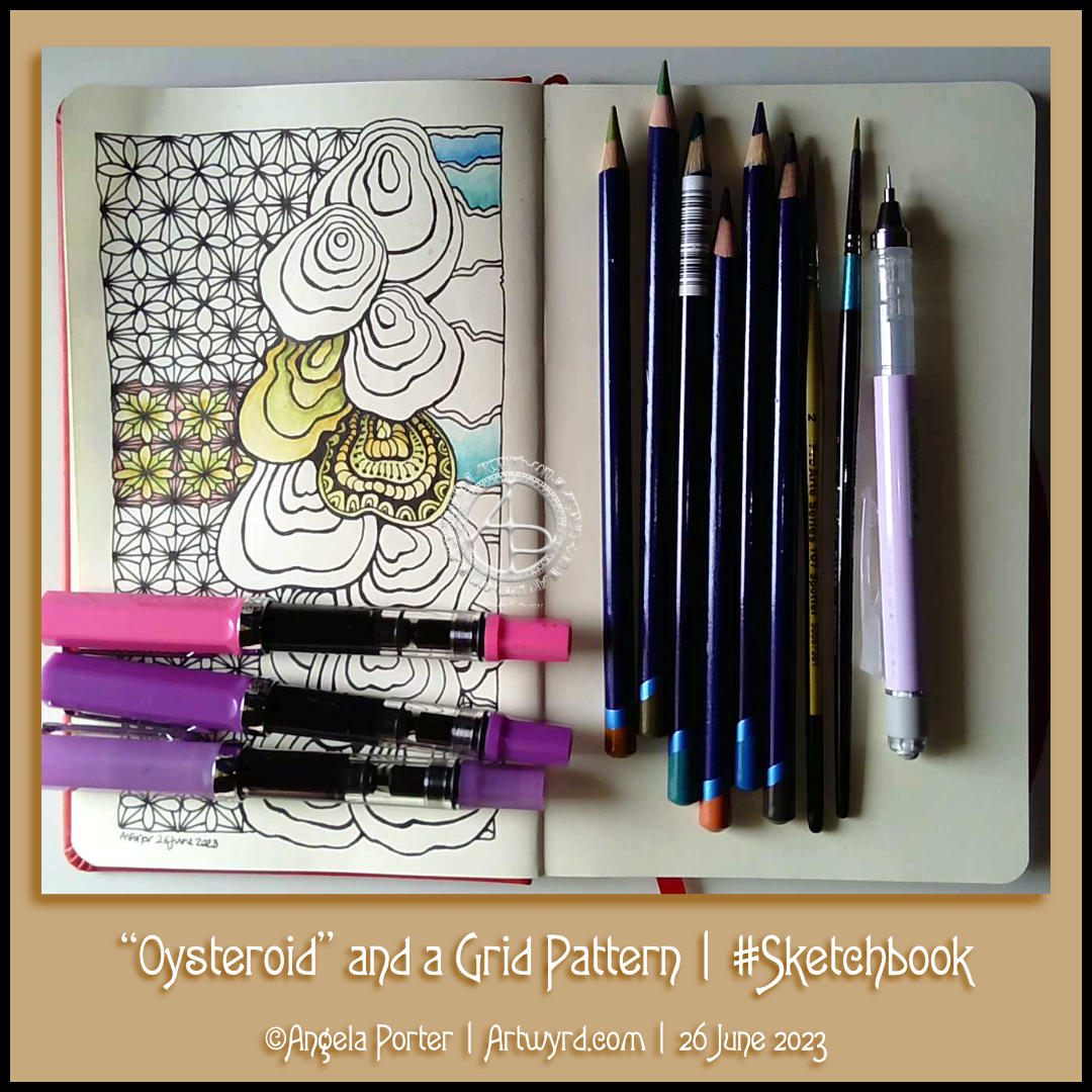
I had a peaceful and content time this afternoon as I created this page in my sketchbook. Well, the pen drawing part with some examples of how I’ll colour it. And I filmed it too, and you can watch it on YouTube.
I started with the stack of Oysteroids, a tangle pattern that I particularly like. I decided that I’d like to use a geometric pattern as a counterpoint to the roundedly organic Oysteroid.
So, I did! I like the way that this instantly gives a feeling of layers or volume.
Colour always vexes me. So, I decided to stick with an analogous colour scheme, choosing Fern and Mustard Inktense pencils to create stripes on the Oysteroids. I carried this palette into the geometric pattern. That was fine until I foolishly decided to use some Red Oxide Inktense. I have no idea what I was thinking! However, it did give a very ‘earthy’ feel to the pattern, in contrast, perhaps, to the sea-related Oysteroid.
That led me to wanting to use colours that remind me of the sea on the right-hand side. I’ll hold judgement on those until more colour is added. If the red oxide doesn’t work out, I have a rather lovely gold ink that can hide it away! Or black with gold highlights…
I used my fine and extra fine nibbed TWISBI Eco fountain pens, which are filled with black Dokumentus ink.
As you can see, I couldn’t help adding some pattern and texture to one of the Oysteroids. I’m sure the others will be treated in a similar way!
Over the past couple of weeks, I’ve been experimenting with monograms and my style of art. It’s fun trying out different things, and it leads to new insights into how I can express myself.
My self-expression is constantly changing and evolving. Sometimes I seem to make some breakthrough and go forwards with it for a while. But something happens, like a slip into poor mental and emotional health, and I retreat into my familiar styles. That doesn’t mean progress is not being made. When I look back, I can see how even my ‘comfort art’ has subtly, or not so subtly, changed as the breakthrough shares its influence subconsciously.
I keep returning to hand lettering, hoping to find out how I can make it work for me. Monograms really do seem to be the way forward.
I’m also thinking about my relationship with colour palettes. I really do struggle at times with the colours I put together, particularly when using traditional media. They seem like a good idea at the time…but…that isn’t always how I feel about them as I continue to add colour.
Contrast can be a thing I struggle with too. I really do think very simple colour palettes – monochromatic or analogous, are likely to be the way for me to go at the moment. They always seem to work nicely, monochromatic, especially as I can focus on contrast far more.
Digitally, I feel I do better, but again a limited palette is the best thing for me.
I know that, like my drawing/design skills, this will improve with time and practice. But I get so frustrated when I make the same silly mistakes over and over with colour choices.

Link to the accompanying #DrawWithMe YouTube video tutorial.
This afternoon, I spent a lovely hour or so exploring variations of a simple pattern cell, or fragment in Zentangle terminology. I picked one of the most basic ones there is and just tried variations to see where it let me. In about 20 minutes, I’c come up with 12 variations.
I then chose one of the variations to turn into a grid pattern. I had a very pleasant surprise as the pattern started to build up and star shapes started to appear!
The Zentangle pattern Flux and a simple daisy motif complete the design. I did start this drawing off with the fluffy flux foliage!
The next thing to do is to add colour and/or shade with highlights. But not today. I actually feel I need to eat something. So, that’s what I’m going to do when I’ve finished all my social media posts.
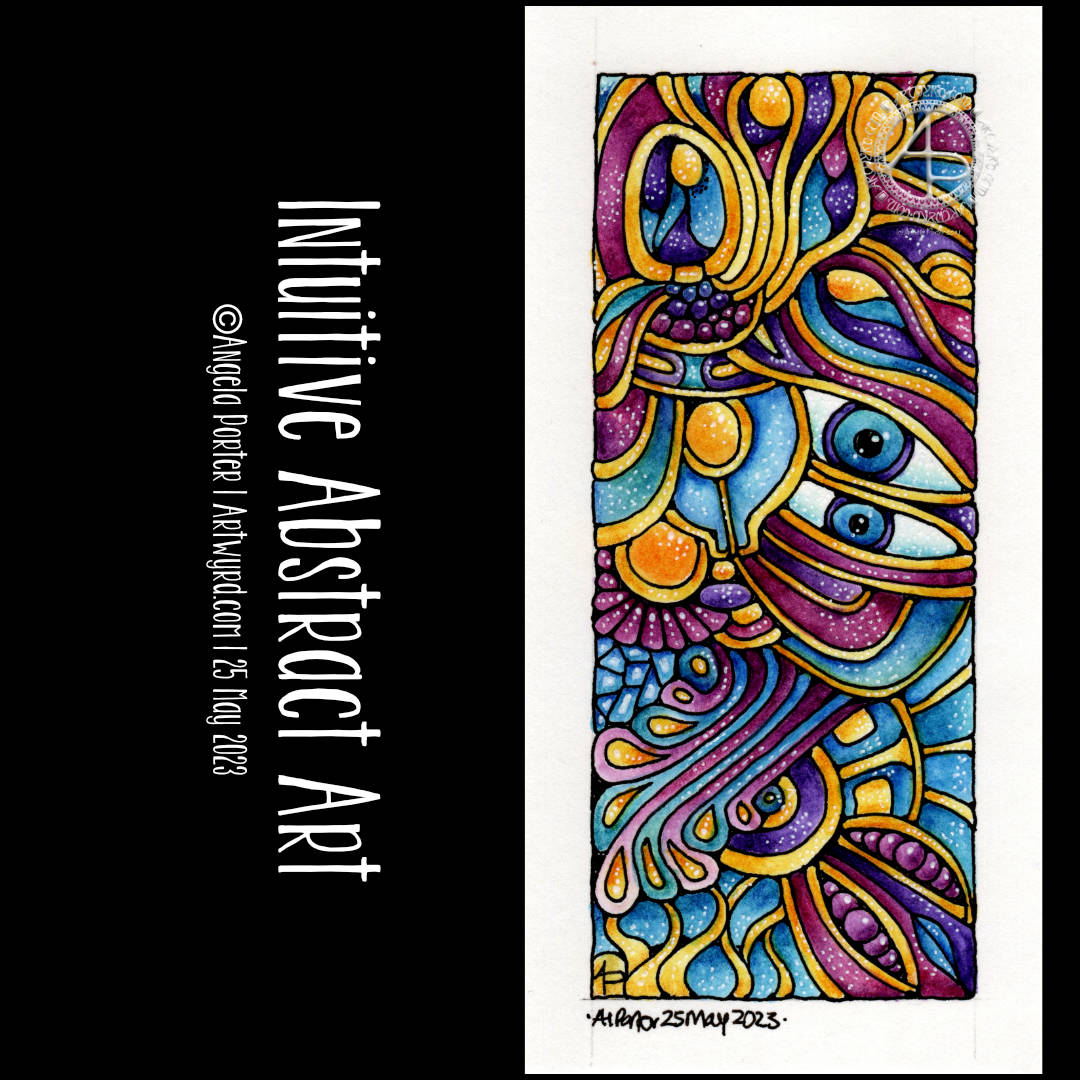
The last couple or so days I’ve been immersed in drawing intuitive, abstract art. I really wanted to bring one to life with colour, but the ones drawn on A4 paper just felt too much to do.
My solution? Cut some paper into smaller pieces and use one of them! So I did. The paper is 14cm x 7cm and is Canson Imagine mixed media paper. To draw the design I used a TWISBI Eco filled with black Dokumentus ink and fitted with an extra fine nib.
I just let the lines flow as they needed to, each one leading to the next, doing whatever felt right.
Then, it was time to add colour and I dug into my Inktense pencils. This time, I layered colours to get the intensity of colour I wanted and added highlights with a white pigment gel pen from Pentel.
Oddly, I didn’t want to add much in the way of patterns or details in the sections. I just thought they were just fine as they are.
I’m left puzzling a little as to why eyes so often appear in my intuitive art. I don’t even realise I’m drawing or have drawn them until the drawing is done!
As it’s intuitive art, it speaks for what is going on within me. The shapes and lines and colours chosen represent my inner wellbeing in terms of my mind and emotions. Or maybe they speak about what I need at this time. Blue for peace, calm, tranquility. Pinks for gentleness, compassion and kindness towards myself. The purple is more to do with the wonders there are in nature and the universe and life. The threads of gold … well … light, warmth, sunshine that supports the vast majority of life on this planet…child-like joy, pleasure, wonder with what I have in my life, the things that are precious, golden, to me.
It’s easy when the traumas of the past rear their heads and do their best to drag me down into a dark abyss of the heart and mind. I think I needed to do this drawing today to help remind me of what there is in me and what I need at this time.
My intuitive, entangled, abstract art is perhaps the most personal kind of art I share with people. It comes from within, from my heart and soul, not my head. And today was the day I fully realised that this is why I create art like this, and almost face palm at how long it’s taken me to realise it! Almost facepalmed…as I also know these insights and realisations come when we’re ready for them.
All the same, I feel kind of exposed when I share this kind of art as you get to see past the mask I wear to try to fit into a world where I feel out of step, awkward, clumsy, weird, different, a square peg in a world that only has round holes for round pegs. I’ve always felt that way and I’m on a journey to discover why that is.
Through this kind of art, I get to express my sense of wonder and emotions that aren’t easy to access. The visual-hoard of patterns and shapes and forms that is stored in my subconscious flows out naturally and easily in ways that are pleasing to me, and I’m really chuffed if you find them pleasing too!

This week’s colouring page for the Angela Porter’s Colouring Books Fans facebook group is a typically ‘Angela’ entangled design. I enjoyed the process of drawing it, very much.
The design was drawn with a medium nib TWISBI Eco fountain pen filled with Documentus Ink on an A4 sheet of Canson Imagine mixed media paper.
I’ve added colour digitally, so making this tradigital art! Why digital colouring? Well, partly because I can, but also I can try different colours out.
Adding colour was interesting it seems. I started thinking I’d use softer, more muted, less saturated colours. But that soon changed, without any conscious decision, to richer and glowing jewel-like or metallic colours.
As I tend to work very intuitively, whether drawing or adding colour, what appears in my creation is an expression of my unconscious, inner self. I’m sure there’s a message of some kind here for me about me!

I easily forget how much I enjoy drawing ‘small art’. A small piece of paper is less overwhelming, and the creativity is no less soothing to heart, soul and mind.
Drawing with pen on paper is never overwhelming. It is a contented, peaceful, delighted experience for me, especially when I work intuitively. The flowy, abstract patterns, with various patterns and textures are always a joy to draw and work with. Starting with just one shape and allowing the design to form, not knowing what will appear from the nib of my pen, is a think of wonder, surprise and magic.
I lose myself in the intricacy of the drawing. then, there’s the addition of colour and contrast to bring the drawing to life. What was flat now appears to have volume to it. The colours may evoke emotions or memories. There is a story to be told in the drawing, but not one that is obvious as an illustration would make it. This is an inner story, an inner expression of my creativity, emotions, thoughts, and what shapes, lines, patterns, textures and items that make me smile.
If my art makes you smile, or brings you joy, peace and/or calm, then it’s done it’s job. There is enough in this world to make us think, to make us feel uncomfortable. We’re assaulted by such things constantly through the media. Time and space to have a break from all of that, to remind us that there is still wonder and beauty, kindness and compassion and creativity in this world is important. It’s also important to remind ourselves that us humans have a great capacity to create these important qualities that heal and soothe and connect us, help us to feel we belong as a member of humanity.
I’m not sure I got all the words I could say out there. Hopefully you’ll understand what I’m trying to get across.
I think what I’m trying to say is that I hope my art reminds you that beauty and wonder, times of peace and contentment, joy and belonging are essential to each of us. That’s still not right. Perhaps once day I’ll manage to express these feelings succinctly in words.
Adding colour, however, is a another tale. I get overwhelmed by the process at times. I doubt my choice of colours, and soon regret what I’ve decided to do. I always try to remember to scan my drawing in before I start to apply colour with traditional media; if I mess up at least I have a clean copy I can add colour to digitally.
Also, there are many times where I just get fed up of the process of adding colour and give up before completion. I can find it a very tedious process. Yet, when I complete the process and it all comes together I’m often really surprised and pleased with the end result. The frustration comes in because it takes so much longer to add colour than it does to draw a design!
Having said that, there have been a couple of pieces of artwork I’ve done recently where I’ve partly coloured them and I really like the effect, especially one where I’ve added shade first. That is something for me to consider going forward for sure.
There is a ‘Draw With Me’ video on my YouTube Channel, available to view from 1900 UK time this evening (19 May ’23).
Here’s a list of the materials I used in the video.


