The rant
Over the past week or so I’ve been feeling incredibly stupid and naive. I’m quite proud of the art I create; the process of creation brings me a lot of pleasure and I like to share images so others can share in the pleasure when they see the art and appreciate it.
I’ve had to think long and hard about whether to share my drawings on the internet, and if I continue do how I stop them from being treated as if they are free for all and sundry to print and use as they wish.
My art is how I make an income now, having gone self-employed last summer. Some of my recent images I shared and naively thought that I’d be able to put them together in some kind of publication to sell.
That is now impossible for many of the images as they’ve been declared and shared as ‘freebies’, even though I never gave express permission that this was the case. I deliberately uploaded images of relatively poor quality and small size to discourage this from happening, and it’s still happened.
I feel really upset and rather low as tam really proud of my latest drawings and I thought they’d be of some commercial value.
Now they are of no value, to me or to anyone else.
Stupidly, naively, I forgot that as soon as you post something on the internet, you lose control of it, you seemingly lose your rights as the copyright holder.
A lesson to learn for me. And I’m trying to remind myself constantly that the more I draw in this style, the better I get at it and the more ‘Angela’ it becomes.
Despite this, I still want to share some of my drawings, and I think the best way to do this will be to colour the images in someway to discourage this happening again. I know it won’t discourage the determined die hards who have no conscience, but I do hope that it will make others stop and think about the consequences of their actions.
I do, from time to time, draw images that I do offer as ‘freebies’ via my facebook page, and I always say they are such. What I don’t do I tell people that something is NOT a ‘freebie’, and I suspect even if I said that there would be some who would ignore it.
I hope that I have found a way round this…and that perhaps these words will make people stop and think.
What I’m trying to do is to learn from this, to take it as a message that I need to protect my work more when I put it on the internet, and to take it that the last few images I have been serving my apprenticeship in a slightly different art style as I make it ‘mine’, and keep work back that won’t be seen unless it’s published or in a portfolio for prospective employers.
If anyone has any suggestions to help me with this, apart from to never show my work (which I generally don’t do if I’m working for a publisher, but even then I do the odd sneak peek), I’d appreciate it greatly.
Rant over.
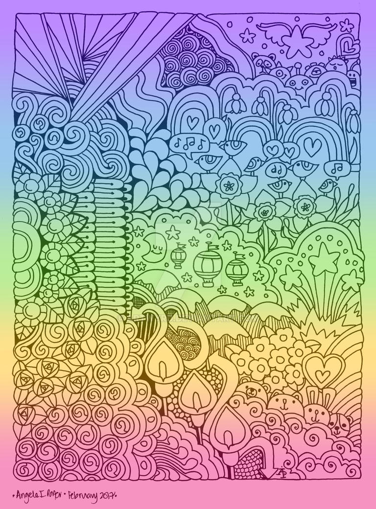
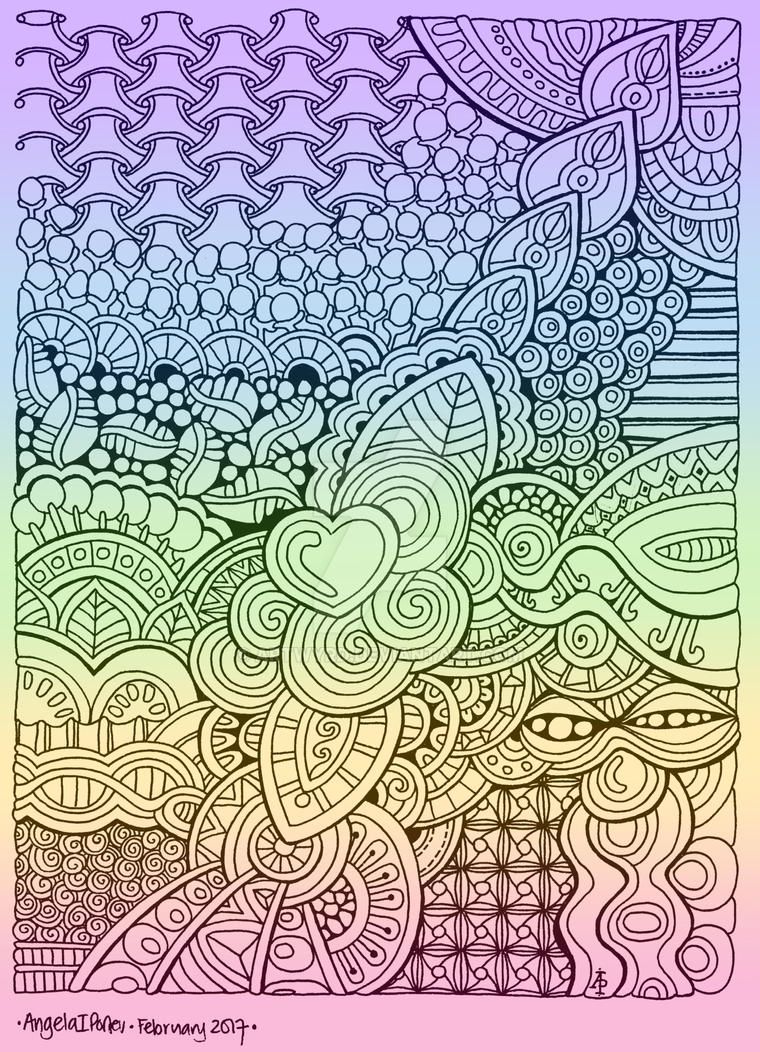
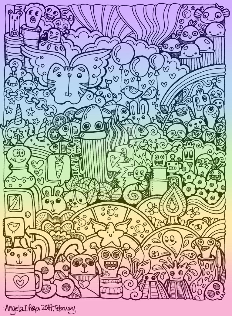
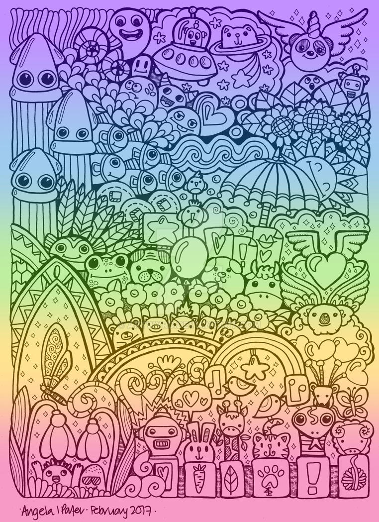
Rainbow Doodles
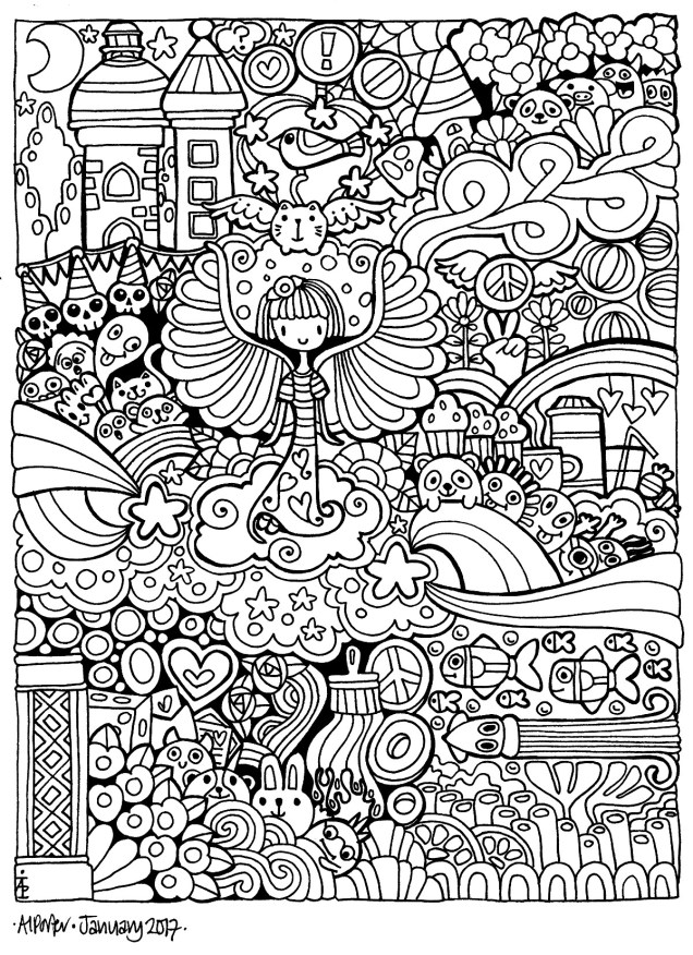
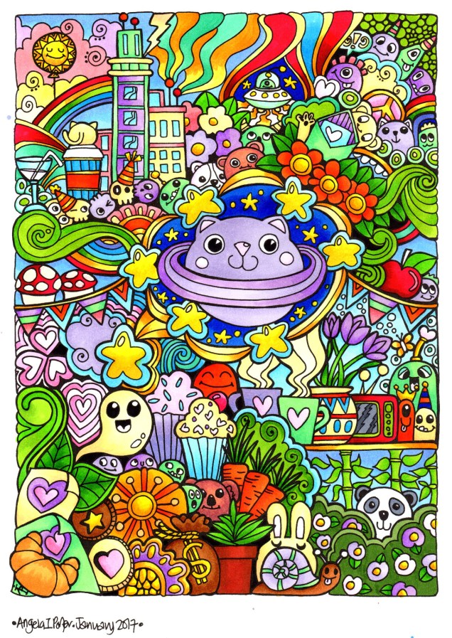
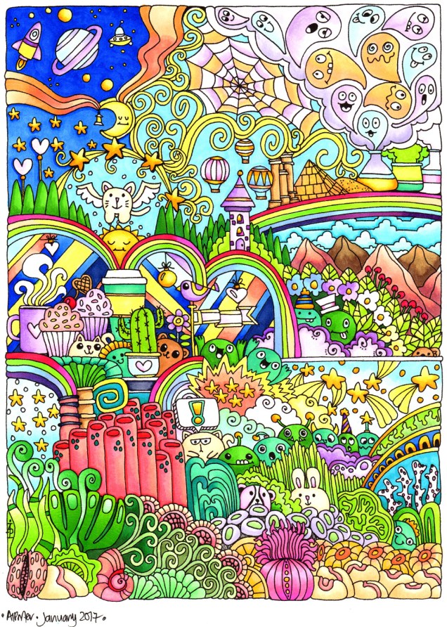
So, one of the things I’ve done to try to protect my work is to colour it in. It takes way too long to break out media to colour in everything I draw, so I’ve made use of Autodesk Sketchbook to apply a rainbow colour gradient to my drawings.
I’ve also uploaded them to artwyrd.deviantart.com so they become watermarked as an added bit of protection. I need to learn how to do that somehow…
I quite like the rainbow gradients.