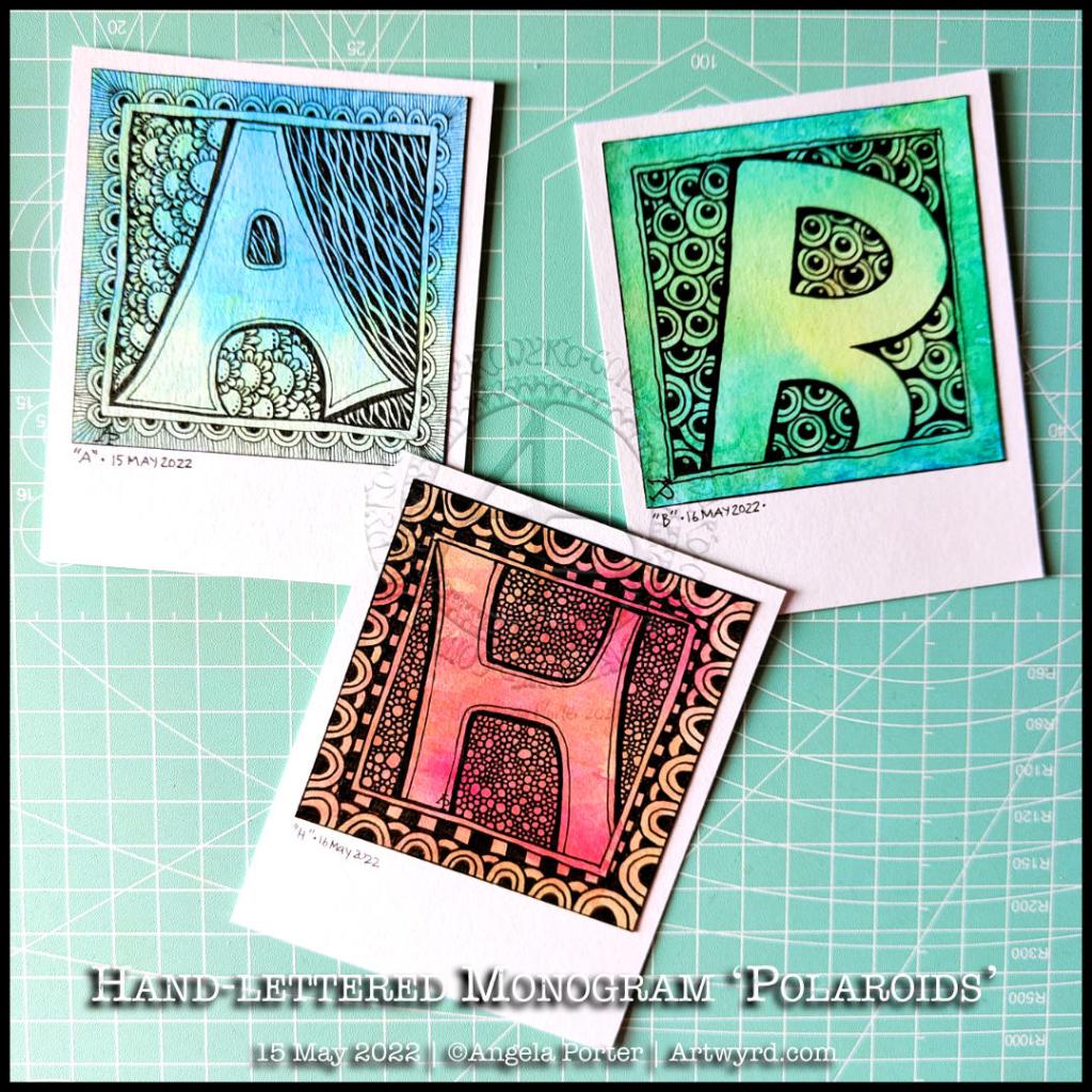
Monogram ‘B’ (and a couple of others!)

Click on this link to view today’s video tutorial that goes with this design!

Watching some arty videos yesterday, I stumbled upon one that involved creating “Polaroid Pops”, part of a challenge hosted by AALL and Create back in January 2022. In this challenge, you had to create mixed media polaroid ‘photos’ using stamps by a specific artist in the AALL and Create range.

I really liked the format of the images created and thought it could be fun to try this for myself!

Polaroid photos have the following dimensions:
The image is 3.1″ x 3.1″ (approx. 8cm x 8cm)
The whole photo is 3.5″ x 4.2″ (approx 9cm x 11cm).

So, yesterday I cut up some of my Neocolour II backgrounds to 8cm x 8cm and got to drawing on them!

I really like the square format. At 3.1″ x 3.1″ (8cm x 8cm), they’re only a wee bit smaller than a standard Zentangle tile. And they do look fab when mounted on the white card to create the polaroid.

After drawing a kind of botanical scene in silhouette (not quite my thing, but you have to try, you know.), I tried popping a hand-lettered monogram into the square and using Zentangle patterns to fill in the negative space.

That was much more ‘me’. And in today’s video, I continue with the letter B, though it looks like an R because I deliberately drew it as bigger than the ‘photo’. Duh, didn’t check for it looking weird before inking it in. Luckily, there’s space on the white background to write in what it is!

While the video was uploading and processing, I drew the ‘H’.

I think I may make an alphabet collection for future reference and inspiration! So, if you fancy having a go take a look at today’s video on YouTube.

Draw With Me | Embrace Beautiful Chaos – Part 2

Please click on the ‘Watch on Youtube’ option. Cheers!

I spent some lovely time adding a bit more to this drawing. In the video, I share how, step by step, I draw some of the motifs so you can use them too!

Peace, calm, and just creating for the contentment it brings me.

Draw With Me | Two More Organic Motifs

Please click on the “Watch on YouTube” button to view on YouTube itself (and help the algorithm!).

I’ve now finished this drawing by adding two organic motifs, both fairly simple.

With the trailing flowers or leaves or stones, the hardest part is arranging them to look like they’re trailing and remembering to decrease the size towards the point.

The other motif, a stack of small seeds on a stem, is easy enough to draw.

After doing this, I thought it needed some colour to bring the motifs to life. So, I dug out some of the Neocolour IIs I’d used for the background and used them a bit like watercolour paints. I scribbled a little of each Neocolor II on my plastic palette, added water, and painted.

I’m not entirely sure about my efforts with adding colour – this is where it can all go wrong for me. Part of me knows I’d most likely be better off if I were to add shadow and texture using pens.

I did use some metallic watercolours to add some sparkle here and there too.

One thing I did notice is that I was glad I tried not to paint over the black lines. The pigment ink in Micron pens is usually waterproof, but, as the Necolor IIs are wax-based and coat the surface of the paper, the pigment doesn’t sink fully into the paper and so water will move the ink.

It’s not a problem, now I’m aware of this. Oh, it also means erasers will lift some of the ink as well as pencil lines. Again, just something to be aware of.

One other thing I did was to cut the paper down to frame the design a bit better. In my clumsy way, I managed to cut it just across the tip of one of the trailing thingies. So, no border around that area.

I will keep going with adding colour and see where it leads me, hopefully not into a disaster! Still, if that happens, it’s only a bit of time, ink, paper and colour and the design can be used as inspiration for the next one. Important lessons about the Necolor IIs are being learned, which is, perhaps, the most important thing.

Draw With Me … Five of my favourite organic motifs

Please click on the ‘Watch on YouTube’ option. Cheers!

In today’s tutorial video, I enjoyed drawing on one of my Neocolor II backgrounds. And I’ve just remembered I forgot to scan the background before cutting and drawing on it. Oh well. I’ll just have to make another one!

Anyhoo, I sometimes forget how much I enjoy working on a coloured background. The colours add an instant “feel” to a drawing. This one reminds me of sunrises and sunsets and the joy and awe that I experience when I see them. So, it was natural I’d choose a few of my favourite motifs to start filling this A5-ish sheet with pen drawings.

Of course, it’s lovely to share how to draw these motifs with others, helping them along their arty journey.

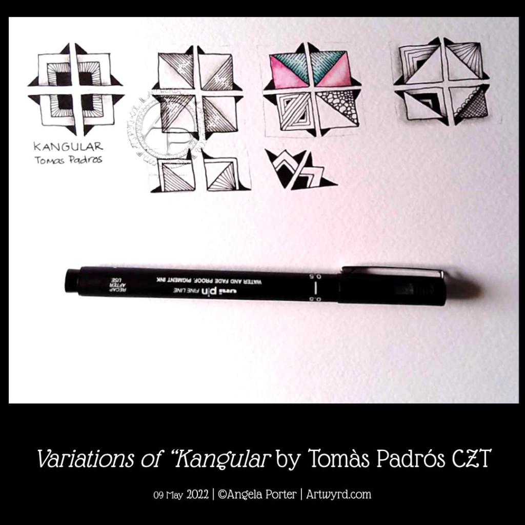
Pattern Exploration – Kangular by Tomàs Padrós CZT

After getting my daily quota of sketches done for the next Creative Haven book, I turned my attention to some sketchbook work. This time I chose to do a tangle pattern exploration of Kangular by Tomàs Padrós CZT.

I love all of Tomàs’ patterns, and Kangular is no exception! It’s a charming, geometrical pattern with lots of possibilities for variations. And there’s only a small number here.

Adding shading really brings volume to the individual fragments and overall pattern, as does the use of fairly high contrast.

I enjoyed my time with this pattern, and you can see my explorations in today’s YouTube video.

Whimsical houses, and other stuff…

In today’s video, I draw these three cute, happy, whimsical houses, and I always feel I mess them up when I add colour.

The first part of the video is a chat about organising artwork, using a dot grid notebook as a visual reference/collection of my favourite patterns and motifs and variations. I also talk about some requests/suggestions made.

But the very, very first part is a huge thank you to all my subscribers on YouTube for clicking that Subscribe button (which is totally free to do!). I hit 750 subscribers a couple of days ago and I’m amazed, surprised and a tad humbled by this. So, if you’re one of those subscribers, thank you so much!

Draw With Me | Stylised, whimsical, imaginative seashell No.3

Click on this link to view the YouTube tutorial video.

Day 3, shell 3. This time a little more complicated, or so it seems. I took some imaginative liberties with this one, and that’s fine! I’m not trying to accurately draw these shells, just get the essences that make the shell identifiable. Then, I want to add my own ideas of patterns and colours and alter things a tad.

Making those imaginative changes was an enjoyable thing to do. I hadn’t realised how much I do this in my art generally. Sometimes, it takes a while for me to have that kind of insight – this one took about 20 years!

I’m also really chuffed that my YouTube channel has hit 750 subscribers! I was amazed and humbled when I achieved one subscriber. 750 is beyond what I imagined. I’m both amazed and humbled by this. So a huge thank you to all who have subscribed.

Draw With Me | How to draw a stylised, whimsical shell using a reference – No 2

Link to the accompany video tutorial

In today’s YouTube video, I show and try to explain verbally, how to draw a different kind of shell, one step at a time.

This shell is, perhaps, a bit more challenging than yesterday’s. However, when broken down it’s not much more difficult.

Again, I add shadow to the drawings using a graphite pencil and a paper stump/tortillon or, in the case of part of the second shell, pen lines and density of pattern.

I also added some colour to the second shell, using a damp brush and lime green and turquoise Karin Brushmarker Pro pens. The graphite shading shows through the transparent watercolour inks from the pens.. I think this combination makes the image look quite metallic. Not surprising as graphite, as an element, is rather grey and shiny and metallic looking! Actually, it’s just the cool grey tones of the graphite that makes this so!

It’s really a lot easier to show than to explain in words, spoken or written. This is why I’m creating videos. It also makes that part of me that is a retired science teacher happy to use my teaching skills and feed my passion for helping others learn and grow.

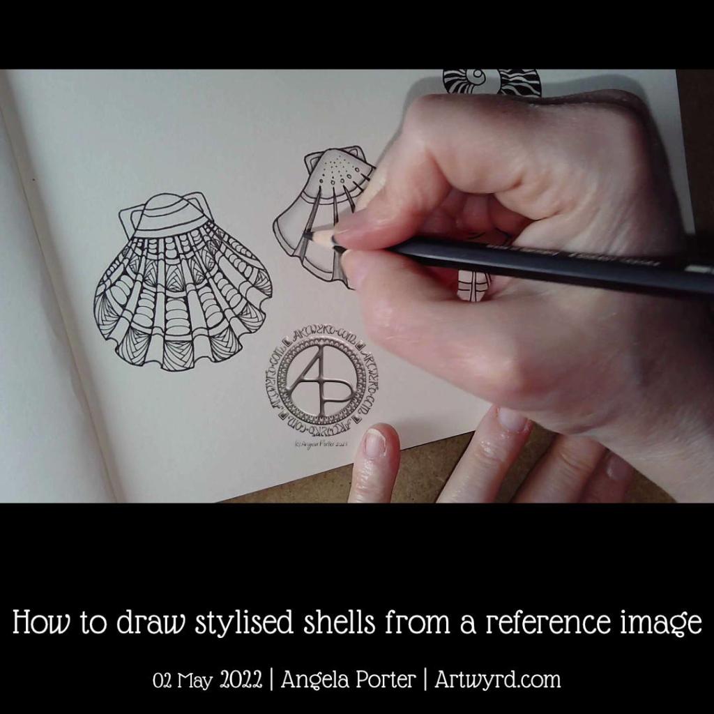
Draw With Me – How to draw stylised shells from a reference image

In today’s YouTube video tutorial, I do my best to describe and show how I draw a stylised seashell or two from reference photos.

I had a request from one of my subscribers to do this. I find it hard to put into words how I do this, I don’t have conscious thoughts/words about it – I just do it. So, this forced me to slow my mind down and put into words what goes on. And I do hope those words make some sense.

The end results are good enough for my sketchbook, and the spiral shell is perhaps my favourite of all time that I’ve drawn, including realistic, diagrammatic, whimsical and stylised.

I’m particularly fond of stylised drawings. The spaces within them are perfect for adding pattern and texture. All my favourite things combined! Shading, highlight and/or colour can be the icing on the cake or shell.

This was a nice diversion from the lettering projects I have on the go. It was also something quiet, relaxing and soothing and perfect for me. Today, I’m exhausted after a stressful yesterday. It was a good kind of stress, but still stress/anxiety. I knew I’d be doing something yesterday a week ago, and so the stress built up gradually over the week. I’ll gradually recover, but today is a quiet, down-day with plenty of self-care, but not any naps as I’ll need to sleep properly tonight.

Hand lettered capital I

Click on this link to see how I drew this letter I and draw along with me!

I thoroughly enjoyed drawing this ‘I’ in today’s video. The combination of hand lettering and using various patterns and motifs… well it’s a match made in my idea of arty heaven!

The pencilled letter is just a space to add patterns to, and they can spill out of the lines just a little.

Drawing with a fountain pen (EF TWISBI Eco pen filled with dokumentus ink by Rohrer and Klinger) was an absolute delight! The paper I used was nice and smooth, and even though there was a bit of feathering, I was fine with that; it adds character and a human touch.

The more I do letters like this, the more I become comfortable with this kind of hand lettering.

For now, this will live in one of my lettering sketchbooks, along with, eventually, the rest of the alphabet. They’ll be a resource to dip into for some inspiration at later points in time.

I’ll also need to work out if I leave the letters as they are or whether I’ll try adding shadows and/or colour. I’m undecided on this.

The letter may be a bit on the wonk, but I’m quite happy with it. It makes me smile when I look at it and remember the process of drawing. That means it’s good enough!