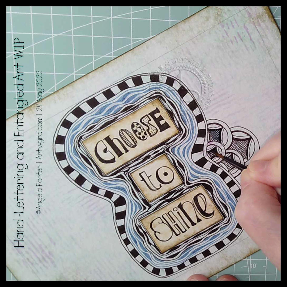
It was one of those mornings when I wake up with what seemed to be a good idea on my mind. Then, I execute the supposedly good idea to realise it’s not working out as expected, and it may not have been such a good idea at all. That is what is happening here!
I think the idea of doing my hand-lettering like this may have some mileage in it. I do feel I have problems pleasingly arranging lettering. If I work on pieces of paper and cut out the words, I can arrange them on the paper until I’m happy with it. So that’s fine. A good plan.
But, I’ve ended up with a birdseye view of an “I” shaped moat around a blocky castle “rolls eyes”. Having “choose to shine” inside a capital I works rather well – I choose to shine. But what possessed me to use blue Diva Dance around the letters? I really didn’t think it through or see the consequences of that choice. Duh!
Of course, this may just be that part in drawing where I think it’s all awful and I should just give up. But I’ve learned to be a bit stubborn and push through to the end, with a drawing at least. Adding colour is an entirely different matter.
So, I will push on and see what happens. Who knows, it may work out nice enough in the end. Or not. Either way, there are plenty of opportunities for me to learn some stuff.
Sheesh, I really can drop some rather heavy clangers at times. But it’s through these that we learn, grow and develop as artists. In my case, I seem to drop the same clangers time after time after time and never quite seem to learn. One day the pennies will drop!
Exploring a totally new tangle pattern may not have been the best choice for me as I wait for the last pain of a migraine to go so I can sleep the rest of it off! Plenty of mistakes and not good choices here, but plenty of opportunities to learn from.
In today’s video on YouTube, I first make some Distress Ink backgrounds, then I explore this lovely tangle pattern, mangling it completely at times! This isn’t a problem as it’s all sketchbook work!
I’m a tad out of sorts today, just a dose of gloomy emotional weather, that’s all. It’s also beginning to pass on by too, which is a good thing! Even with the gloomy weather, I’ve been able to feel the touchstone of contentment within me, but my thoughts have been on shaky ground concerning art.
I was drawing last night, and this morning a different page, and lots of questions came up about my art style. I wasn’t feeling happy with my hand-lettering journey and what my ‘style’ is. I’m finding it really hard to feel comfortable with the hand-lettering I’ve been doing lately. I don’t know why that is, not entirely anyway.
So, my solution is to draw! Well, hand-letter and then draw, but hand-lettering is drawing letters rather than writing. So drawing it is!
Instead of popping words/phrases into my ‘entangled’ art style as I draw, I thought I’d place them on the page first. Then I can do the pattern stuff, repeating various motifs to bring some coherence to the whole design. Not sure I’ve managed it.
Instead of filling the whole space with lots of black pen work, I thought that I could use a brown pen to add just lines to the spaces between. I think I like this as the spaces just looked cold and empty before.
I’m still not sure I’m finding my way with this. I know I do get all flustered and fed up with my art from time to time and start to question myself and be quite harsh with myself.
Working on this, and talking my way through some of it in today’s video, has certainly helped, and my mood is lifting. But regardless of my emotional weather, this was something that still needed to be thought through to do my best to pinpoint what I was struggling with when it comes to including hand-lettering in my art.
Please click on the “Watch on YouTube” button. Cheers!
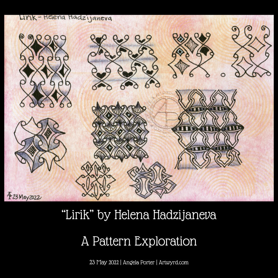
Carrying on with my look at arches is an exploration of the tangle pattern “Kruffle” by Kelli King CZT.
It actually took me a little while to understand the deconstruction of this pattern, it’s deceptively tricksy! But, when I’d got it, quite a few variations appeared in my sketchbook.
Of course, I go through these, step by step, in today’s video.
I really do enjoy exploring tangle patterns, as well as all my favourite motifs. They are such a good way to get creative juices flowing, but also of practicing your drawing skills, as well as other techniques, such as adding shadows or colour, or further patterns.
Thursdays come around quickly, or so it seems. And with Thursday comes a new colouring page (template) for members of Angela Porter’s Coloring Books Fans Facebook group. The group is free to join, and the templates are free to the members of the group.
This week, I indulged myself in creating a tile mandala kind of design. That central panel looks really awkward, but I suspect it has more to do with my colour choices than anything else! I’ll be interested to see how people tack that one. Ho hum.
Please click on the ‘Watch on YouTube’ option. Cheers!
Before filming this video, I primed a piece of watercolour card with white gesso. Then, I added colour using Inktense pencils and water. I added each colour separately, drying them before adding the next. Finally, a layer of clear gesso was added to seal the colours.
I had no particular idea as to how I would add the colour or what I wanted to use the paper for after this. But, as I looked at it, the pink areas just looked like very fuzzy flowers, so that was it! A floral based drawing it would be!
I do not intend to fill the whole area with flowers. I have plans for the ‘white space’ around the designs. But you’ll have to wait to see how that pans out!
In the video, I take you through drawing each flower design, one step at a time. I try to vocalise my reasons for doing certain things too.
Please click on the ‘Watch on Youtube’ button. Cheers!
Step 1 – Create a Gesso and Neocolor II background
Yesterday, I had a delivery of Finnabair Art Basics Clear and Heavy White Gessos, made by Prima Marketing. Neocolor II backgrounds are a lot of fun to make, but they do leave a smooth, waxy finish to the paper. I like drawing on it, but my pens aren’t too keen.
So, I wanted a way to seal the Necolor IIs into the paper and a surface I could draw on. Yesterday, I tried some glassy gel medium from my stash. It worked well, and the colours appeared more vibrant. It was OK to draw on, but the pen took a long while to dry, and I’m not sure how permanent the Micron ink would be on it.
Synchronicity-like, some suggested videos cropped up on YouTube where gesso had been used to prepare the paper and then seal in the Neocolor IIs, even using the gesso instead of water.
I have used gesso in the past, but it always felt very rough and gritty. However, the Finnabair Art Basics gessos had reviews that suggested they are smooth and chalky in feel. So, I had to try them.
I’m glad to say that they are smooth and chalky! I did spend a little time last night testing them out and gessoing some “polaroid pops” image tiles.
In today’s video, though, I wanted to quickly show what gesso is and how I’m thinking of using it, particularly in my sketchbooks with paper that won’t take much water.
I covered a page in my Hahnemuhle D&S sketchbook. The paper in this book is for drawing and sketching and is not designed for water-based media. I can get away with a barely damp brush on the paper, but only one, maybe two layers are possible before the paper starts breaking down. Gesso solves this by sealing the paper’s surface and creating a thin, flexible layer that can be worked upon. I used the heavy white gesso to do this.
Gesso dries really quickly, but a craft heat tool (or hairdryer) can help to speed the process up.
The next step was to add colour with the Neocolor IIs. I used water to activate them, though I could’ve used gesso. I wanted to create an uneven, weathered or worn kind of background. I started with the browns, sealed them with clear gesso. After this had dried, I added the blues and finally another layer of clear gesso.
Then, I was ready to try drawing on this.
2. Drawing on the gesso surface
I really didn’t know what would happen. I know I’ve used gesso in the distant past, but couldn’t remember if I’d used pens to draw on it or not.
As it happens, it was really lovely to draw on! The Sakura Pigma Sensei 04 pen did feel like it caught on the tooth of the gesso from time to time, but nothing more than a rough-surfaced paper. It may be my imagination, but the ink seemed darker on the gesso, perhaps because it dries on the surface and doesn’t sink into it, like it would with paper.
I did a test to see if, once dry, the ink would be affected by water or gesso. There was a tiny amount of pigment that seemed to move, but nothing noticeable.
3. The arch motifs/fragments
I really love round arches! It stems from my love of Romanesque architecture. I use them a lot in my artwork. So, I thought it was about time I explored individual arches as if they were fragments of a tangle pattern.
4. Reflections
I’m so glad I rediscovered gesso. I’d forgotten how it could be used. I know the rough grittiness of the gessos I’d used in the past really did put me off using them again. However, this lovely, chalky smooth gesso is really nice to draw on. It also opens up more ways to create backgrounds and use colour. I’m sure I’ll continue to experiment and explore it going forward.
Watching some arty videos yesterday, I stumbled upon one that involved creating “Polaroid Pops”, part of a challenge hosted by AALL and Create back in January 2022. In this challenge, you had to create mixed media polaroid ‘photos’ using stamps by a specific artist in the AALL and Create range.
I really liked the format of the images created and thought it could be fun to try this for myself!
Polaroid photos have the following dimensions: The image is 3.1″ x 3.1″ (approx. 8cm x 8cm) The whole photo is 3.5″ x 4.2″ (approx 9cm x 11cm).
So, yesterday I cut up some of my Neocolour II backgrounds to 8cm x 8cm and got to drawing on them!
I really like the square format. At 3.1″ x 3.1″ (8cm x 8cm), they’re only a wee bit smaller than a standard Zentangle tile. And they do look fab when mounted on the white card to create the polaroid.
After drawing a kind of botanical scene in silhouette (not quite my thing, but you have to try, you know.), I tried popping a hand-lettered monogram into the square and using Zentangle patterns to fill in the negative space.
That was much more ‘me’. And in today’s video, I continue with the letter B, though it looks like an R because I deliberately drew it as bigger than the ‘photo’. Duh, didn’t check for it looking weird before inking it in. Luckily, there’s space on the white background to write in what it is!
While the video was uploading and processing, I drew the ‘H’.
I think I may make an alphabet collection for future reference and inspiration! So, if you fancy having a go take a look at today’s video on YouTube.
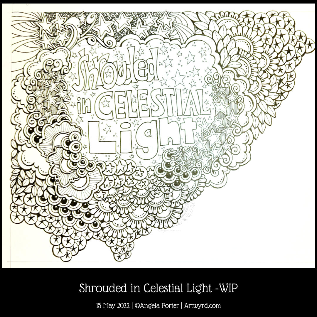
Late afternoon yesterday, I was listening to my “Liked Songs” playlist on Spotify and “Shining Light” by Ash came on. The lyrics “Shrouded in Celestial Light” just stuck in my head, so hand-lettering had to be done, followed by some entangled art!
I wanted to put the letters of “shrouded” overlapping, cwtched close together as if they were covering and protecting each other, apart from that brave S at the front (which I may alter digitally when I’ve finished this off). And that is one of the meanings of shrouded – to be protected and/or covered.
Naturally, stars had to feature in the entangled artwork around the hand lettering. What better to represent “celestial”, though the flowers and plants and seeds are related in a roundabout way.
Our sun is the star nearest to us and the source of natural light. The moon is closer, but it doesn’t generate any light itself, the light we see from the moon is reflected sunlight. Anyhoo, most life, as we know it, on Earth depends on the sun’s energy to remain alive. Without photosynthesis in green plants, there’d be no food. Some living things can exist without any energy from the sun, but they are extremophiles and live around extreme habitats, such as the deep ocean volcanically driven ‘smokers’.
I’ve digressed and slipped into science teacher mode! The point is, that though flowers and plants and seeds don’t seem to have a link to celestial light, they do, as they depend on sunlight to produce food, which gives them the energy they need to live and grow and reproduce and so on. All of us here on the Earth are shrouded in celestial light!
I really wasn’t sure how this was going to work out without a definite frame for the words, but I think by placing clouds and drifts of other things around the lettering it kind of looks like a view through to the celestial night sky, perhaps, with a bit of fanciful whimsy.
Please click on the ‘Watch on Youtube’ option. Cheers!
I spent some lovely time adding a bit more to this drawing. In the video, I share how, step by step, I draw some of the motifs so you can use them too!
Peace, calm, and just creating for the contentment it brings me.