On looking at the monogram K I posted earlier with slightly rested eyes and mind, I’ve decided to leave it as it is. For now at least. I may try to add a dangle design to it in the coming days.
So, I thought I’d post my page of various hand lettered styles of the letter K. I used a 0.4 Sakura Pigma Sensei pen to draw them. No pencil lines were used for any of these letters, just the dot grid to help me keep things vaguely organised and vertical where they need to be.
I like the 0.4 Pigma Sensei pens. You may notice that I do tend to vacillate in my choices of pens – I just like to change things around from time to time! The Pigma Sensei 0.4 has a solid plastic tip, a bit like the Pigma PN pens. That means it’s not quite so easy for heavy handed me to wreck the nib as quickly as I do on the Sakura Microns or Uniball Unipins or Faber-Castell Pitt artist pens or the Copic Multiliners.
That doesn’t mean I’ve managed to use them until the ink runs out – the nib gets wrecked long before then – but they do seem to last longer.
I’ve spent the 3 hours or so that I’ve been up adding patterns/motifs to my lovely new A4 Leuchtturm dot grid ‘Master’ notebook. It’s a rather comforting activity for me. I don’t know how many times I’ve tried to do this in various formats in order to create my own reference book of patterns/designs/motifs and so on. However, realising that my use of a bullet journal is working for me on a more or less daily basis, at least as far as organising myself and making notes ot what to do, what’s been done and so on, I wanted to use a very, very basic form for this visual reference for me.
The A4 notebook will also take up a lot less space than the ring binder I’m currently using. It is a bit cumbersome working in the hardback notebook compared to loose leaf paper, but it should help to keep things all in one place. It’s the method of tracking collections in a index in bullet journal fashion that will make it most useful for me.
So, this morning I’ve started to add my small collection of medieval motifs inspired by jewellery and floor tiles.
I suspect I’ll be having a bit of a quietish day today. I’m practically nodding off here as I type! Maybe a short nap later will help me a bit – but not too long otherwise I’ll be up at stupid o’clock once again!
This is what I end up doing when I’ve fallen asleep earlier in the evening and end up being alert far later than I’d like to! All thanks to that one small glass of port after my lunch. I very, very rarely drink alcohol, so it always floors me either in terms of needing to sleep or in terms of my mood. At least this time it was the nap, so I’ve still got my calm, content mood intact at the end of this day – the first time I’ve felt this way on a Christmas Day for many, many, many years. In fact, I don’t think I’ve ever felt this way. Therapy is working! Yay!
Anyways, after I woke, had a huge mug of tea, I picked up a dot grid pad and a 0.4 Sakura Pigma Sensei pen and started to draw variations on the theme of letter ‘k’ as I listened/watched the second part of the Fellowship of the Ring.
I then remembered that I wanted to try something digitally like I did yesterday, so this is the result. I’ve been working on it for over 2 hours (it’s now around 1:30am, so if some words don’t make sense it’s because I’m just about ready for my bed).
I started by sketching out the shape of the letter in Autodesk Sketchbook Pro, using a Microsoft Surface Pen on the screen of my Microsoft Surface Studio.
The next step was to finalise the shape and redraw it and colour it in. After this, I added the black lines round the K, then the curvy lines on the outside edges. The final step was to add the patterns and colour in small sections of the outside embellishments. Oh, and I created a thin drop shadow and plonked the monogram on top of a paper texture background.
What I want to do tomorrow is to add a dangle to the design. I started trying to do that this night, but my concentration is now going. I also want to try to add some shading to the patterns within the K too. I think they could do with a bit more illusion of dimension.
Oh, the knitted stegosaurus is now complete. I may photo and show. Not sure if I’ll be doing any more knitted dinosaurs. I much prefer amigurumi! I have started an amigurumi monster, but I need to remember to limit my time spent crocheting as it does make my finger joints ache in a way knitting and drawing don’t.
Wishing everyone who visits this little space on the interwebs all the very best blessings and wishes of the season.
I also wish to thank you for visiting, for sharing my posts.
However you spend this day, whether with friends, family, at work, or by yourself, I wish you well and the best.
About this image
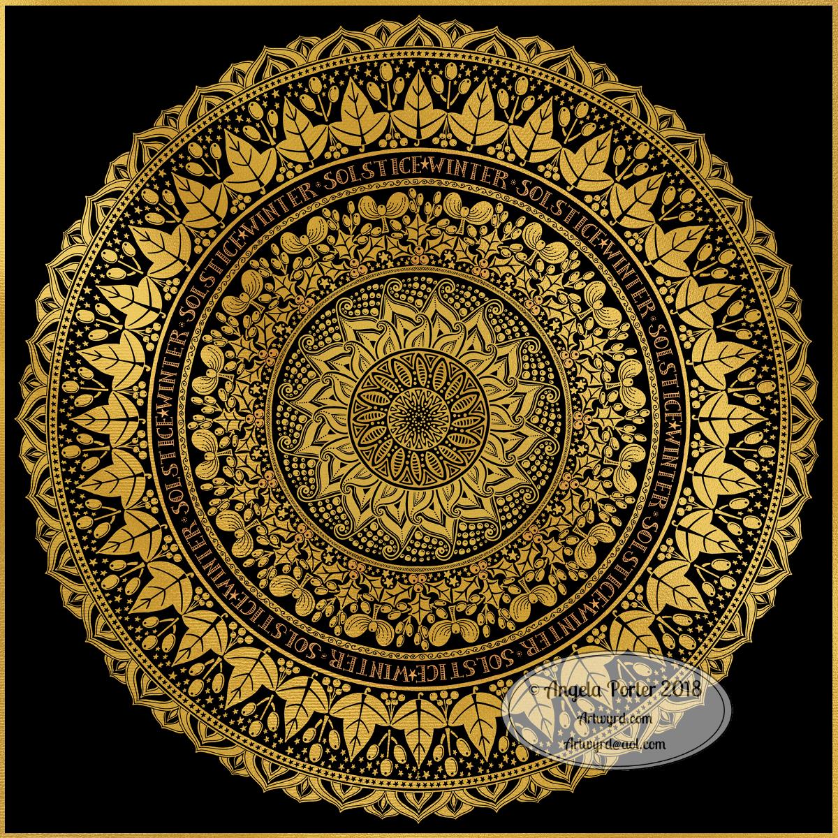
I woke early-ish this morning and had an idea that involved creating this mandala/wreath design, so I had to do it!
Unusually, I drew the motifs in colour! Yup. No black line, just colour.
They’re all very simple with simple colour gradations. The black lines were created by removing colour so the dark background would show through.
I think the outer ring of leaves could be a little lighter, but then it does give a sense of the outer ring bending away, with the hearts and mistletoe on the high point of the ‘wreath’.
Adding texture to the design helped to scuff up the perfection of the colours.
I really enjoyed doing this, as simple as it is.
I am really grateful that I used an insulated mug for my gingerbread mocha latte this morning – I forgot all about it for over 3 hours, so engrossed in my art as I was, and it’s now just the perfect temperature for drinking!
My tools were Microsoft Surface Pen, Microsoft Surface Studio and Autodesk Sketchbook Pro. Yes, this is a digital piece of art.
The rest of the day I intend to spend in arty/creative pursuits, including finishing off my knitted cuddly triceratops (yes, I know yesterday I incorrectly said it was a stegosaurus).
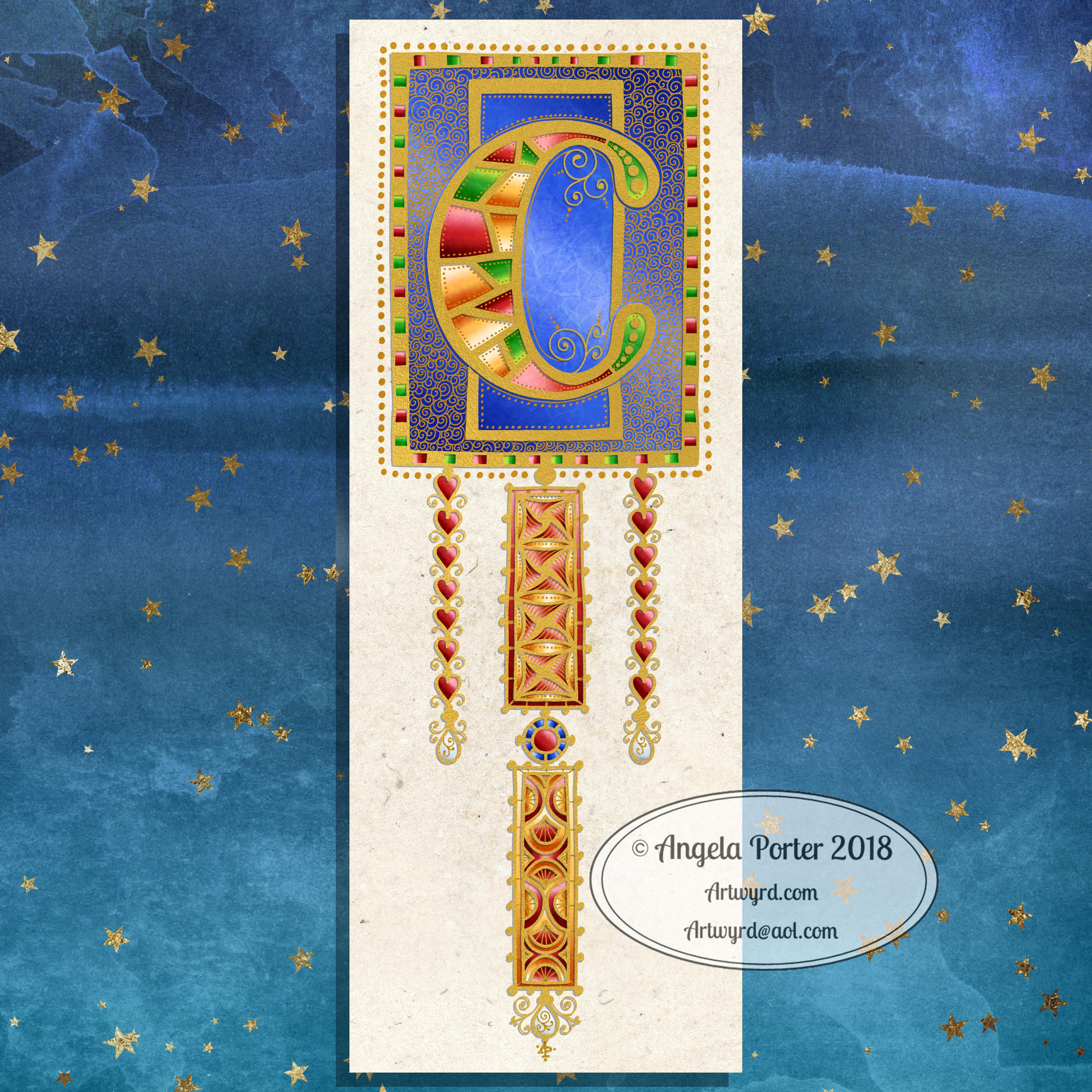
I was browsing through ‘Decorated Lettering’ by Jan Pickett yesterda and came across something I thought I’d like to try. This something involved drawing a letter using coloured pencils or watercolour pencils then adding patterns and embellishments afterwards.
I usually do the patterns and embellishments first, then add the colour. But I also know that if I were to use coloured pencils, watercolour pencils or other media over my line art (traditional art time here!) then the black lines can become masked a little by the colours.
So, I had to try this out.
I grabbed a pad of Daler-Rowney Mixed Media paper along with my Inktense pencils and a fine water brush and began the process of creating the design in colour.
I did use a pencil to sketch out the shapes very lightly, even using an eraser to make them lighter still. Pencil can become trapped under colours and become difficult to erase.
As I knew I’d be posting it on Christmas Eve, I thought a monogram C along with a simple Christmas themed dangle would do the job just nicely. Red, green and gold had to be the colours used too.
For each part of the design I used two or three different colours to achieve the colour gradients. Once I’d finished this step I scanned the drawing/painting/design in and you can see it on the left. Scanning does tend to wash out the colours a little – they are a little more saturated, honest, but not much more.
Then the fun begins. I decided to use a 0.7 Copic Multiliner outline the design elements and add some of the patterns and lines. I then used a 0.25 Copic Multiliner to add some of the finer lines, particularly around the dangles.
I was toying with the idea of using a dip pen or brush and gold ink, but thought I’d play it safe this time and go with rather graphic black lines.
My final steps included using green and gold metallic Sakura Gelly Roll pens to fill in small sections and add dots. I regret the outlines around the stars.It’s made them way too heavy and cumbersome I think. However, as this was an experiment, was me trying something a bit different, it’ll do.
Although I carefully drew out the design elements and added the colour to ensure that the shape was maintained, adding water to activate the Inktense colours meant there were places where I didn’t keep to the shape exactly. I used the finest water brush that I have, but I really could’ve done with not being so lazy and grabbing a fine brush and a pot of water. However, as this was just a bit of a play the waterbrush worked.
Also, I realised that I could fix any wobbly edges with the black lines and any overspill could be incorporated into the embellishment lines/patterns quite happily.
So, I didn’t start over. I went with the imperfections in the ‘just colours’ version.
Next, it was the fun bit – adding lines and patterns. My favourite thing! This time it was adding them to the shapes formed by colour, which is backwards to how I usually work.
There were times when I was getting a little stressed about the lines not looking right or I was making a mess of it all and I’d have to start again.
However, I reminded myself it’s an experiment, it’s trying something new to me and I just need to trust myself and go with it. Which I did. After all, working directly with black pen with no pencil lines, as I mostly do when I draw, means that what you put down stays down!
Adding metallic colours to these patterns as well as the dots around the lines meant that I became happy with what I’d done.
What I could’ve kicked myself for, however, was using the mixed media paper. This has a grainy texture to it and the pens just didn’t want to leave clean lines on it. I do have smooth watercolour paper lurking in my stash, but the mixed media paper came first to hand. Also, some of the smooth watercolour papers – the hot pressed ones – aren’t as white as the mixed media paper and I didn’t want the vibrant colours of the Inktense pencils to be dulled. Mind you, a watercolour paper would’ve helped the colours to flow and not be quite so patchy I think.
Overall, I’m fairly happy with this. It is ‘perfectly imperfect’ in its own way. Learned from the process. Enjoyed challenging myself to do something a little different. It’s certainly something I’ll be doing again, perhaps with different media. Copics or Chameleon markers spring to mind, as do Tombow Dual Brush pens and the Kuretake Clean Colour Real Brush pens, though not exclusively these. I do have watercolour pencils here somewhere, and Distress Ink pads and refils so they’re a possibility too. And, of course, I have plenty of coloured pencils.
I definitely have a love affair with digital art these days, but I also love using traditional media. They’re both important to me and allow me to express my creativity in different ways, that are really the same in so many ways.
Traditional media really makes me have to accept imperfections in colouring and line work as I create. Digital art means it’s easier for me to create those perfect colour gradations and to blend colour and add texture and so on. Also, it’s so easy to have really vibrant colours with digital art, something I really struggle with when using traditional media. I do love vibrant colours, if you hadn’t noticed!
Winter begins! It’s the end of one astronomical cycle and the start of a new one. Winter Solstice is one of my favourite days of the year, along with All Hallow’s Eve. There’s always a feeling of excitement on this day that’s associated with ending and beginnings. Time to lay to rest that which is completed to make way for the new that replaces them as the Sun symbolically ‘dies’ on this day and will begin to ‘grow’ again in the days that follow until the Summer Solstice. It’s also a time to be grateful too.
I know there are many endings and beginnings; every moment in our lives is both an ending and a beginning. However, I feel that days like this, where we can focus on this never ending process in a bigger, more symbolic, more formal way, is important. Traditions are important as they bring a semblance of order to our rather chaotic lives.
I spent some time yesterday drawing this mandala to go with today. The dull gold represents the weakness of the Sun, relatively speaking. I’ve included mistletoe, holly and ivy as they’re traditionally associated with this day. I’ve also added berries as symbolic of the fruits of gratitude I carry for all the days since the last Winter Solstice. And, of course, there are plenty of sun-ray-like motifs and patterns. And stars. Plenty of stars, which from a distance look like snow drifting down.
Yes, I can say I’m rather pleased with this mandala. That’s not something I say often as I’m highly critical of myself and my work. But this one I really do like. I like the more graphic nature of the motifs. I like my hand lettering. I like the rhythm and flow of the design with the rings of designs radiating out.
So, I wish you all the very best that comes with the Winter Solstice, for today and all the days ahead of you and yours.
This was created using a Microsoft Surface Pen and Surface Studio along with Autodesk Sketchbook Pro and a gold texture purchased via Creative Market.
Tomorrow is the Winter Solstice, or Yule. So, I wanted to create a dangle design for Yuletide, and wish you all the blessings of the season.
On the Winter Solstice here in the Northern Hemisphere, it is the shortest day and from here on in the amount of daylight begins to increase once again, albeit very slowly at first.
People gather at prehistoric monuments, such as Stonehenge, Newgrange and Avebury, to watch the sunrise on this day. These monuments have Winter Solstice alignments. That’s why I’ve got a pair of big stones framing the sun.
Of course I had to include holly, mistletoe and some evergreens in the design, along with stars, hears and a couple of cute robins.
It is a digital piece of art which started life as a pencil drawing on dot grid paper. The design was scanned in and re-drawn using a Microsoft Surface pen on the screen of my Microsoft Studio in Autodesk Sketchbook Pro. I did make use of the mirror symmetry tool to help me with the symmetrical nature of the design. I hand lettered the sentiment in the ribbon.
I did colour this quickly using gradient fills – yesterday I really wasn’t up to doing much. I am feeling a bit better today, though drained after a quick visit to my local town to run a couple of errands. I’m really easy to startle at the moment and me being jumpy at every noise and the number of people out and about was something I kind of expected but hoped I wouldn’t experience today.
I’m safely back home now and am starting to calm down a little, though I feel exhausted. So, the rest of the day will be spent quietly for sure.
I do have a Winter Solstice mandala to share tomorrow, and I’m rather pleased with this one. So, do pop back tomorrow.
I’ve spent around two and a half hours on this monogram. I’m still playing with metallic/glitter textures rather than black line work.
I still haven’t ‘cracked’ how to achieve a more dimensional look to the gold lines/beads. No doubt I’ll have a bright idea to try sometime soon.
Medieval, Anglo-Saxon, Celtic and Romanesque art and architecture has long been an inspiration for me, though it’s not often I express it in such an obvious way. This definitely has a medieval ‘feel’ about it, but there’s also a more modern take with the rectangular dangle charms and the very contrasting gradient colours that fill the patchwork pattern inside of the letter.
I was thinking of adding more complex patterns inside some of these patchwork sections. However, I decided that could be way too busy and went with the dots.
Dots are a very common embellishment in Anglo-Saxon and Celtic manuscripts. After adding dots to those patchwork panels, I had to go and add them elsewhere. Such a simple thing, the humble dot, but how much it can add to a design.
I love the plain blue panel behind the C, so the letter doesn’t get entirely lost in the background pattern – my favourite little spirals. I like the thicker lines around the letter too, but they’re too ‘flat’ for my liking at the moment. The little square-ish gems in the main outline help to break that thick gold line up, adding a bit more opulence in the process.
I love the dimension in those rectangular panels, particularly the lower one. The high contrast gradations in colour really give it some dimension. I wasn’t at all sure about using the pale yellow to orange color gradations anywhere in the design, but once I’d completed this particular ‘charm’ I absolutely loved it!
Although I don’t show such complex monogram dangle designs in my book ‘A Dangle A Day‘, this design really isn’t all the complex to do.
Talking of ‘A Dangle A Day’, Lydia at #quartocreates sent me a link to a nice review of the book by Funky Frugal Mommy.
This is a piece of digital art using my Microsoft Surface Pen and Surface Studio along with Autodesk Sketchbook Pro and some texture files purchased via Creative Market. I did start with a pencil sketch of the monogram and dangle design which was then redrawn digitally.
The previous and latest version of the monogram dangle design. The variation is the background paper colour as well as a drop shadow for the design.
I had a lot of fun as well as some frustration when I found it difficult to do what I wanted to do, though I got there in the end, I think.
I certainly have a few more tools in my digital art toolbox.
Autodesk Sketchbook Pro really makes it easy to create art like this. Though this may have been simpler for more accomplished, learned digital artists, for me it was a bit of a process. However, I have managed to create something I could only dream about doing in traditional media, I think.
The skills required are, in my opinion, equally as demanding, whether working digitally or traditionally. Don’t forget, this started out as pen and ink line art on paper – very traditional! I just made use of digital tools to develop it into something that definitely has a medieval feel to it but in a modern medium. Indeed, all the lines/patterns were re-drawn digitally using a pen and the screen as ‘paper’ to arrive at these final versions. I did make use of the color-fill tools to colour these ones in, but the addition of textures makes them less digitally perfect and more ‘perfectly imperfect’.
This certainly has inspired me to create a whole series of such monograms over the coming days, weeks or months. Goodness alone knows what I can do with the digital versions as having them printed wouldn’t result in any sparkle where there’s sparkle. However, I do have an idea about foiling my line art, as well as working with metallic inks once more. Indeed, I had a deliver of Encres A Decorer by Herbin yesterday and dug out my glass pen to use with them. So some experimentation with those is likely (as well as digging out my dip pens and nibs too). I think I have some calligraphy ‘parchment’ or ‘vellum’ paper lurking somewhere in my stash as well.
Finally, I think I’m getting comfortable with my style of hand lettering. It sure ain’t perfect. It’s sure ain’t as slick as that of others. But it’s mine, not theirs.
Of course, some of the ideas/tools/techniques I’ve used here I can make use of in my more usual style of art. For today, I want to work on a design for the Angela Porter’s Coloring Book Fans facebook page to help celebrate the changing over of the calendars at midnight on New Year’s Eve as it turns into New Year’s Day. A liminal point of time between one thing and another. A boundary between the old year and the new.
So, finish my toffee nut latte mocha morning drink I will, then it’s to some hand lettering and drawing, while keeping warm and dry on a chilly, rainy and windy day.
This version is totally digital. I used the pen and ink drawn version to re-draw the design in Autodesk Sketchbook Pro, making use of a glitter texture.
I think I got my head around how to do this, and colour the images in and I’m kind of pleased with it, though I’d like a bit more of a highlight/shadow on the glitter bits. That will take some thought and experiments as to how to achieve that, but for now my head is overloaded with working in layers and with digital art techniques I’ve barely used before.
I’m pleased with how it looks rather medieval in style – medieval drawn using modern technology. This version doesn’t even exist in physical form, which is crazy!
I have no idea how this would print out as, say, a book mark or note card. As it’s a fairly high resolution file on my computer it would print as a photograph. Of course, there wouldn’t be any real glittery sparkle and shine.
Yes, I’m fairly pleased with this and for myself for figuring it out how to do it, though there’s lots of improvements that could be made.
I think I’d like finer ‘glitter’ on the texture background I used – that’s just a matter of creating another tiled image via GiMP. However, until I do something I never quite know how it’s going to work out, nor do I know if it’s going to be a good idea.
It certainly satisfies a part of me that likes glitter and sparkle and shiny things.
All I have to do now is try to remember how I did this so that I can repeat it in the future, if I’m so inclined.
I am waiting for some metallic inks to be delivered today, so no doubt I’ll be drawing with them on paper.
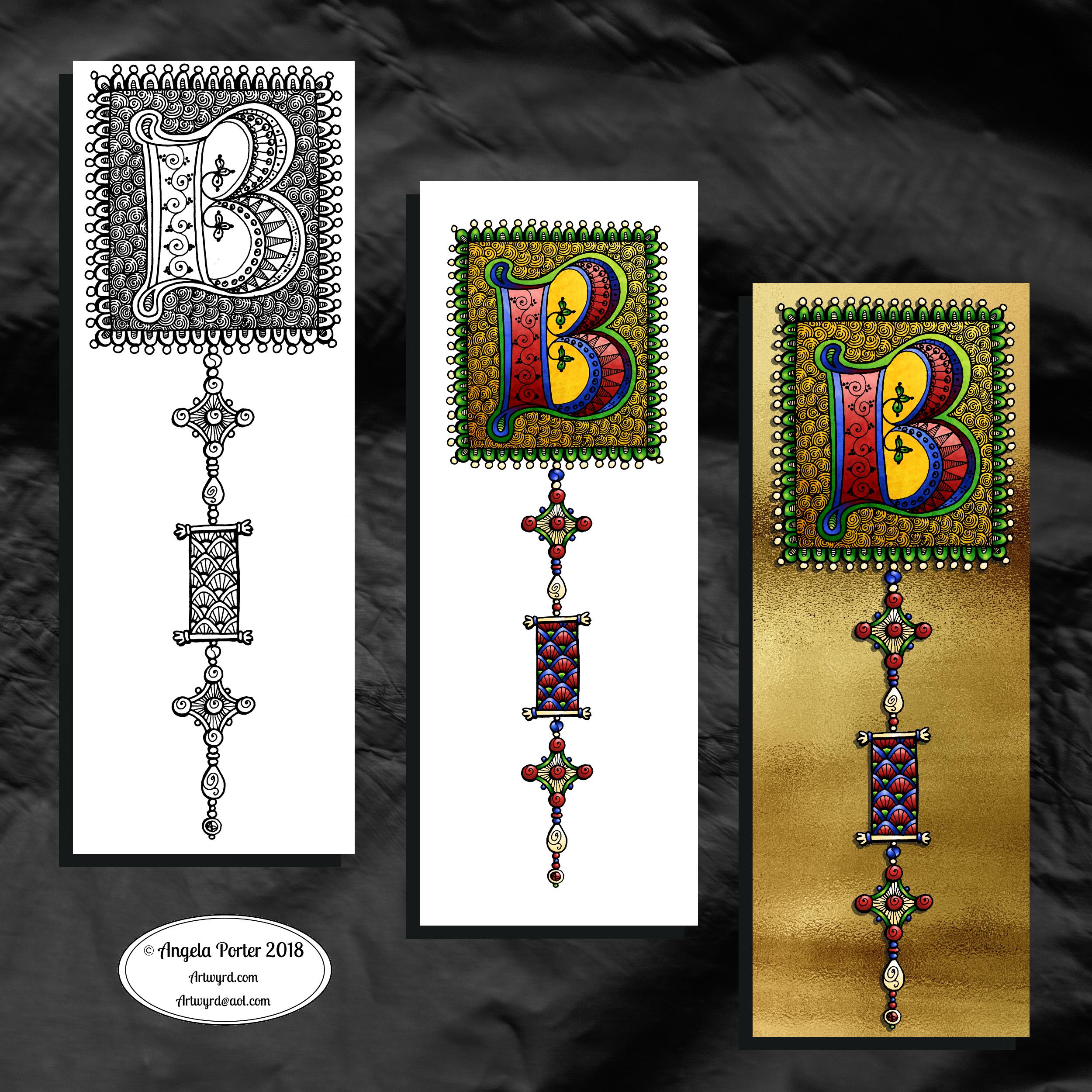
One monogram dangle design, three different versions.
The first is just the black and white line art. This was drawn with Uniball Unipin pens on dot grid paper then scanned in so the dot grid and faint marks could be removed as well as making a transparent background. This dangle design is much more ornate in terms of pattern than is in my book ‘A Dangle A Day’ but is still easy to do if a bit time consuming.
The second is the line art coloured digitally with some texture added.
The third has the coloured line art floating on a golden sheet.
I’ve not quite managed to get my head around how to convert the black and white line art into golden line art where I can add colour. I suspect it’ll have to be re-drawn, which I’ll most probably do while I’m waiting for a delivery.
I kind of like the gold background, but it is a bit too much as well.
Which version do you like best? Let me know your thoughts!