Lettering Practice – 29 May 2022

Finishing my work quota for the day deserves a treat, and that involved some hand lettering practice and exploration. So, these two pages from my A4 lettering sketchbook have been worked on over the past couple of evenings.

I still haven’t found a way of lettering that resonates with me, though both of these pages resonate with me more than other lettering work I’ve done. I really want to combine lettering and my love of patterns and abstract design. Working out how to do that in a way that feels right and makes my heart smile, is proving to be a difficult task!

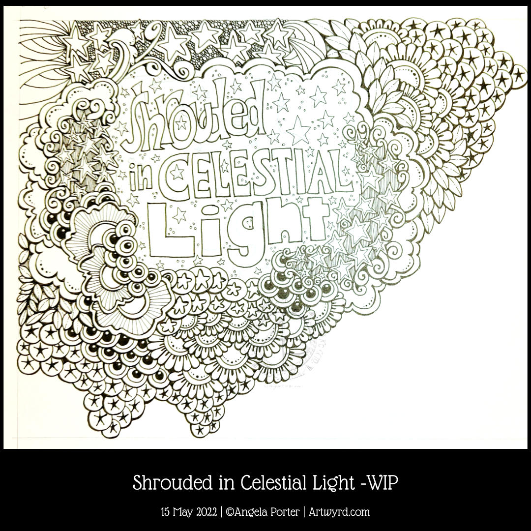
I think, however, that I may be circling in on some ways of achieving this. One style that may bear fruit I stumbled upon several days ago and I blogged about it then (Hand Lettering and Entangled Art). Thoughts and quotes and words in shapes with entangled, zentangle inspired, patterns connecting them and creating a background pattern. I’m still not sure about this particular mode of expression. But I’ll work with it and see where it leads me in time.

Another way of lettering I stumbled upon was in lettering an alphabet in the style of “Hand-lettered capital I”. That was the inspiration for the image on the left above.

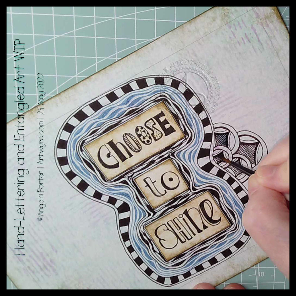
Last weekend, I bumbled my way through “Choose to Shine”, and the abstract patterns in the background gave me an idea to try out. Which I did in the right-hand image above.

There’s a fair amount for me to think about with these experiments. I’ve finally found a way to make use of Gelly Roll Moonlight pens – both for drawing patterns in letters, but also as patterns that flow over or behind letters – as in Shine and Because in the right-hand image. I also used the Moonlight pens, along with some Zig Writers and some vintage coloured gel pens in the left-hand image and the “A Curious Pattern” and “Never give up” designs in the right-hand image.

It’s so unusual for me to draw in colour. I usually stick to black ink for drawing, but suddenly I may have found a way for colour to appear in my whimsical and entangled worlds.

At the moment, though, I’m still not at all sure about this. My head hurts (another migraine feels like it’s on the way) and I’m not able to think clearly or write all that coherently, or so it seems to me.

One last thought to share. For both of these pages, the only thing I may have looked back on was my own work. I didn’t look in books or at work online for inspiration, I only used my lettering sketchbook and my love of abstract patterns. Learning not to compare my work to others, trusting myself that what I produce is good enough because it is an expression of myself, is not an easy thing to do. But I’m working on it and here it may have paid off with examples of lettering by me that I kind of like.

“Choose to Shine”

I’ve finished it, I think. I’m feeling a bit happier with it now. I really like the abstract, curvy, swirly bits that remind me of La Tene (early Celtic) art. I’m still not happy with that central ‘moat’, though.

Oh, I’m also really pleased I stuck to an analogous colour scheme, mostly. Having the words in an almost complementary colour to the blues and purples makes them stand out. But I still rather like the swirly abstract patterns, and I’m so glad I added them!

I’ve not quite found my way with hand-lettering. I keep trying new and different things out, but nothing seems to sit well with me yet. Although I like the more formal lettering layouts, I don’t think that’s for me. I tend to work fairly instinctively and intuitively with little forethought or planning. When I do think my way through something, that’s when disaster tends to strike!

I suspect a looser, expressive, intuitive kind of style is going to work for me, along with my style of entangled, abstract art. Probably. Possibly. Perhaps…

Draw With Me … Whimsical Houses #2

Please click on the ‘Watch on Youtube’ button. Cheers!

We all need some whimsy in life at one time or another. Given all that’s going on in the outside world, I definitely need a huge dose of whimsy! So, today, I drew three whimsical houses, one step at a time.

These are more ornate than the first set of whimsical houses I did (https://artwyrd.com/2022/05/06/whimsical-houses-and-other-stuff/), but how complex they are is entirely up to you if you choose to draw along!

Hand-lettering and Entangled Art WIP

Click on this link to view today’s video on YouTube – you can see how I got to this point and even draw along with me!

It was one of those mornings when I wake up with what seemed to be a good idea on my mind. Then, I execute the supposedly good idea to realise it’s not working out as expected, and it may not have been such a good idea at all. That is what is happening here!

I think the idea of doing my hand-lettering like this may have some mileage in it. I do feel I have problems pleasingly arranging lettering. If I work on pieces of paper and cut out the words, I can arrange them on the paper until I’m happy with it. So that’s fine. A good plan.

But, I’ve ended up with a birdseye view of an “I” shaped moat around a blocky castle “rolls eyes”. Having “choose to shine” inside a capital I works rather well – I choose to shine. But what possessed me to use blue Diva Dance around the letters? I really didn’t think it through or see the consequences of that choice. Duh!

Of course, this may just be that part in drawing where I think it’s all awful and I should just give up. But I’ve learned to be a bit stubborn and push through to the end, with a drawing at least. Adding colour is an entirely different matter.

So, I will push on and see what happens. Who knows, it may work out nice enough in the end. Or not. Either way, there are plenty of opportunities for me to learn some stuff.

Sheesh, I really can drop some rather heavy clangers at times. But it’s through these that we learn, grow and develop as artists. In my case, I seem to drop the same clangers time after time after time and never quite seem to learn. One day the pennies will drop!

Hand-lettering and Entangled Art

I’m a tad out of sorts today, just a dose of gloomy emotional weather, that’s all. It’s also beginning to pass on by too, which is a good thing! Even with the gloomy weather, I’ve been able to feel the touchstone of contentment within me, but my thoughts have been on shaky ground concerning art.

I was drawing last night, and this morning a different page, and lots of questions came up about my art style. I wasn’t feeling happy with my hand-lettering journey and what my ‘style’ is. I’m finding it really hard to feel comfortable with the hand-lettering I’ve been doing lately. I don’t know why that is, not entirely anyway.

So, my solution is to draw! Well, hand-letter and then draw, but hand-lettering is drawing letters rather than writing. So drawing it is!

Instead of popping words/phrases into my ‘entangled’ art style as I draw, I thought I’d place them on the page first. Then I can do the pattern stuff, repeating various motifs to bring some coherence to the whole design. Not sure I’ve managed it.

Instead of filling the whole space with lots of black pen work, I thought that I could use a brown pen to add just lines to the spaces between. I think I like this as the spaces just looked cold and empty before.

I’m still not sure I’m finding my way with this. I know I do get all flustered and fed up with my art from time to time and start to question myself and be quite harsh with myself.

Working on this, and talking my way through some of it in today’s video, has certainly helped, and my mood is lifting. But regardless of my emotional weather, this was something that still needed to be thought through to do my best to pinpoint what I was struggling with when it comes to including hand-lettering in my art.

Draw With Me | Using a coloured background to inspire a floral drawing

Please click on the ‘Watch on YouTube’ option. Cheers!

Before filming this video, I primed a piece of watercolour card with white gesso. Then, I added colour using Inktense pencils and water. I added each colour separately, drying them before adding the next. Finally, a layer of clear gesso was added to seal the colours.

I had no particular idea as to how I would add the colour or what I wanted to use the paper for after this. But, as I looked at it, the pink areas just looked like very fuzzy flowers, so that was it! A floral based drawing it would be!

I do not intend to fill the whole area with flowers. I have plans for the ‘white space’ around the designs. But you’ll have to wait to see how that pans out!

In the video, I take you through drawing each flower design, one step at a time. I try to vocalise my reasons for doing certain things too.

Shrouded in Celestial Light WIP

Late afternoon yesterday, I was listening to my “Liked Songs” playlist on Spotify and “Shining Light” by Ash came on. The lyrics “Shrouded in Celestial Light” just stuck in my head, so hand-lettering had to be done, followed by some entangled art!

I wanted to put the letters of “shrouded” overlapping, cwtched close together as if they were covering and protecting each other, apart from that brave S at the front (which I may alter digitally when I’ve finished this off). And that is one of the meanings of shrouded – to be protected and/or covered.

Naturally, stars had to feature in the entangled artwork around the hand lettering. What better to represent “celestial”, though the flowers and plants and seeds are related in a roundabout way.

Our sun is the star nearest to us and the source of natural light. The moon is closer, but it doesn’t generate any light itself, the light we see from the moon is reflected sunlight. Anyhoo, most life, as we know it, on Earth depends on the sun’s energy to remain alive. Without photosynthesis in green plants, there’d be no food. Some living things can exist without any energy from the sun, but they are extremophiles and live around extreme habitats, such as the deep ocean volcanically driven ‘smokers’.

I’ve digressed and slipped into science teacher mode! The point is, that though flowers and plants and seeds don’t seem to have a link to celestial light, they do, as they depend on sunlight to produce food, which gives them the energy they need to live and grow and reproduce and so on. All of us here on the Earth are shrouded in celestial light!

I really wasn’t sure how this was going to work out without a definite frame for the words, but I think by placing clouds and drifts of other things around the lettering it kind of looks like a view through to the celestial night sky, perhaps, with a bit of fanciful whimsy.

Draw With Me | Embrace Beautiful Chaos – Part 2

Please click on the ‘Watch on Youtube’ option. Cheers!

I spent some lovely time adding a bit more to this drawing. In the video, I share how, step by step, I draw some of the motifs so you can use them too!

Peace, calm, and just creating for the contentment it brings me.

Draw With Me | Two More Organic Motifs

Please click on the “Watch on YouTube” button to view on YouTube itself (and help the algorithm!).

I’ve now finished this drawing by adding two organic motifs, both fairly simple.

With the trailing flowers or leaves or stones, the hardest part is arranging them to look like they’re trailing and remembering to decrease the size towards the point.

The other motif, a stack of small seeds on a stem, is easy enough to draw.

After doing this, I thought it needed some colour to bring the motifs to life. So, I dug out some of the Neocolour IIs I’d used for the background and used them a bit like watercolour paints. I scribbled a little of each Neocolor II on my plastic palette, added water, and painted.

I’m not entirely sure about my efforts with adding colour – this is where it can all go wrong for me. Part of me knows I’d most likely be better off if I were to add shadow and texture using pens.

I did use some metallic watercolours to add some sparkle here and there too.

One thing I did notice is that I was glad I tried not to paint over the black lines. The pigment ink in Micron pens is usually waterproof, but, as the Necolor IIs are wax-based and coat the surface of the paper, the pigment doesn’t sink fully into the paper and so water will move the ink.

It’s not a problem, now I’m aware of this. Oh, it also means erasers will lift some of the ink as well as pencil lines. Again, just something to be aware of.

One other thing I did was to cut the paper down to frame the design a bit better. In my clumsy way, I managed to cut it just across the tip of one of the trailing thingies. So, no border around that area.

I will keep going with adding colour and see where it leads me, hopefully not into a disaster! Still, if that happens, it’s only a bit of time, ink, paper and colour and the design can be used as inspiration for the next one. Important lessons about the Necolor IIs are being learned, which is, perhaps, the most important thing.

Draw With Me … Five of my favourite organic motifs

Please click on the ‘Watch on YouTube’ option. Cheers!

In today’s tutorial video, I enjoyed drawing on one of my Neocolor II backgrounds. And I’ve just remembered I forgot to scan the background before cutting and drawing on it. Oh well. I’ll just have to make another one!

Anyhoo, I sometimes forget how much I enjoy working on a coloured background. The colours add an instant “feel” to a drawing. This one reminds me of sunrises and sunsets and the joy and awe that I experience when I see them. So, it was natural I’d choose a few of my favourite motifs to start filling this A5-ish sheet with pen drawings.

Of course, it’s lovely to share how to draw these motifs with others, helping them along their arty journey.