Please click on the button “Watch on YouTube”. Cheers!
I had a really, really cruddy, broken night’s sleep. So, doing art that doesn’t have a bit more than good enough was in order.
Getting the pen drawing done for this cute bird I started a couple of days back was just the thing!
It’s always interesting to look at my art, whether finished or, like this one, a work in progress after a day or so’s break from it. With fresh eyes there’s a different perspective. With this drawing, I needed to alter the design and size to get it to work. Not sure I’ve got it right, but it’s better than it would’ve been if I’d carried on as I originally planned.
The next decision to make, and the trickiest, is whether to just add shadow and highlight or whether to go with colour. The next tricky decision is what media to use to this.
I’m so aware that my colour choices can be … quite dire. And so I am tempted to add colour digitally initially. Maybe. Perhaps.
A little break from it will be in order before I make that decision.
I’m most probably not the first to discover this, but it is entirely new to me!
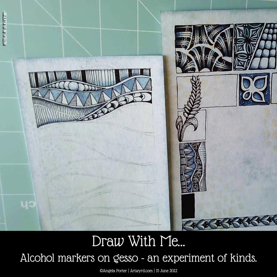
Early this morning, I added some alcohol markers to a pen drawing I’d finished. I’d drawn over a Distress Ink background with some old book pages collaged and gessoed onto it.
I know gesso coats a surface with a waterproof and slightly textured finish. I do know this. But that didn’t occur to me as I added alcohol markers to the drawing.
I was absolutely delighted with the interesting variations in the intensity of colour that resulted. Also, the application of alcohol marker also brought out the texture where the gesso was patchy, even a little bit. The paper soaked up so much more colour than the gesso – duh go me for not realising that first, but that’s not the important thing – it’s the effects that result!
It’s not all that easy to see on the image to the left. But, behind the triangular pattern, I used just one soft blue marker, but you can see the variation in intensity! Usually, it would be a very flat kind of colour. The darker areas are where there is no gesso.
This is something I really want to use as I go forward. I love the crazy, random variations in colour and texture that happen. It seems to me a way to bring a little unpredictability to the rather predictable results you get with marker pens.
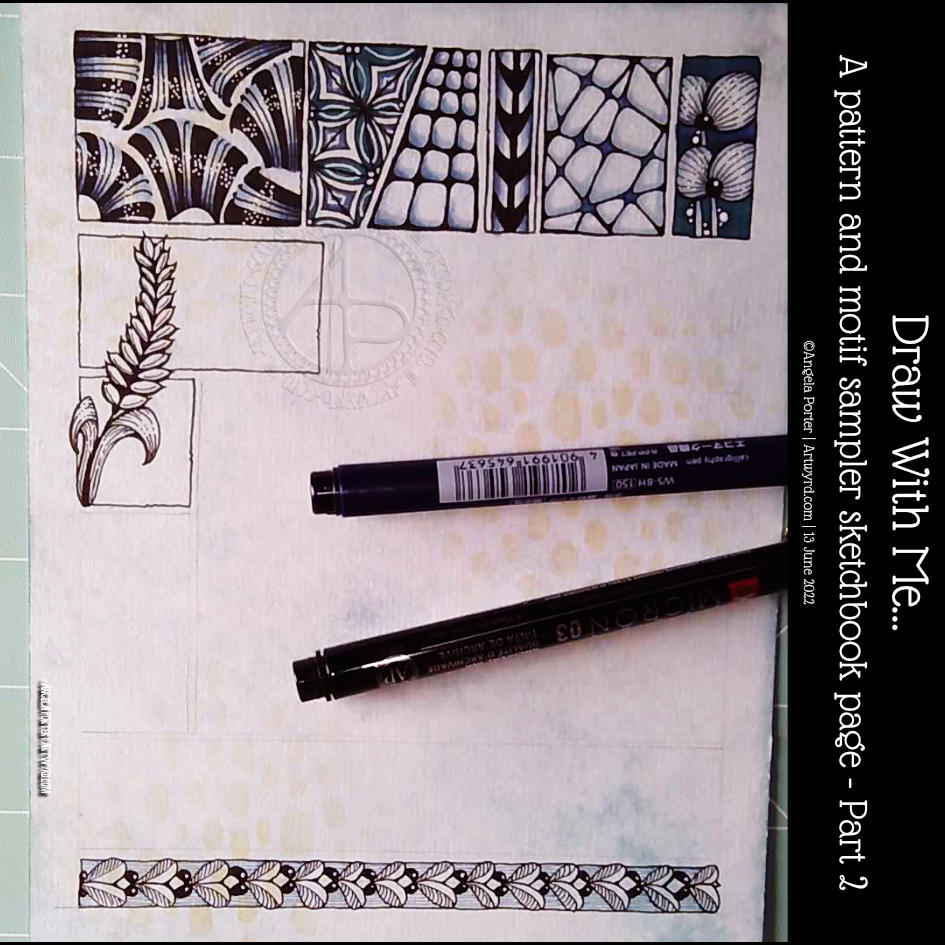
This was a lovely way to start my day. At the bottom is a tangle pattern that is new to me – Zhuer by Yuru Chen.
I also wanted to add a motif across a couple of boxes in the sample. This one ended up like a stylised ear of wheat. As I look at it now, I wish I’d had it going behind the boxes and maybe the top bending towards the left and reaching outside of the upper box. That’s something to think about for the next motif I add.
Still, it was a nice half hour or so before my attention turned to inking in colouring templates.
I had a request from one of my subscribers on YouTube asking how I create this kind of art. Well, a nice request has to be met with a response, in this case, a YouTube video.
I’d tried out this way of working a week or so ago. I’m trying out different ways of combining hand-lettering with my kind of entangled kind of abstract art. In fact, I’m trying to work out my hand-lettering artistic voice. It’s very much a work in progress.
I’m really rather pleasantly surprised with this page. It’s not finished but is a melange of different ideas and pen types. There are a lot of ideas to take away from this and a lot to think upon.
I particularly like how I eventually worked out I could have patterns weaving in and out of the letters, again messing around with volume/dimension/space. I’ve yet to work out how this could work, but I’ve made a start.
My fingers are itching to get to work on something similar to this. I am, however, feeling totally exhausted. I didn’t sleep well last night, and my eyes are constantly on the point of closing as I fall I asleep where I sit.
I have a delivery due soon, I hope. And after that, I’m going to crash and have a nap. Then, I’ll see what happens this evening, as far as art goes!
Looks like yesterday and today are my ‘weekend’ this week. I do know, from past experience, that if I try to do some serious work while falling asleep, I’ll just mess up and have to repeat it again. So, time for self-care for sure.
How I spent my afternoon – adding colour to this particular design. The colour isn’t even, but I’m fine with that as I do want to add subtle patterns in the coloured sections eventually, I think.
I’m now taking a break from this as I just don’t know what to do next. Do I add more colour? Or is it time to add more pattern or texture? Or, do the patterned areas need shadows and highlights added rather than colour. Dare I add any sparkle and shimmer in places?
I just don’t know at the moment. What I do know is I quite like this way of combining words and patterns – two things I love very much.
A second thing I know is that it’s time for a mug of tea, a biscuit, maybe, and some slow stitching. Oh, and watch episode 3 of Obi-Wan Kenobi!
I’ve seen a bit about slow stitching recently. It kept on catching my attention, so time to take a look at it a bit more.
Permission is given!
I lost my way with textile art many years ago – my attention went to other things. I still have a sizeable stash of threads and beads and sequins and so on. I got a couple of Slow Stitching books on my Kindle, had a quick read/flick through and had a realisation. Slow stitching gives me permission to create with stitches with a similar mindset to my more abstract art – to lose myself in the flow of creating, of just letting things happen and going with it and enjoying the process!
Being given permission – that is such a powerful thing! So often many ‘rules’ seem to be set about how you ‘should’ use a particular medium, or how you ‘should’ draw or create. It’s so refreshing when someone gives you permission to just do want you want, whatever brings you relaxation and pleasure (talking about stitching here!).
The stitching doesn’t have to be perfect. It doesn’t have to look like anything. It’s just creating pattern and texture with colour and so on in a way that is pleasurable to you, to me.
It’s taken me a long time to give myself permission to draw the whimsical art I draw, or the more abstract stuff I do. But sometimes it really does take someone else to give that permission, either overtly or tacitly.
So, last night I dug out some felt and embroidery threads and needles and just started to stitch – cross stitch, seed stitch, running stitch and French knots. I’ve never been able to do French knots before!
Fond stitchy memories
As I stitched I had fond memories of Friday afternoons in primary school, I must’ve been 9 or 10, and being able to take out a sturdy cardboard box that stored my sewing project. Everyone in the class had one of these – boys and girls. A rectangle of navy blue Aida fabric, with the holes forming fairly large grids. A blunt needle was carefully stored in the fabric, and there was a selection of embroidery silks on the teacher’s desk to choose from.
Each week, we added another border or row to this fabric, learning different kinds of decorative stitches as we went. The Aida fabric made it easy to do, the only tricky things were not pulling the thread too tight and getting twisted, tangled and knotted thread!
Eventually, a panel was completed and the entire project was turned into a kind of pouch for pens and pencils. I had to add a linking – bright red – and stitch everything together by hand.
I remember being really proud of what I’d made and I treasured that pouch for years, even when black ink stained it, in one corner. I don’t know what happened to it. It just seemed to disappear at some point never to be found again by me. I remember being a bit upset at it going missing.
When I was in University, studying Chemistry and Environmental Pollution Science, I often used to get acid splashes on my jeans. So, rather than throwing them out, it seemed sensible that I use simple stitches to turn the holes into flowers and extend that pattern beyond the holes.
Over the years I’ve dabbled with cross-stitch and stitched tapestry and patchwork, but nothing really grabbed my attention until I did a lot of textile work during my A-Level art in my early 40s. Yet, that went by the by as other art took over, particularly when I started to work for publishers. I even won an art competition with one textile piece.
Slow Stitching
Returning from a little trip down memory lane, I wanted to take a look at this slow stitching. It feels right that I revisit stitching with the aim of incorporating it into my drawing and hand-lettering work. It may take me a while to work out how I’m going to do that, but unless I make a start it may never happen.
Felt is OK to work on, and I may return to needle-felting beautiful fibres onto black felt and then using slow stitching and beads to embellish the work. First, I have to get some black felt! I have loads of the rest of the stuff in my stash!
I also want to explore stitching on paper, using the stitches as a way to collage papers and so on. Like in the photo above.
Working on paper also gives me the opportunity to draw and/or paint patterns or textures alongside the stitches; giving me the opportunity to find different ways to combine my favourite things!
It may not be everyone’s cuppa, but my first attempt is making me smile and there’s a small sense of achievement.
I have no idea where this will take me, nor how persistent I’ll be with the stitching thing. It is, however, one more technique to add to my toolbox of arty techniques to choose from. And another one that is both relaxing and pleasurable, especially now it’s ok for me to do what I want when it comes to stitching!
I’ve finished it, I think. I’m feeling a bit happier with it now. I really like the abstract, curvy, swirly bits that remind me of La Tene (early Celtic) art. I’m still not happy with that central ‘moat’, though.
Oh, I’m also really pleased I stuck to an analogous colour scheme, mostly. Having the words in an almost complementary colour to the blues and purples makes them stand out. But I still rather like the swirly abstract patterns, and I’m so glad I added them!
I’ve not quite found my way with hand-lettering. I keep trying new and different things out, but nothing seems to sit well with me yet. Although I like the more formal lettering layouts, I don’t think that’s for me. I tend to work fairly instinctively and intuitively with little forethought or planning. When I do think my way through something, that’s when disaster tends to strike!
I suspect a looser, expressive, intuitive kind of style is going to work for me, along with my style of entangled, abstract art. Probably. Possibly. Perhaps…
Thursdays come around quickly, or so it seems. And with Thursday comes a new colouring page (template) for members of Angela Porter’s Coloring Books Fans Facebook group. The group is free to join, and the templates are free to the members of the group.
This week, I indulged myself in creating a tile mandala kind of design. That central panel looks really awkward, but I suspect it has more to do with my colour choices than anything else! I’ll be interested to see how people tack that one. Ho hum.
Please click on the ‘Watch on Youtube’ button. Cheers!
Step 1 – Create a Gesso and Neocolor II background
Yesterday, I had a delivery of Finnabair Art Basics Clear and Heavy White Gessos, made by Prima Marketing. Neocolor II backgrounds are a lot of fun to make, but they do leave a smooth, waxy finish to the paper. I like drawing on it, but my pens aren’t too keen.
So, I wanted a way to seal the Necolor IIs into the paper and a surface I could draw on. Yesterday, I tried some glassy gel medium from my stash. It worked well, and the colours appeared more vibrant. It was OK to draw on, but the pen took a long while to dry, and I’m not sure how permanent the Micron ink would be on it.
Synchronicity-like, some suggested videos cropped up on YouTube where gesso had been used to prepare the paper and then seal in the Neocolor IIs, even using the gesso instead of water.
I have used gesso in the past, but it always felt very rough and gritty. However, the Finnabair Art Basics gessos had reviews that suggested they are smooth and chalky in feel. So, I had to try them.
I’m glad to say that they are smooth and chalky! I did spend a little time last night testing them out and gessoing some “polaroid pops” image tiles.
In today’s video, though, I wanted to quickly show what gesso is and how I’m thinking of using it, particularly in my sketchbooks with paper that won’t take much water.
I covered a page in my Hahnemuhle D&S sketchbook. The paper in this book is for drawing and sketching and is not designed for water-based media. I can get away with a barely damp brush on the paper, but only one, maybe two layers are possible before the paper starts breaking down. Gesso solves this by sealing the paper’s surface and creating a thin, flexible layer that can be worked upon. I used the heavy white gesso to do this.
Gesso dries really quickly, but a craft heat tool (or hairdryer) can help to speed the process up.
The next step was to add colour with the Neocolor IIs. I used water to activate them, though I could’ve used gesso. I wanted to create an uneven, weathered or worn kind of background. I started with the browns, sealed them with clear gesso. After this had dried, I added the blues and finally another layer of clear gesso.
Then, I was ready to try drawing on this.
2. Drawing on the gesso surface
I really didn’t know what would happen. I know I’ve used gesso in the distant past, but couldn’t remember if I’d used pens to draw on it or not.
As it happens, it was really lovely to draw on! The Sakura Pigma Sensei 04 pen did feel like it caught on the tooth of the gesso from time to time, but nothing more than a rough-surfaced paper. It may be my imagination, but the ink seemed darker on the gesso, perhaps because it dries on the surface and doesn’t sink into it, like it would with paper.
I did a test to see if, once dry, the ink would be affected by water or gesso. There was a tiny amount of pigment that seemed to move, but nothing noticeable.
3. The arch motifs/fragments
I really love round arches! It stems from my love of Romanesque architecture. I use them a lot in my artwork. So, I thought it was about time I explored individual arches as if they were fragments of a tangle pattern.
4. Reflections
I’m so glad I rediscovered gesso. I’d forgotten how it could be used. I know the rough grittiness of the gessos I’d used in the past really did put me off using them again. However, this lovely, chalky smooth gesso is really nice to draw on. It also opens up more ways to create backgrounds and use colour. I’m sure I’ll continue to experiment and explore it going forward.
Please click on the ‘Watch on Youtube’ option. Cheers!
I spent some lovely time adding a bit more to this drawing. In the video, I share how, step by step, I draw some of the motifs so you can use them too!
Peace, calm, and just creating for the contentment it brings me.